Fontsmith introduces a trio of storytelling serifs in response to 'homogenous online design trend'
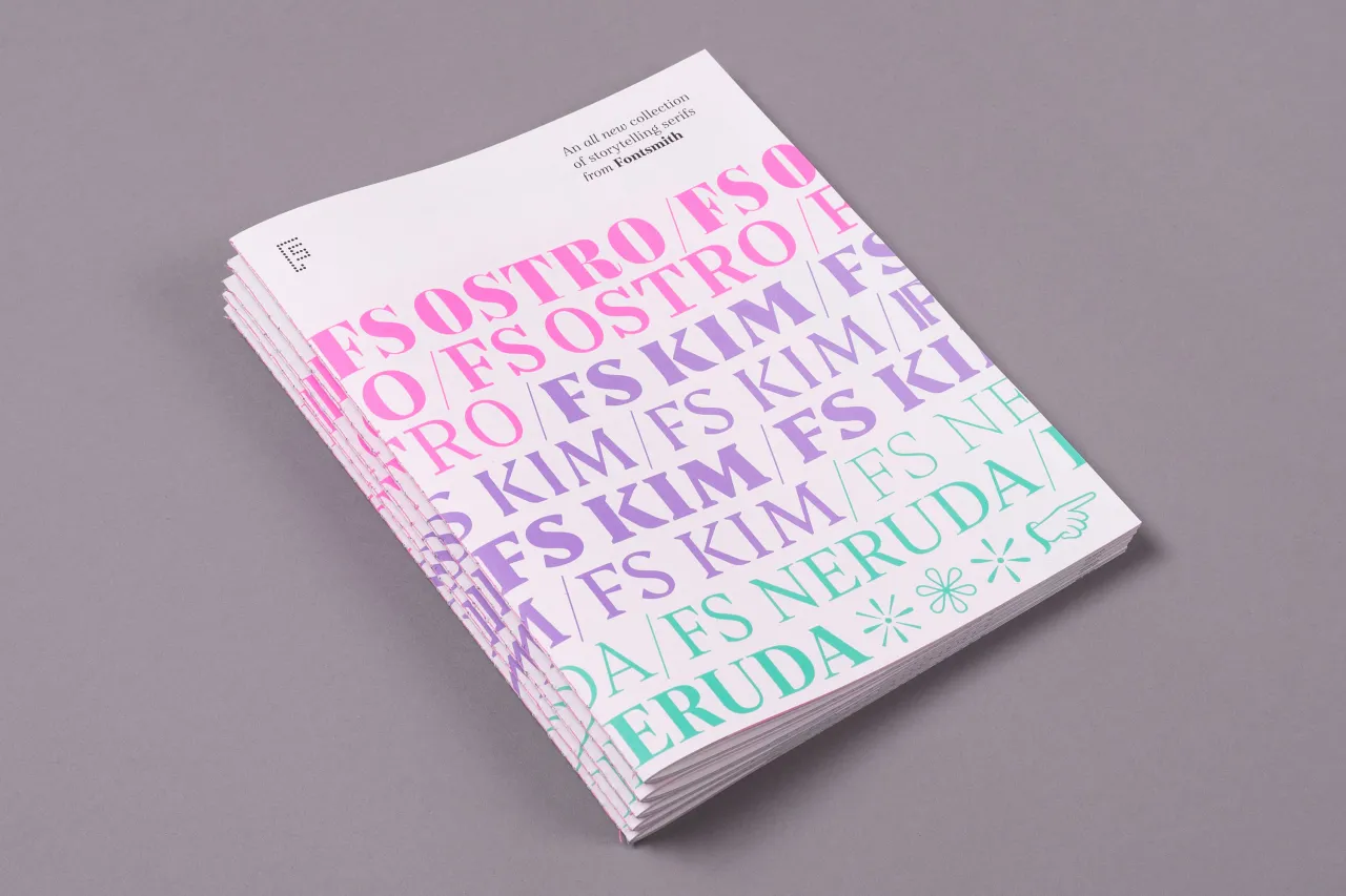
In a Fontsmith first, the boutique type foundry has launched a trio of serif typefaces all at once. While FS Kim, FS Neruda and FS Ostro are all unique and individual fonts, together they form a cohesive, carefully curated addition to the Fontsmith library.
Images courtesy of Fontsmith
These fonts are storytellers and aimed at those who tell stories – from brands to books to newspapers and magazines, to online editorial platforms. Whether those tales are hard-hitting news stories, poems, plays, gossip or serious non-fiction, these fonts are designed to tell them perfectly.
The serifs all work across an impressive range of settings: headlines, large body copy, smaller body copy and more. What they have in common is a marriage of classic, utilitarian values and striking, original touches that make them at once eye-catching and versatile.
Whilst you might already be familiar with Fontsmith's existing serifs, FS Kim, FS Neruda and FS Ostro were all created to bring something entirely new: a fashion-influenced showstopper, a quirky Sabon-inspired old-style serif and a contrasting Modern-style serif respectively.
"Everyone’s getting tired of the same old geometric fonts we see online," says Fontsmith founder Jason Smith. "Screens are so much better these days and audiences are much more educated, so you don’t have to dumb down fonts. People want to read things properly, and to see and importantly feel something different – we can, and do, use serif typefaces digitally.
"There’s a backlash beginning against a lot of online brands looking the same: people and brands want to be identifiable, so we’re moving away from those geometric monoline styles. You can be more expressive in some cases with serifs.
"It’s our job as type designers to negotiate trends, and we look at what’s happening in music, fashion, car design, art, architecture – all those things inform us as visual designers, classic craftsmanship is all around us."
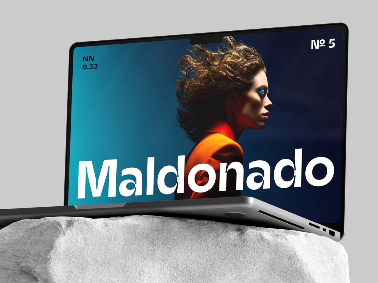
Now let's take a closer look at each one, starting off with FS Ostro – a typeface with a cosmopolitan elegance. Designer Alessia Mazzarella told Creative Boom: "Named after a southerly wind that blows over the Mediterranean sea, FS Ostro breathes warmth into letterforms with their roots in colder, stark Modern typefaces.
"This elegant, cosmopolitan font comes in three display versions and four text versions, and is characterised by its thoughtful contrasts between thick and thin; between sharp angles and sophisticated curves. The letterforms are confident yet fluid, creating an overall sense of refinement and modernity. One for the discerning, well-travelled reader."
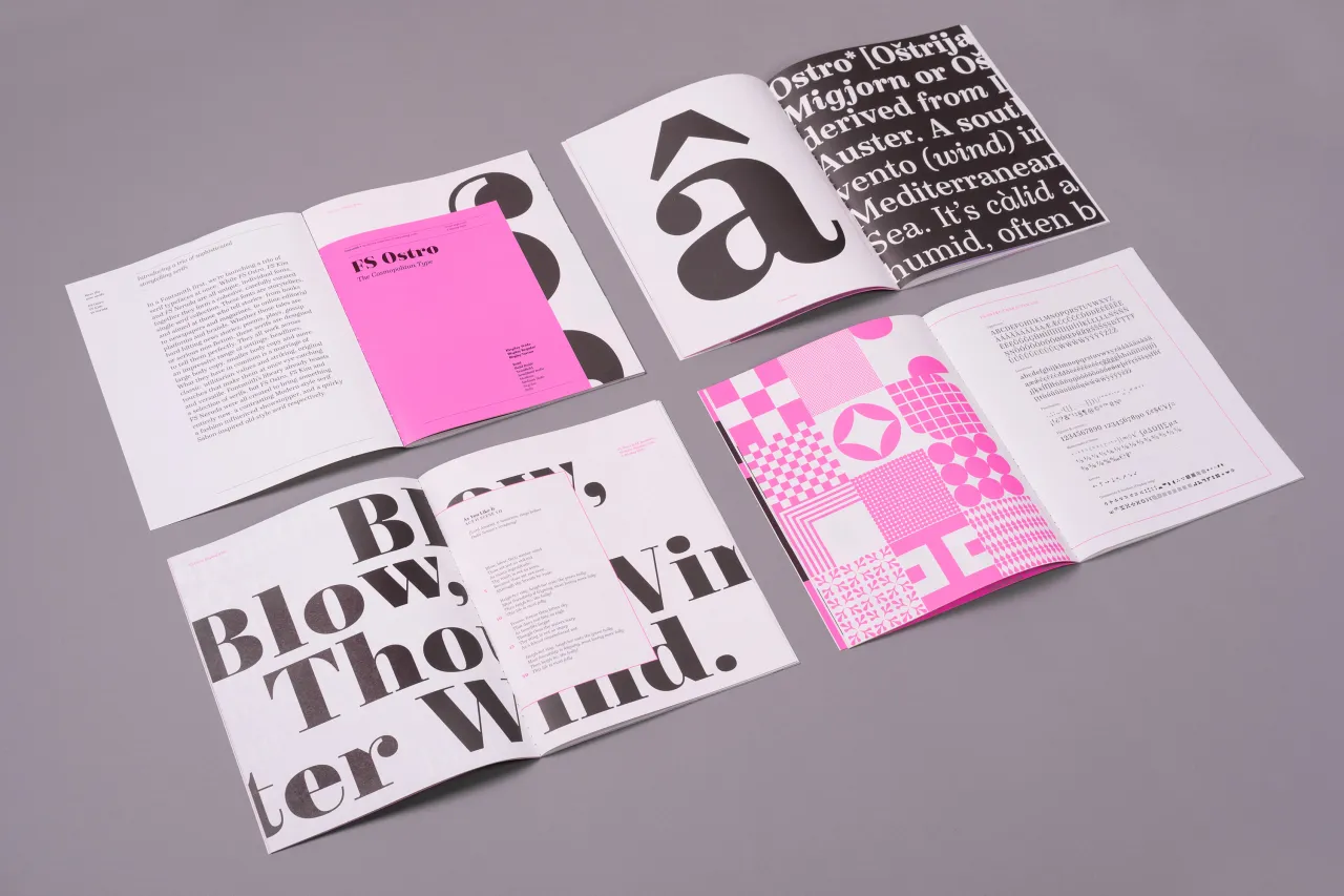
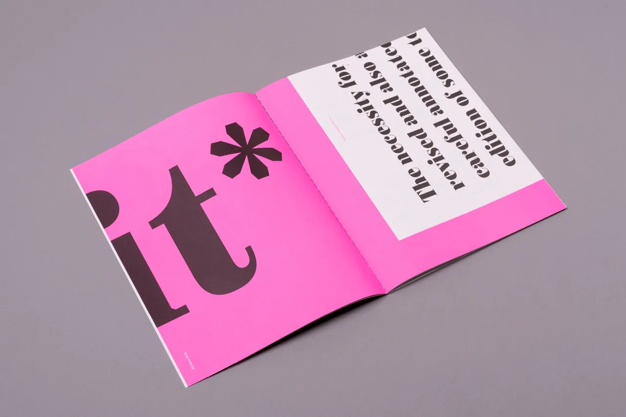
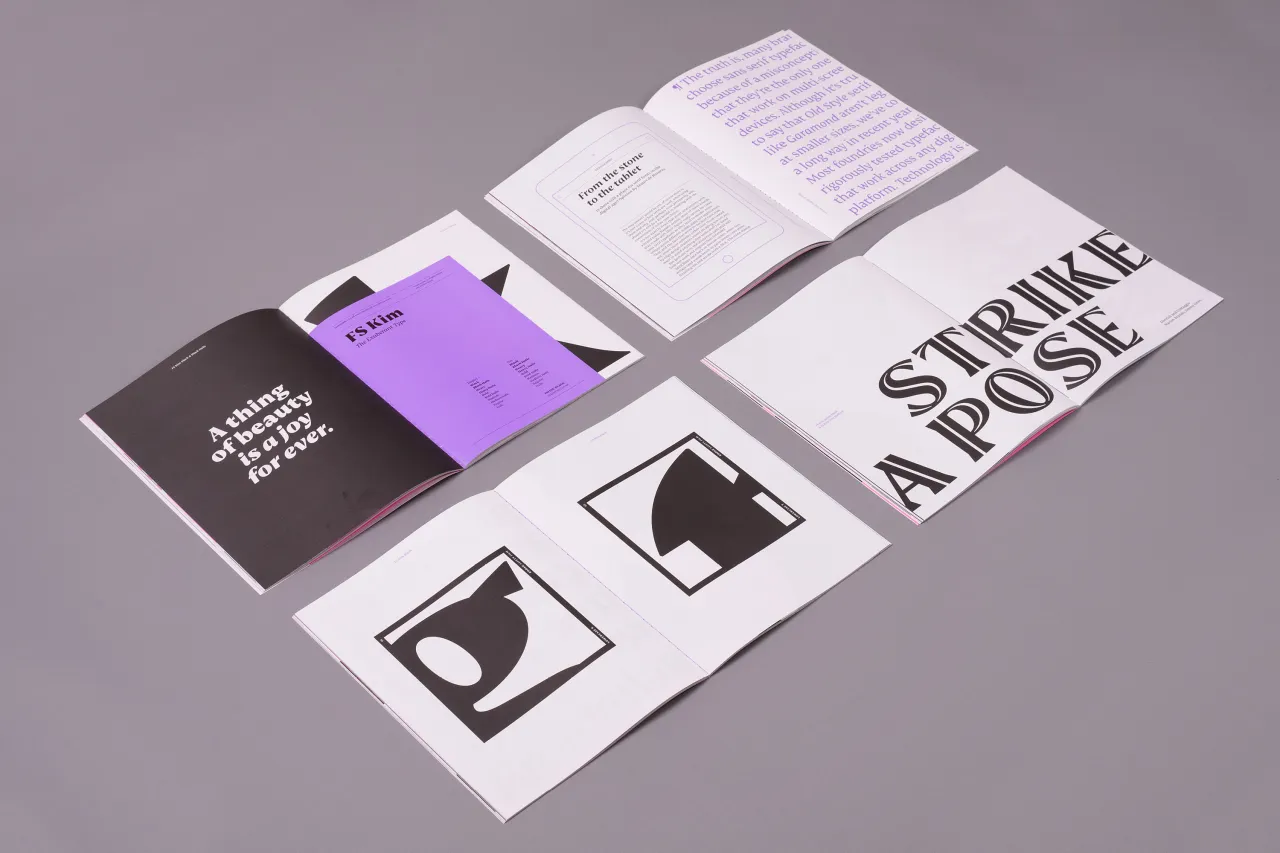
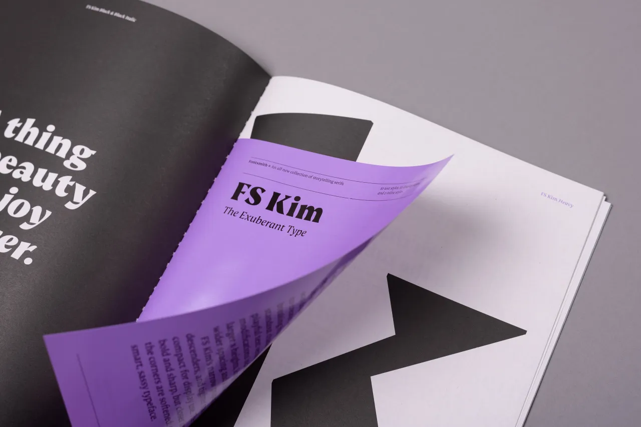
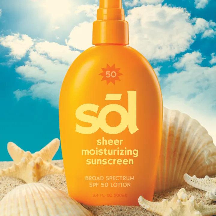
Elsewhere, FS Kim has an unconventional beauty. Designer Krista Radoeva said: "FS Kim is rule-breaking, bold and intriguing – exuberant and unmissable, but playing a supporting role when needed. FS Kim shines brightest as a display font, and is perfect for applications across fashion, theatre, cultural projects and pretty much any brand that wants to make a statement. While this font is dramatic, it’s incredibly versatile, too, and works to showcase content in a stylish, daring way with its text versions."
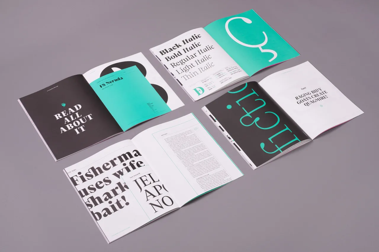
Finally, FS Neruda is described as a typeface with idiosyncratic precision. "“It takes its name from Chilean poet Pablo Neruda, described as ‘the greatest poet of the 20th century in any language’," explains designer Pedro Arilla. "As such, it’s a font informed by the very best literary typeface traditions, with a very different feel in thin weights to its bold counterparts. Smart, sharp and classical, FS Neruda bridges the gap between the traditional and the offbeat.
"It’s clear and legible in body text, and in larger sizes becomes a different beast – livelier, quirkier, but no less sharp. This font started life in the world of newspapers and books and is the perfect storytelling typeface for savvy, inquiring readers whether in printed journals, hard news, short online missives or poetry."
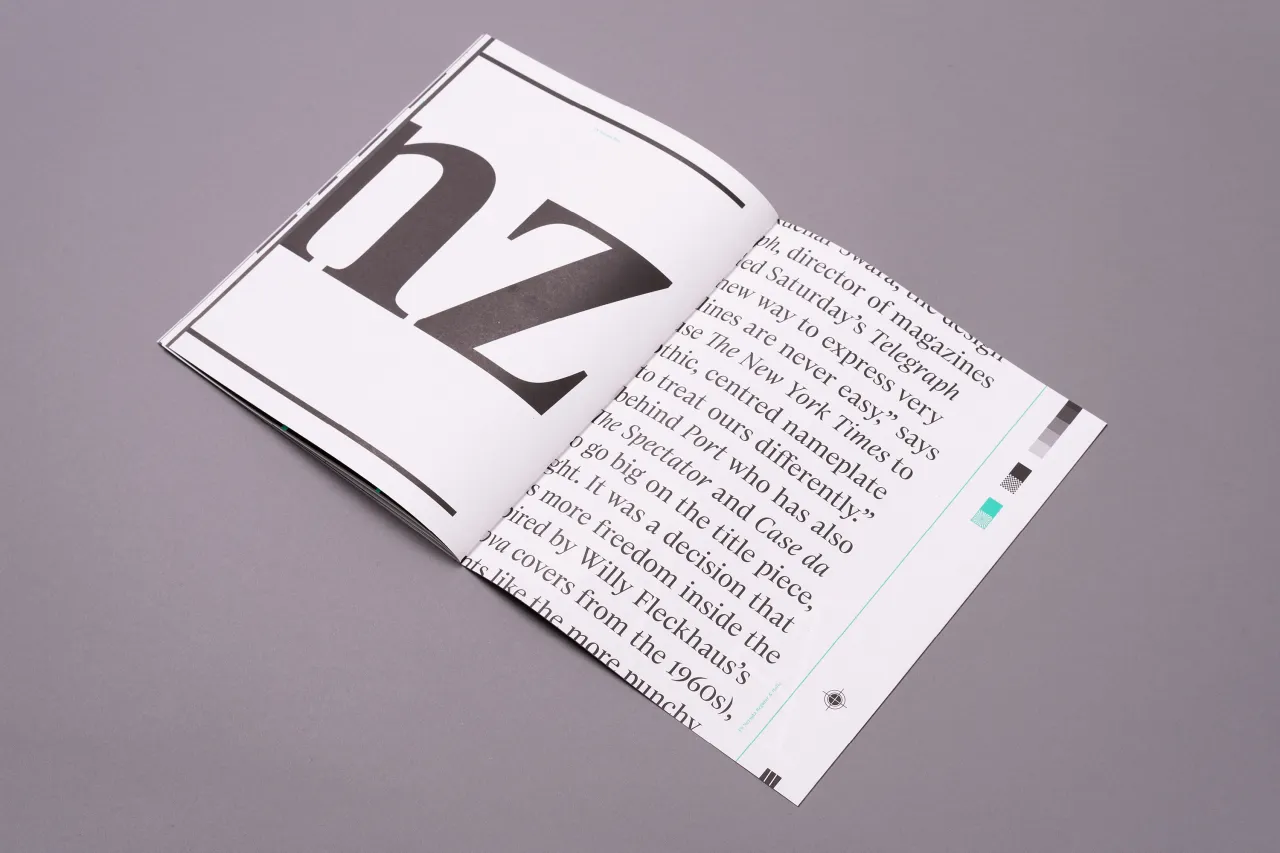
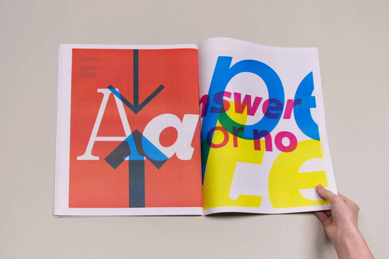
The Storytelling Serif specimen featuring FS Kim, FS Ostro and FS Neruda is available to buy from the Fontsmith Shop.
Editor's Picks





Trending






Latest Jobs
Senior Brand Designer at Analogue
Full-time·Leeds·£38k-£45k
Brand Strategist at DNCO
Full-time·London·£45k-£60k
Midweight Designer at Catalyst Creative
Full-time·London·£32k-£36k
Marketing Copywriter at ustwo
Full-time·London·£40k-£50k
Digital and Marketing Manager at Manchester Art Gallery
Contract·Manchester·£38,126 pro rata
Senior Digital Designer at Red Antler
Full-time·New York·$95k-$130k




. In use by [Garbett](https://garbett.com.au/) for Career Trackers](https://media.creativeboom.com/514ca61a-e599-4ae7-bed3-a107421ce0f3/conversions/e8ba48815e7898e3d263f3452e50572efdb4fd9a-medium.webp)