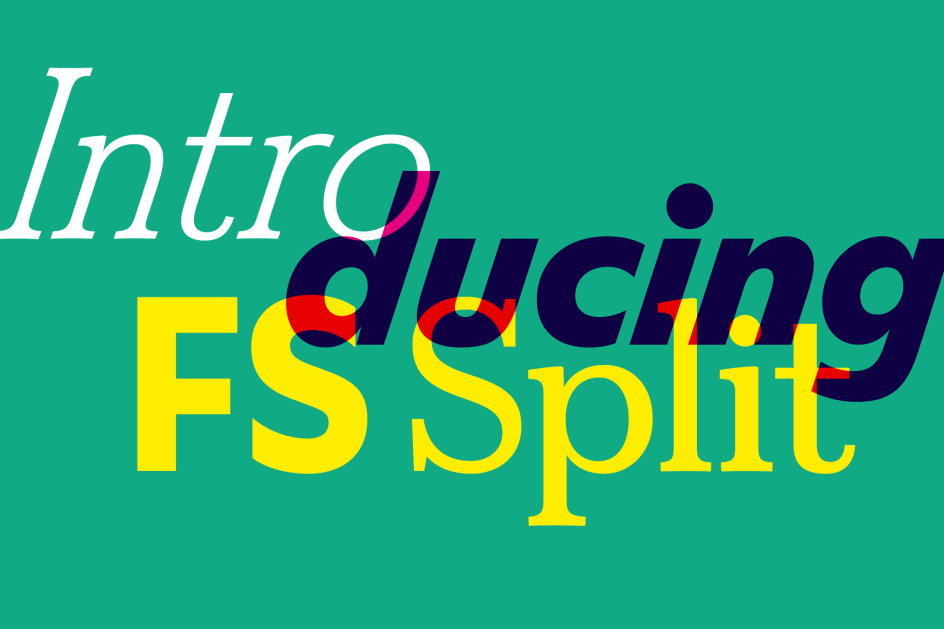
Fontsmith launch FS Split: a new experimental typeface with specimen designed by Studio.Build
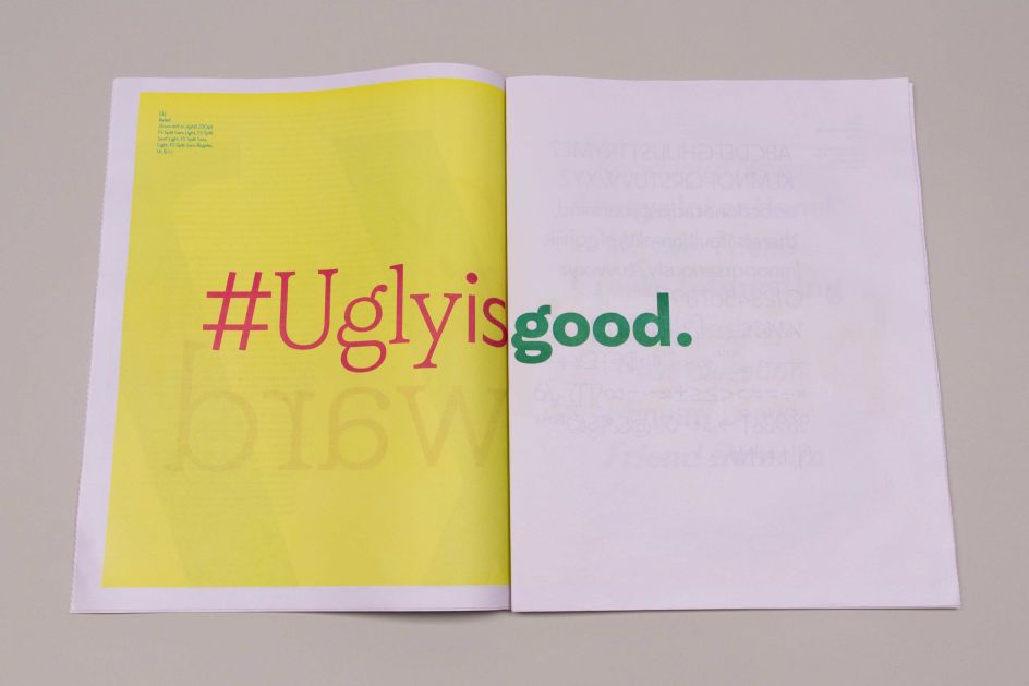
Fontsmith has today launched FS Split Sans and FS Split Serif – two "ugly yet beautiful" typefaces for editorial projects, designed by Fernando Mello and Jason Smith.
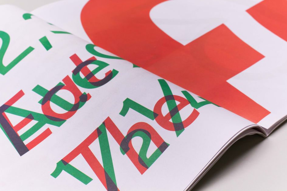
All images courtesy of Fontsmith and Studio.Build, via submission
Created to complement and contrast one another, each with their own personalities, the idea was to create something different, less "perfect" and "fine-tuned", which would stand out from other digital, geometric typefaces.
Fontsmith Founder Jason Smith said: "From the outset, this typeface duo was intended to be a bit odd in proportions and a bit 'wrong' in traditional type design terms. I wanted to push the design oddities and balance the quirks with the quality of the type."
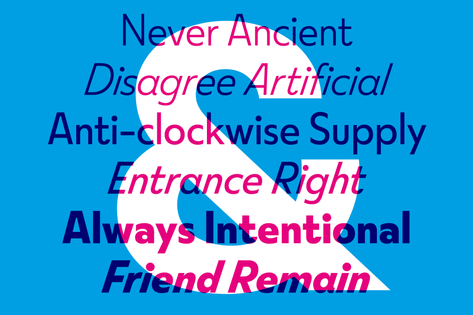
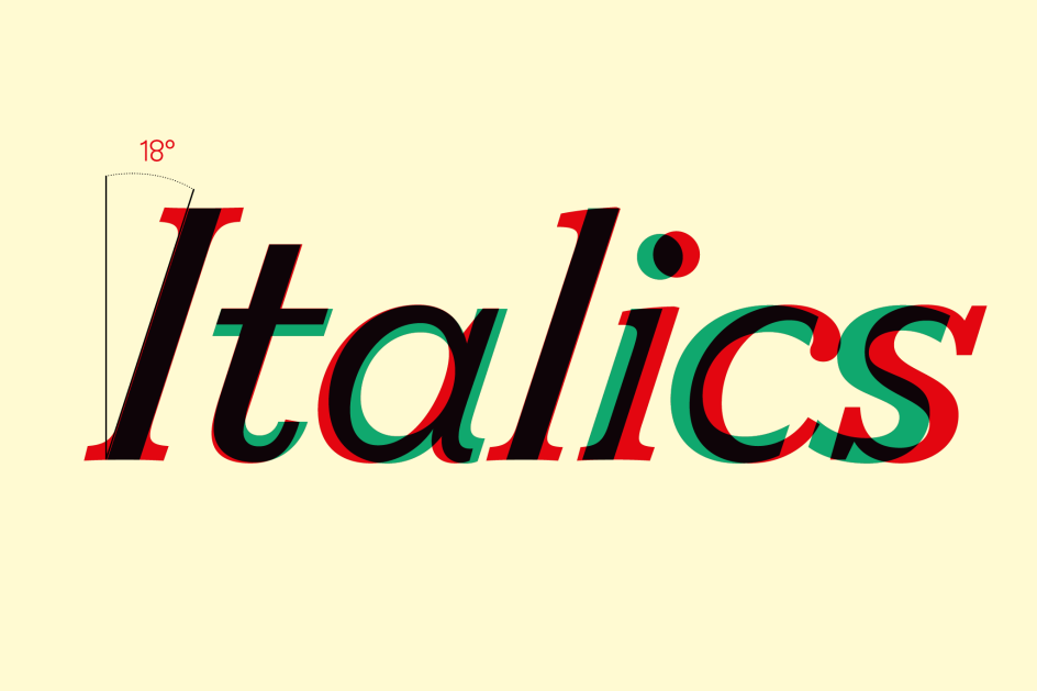
FS Split Sans and Serif both have eclectic proportions, where round characters are wide but straight ones narrow; long descenders and ascenders, and a cap-height that aligns with the latter; dramatic dots on the 'i' and 'j'; oversized top counters on the 'B' and '3'; and extreme italics at an 18-degree forward-slant angle.
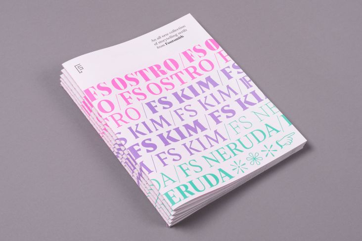
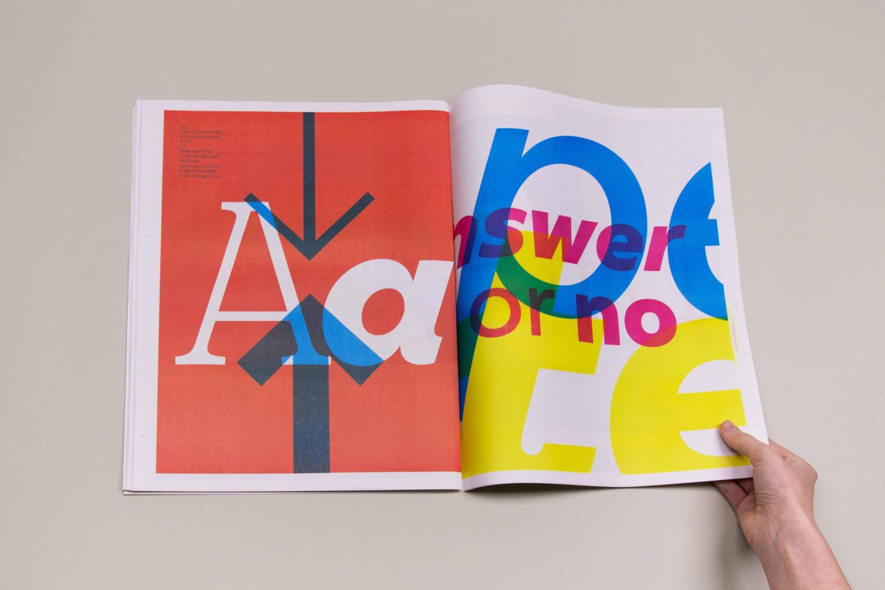
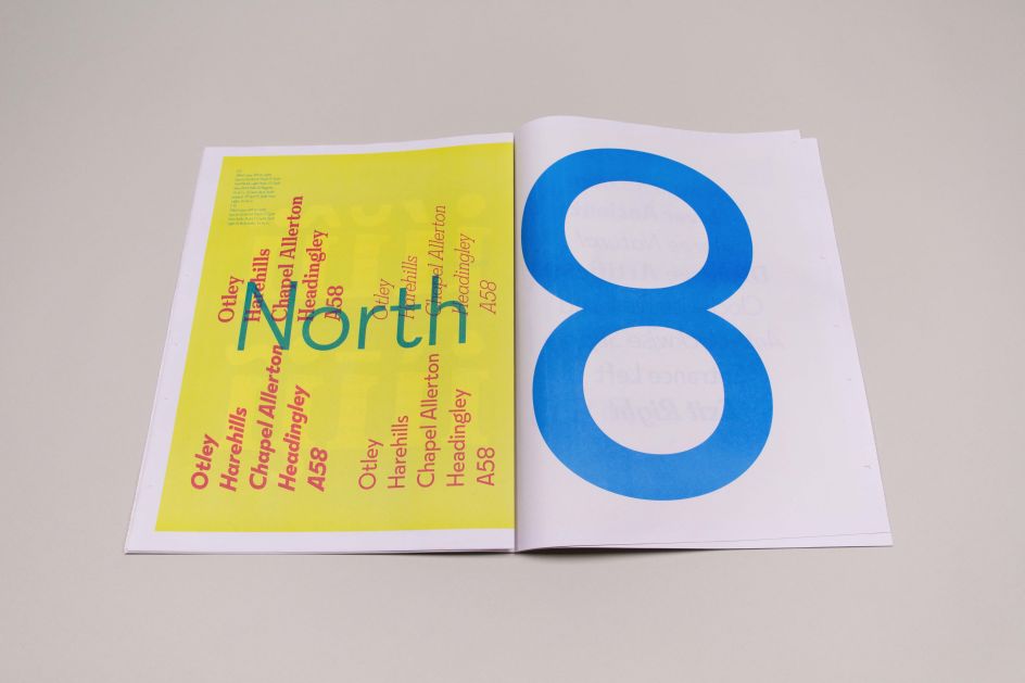
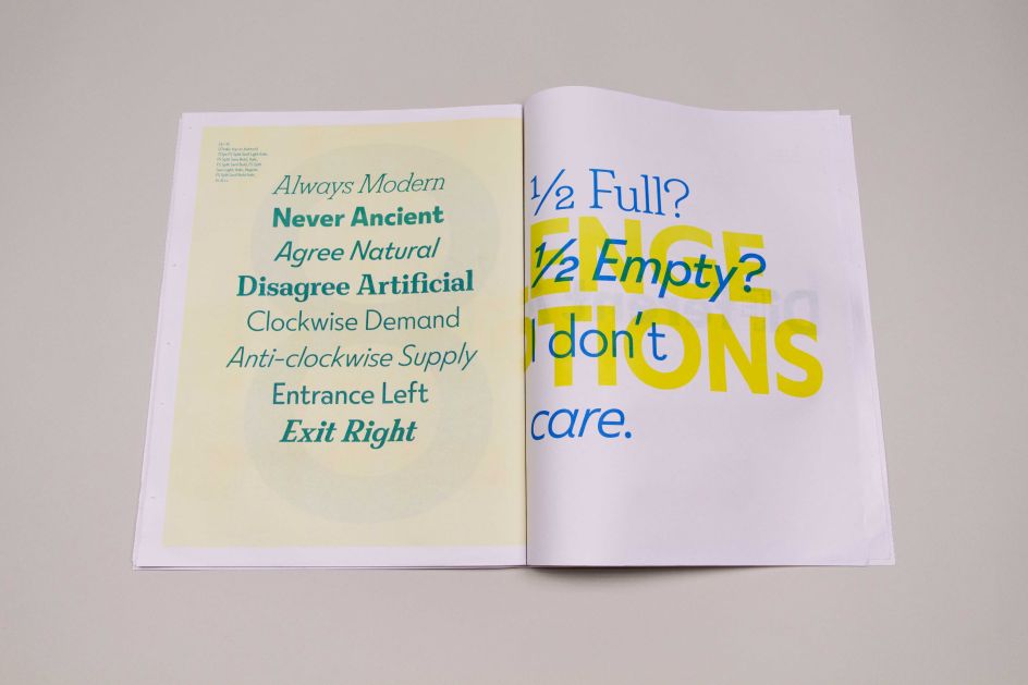
To launch the new typefaces, Fontsmith appointed Leeds agency Studio.Build to create a 48pp newspaper specimen-based around the idea of graphic collisions.
Michael C Place, creative director and founder of Studio.Build said: "We created this idea of graphic collisions, a kind of split personality-type idea. Something super graphic, not pretty but with lots of attitude and energy."
Michael adds: "By designing a tabloid newspaper, we were able to show a series of intentional clashes – there are wonderful moments where the spreads collide together creating tension, a nod to the idiosyncratic nature of the font itself. Looking disparate and archaic when reading like a traditional newspaper, the specimen opens out to single spreads to match the idea of a split personality."
FS Split Sans and Serif make a broad type family suitable for everything from magazines and packaging to websites and branding. With the conflicting yet harmonising nature of sans and serif, you can be bold and subtle, eclectic and ordinary, contemporary and classic. Find out more: fontsmith.com.
Editor's Picks


Trending


](https://www.creativeboom.com/upload/articles/90/908fdb6378db1e95d12595416f54e6336d5e80b8_732.jpg)
Podcasts


Editor's Picks
Further Reading