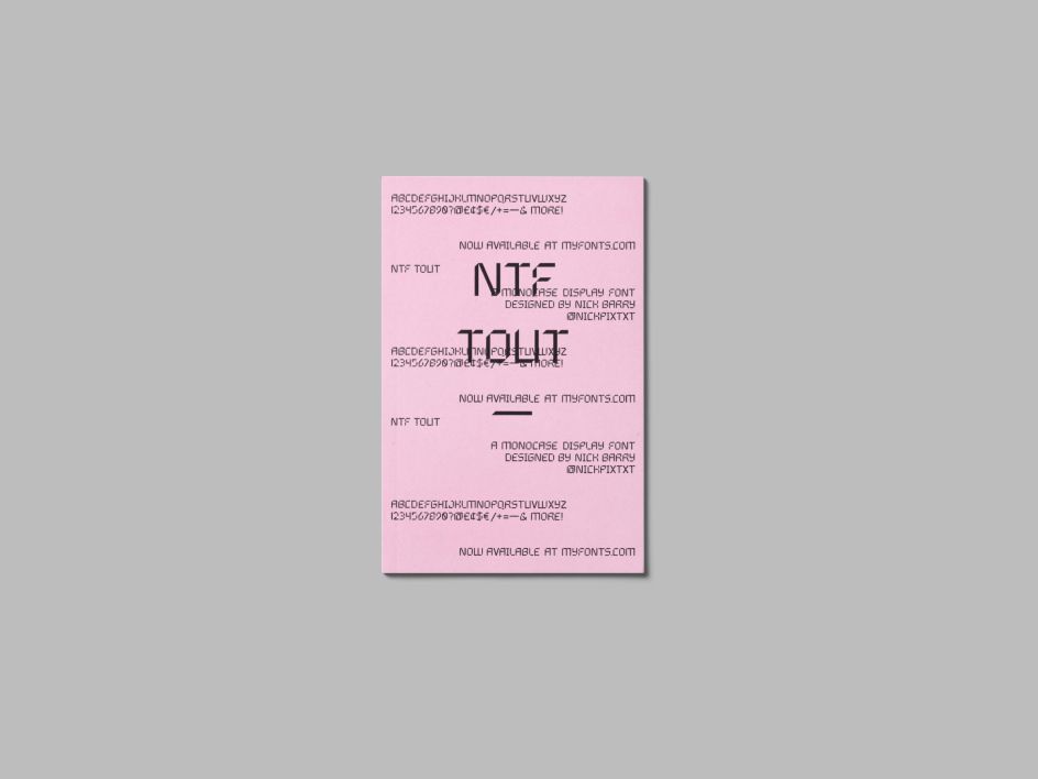
Designer Nick Barry releases NTF Tout, a display font inspired by calculators and Chinese characters
British designer Nick Barry has released NTF Tout, a display typeface inspired by the Chinese characters he learnt to write with when he lived in China.
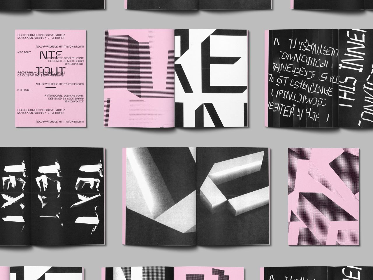
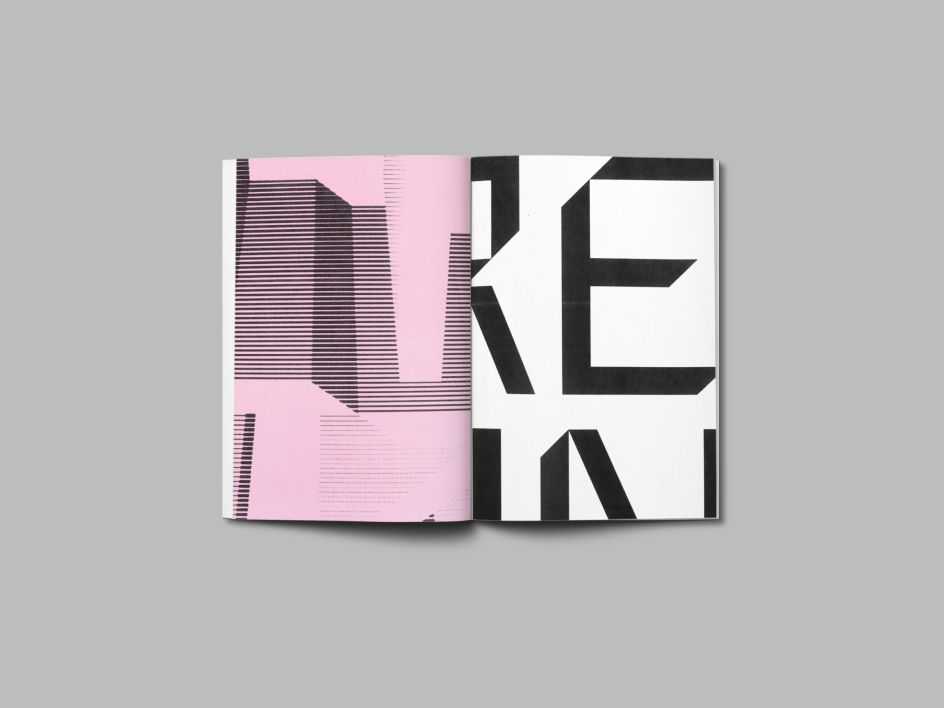
Available via MyFonts, it began "by experimenting with simplified blackletter characters, then eliminated any of the filigree and decorative strokes" and looks "similar to the typeface of a calculator," as Nick puts it. "But still employing the thick strokes and 45-degree angles of a blackletter."
"As I designed each individual letterform, I started to realise how modular each one could be. Like Chinese characters, each is made up of a number of repeated strokes. Once I established these strokes as the letterforms building blocks things started to move a lot faster."
Nick did a lot of research into type design applications and found Glyphs Mini checked all his boxes for designing the typeface. "One of the most fulfilling things about using it is that immediately after you've created your first vector glyph (character) you can begin to type with it. So, at the hit of a key, a letter that took hours to design will pop up in a matter of nanoseconds. Imagine the joy of typing an entire word. This got me hooked."
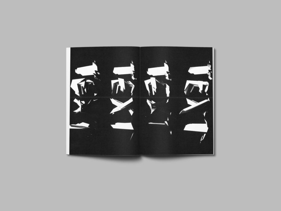
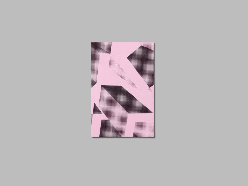
On completing NTF Tout, Nick decided to create a zine. He adds: "While experimenting for the zine's content, there was a real disconnect between the preciseness of the letterforms I'd created digitally and anything I’d be able to achieve making a DIY zine. As a result, I decided the zine would both dismantle and celebrate the details I'd built for months."
Nick is originally from Dorset. He graduated from De Montfort University in Leicester in 2008, right around the time of the last big financial crisis. With employment options looking a little bleak, he opted to go and teach English abroad and study Mandarin in China with two friends. While on this three-year stint, he met his future wife, an American, Natasha. Today, they live in Sacramento, California where Nick works at branding and digital studio, Bukwild.
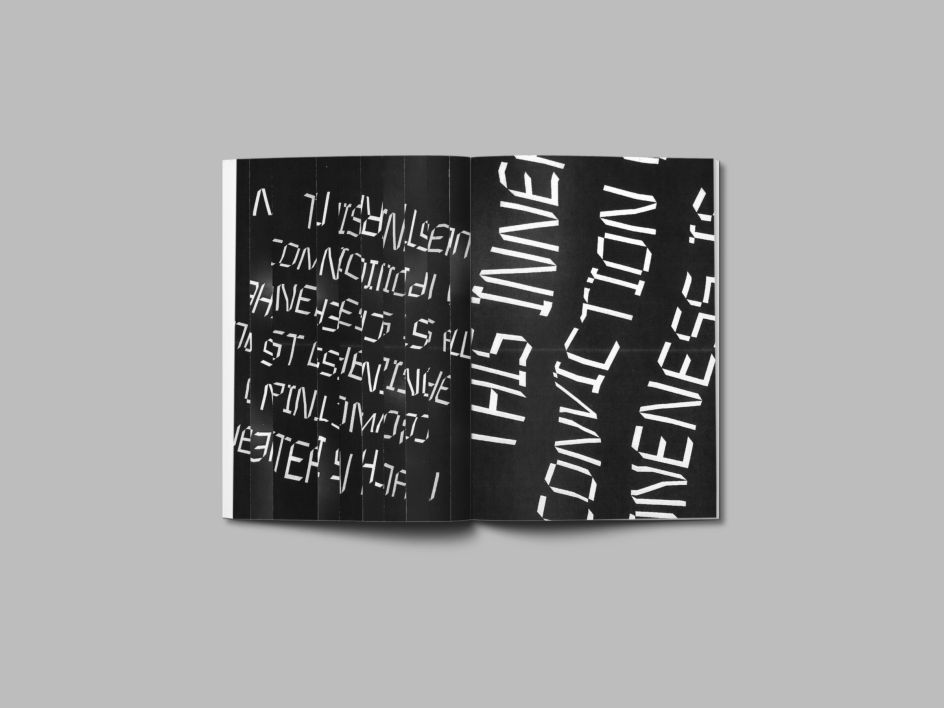
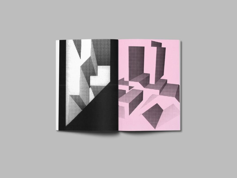
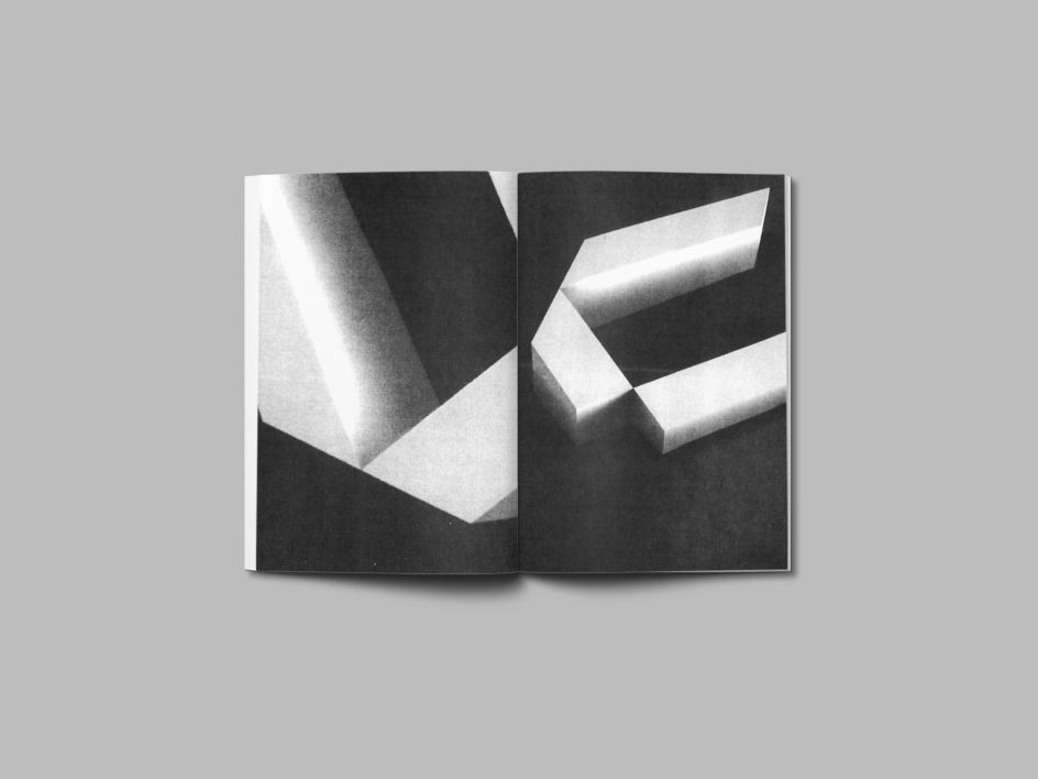
Does he feel he got a lot out of his latest side venture? "The typeface definitely has a science-fiction quality to it and I love how the diagonals almost give it a three-dimensional appearance. From designing this typeface I can definitely better appreciate the beauty within the negative space of letterforms. And I learned a lot of lessons about best practices in typeface design through this process."
NTF Tout by Nick Barry is available via myfonts.com. You can also follow him on Behance or Instagram.
Editor's Picks


Trending


](https://www.creativeboom.com/upload/articles/90/908fdb6378db1e95d12595416f54e6336d5e80b8_732.jpg)
Podcasts


Editor's Picks
Further Reading