Kensington & Chelsea Art Weekend gets a brand overhaul to mark its second year
Kensington & Chelsea Art Weekend (KCAW) is marking its second year with a bold new rebrand, courtesy of AH-KB design studio.
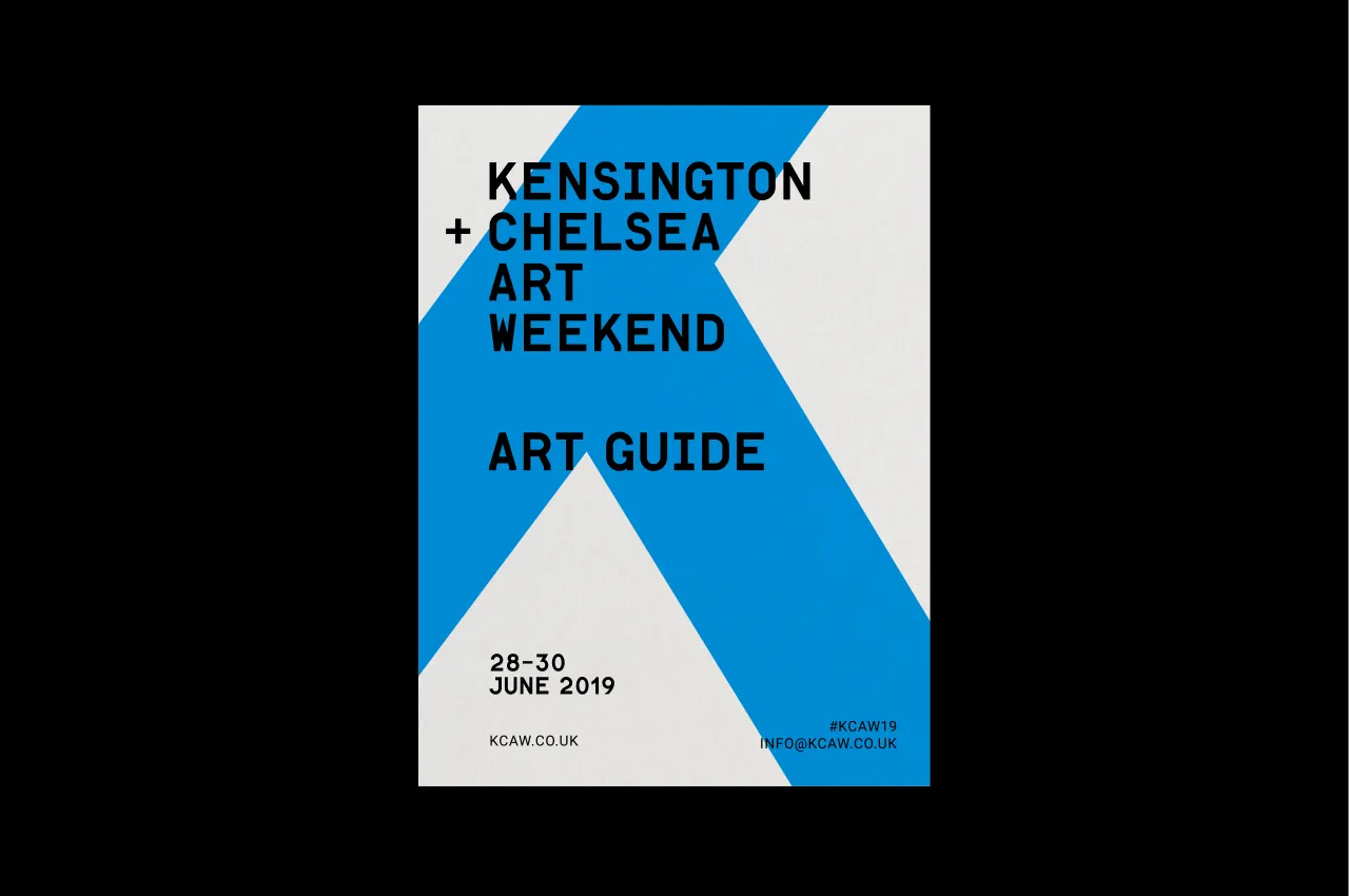
Founded in 2018, the event is hailed as "the weekend of art and culture in West London" – an insider-led programme of activities held in galleries, studios, public spaces, museums and cultural institutions to celebrate the area’s bold heritage and cultural legacy.
Having been an artistic hotspot for nearly 200 years – from JMW Turner’s residence on Cheyne Walk to the swinging '60s youth fashion and then '80s punk on the Kings Road – its cultural identity is bursting with historical and artistic diversity. Whether it’s the urban Bohemia of Notting Hill or the modern elegance of the Design Museum – it is this diversity which serves to recreate and reinforce the area’s unique identity.
So how does one go about communicating all of this visually to a wide-reaching sophisticated audience in 2019? Kensington & Chelsea Art Weekend Director, Vestalia Chilton, said: "When approaching the rebrand we wanted to be inclusive but speak quality whilst reflecting the massive variety of our exhibitors in the area. Not an easy feat. Our ambition was also to supply a recognisable ‘look & feel’ framework for our participants to use."
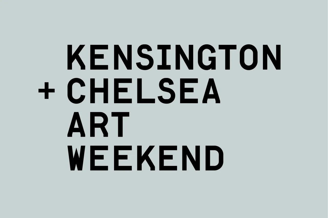
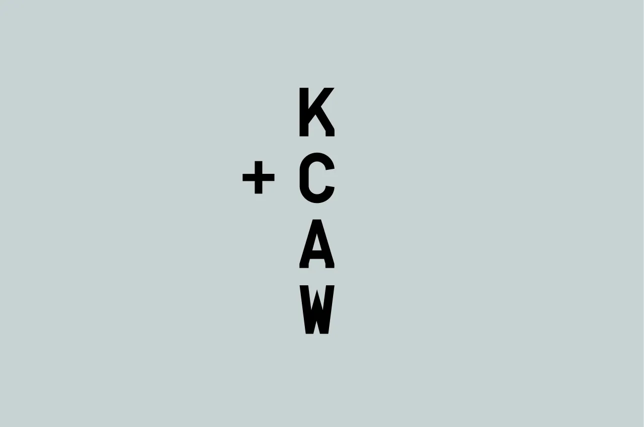
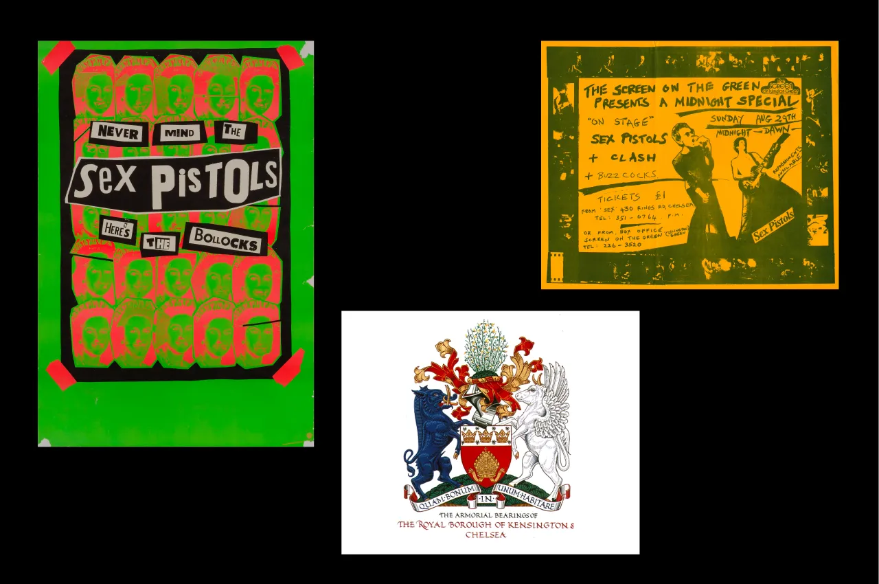
The logo letters K–C–A–W have been enlarged, cropped and abstracted with a contemporary colour palette that fuses the edgy cool of the Sex Pistols poster colours with the more traditional heritage colours of the borough. Their bold shapes and forms have been highlighted and paired down to contemporary angles and lines to reflect the festival’s key values of encouraging the public to "look more closely at art".
"The rebrand of Kensington and Chelsea Art Weekend embodies the overall aim of the festival – to get more people engaging with the art being produced and exhibited in the borough," explained Kelly Barrow and Antonia Huber, founders of AH-KB design studio. "We arrived at the concept of ‘getting closer to art’ as the main inspiration behind the design.
"The colour palette is bold and inspired by the cultural layers of the borough. The blue and red are brightened, modernised versions of the borough colours representing the area’s heritage and the fact that it is the Royal Borough, whereas the yellow and green are a subtle nod to the 70’s Punk aesthetic and are taken from early Sex Pistol’s posters."
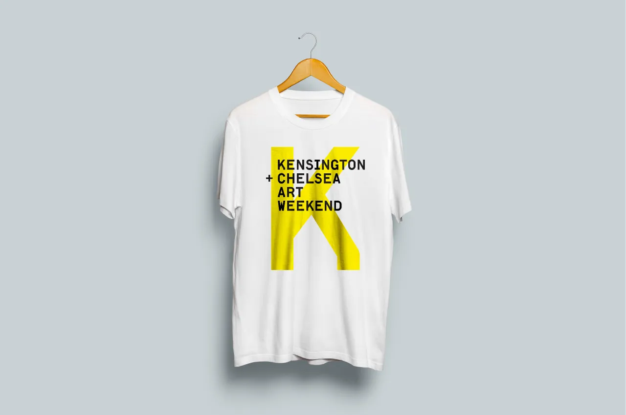
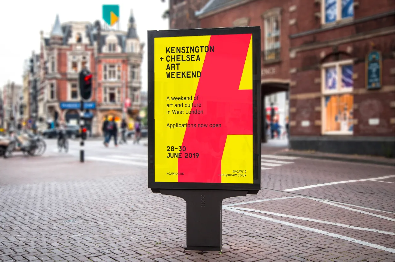
The collaborative duo has developed visual identities for the likes of the Photographers Gallery, Modern art Oxford, Somerset House and Royal College of Art. Passionate about typography, layout compositions and strong experimental concepts, their rebrand for KCAW will form the basis of a wide variety of digital and printed material including bold street signage, posters, and a free Art Weekend Guide available at participating venues.
In terms of design, the selected primary typeface, Lutz Headline, is also modern and cosmopolitan in its appeal. With intelligent treatment of typeface, form and colour Barrow and Huber have been able to create a consistent look and feel which doesn’t rely solely on the logo or images in isolation but instead, work together to accommodate the images as and when they come through.
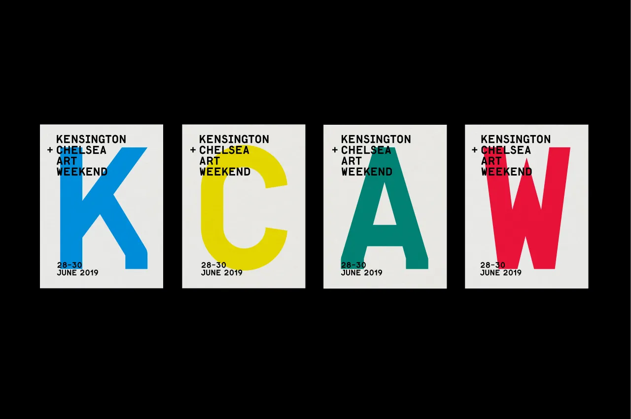
In this way, the rebrand forms of the abstracted letters cleverly hold the diversity of colours and images of the arts weekend programme. Thirdly, without compromising the festival’s aesthetic, it works across all printed and digital platforms and is confident and welcoming enough to reach a wide audience whether it’s the public, arts or businesses.
The new identity of the weekend is being launched on 4 February to coincide with the Opening of Participant Registrations on the website: www.kcaw.co.uk.
Editor's Picks





Trending






Latest Jobs
Art Director at The New York Times
Full-time·New York·$120k–$130k
Art Director at SPOKE
Full-time·London·£55k-65k
Design Lead at Madeo
Full-time·New York City·$85k–$120k
Midweight Designer at All Purpose
Full-time·London·£30k–38k
Digital Marketing Executive at Arise
Full-time·Sheffield·From £23,750
Client Success & Growth Director at Revolution Growth
Full-time·Manchester·£60k-£70k