Among Equals designs NASA inspired brand for futuristic energy programme
While brands in the fusion space are already falling into stereotypes, STEP is standing out from the crowd with a colour palette inspired by the synthetic image of future plasma.
Among Equals is behind the identity for new UK energy programme STEP, designed to position the brand as ambitious as NASA's Apollo missions.
As a brand-new government-backed organisation, STEP (Spherical Tokamak for Energy Production) wants to establish itself as a pioneer in fusion energy – a sustainable, low-carbon energy source with far-reaching economic, scientific, and technological benefits. With plans to build the UK's first prototype fusion power plant by 2040, STEP is laying the groundwork for a scalable commercial fusion industry.
"The industry for fusion simply doesn't exist yet," says STEP CEO for UK Industrial Fusion Solutions and Senior Responsible Owner Paul Methven. "As well as designing, building, and operating the UK's first prototype fusion energy power plant, STEP is building a whole industry which will benefit the world because we'll have low-carbon, virtually unlimited power."
He believes that the brand is a key part of making this happen, as it has the power to engage and excite a broad range of people, whether politicians or schoolchildren. "We needed an agency partner who could distil the complex science and technology of fusion into a clear, easily comprehensible visual and verbal language that will inspire and excite people in the same way NASA does," Methven adds.

Not only did STEP need a bold, dynamic brand to match their ambitious vision, but they also needed to find a way to make the complex science clear and compelling for a diverse audience. With a strong background in sustainability and prior experience in fusion, Among Equals was a great partner for the project.
Among Equals creative director Nick May says: "A lot of brands in this sector tend to play it safe and feel quite corporate.
"Fusion energy, though, is amazing – it could be the next big breakthrough for humanity, yet many brands in space aren't capturing that level of excitement."
He also notes how many fusion brands rely heavily on sun-related visuals - think sun-based emblems and orange and yellow colour palettes - because fusion is a process happening at the heart of the sun. However, May believes this to be "an oversimplification, since fusion also happens at the heart of all stars - the sun is just the star closest to us.
"Pedantic? Maybe, but it's actually pretty annoying from a science point of view," May adds.
We wanted STEP to break away from classic fusion energy branding and really stand out. Instead of relying on sun graphics and predictable orange and yellow colour schemes, we leaned into a more futuristic aesthetic inspired by the great space missions of the past.
"Fusion is incredibly complex, and STEP is no less so," says May. "With multiple stakeholders, diverse audiences, and a challenging development timeline, distilling all of this into a simple, impactful visual identity and messaging for a wide audience was a major task."
The real challenge, though, is that nothing exists yet. Due to years of engineering and tech development, the STEP project won't break ground until the 2030s.
As a result, Among Equals tried to make the identity as relatable as possible by drawing on STEP's sheer ambition and the collective mission driving it. "From there, we blended these core elements with hints of the technology behind it, creating a brand that's visually striking yet layered with complexity for the audiences who need it," says May.
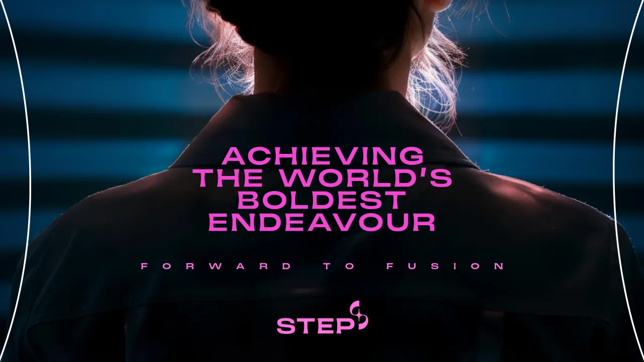
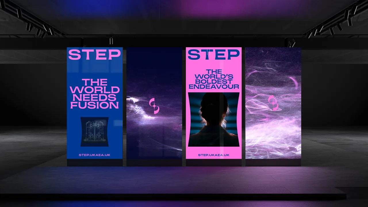
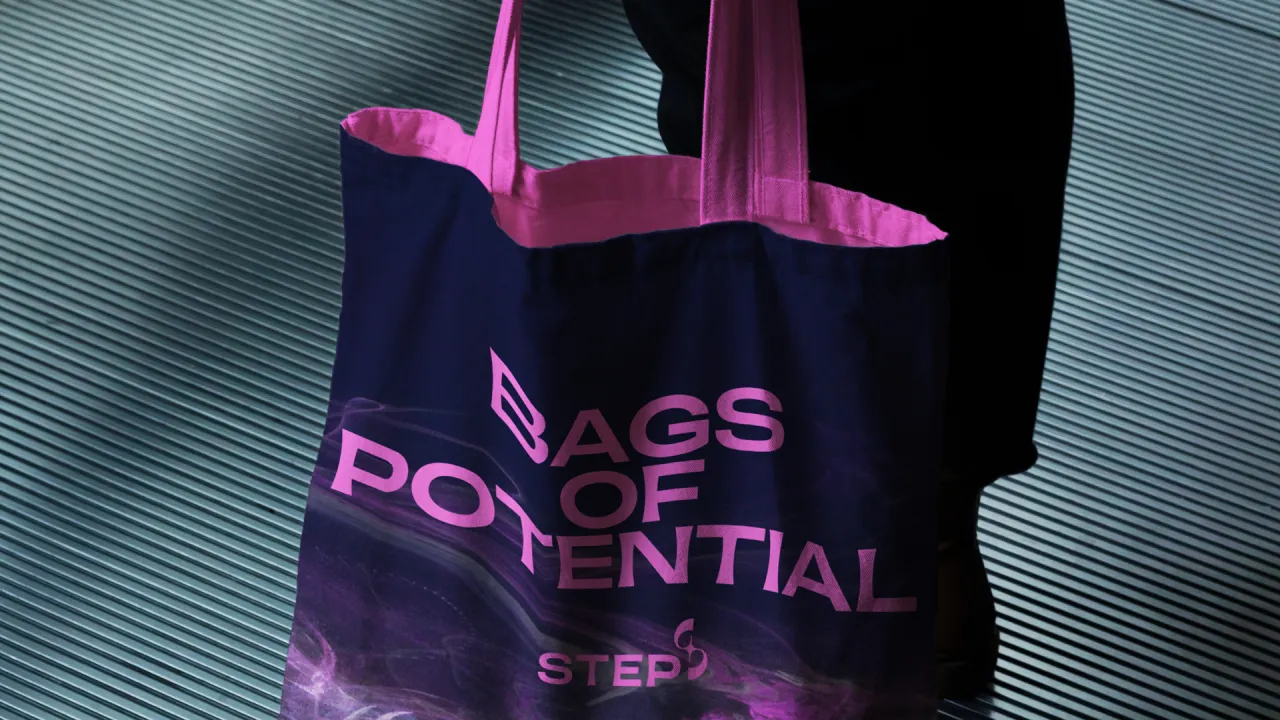
STEP's whole strategy is underpinned by its potential to be as trailblazing and memorable as the Apollo missions, and so it hinges on bringing a sense of excitement to the identity. NASA is more than a space centre—its brand is iconic, something people wear on t-shirts and tote bags, something that could inspire future generations.
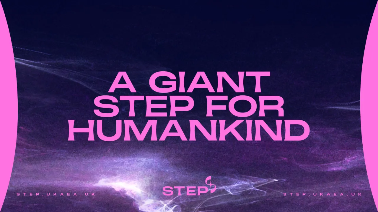
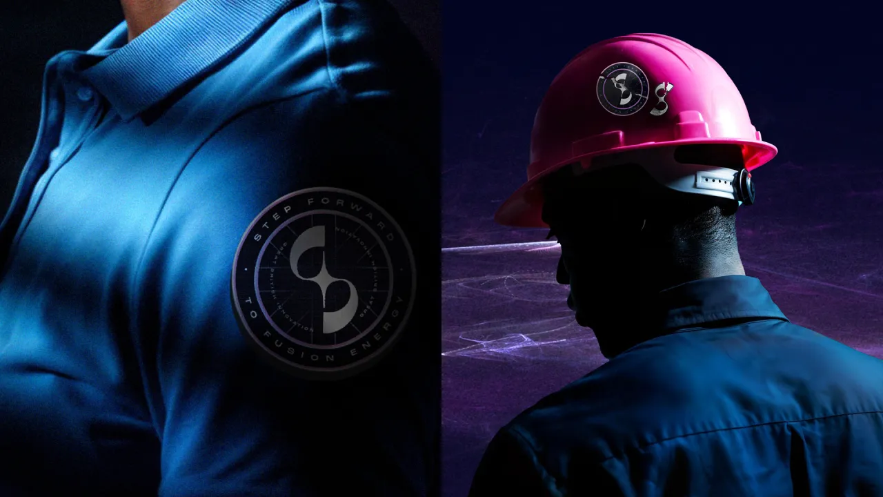
In homage to this, STEP's brand borrows visual cues from space exploration and other legendary tech brands of the past, like NASA and Concorde, which is where the idea for STEP's 'mission patches' came from. Modelled after the badges astronauts wear, each patch combines STEP's distinct colours and key descriptors in a bid to celebrate the teamwork and collective mission driving the project.
"Of course, fusion itself was a huge source of inspiration," says May. "The logo, typography, and colour palette all reflect the science and technology behind fusion and the cutting-edge design of the STEP power plant. It's a brand that's as forward-thinking and powerful as the energy it represents."
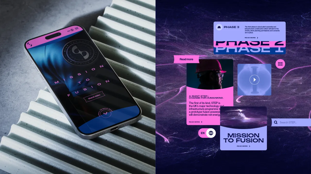
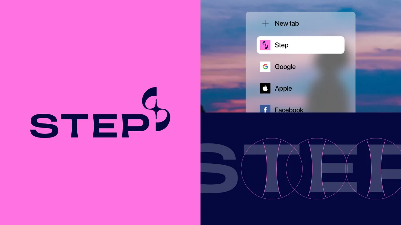
As well as representing the brand name, the curves of STEP's abstract S emblem reflect the shape of the tokamak, the machine that will sit at the heart of the STEP fusion energy plant, where fusion actually happens. May explains how the star at the core references how fusion power works: "Fusion is the process that powers stars, and the STEP reactor will be recreating that process".
STEP's tagline, 'Forward to Fusion,' was developed to convey the energy and ambition behind the project, serving as a call to action and nodding toward a brighter, more sustainable future. It also works nicely in tandem with the name, reading 'STEP Forward to Fusion' when used as a whole phrase.
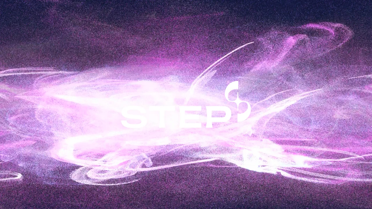
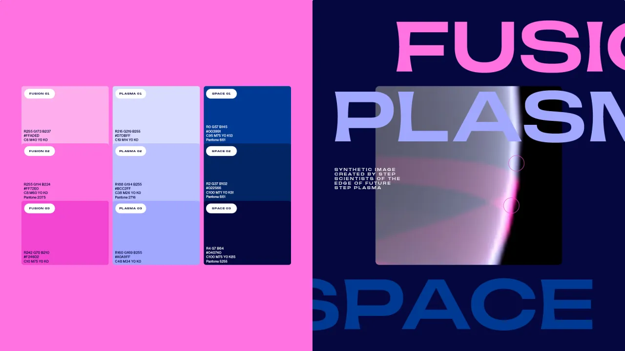
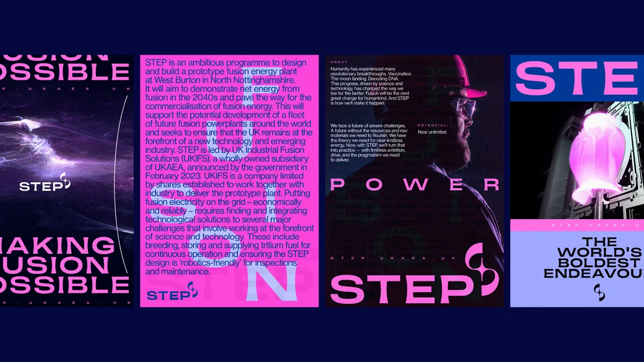
As May mentioned, the fusion sector's main colour palettes often rely on oranges and yellows - inspired by the sun – or greens in reference to sustainability and clean energy. Among Equals took a different approach with this brand, creating a unique palette in collaboration with STEP's scientists. The hues derive from a synthetic image of future plasma, resulting in what May describes as "a striking and futuristic colour palette of pink, purple, and blue, setting STEP apart and capturing the innovative, forward-thinking spirit of the project".
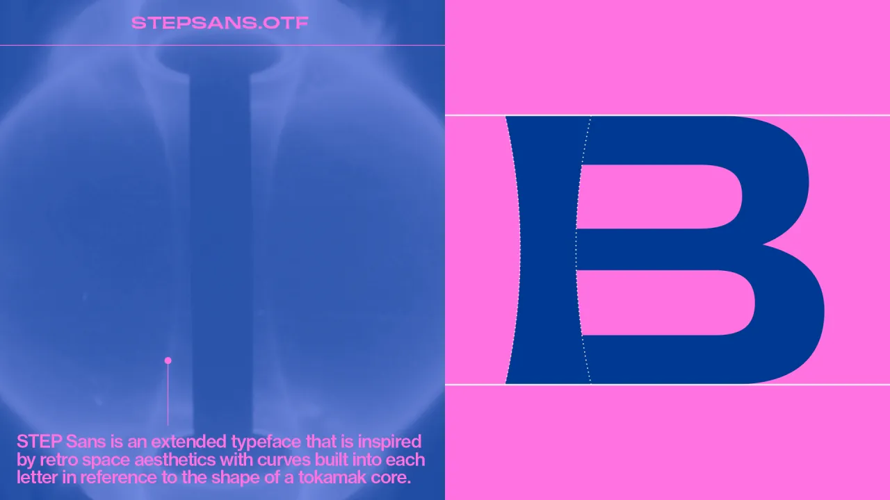
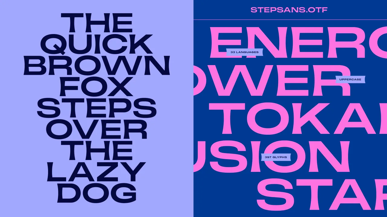
STEP's wordmark was created using a bespoke typeface developed by Among Equals in collaboration with Pangram Pangram. The extended typeface, customised from Pangram's Monument, is inspired by the structure of the STEP tokamak core.
May says: "The shape, which resembles an apple core, influenced the curves which we incorporated into as many letterforms as possible.
"The result is a typeface that feels modern, innovative, and space-like."
Among Equals also created motion assets using TouchDesigner to visualise the plasma of fusion, a design which has also been reproduced in static images. "Since STEP doesn't exist yet, it was crucial to have a visual interpretation of what fusion looks like, helping to bring the concept to life," May adds.
Editor's Picks





Trending





Latest Jobs
Art Director at SPOKE
Full-time·London·£55k-65k
Art Director at The New York Times
Full-time·New York·$120k–$130k
Graphic & Motion Designer at The SHARP Agency
Full-time·Leeds·£26k–£33k
Senior 2D Motion Designer at Art&Graft
Full-time·London·£50k-£65k
Senior 3D Motion Designer at Art&Graft
Full-time·London·£50k-£65k
Senior Designer at Definition
Contract·London·£45k–£50k