A new identity for Barcelona language school Freeda
Barcelona-based graphic designer Ilia Tuma has refreshed the school's decade-old identity with a new logotype and vibrant colour palette, as well as bespoke illustrations by Anastasia Sheremeteva.
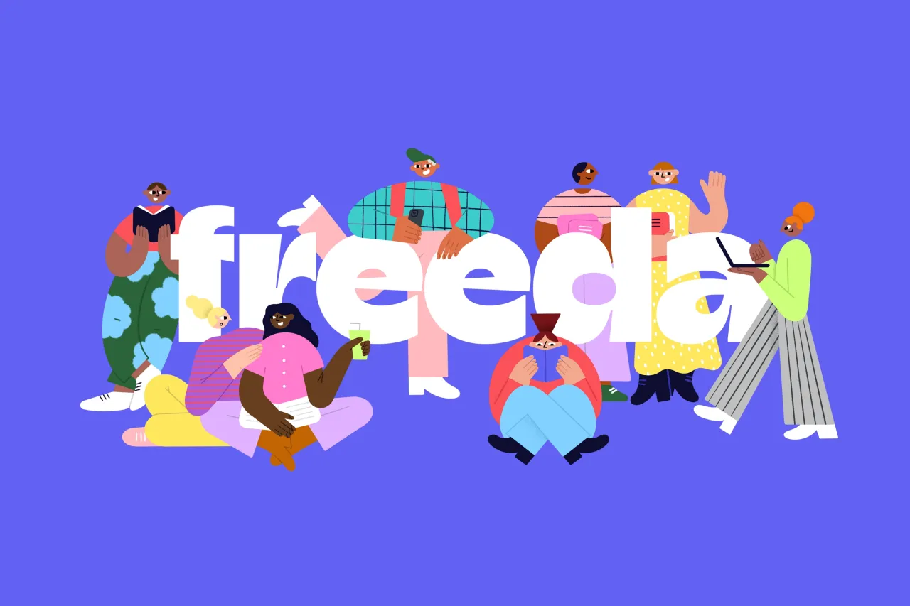
Renowned Barcelona-based language school Freeda has a new identity created by graphic designer Ilia Tuma. The work emphasises humanity and friendliness alongside an engaging learning experience.
Tuma was actually studying at Freeda School as a student when the idea for the brand refresh came about. After seeing its old brand identity every day, he was inspired to create something new and approached Freeda's CEO with a vision to update its visual brand identity.
The initial brief was created in collaboration with the Freeda school team and devised to align perfectly with its future vision for the school. "I saw an opportunity to modernise the brand while keeping its core values intact and emphasising a vibrant and engaging learning environment," says Tuma.
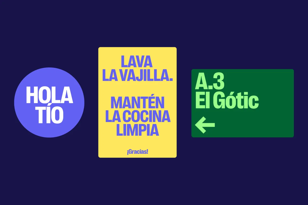
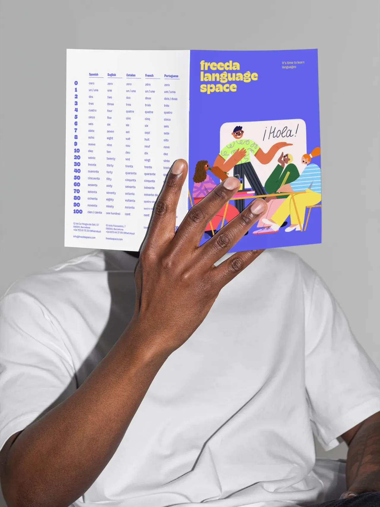
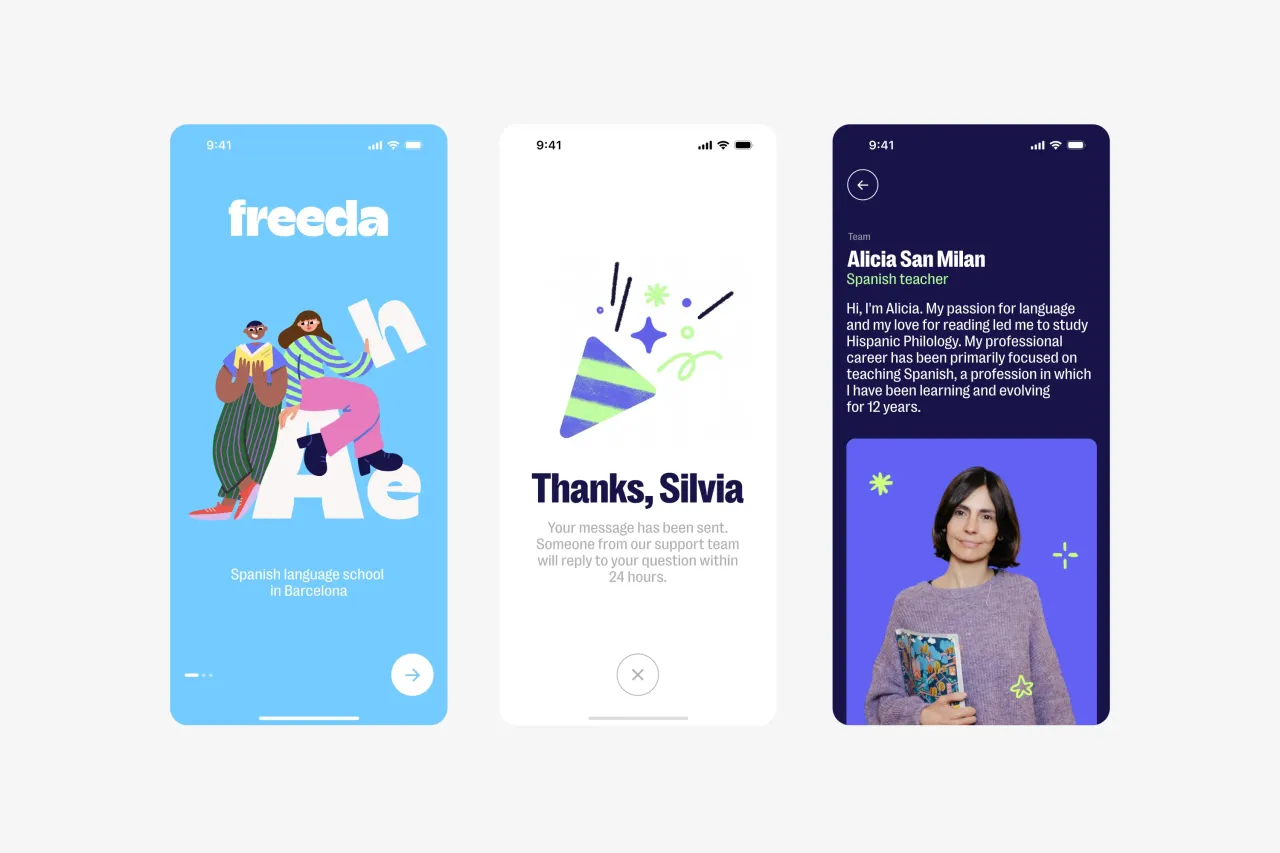
Freeda's previous visual identity was a decade old and didn't quite represent its position at the forefront of language education. According to Tuma, the aim of the new identity was to help the school continue attracting and inspiring students from around the world.
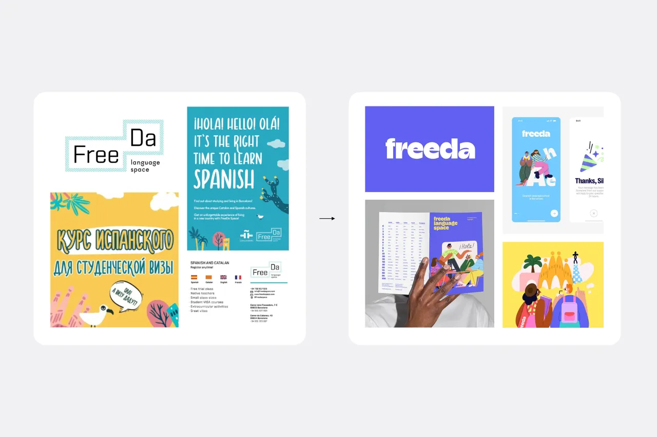
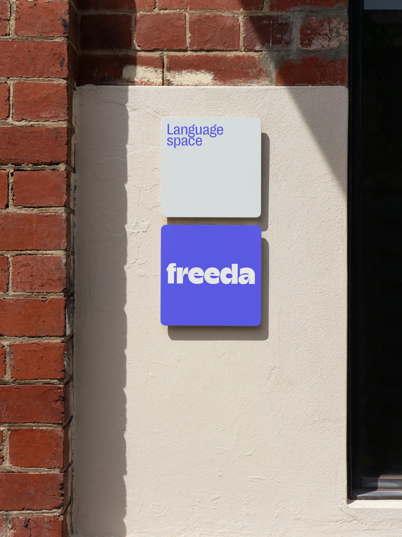
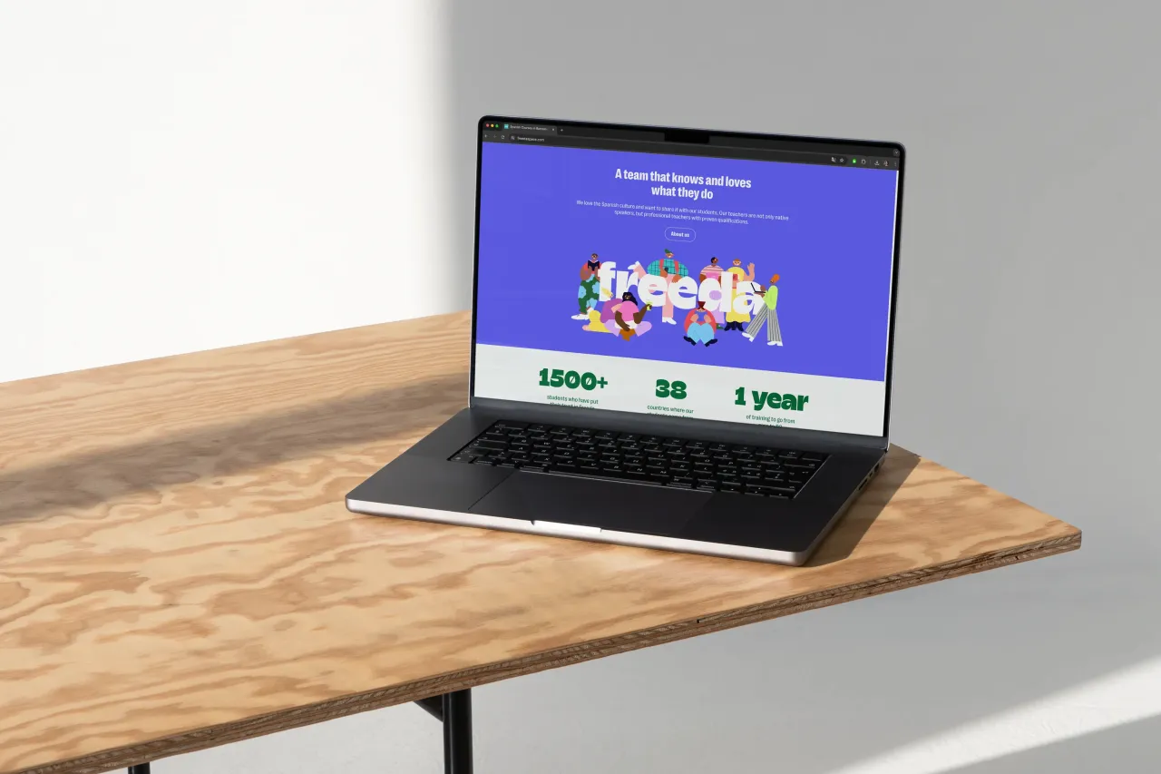
The typeface Champ Black from foundry Typeeverything was chosen for the logo because it conveys the friendly nature of the school's brand. Tuma describes it as "a high-quality and modern typeface" and thanks Andrei Robu for helping license the font for use in the logo.
Tuma opted for Right Grotesk from the Pangram Pangram font studio for the headline and body text. He explains how it balances "neutrality and functionality with a distinctive touch of personality" and harmonises perfectly with the logo.
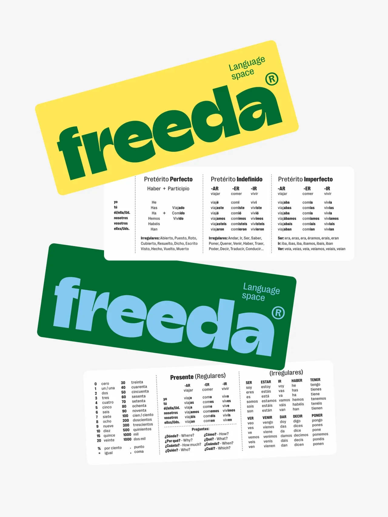
Illustrations were created in collaboration with Anastasia Sheremeteva, an illustrator whom Tuma has followed for a while. He says: "I was particularly impressed by her experiments with character illustration.
"She is kind and friendly; you can feel that warmth in her illustrations. I believe in choosing people who share a similar spirit as it makes the final work more cohesive and consistent."
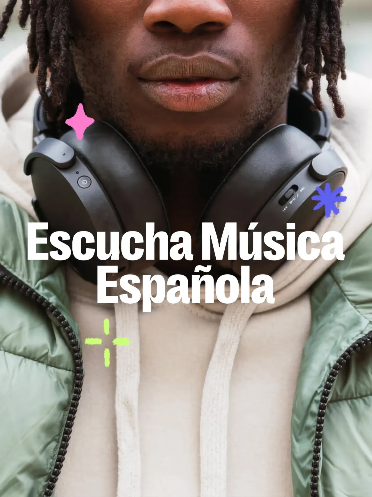
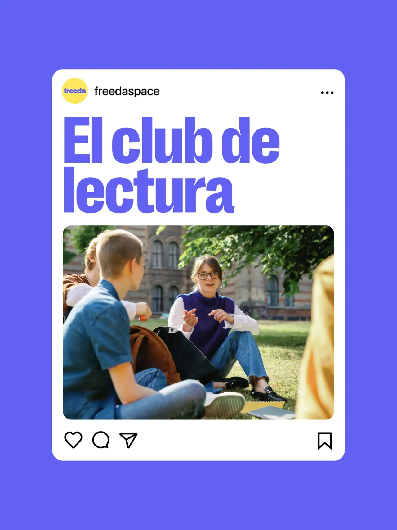
Another new inclusion in Freeda's graphic identity was a vibrant colour palette, curated to reflect its bright spirit and enhance its friendly character. With the art direction, Tuma focused on amiable photos and illustrations that aim to capture the essence of the student experience.
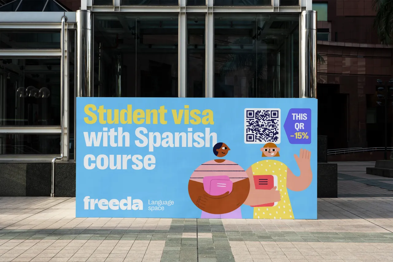
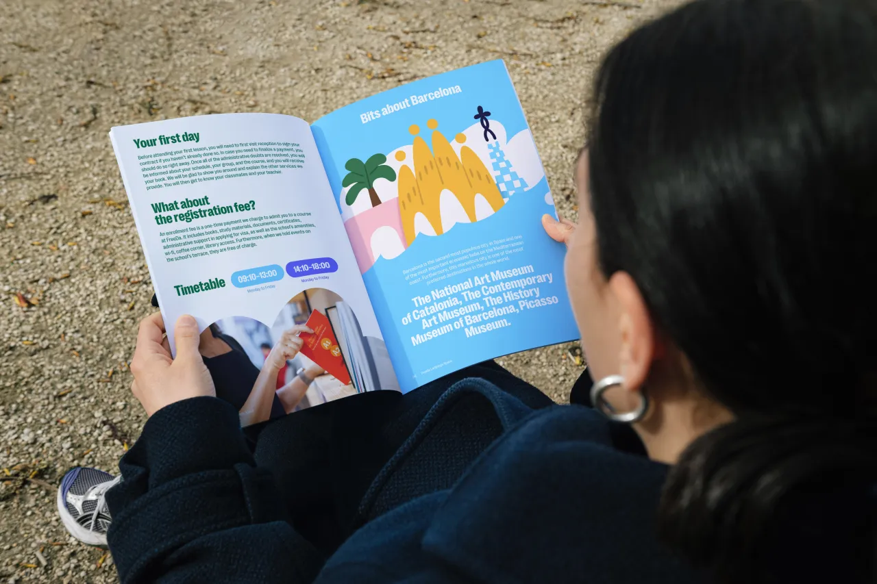
He stresses the importance of showcasing the diversity of ages and nationalities of the school students, which is one of Freeda's core values.
"The imagery used is vibrant and engaging, reflecting the dynamic and friendly nature of Freeda, helping to make learning at Freeda both inviting and inspiring", says Tuma.
Although the redesign initiative was Tuma's idea, he explains how it still required a series of meetings with the school management to present a vision for the future and visualise its brand image.



He says, "In my opinion, print management is an equally important detail in my work.
"It is not enough just to show photos and send the source files; it is very important to be involved in communication with manufacturers who produce materials with new designs."
Tuma also tried to advise on the choice of materials for printing and art direction where possible, which is what he's currently doing for the final stage of the Freeda redesign.

Editor's Picks





Trending



Latest Jobs
Designer, Marketing (Games) at The New York Times
Full-time·New York·$85,000 – $100,000
Marketing & CRM Manager at Unity Theatre
Full-time·Liverpool·£30,000
Visual Development Artist - Feature at Sony Pictures Animation
Full-time·Los Angeles·$53.37 – $83.75 per hour
Head of Production at Art&Graft
Full-time·London·£80,000 – £95,000
Multidisciplinary Designer / Photographer at Boomkat
Full-time·Manchester·£42,000 – £48,000
Staff Producer, Studio Central at DoorDash
Full-time·San Francisco·$176,800 – $260,000