A 'functional and cheerful' new serif type family that tips its hat to the Dutch masters
British type designer Jonathan Hill has released a new robust but refined serif-type family, Leida, through his independent foundry The Northern Block.
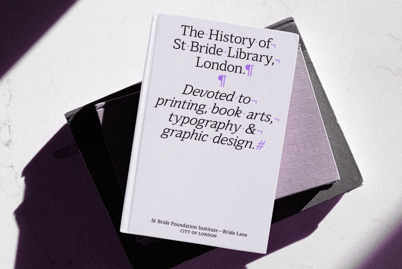
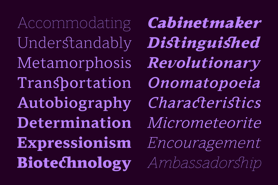
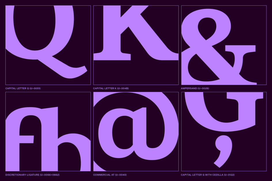
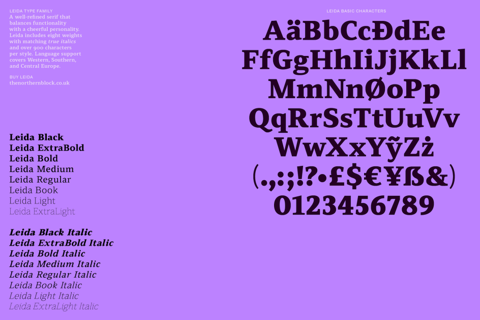
Billed as a ‘functional and cheerful’ font family, Leida comes in eight different weights with true italics, and its variable font features mean it offers six stylistic sets with more than 900 characters per style; and features 14 number variations, including circle, Old Style, and a slashed zero.
Across its various weights, Leida’s sturdy appearance comes down to its condensed letterforms with shorter ascenders and descenders, set off by distinctively open counters and a lower stroke contrast that makes the shapes feel powerful but energetic. As such, it’s also highly legible across even longer lines of text.
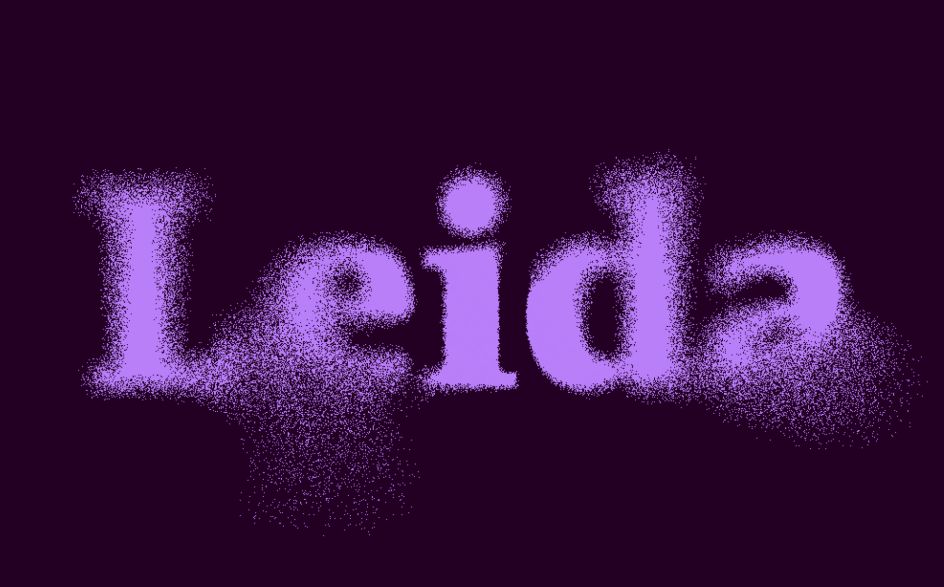
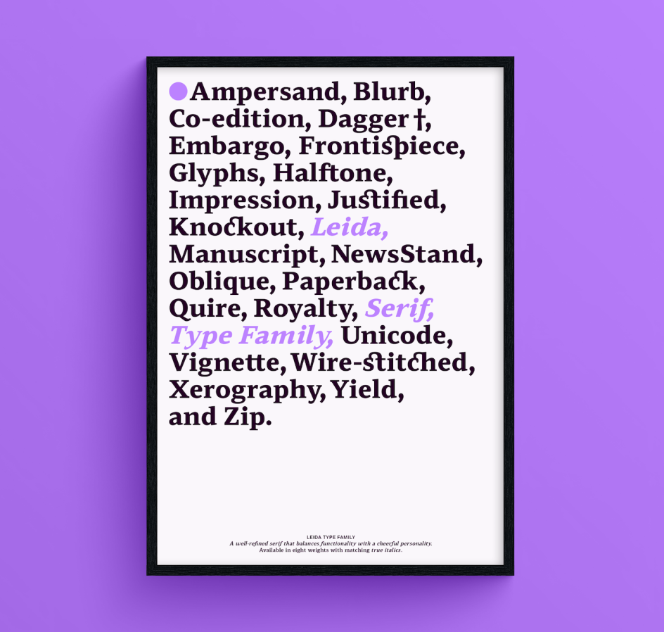
The main reference point for Hill’s designs was “the Dutch masters, specifically Bram de Does and the typeface Lexicon, regarded as one of the best type designs in history,” he says. “In naming Leida, he wanted to reflect its origins without using a Dutch word (which was not easy) by adapting the word Leiden, a small town in South Holland, to form ‘Leida’.”
However, he’s keen to point out that Leida isn’t a “re-interpretation” of Lexicon; rather, it draws inspiration from de Does’ process “to utilise the most up-to-date techniques to create a serif with a new purpose”. Aesthetically, Hill adds that Leida - which has been in the making for months - builds on the success of previous serif families released through The Northern Block, such as Modum and Scharf.
“In simple terms, Leida’s typeface alchemy takes rich documented ingredients and applies new skills and technology to create something far greater and more in-tune with future type design practices,” says the type designer.
“Bram made a typeface that changed the direction of the dictionary; with Leida, I was looking more towards influencing the use of serifs across user-interface applications.”
Arguably, as with most type designs, Leida was ultimately formed as the product of learnings from research into its influences, combined with past experiences and mistakes.
Hill found the fact that de Does didn’t set out to be a type designer (“yet what he created is regarded as excellent as any typefaces created in the 21st century”) one of the most inspiring factors that came into play, demonstrating the importance of knowledge and interests outside of the world of type design alone.
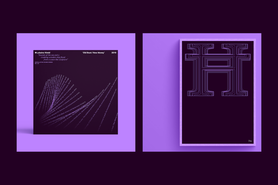
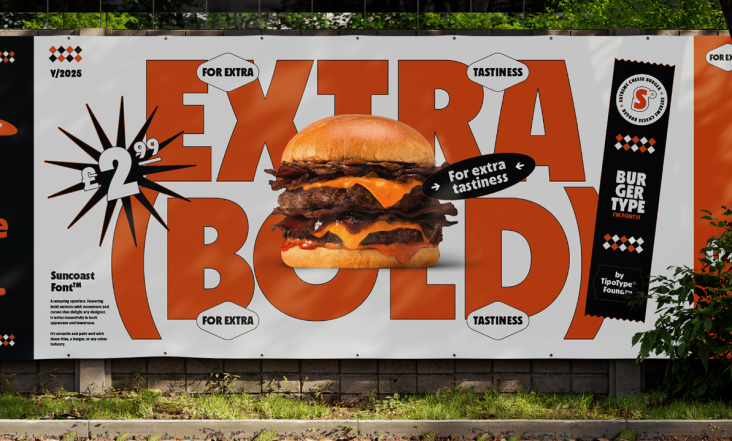
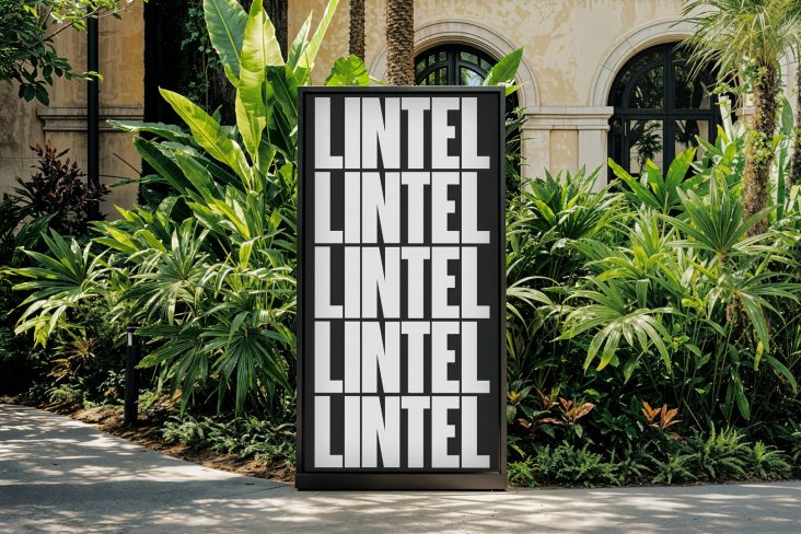
Leida was created with one eye firmly on brands – specifically those who might want to look to the audience for something a little different across a wide range of applications. It’s suggested that the family works equally well across UI applications as it would be editorial uses, such as in newspapers or more bombastic uses, such as on posters or in film credits. “Leida’s style balances functionality with a cheerful personality that can perform across multiple mediums,” says Hill.
