Pentagram helps 2DADS brewery stand out with Brutalist type-based branding
Beer connoisseurs will know all too well that the market is cram-packed with bottles adorned in beautiful illustrations. So how can a new brewing company stand out from the crowd? The answer: impressive typography from one of the world's most renowned design firms.
Founded by fathers Will Sorrell and Greg Iredale, the appropriately named brewing company 2DADS aims to shake up the craft beer scene with refreshing, fruity drinks that are easy to enjoy. Based in British Columbia, Canada, the pair teamed up with the Pentagram partner and internationally-renowned type designer Domenic Lippa to create a brand identity that would get them noticed in a very crowded marketplace.
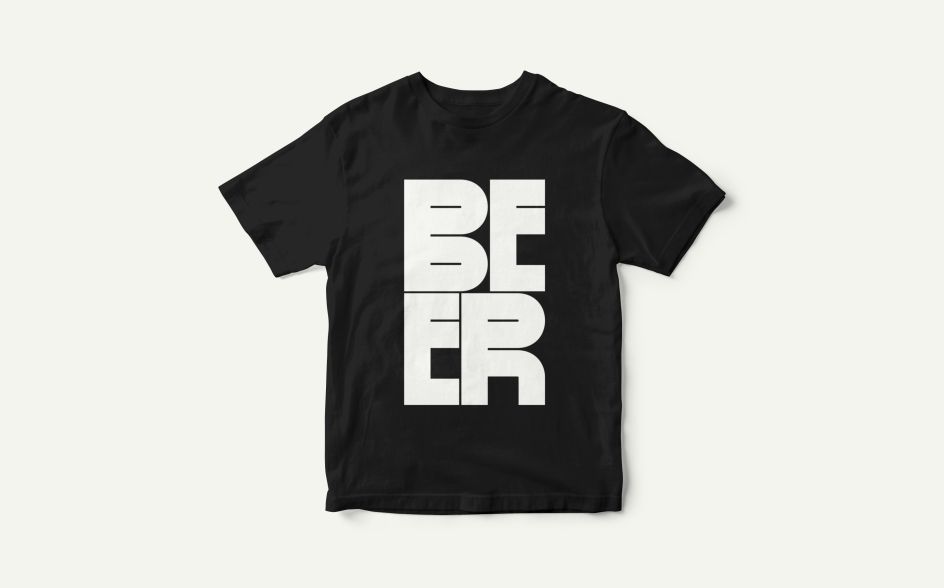
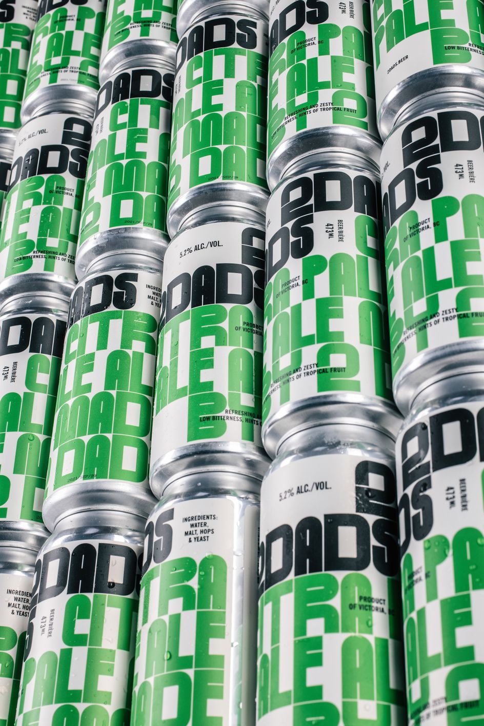
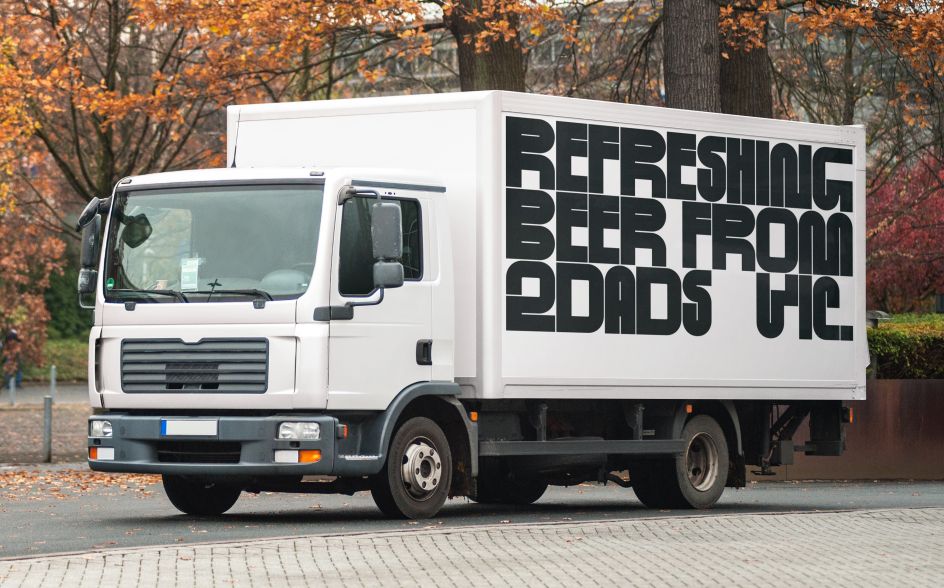
To do this, 2DADS and Dom bucked the traditional, illustrative approach that currently dominates craft beer branding with a bold and unmistakable type-based identity. With unique white lettering on a black background. This crisp look pops off the cans, and more importantly, off the shelves of beers jostling for attention.
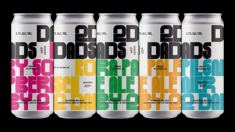
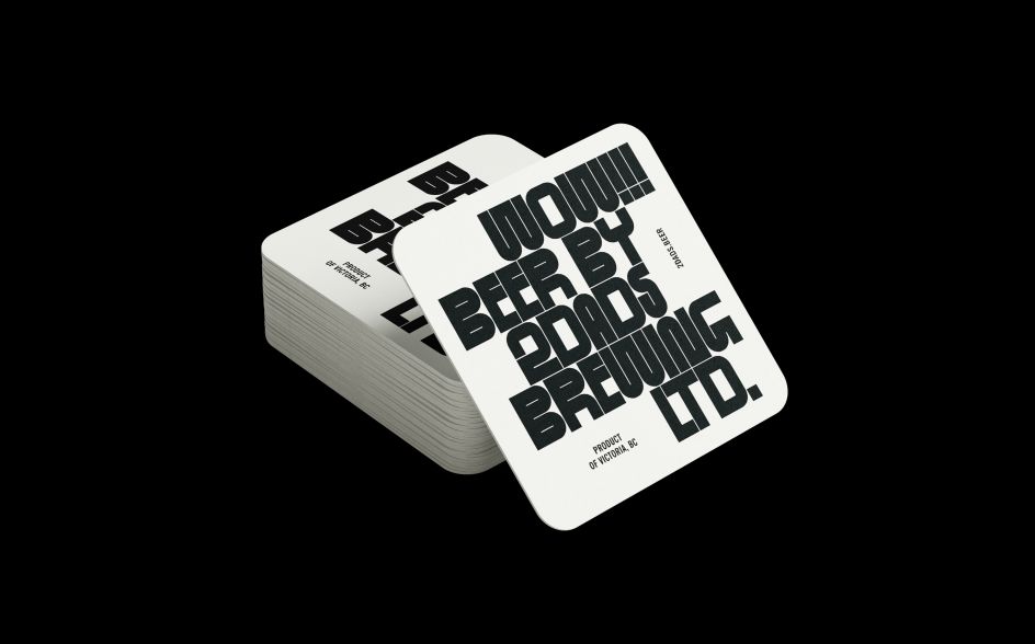
Using the typeface Standard by Benoit Bodhuin, the 2DADS packaging also incorporates bright accent colours to help differentiate each flavour. With its heavily-designed finish and Brutalist feel, this typeface is unlike anything else on the craft beer market and firmly sets 2DADS apart from the pack.
Rounded off with News Gothic as the supporting type and quirky, non-drinking-related imagery, the branding confidently reinforces 2DADS as something different to the rest of your usual craft beer offering.
2DAD's founders said in a statement: "There is such an amazing selection of craft beer these days, which means it can be confusing choosing something from your local liquor store, especially if you're not a beer nerd. We wanted a design that could stand out and look fantastic and also really simply explain what's in the can and who made it – two dads.
"The team at Pentagram really got what we were trying to achieve—the mix of fun with simple, honest communication. They listened closely to us, then took our ideas to the next level. We were absolutely blown away by what came back and how it has evolved."
Perhaps most importantly, the branding is working! The beer is selling well, and not just due to its delicious taste. "We don't underestimate the power of beautiful packaging, which is doing the job of cutting through the noise of a large variety of craft beers." We'll drink to that.

Editor's Picks


Trending


Podcasts


Editor's Picks
Further Reading