Hesign creates a unique, fiery and vibrant package design for Zeitgeist Coffee Factory Museum
What's the role of packaging design? Is it inform, lure, educate or exist solely as a means of a box? For Hesign, an art director, graphic designer and typographer based in Shenzhen, China, the role of packaging is to surprise – or in other words, to go beyond the expected.
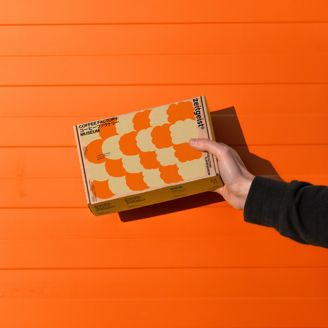
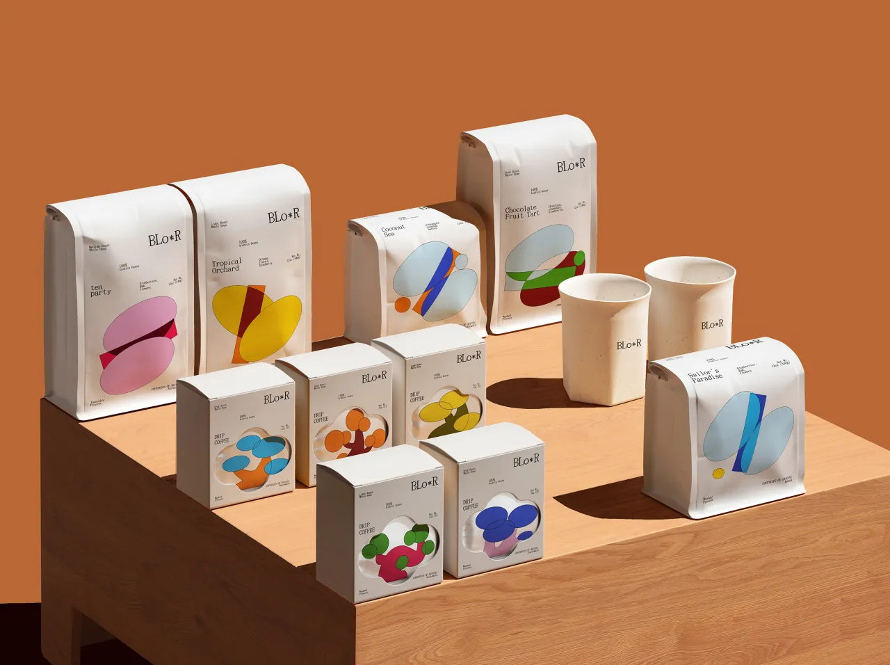
In his latest project, Zeitgeist Coffee Factory Museum, Hesign has designed a beautifully unique identity for a coffee brand featuring vibrant oranges, reds and yellows and an unusual pattern on the front of the box. A deep lover of coffee himself, let's just say that this probably was a dream job or Hesign. "I have bought all kinds of coffee beans at home and abroad," he explains. "I find that the vision of most coffee is relatively old, black or white, white in a large area, and typesetting in the middle of the text." Hesign started to question why most coffee brands were designed this way. Why weren't these – dare we say, boring – trends broken?
This is where Zeitgeist Coffee Factory Museum comes into play. Created as a means of going against the norm, the project reflects the shifting attitude in the Chinese design industry. "At present," he continues, "the more diversified design expression in the Chinese commercial market has more inclusiveness and a strong atmosphere of innovation and difference."
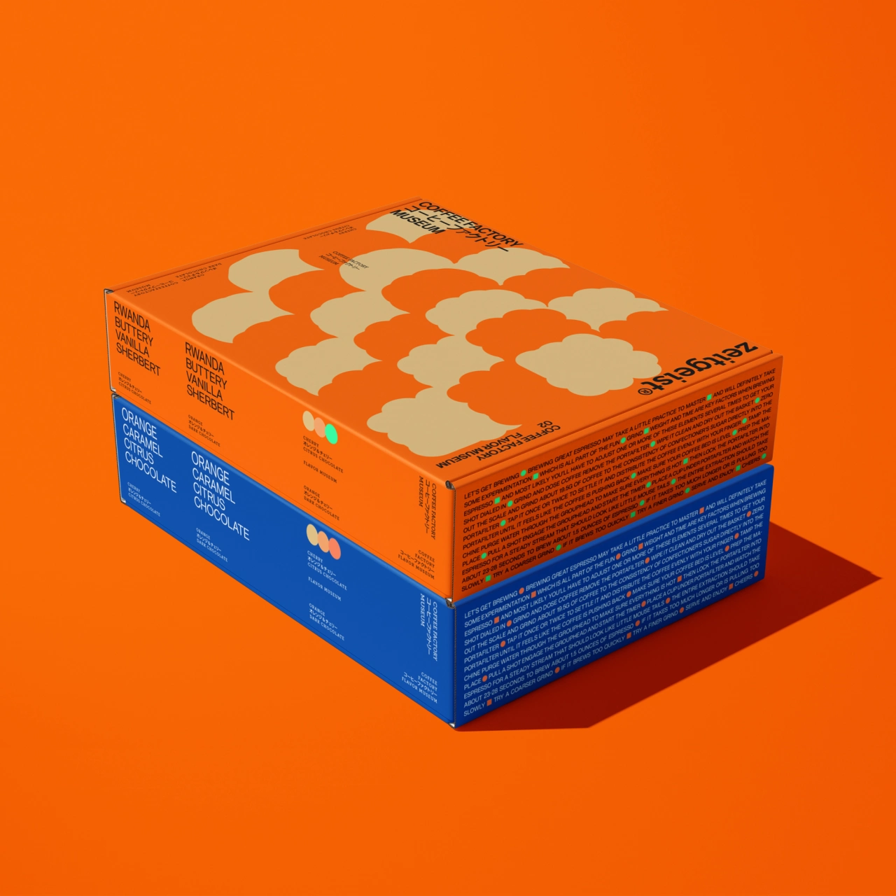
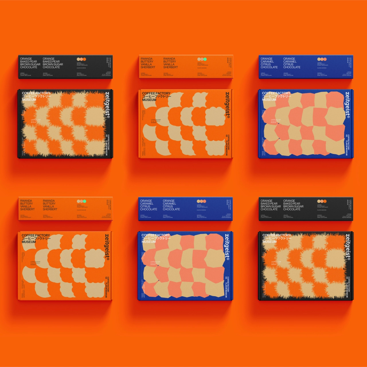
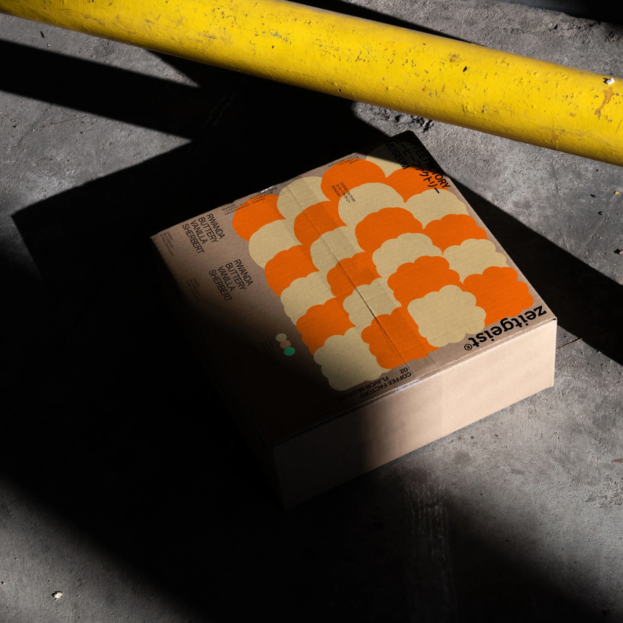
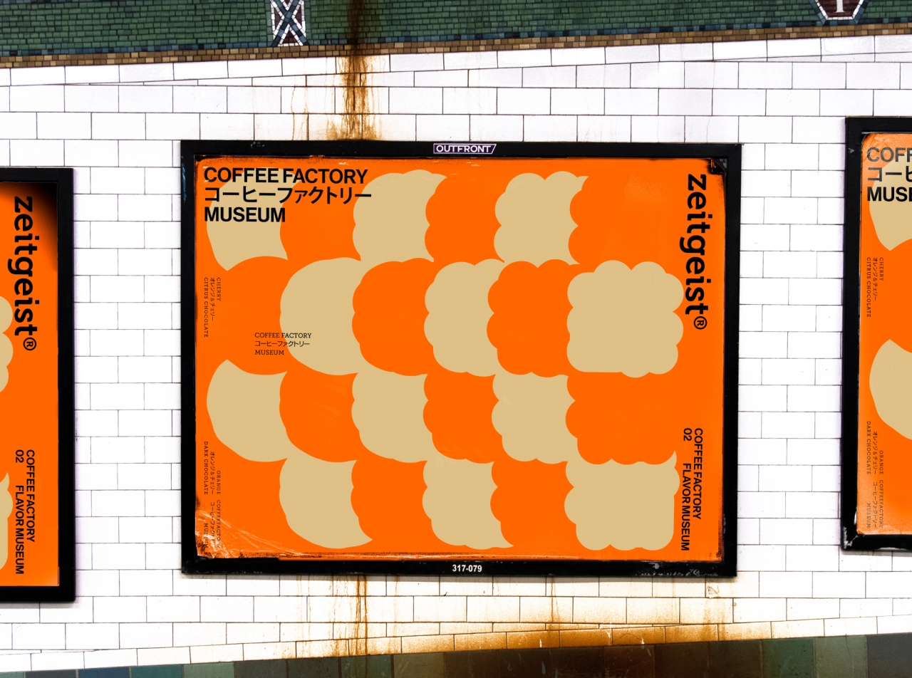
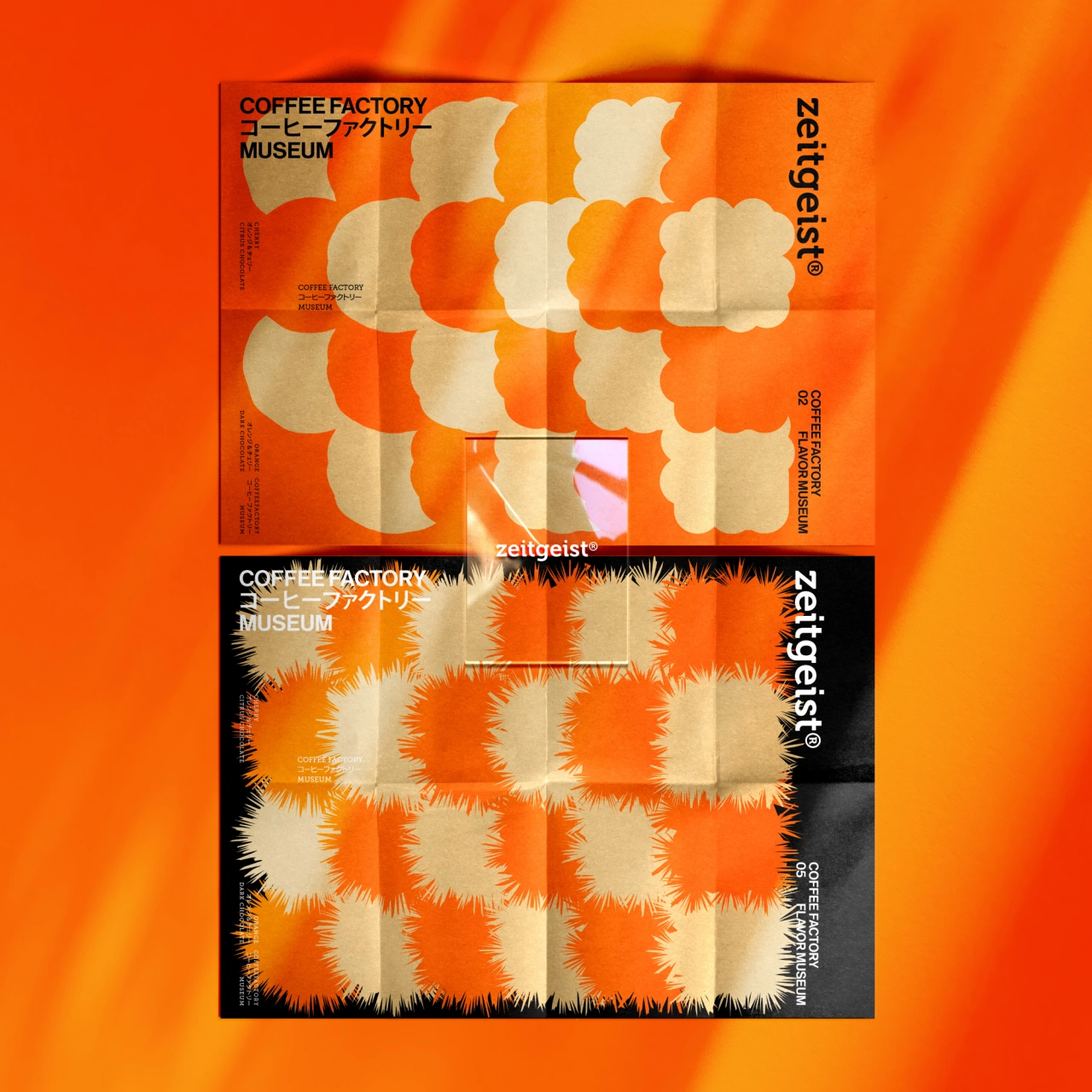
With this in mind, Hesign wanted to give a point of difference to this package design project. "According to my daily coffee tasting experience (sour, sweet, bitter, fragrant), I use the graphics recognised by the public to express it. Even without text messages, you can feel the flavour characteristics of this coffee bean." Fiery and lively, you can instantly imagine what this coffee bean might taste like when ground and poured into a cup. But for those wondering about its exact ingredients and taste, there's also some text placed on the side of the package that provides information about the coffee beans.
Hesign's main goal as a designer is to create something that will suit a consumer's needs while producing a design that steers away from the mainstream. There's a saying he once heard, which he follows as his mantra: "good design can solve the problem, and excellent design can solve the problem most simply." With this in mind, Hesign strives to solve problems through his work and build a system that the consumer can understand and relate to. Zeitgeist Coffee Factory Museum is a perfect example of this, even if he feels like he's still in the experimentation and practice phase. "I don't expect to make a meaningful design right now," he explains, "as I'm still growing up."

Editor's Picks





Trending






Latest Jobs
Art Director at The New York Times
Full-time·New York·$120k–$130k
Senior 2D Motion Designer at Art&Graft
Full-time·London·£50k-£65k
Account Director at How&How
Full-time·London·£73k-£79k
Art Director at SPOKE
Full-time·London·£55k-65k
Creative Social Content Producer at Bompas & Parr
Contract·London·£32k–£40k
Head of Technical & Facilities at Midlands Arts Centre
Full-time·Birmingham·£40,210