World exclusive: meet the artist behind Elton John's new emoji
One of the biggest stars in rock history, it might have seemed like Elton John couldn't get more famous – but 2019 seems to be proving us wrong.

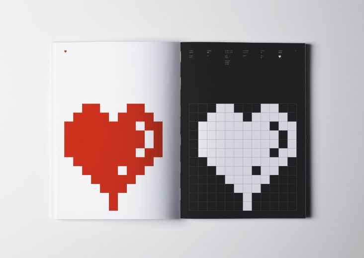
This illustration by Ben the Illustrator is being used as the new Elton John emoji. Courtesy of Ben the Illustrator/Pan Macmillan
With the singer amid a sell-out global farewell tour, the biopic Rocketman has already grossed $200m+ worldwide and has introduced the singer's back catalogue to a whole new generation. And today, Elton mania reaches even greater heights, with the release of his long-awaited, first-ever autobiography: Me: Elton John, published by Pan Macmillan, and full of candour about his colourful and bittersweet life to date.
To help promote the book, the publishers commissioned a special Elton icon, to be used on Twitter and incorporated into relevant hashtags. It's a technique we've seen on Twitter before, usually for big sporting or TV events, but as far as we know, this is the first time it's been used to promote a book.
The icon was crafted by Somerset-based creative Ben O'Brien, aka Ben the Illustrator. We caught up with Ben to find out how he got the gig (jealous, much?), what technical and artistic challenges were involved, and what it all meant on an emotional level.
Working for Elton John is quite a dream gig! How did you get it?
I was asked by Katie Roden - whom I know through Twitter - if I'd be interested in working on it. I leapt at the chance.
Katie works in strategy and marketing in the publishing world and has been freelancing for publishers Pan Macmillan on the promotion for Elton's first-ever autobiography, Me: Elton John.
Katie had seen some art prints I illustrated, featuring musical icons in a very simplified illustration style. These have been getting some popularity recently, especially since my Madonna artwork was recently published in Taschen's new book The Illustrator.
What was the brief?
Simply, 'create an Elton John emoji'. The only other stipulation was to add some kind of rainbow gradient, to fit with the photo on the book cover.
How did you approach the design?
We already knew it should be no more than his head and shoulders. Twitter prefers its emojis to be as square as possible, so a full figure – which ends up being a tall, thin graphic – doesn't work so well.
Initially, we were focused on Elton as he is pictured on the cover of the book: same era, same outfit. But when it was reduced to 16 x 16 pixels, the minimum size of a Twitter emoji, it just didn't look 'Elton' enough. So I started to look at Elton's most iconic looks - glasses, clothing, hats, hair - and put together a set of Eltons through the ages.
It's a good challenge finding a balance between simplicity - how does it shrink down? – and character/personality – does it look like Elton John? This is the kind of work I relish.
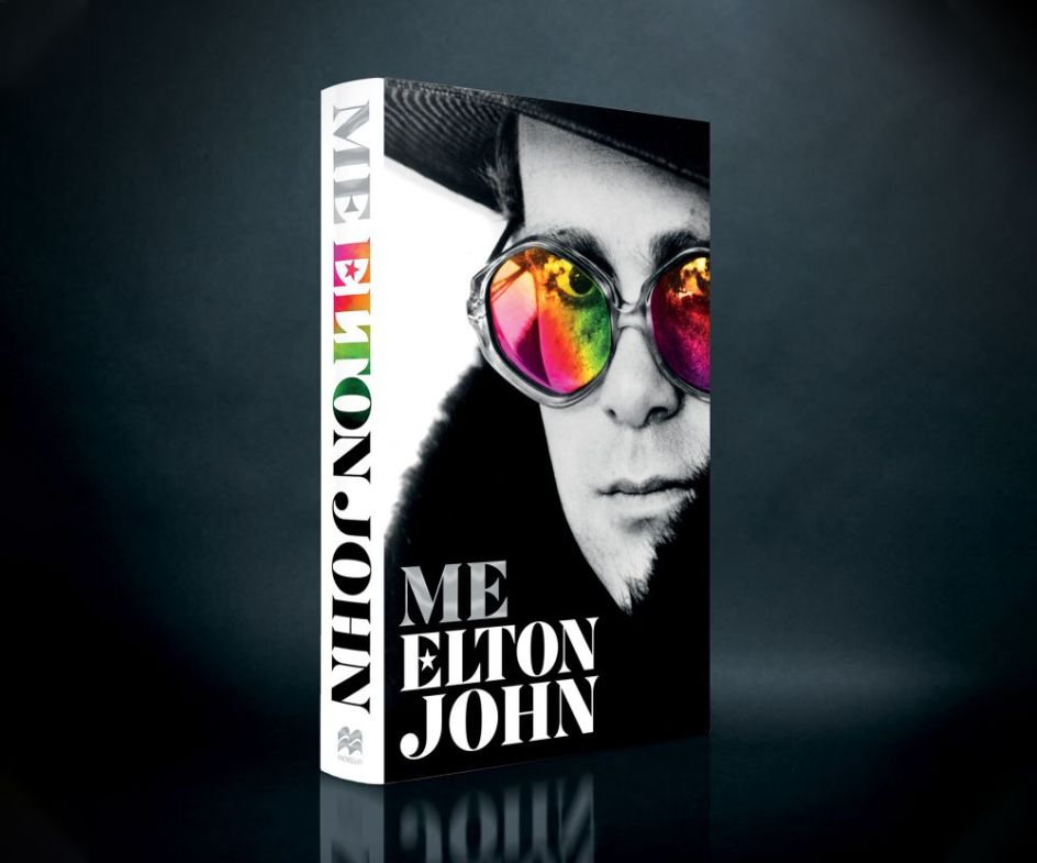
The cover of Me: Elton John, the official biography published today. Courtesy of Pan Macmillan.
What were the technical limitations you needed to work within?
Twitter needs the emoji sized at 72 x 72 pixels, but it has to still be visible at 16 x 16. THAT was the main limitation. So it became a standard process, every time I illustrated any element, to zoom right out, look at it, and consider "Is that still Elton John?".
Sometimes an illustration would look perfect full screen, but shrink it down, and it somehow loses its personality. This is where I struck on the heart-shaped glasses. Other shapes got lost: hexagons, stars, etc., weren't clear at that tiny size, but hearts were. The hearts also added a lovely quirk to it, like a little character.
Any other restrictions that made things tricky, such as legal ones?
Elton is such an icon, and his image is hugely important, as it should be after so many successful years. So although there were no legal restrictions, there was clearly a need to satisfy the key people in his management team, to ensure that the emoji was worthy of Elton John himself.
Thankfully, we all loved the same design and agreed which of the Elton collection would be used. I'll be honest; it's the first time I've had to wait pensively for David Furnish to 'okay' my work. Katie and the publishing team were great and seemed to enjoy having this one fun aspect to a far broader marketing campaign.
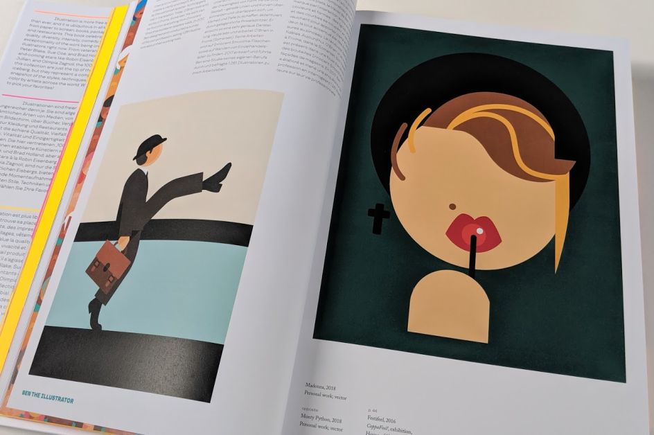
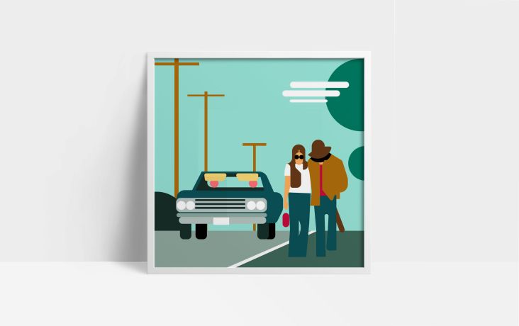
Madonna illustration by Ben the Illustrator in the recent Taschen book The Illustrator. Courtesy of Taschen.
And there was an emotional dimension to this project for you too, right?
Yes, when I was a kid, Elton John was one of the singers we'd all listen to in the car as a family. And I also remember studying some of his record covers in my dad's collection with interest: Goodbye Yellow Brick Road is still a favourite sleeve artwork now.
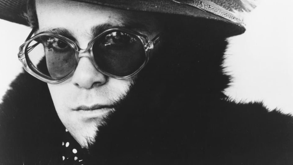
The original photo being used on the cover of Me: Elton John. Courtesy of Pan Macmillan.
My dad was a real fan: in fact, he and Mum went to see Elton in concert when she was pregnant with me! Dad passed away last year, which makes this all a little bitter-sweet, but he'd have loved that I got the chance to work with Elton John, even just in a tiny (16x16 pixels) way.
What lessons have you learned from this experience?
I've learned a lot about simplifying my work far beyond the relatively simple, flat vector work I've always produced. I've learned about how shapes can be reduced and reduced to a bare minimum, while still being recognisable.
It was also great to learn about the technicalities of emoji design. Twitter provides a no-fuss document guiding emoji designers in what does and doesn't work, making this new process a real pleasure.
I think the biggest realisation from all this is that I can produce a fully working emoji, and I would love to be producing more. This past summer, I saw Jennifer Daniel, who oversees emoji design at Google, speaking at the Birmingham Design Festival. And it ignited my passion to create great things on this small, but much-loved, scale. Luckily the project came around just when I fancied it!
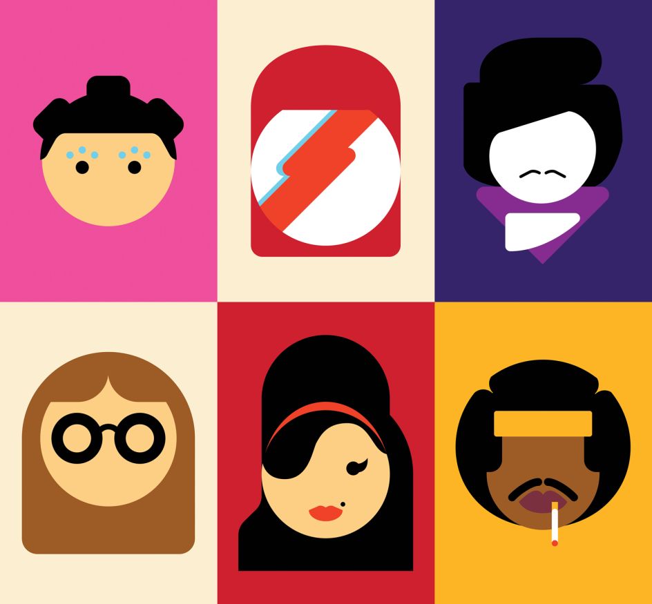
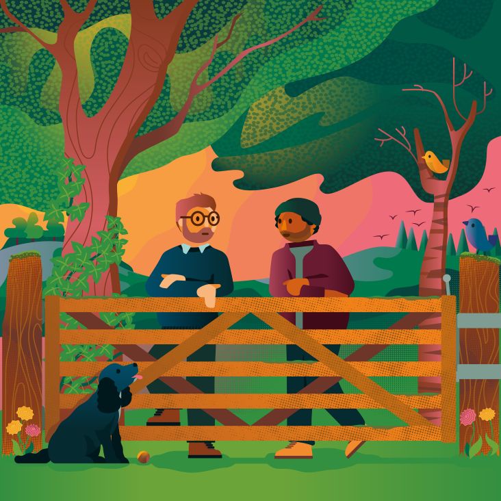
Some of the original pop icon illustrations by Ben the Illustrator which helped get him the commission. Courtesy of Ben the Illustrator
Editor's Picks


Trending


](https://www.creativeboom.com/upload/articles/90/908fdb6378db1e95d12595416f54e6336d5e80b8_732.jpg)
Podcasts


Editor's Picks
Further Reading