With freaky faces, warped type and happy accidents, Julien Gobled is tearing up the graphic design rulebook
The French artist and designer takes familiar images somewhere stranger, drawing on internet culture, forgotten archives and a healthy appetite for experimentation.
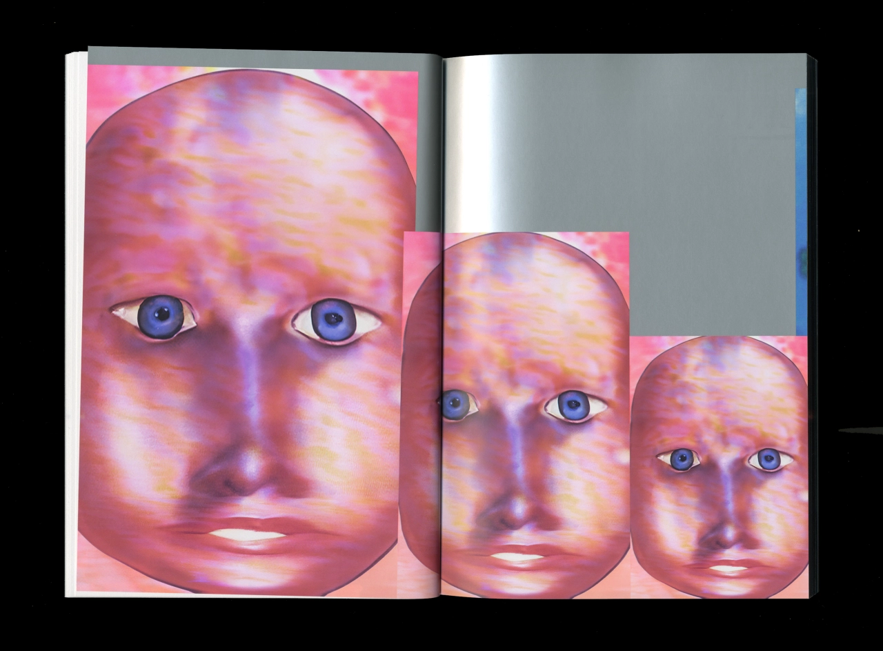
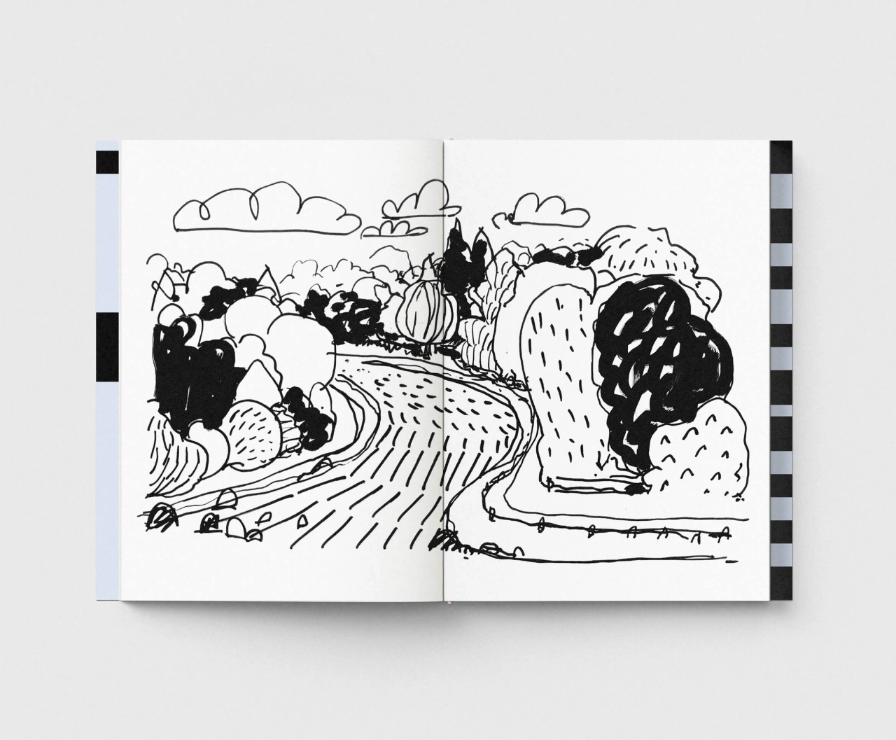
Spread from Derrière le soleil, co-published by Fidèle Éditions and Éditions Biceps. Design by Jean-Philippe Bretin.
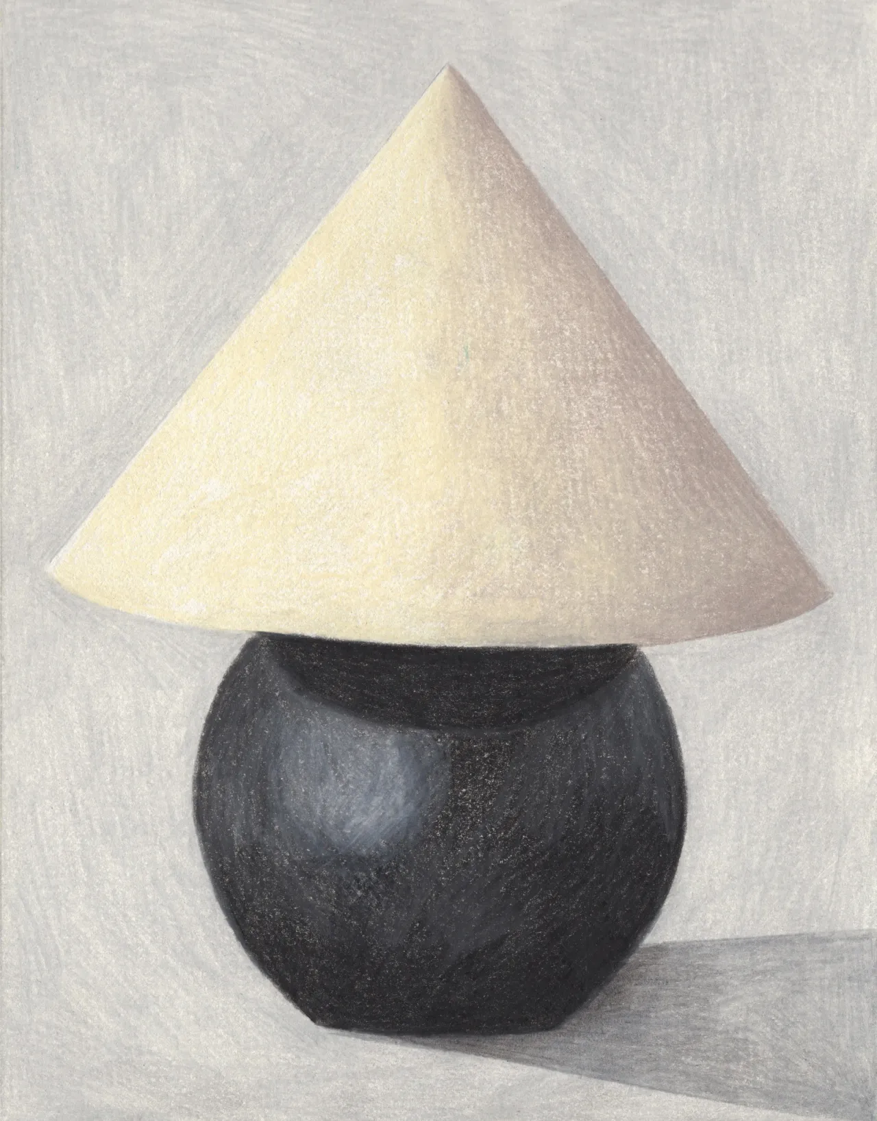
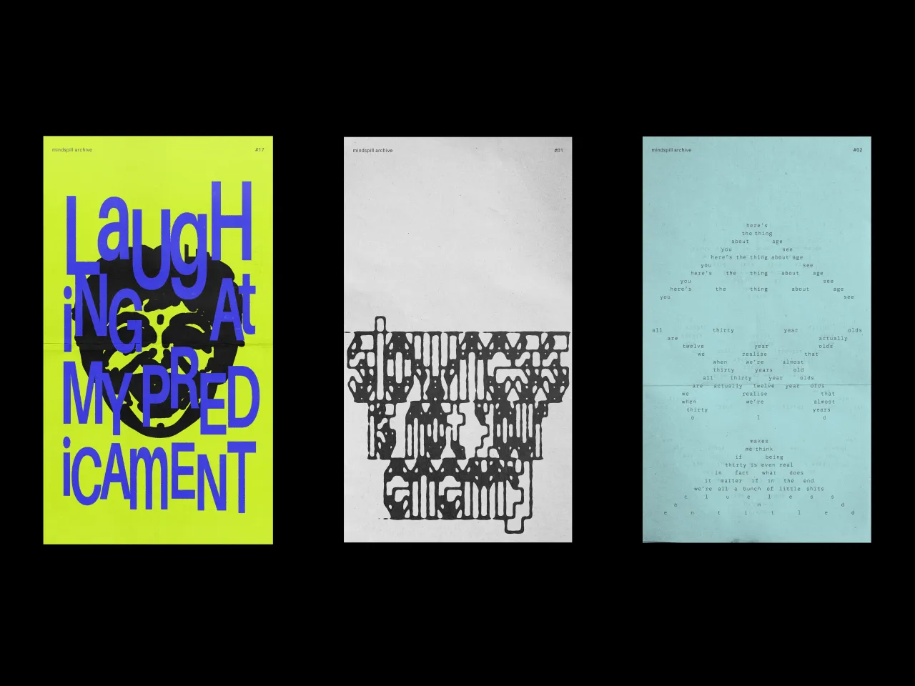
"I feel less and less like a designer and more like an artist," says Julien Gobled, and we can understand why. When you take a look at his work, you'll notice how he doesn't just pair typography and pictures; he creates an entire graphic world – the freaky baby-looking heads, the airbrushy squiggles, bold, colourful shapes and photographs that look distorted, as if they've been run through a photocopier over and over.
The text works like art, whether it's used to communicate information, hand-drawn to match the shapes and tones on the adjacent page, or warped to create an optical illusion. It's the type of work that can only be achieved by someone who's spent years learning the process of graphic design, and then gotten so good as to completely destroy the rulebook.
"For a long time, I tended to want to control every stage of a project," he says. "In recent years, I've learned to take a step back, trust the process and accept that things might develop differently from what I originally expected. This has allowed me to take more risks and move beyond familiar habits."
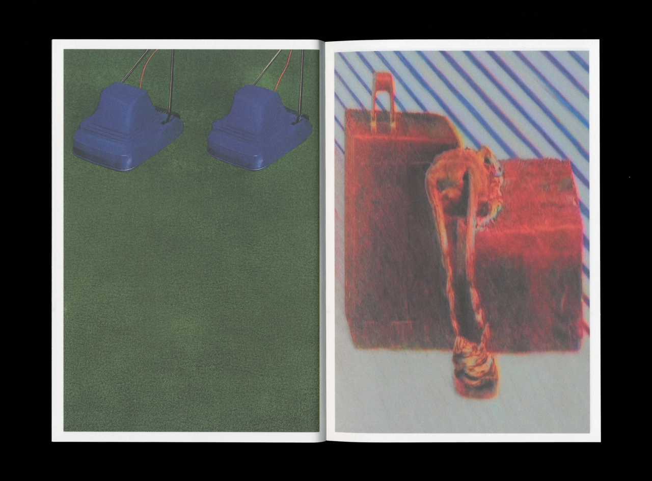
Spread from Derrière le soleil. Design by Jean-Philippe Bretin.
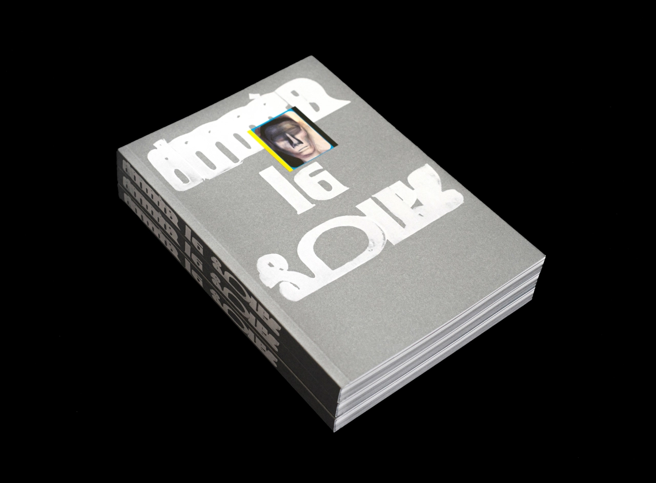
Derrière le soleil, co-published by Fidèle Éditions and Éditions Biceps. Design by Jean-Philippe Bretin.
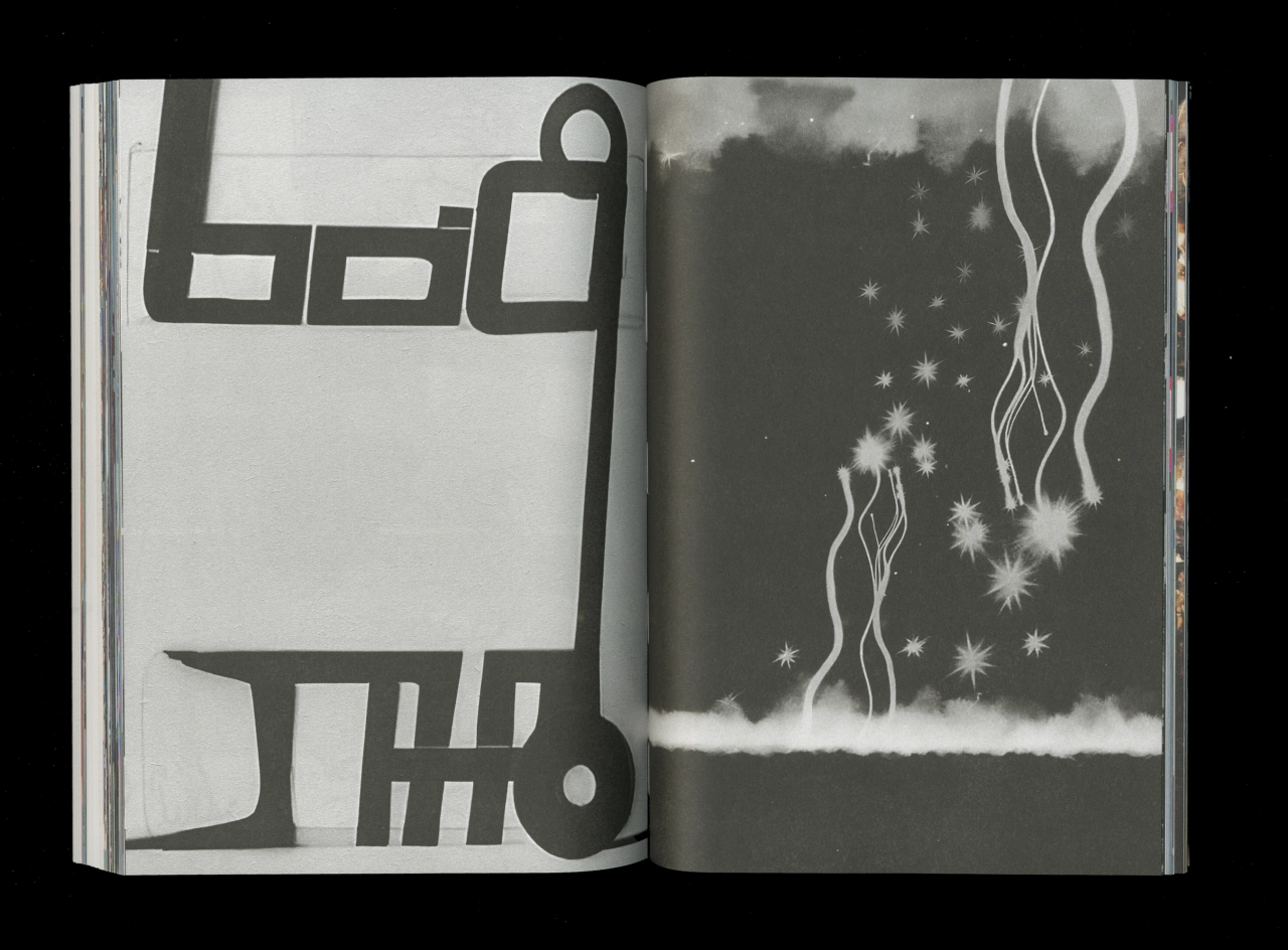
Spread from Derrière le soleil. Design by Jean-Philippe Bretin.
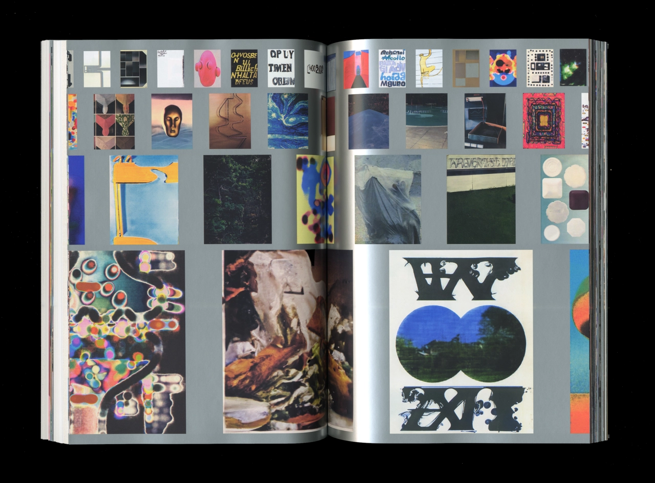
Inside Derrière le soleil. Design by Jean-Philippe Bretin.
As a French artist and designer based in Le Havre, Julien studied fine art before gradually steering more towards design. He then worked as a professional designer, splitting his time between a design agency job and freelance projects. Now, he works fully independently and has learned a few things about his practice. "I realised that what interested me most was image-making and visual research," he explains. "I think my artistic background naturally led me in that direction."
Inspiration can come from a few different sources, including books, archives and internet culture, as well as images encountered in everyday life. He sticks to a rigid routine of head-down work between 9am-6pm, even if he doesn't have a commission going. "I need that continuity to keep producing, experimenting and developing my research," he says. His work is built on experimentation and research, so he needs to put in the time to dive headfirst into inspiration wormholes – usually images found online or in an archive, which he will then treat as raw material. "I manipulate them digitally, crop them, transform them or combine them with other elements to take them somewhere else," he explains.
"I'm becoming increasingly interested in memory, in things that have been forgotten or displaced, or that return to us in fragmented forms. As I work, I try to find the moment when an image begins to evoke an emotion. I don't always know exactly what I'm looking for at the outset. Often, something emerges through the process itself, and I decide to follow one direction rather than another."
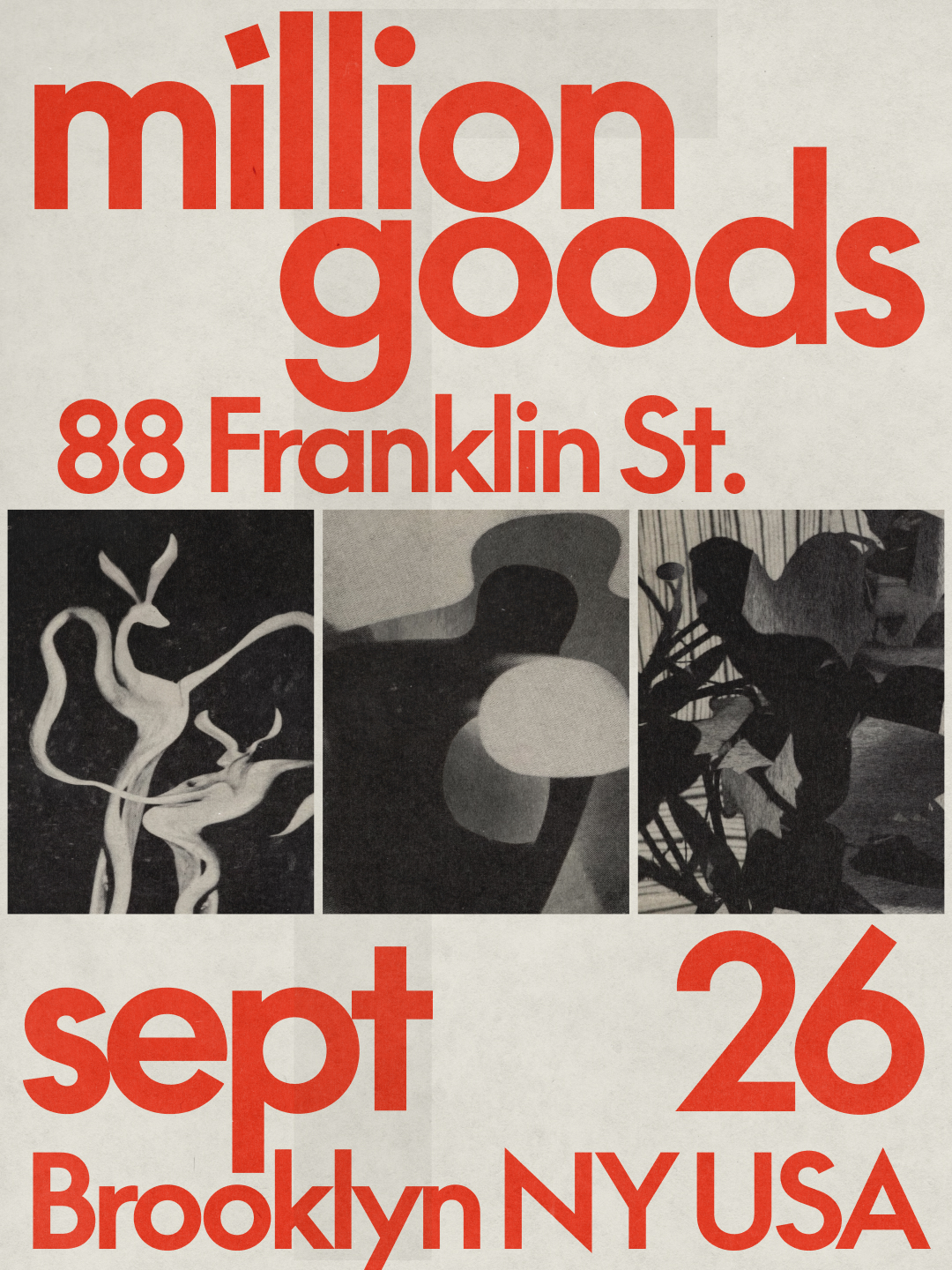
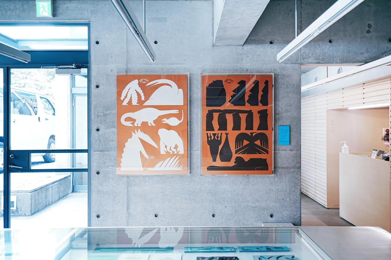
Poster for Million Goods, 88 Franklin St, Brooklyn. Design by Sometimes Always.
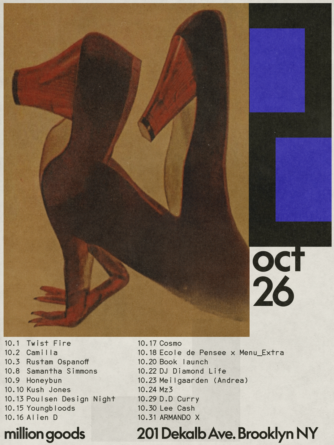
Monthly poster for Million Goods, 201 Dekalb Ave. Design by Sometimes Always.
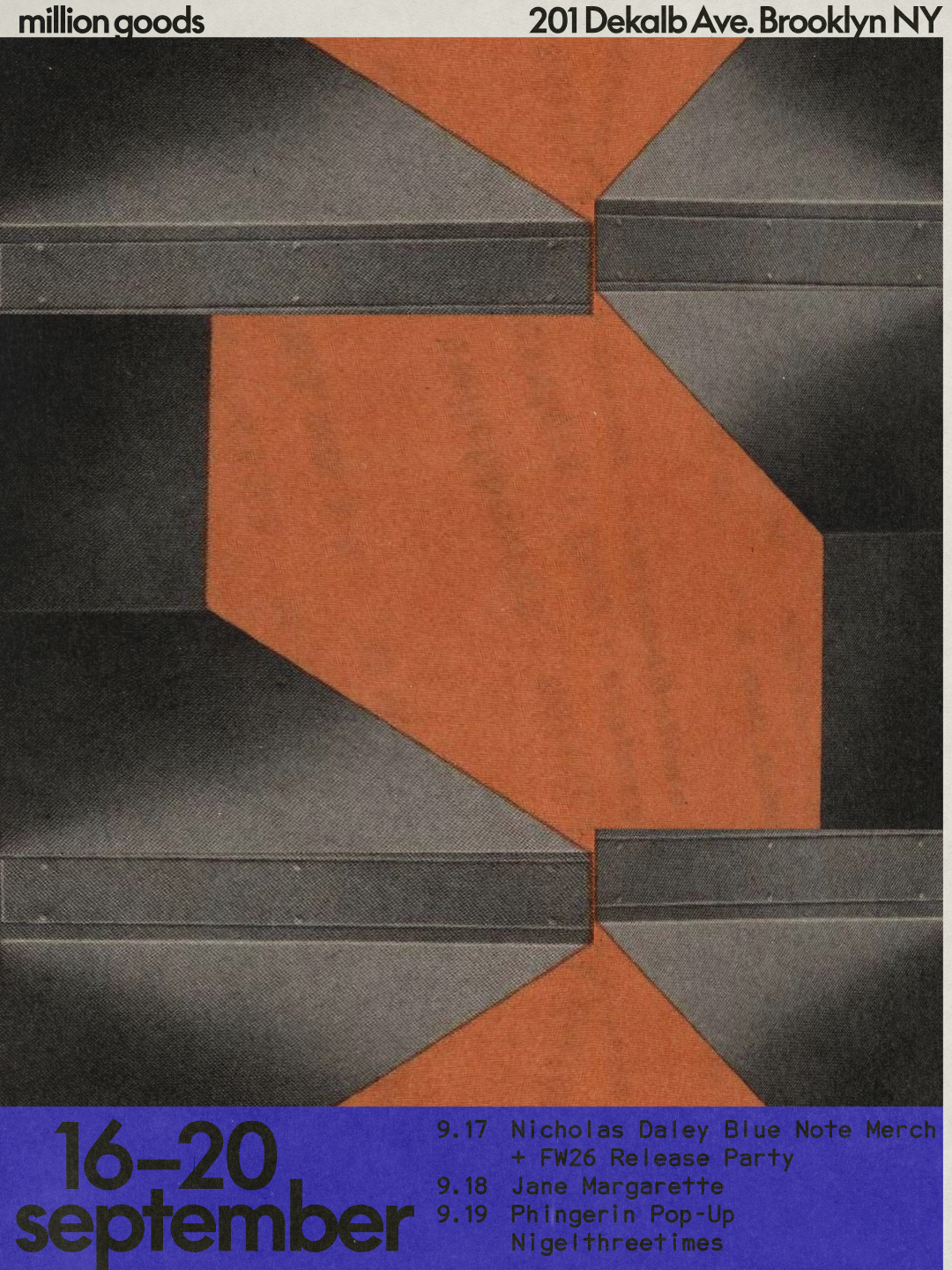
Weekly poster for Million Goods, 201 Dekalb Ave. Design by Sometimes Always.
His portfolio is replete with projects and collaborations that straddle the line between art and design. Derrière le soleil was two years in the making with Vincent from Fidèle Éditions (co-published with Éditions Biceps, and Jean-Philippe Bretin, who led the editorial design and layout. It resulted in a 'dense' publication that brought together several bodies of work by Julien, with the image-making squeezed into one intense three-month period. "The way [Jean-Philippe] interpreted the work and gave it a new dimension was essential; it was a real gift," he says. "The book became something greater than the sum of the images I had produced."
For Tranquilizer, the latest album from experimental musician Oneohtrix Point Never, Julien worked with Daniel Lopatin and Elliott Elder from the studio Uncanny. Julien worked on the art direction, typography and artwork; the cover features a screen print by Abner Hershberger, while the rest sees a graphic mash-up of visuals – layered type, digital drawings, distorted photographic images and chunky illustrative shapes.
Million Goods, on the other hand, is a project created with Gabriel Finotti from Sometimes Always studio for the concept store and wine bar in Brooklyn, which wanted to rethink its visual identity ahead of opening a second location. Julien and Gabriel shared the art direction, while Gabriel focused more on the design so Julien could create the artwork. "The brief pointed us towards the Bauhaus, Brutalism and Modernism," he says. "It was interesting to work with such recognisable references while trying to avoid simply paying homage to them. Instead we treated them as a starting point, drawing out certain principles and bringing them into a contemporary context."
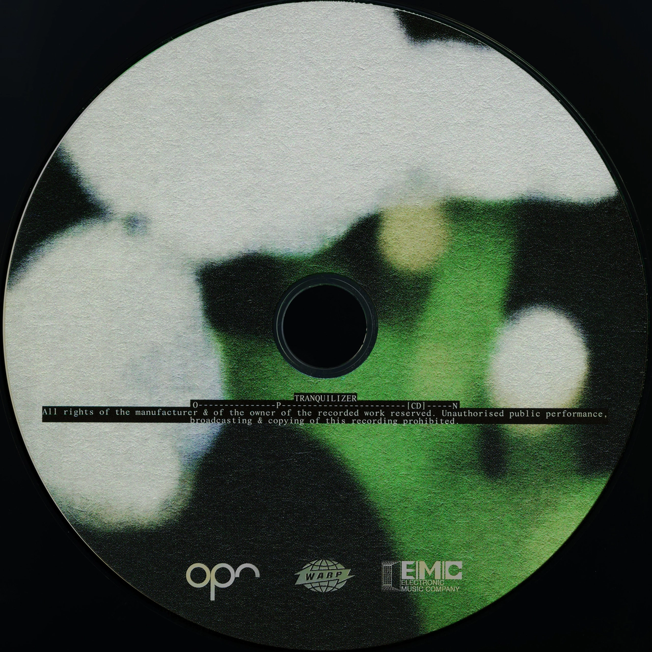
CD for Oneohtrix Point Never's Tranquilizer, released on Warp Records. Design by Elliott Elder.
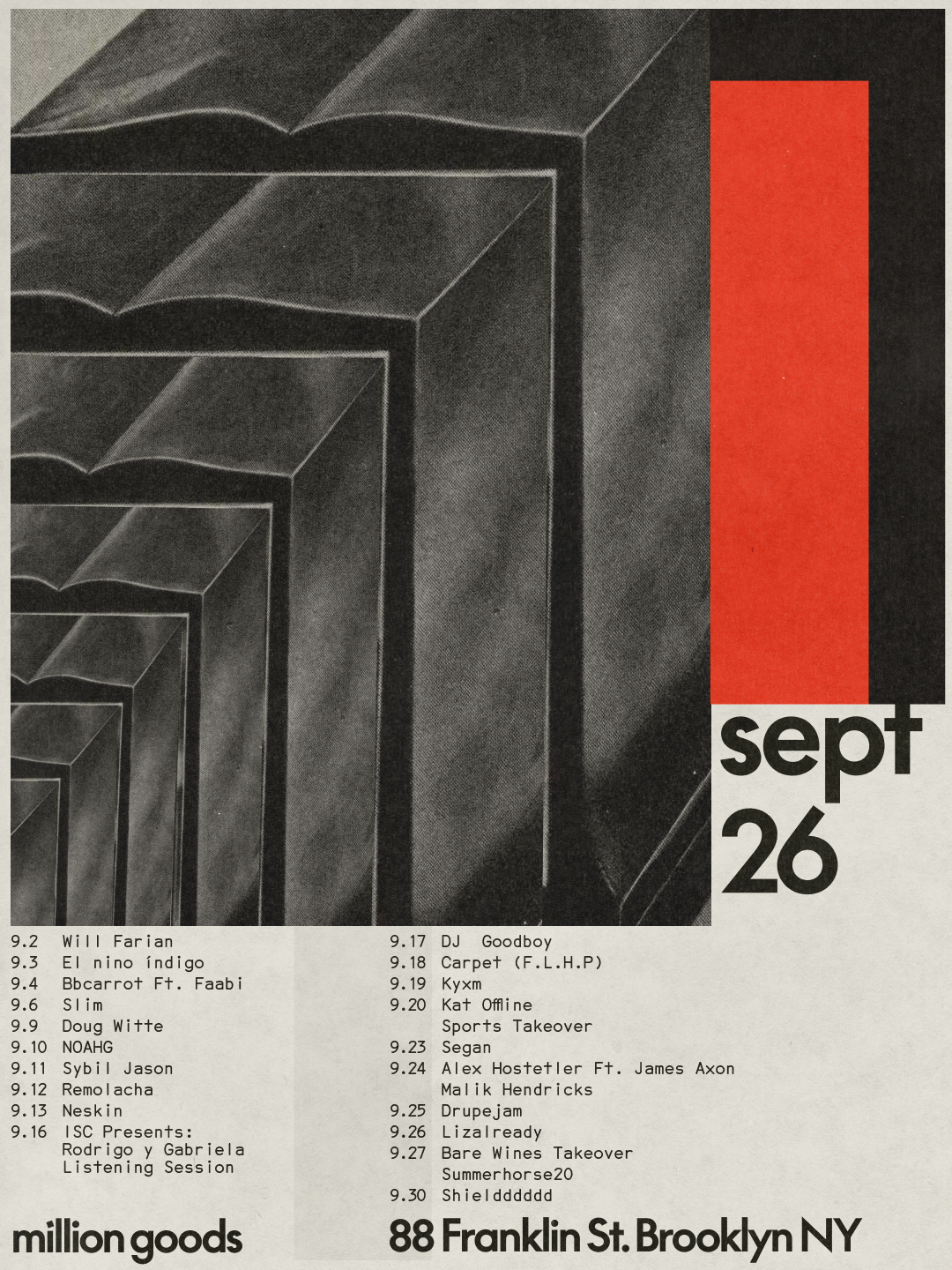
Monthly poster for Million Goods, 88 Franklin St. Design by Sometimes Always.
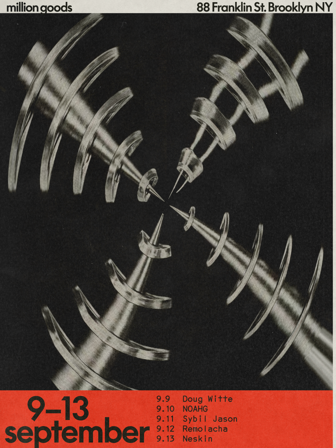
Weekly poster for Million Goods, 88 Franklin St. Design by Sometimes Always.
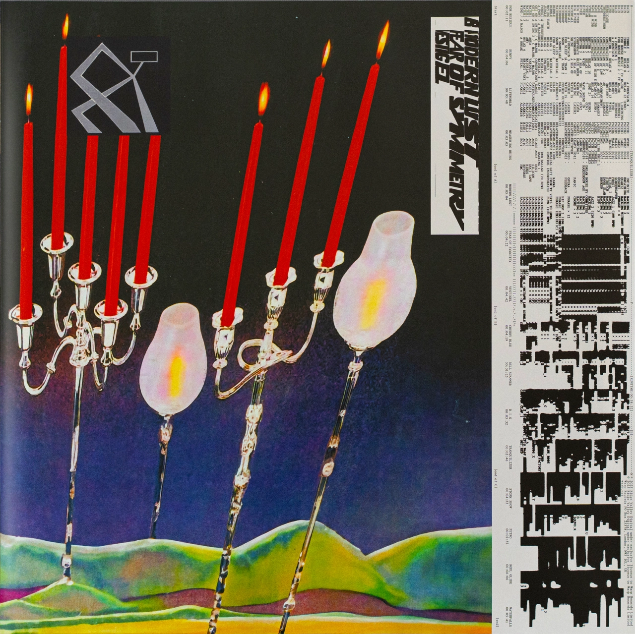
Inner sleeve for Oneohtrix Point Never's Tranquilizer. Design by Elliott Elder.
With several projects in the pipeline, including an exhibition based on the book Derrière le soleil, for which he's invited French designer Sylvia Tournerie to take the material and manipulate it in her own way, it's safe to say that Julien is keeping busy. Who knows what he will create next – something typographic, illustrative or photographic. But what we do know is that he will never stop experimenting.
"I want to keep taking my work into different contexts, discovering new worlds and engaging with different kinds of challenges," says Julien. "I feel that these experiences take me somewhere new each time. They help me break out of familiar habits, see my work differently and keep experimenting."
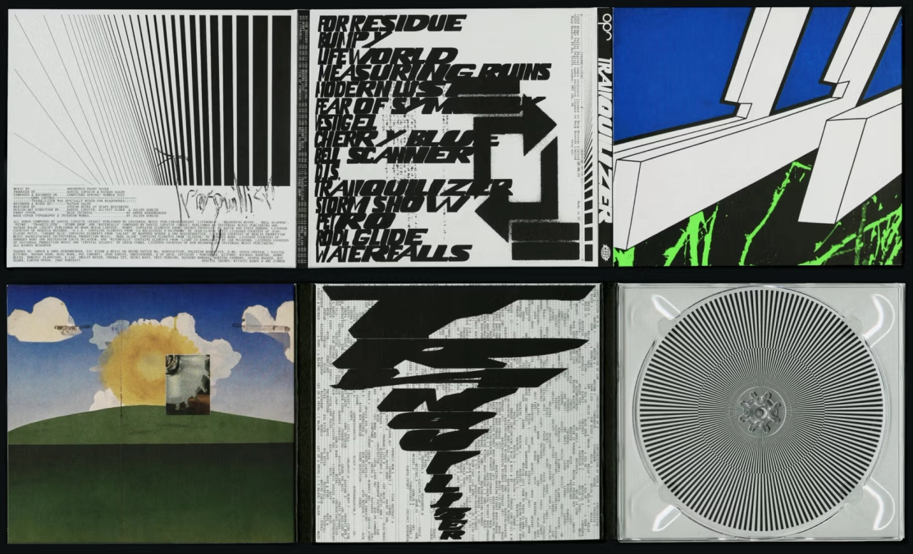
Digipack for Oneohtrix Point Never's Tranquilizer. Design by Elliott Elder.

Trending


Latest Jobs
Brand Videographer & Editor (Short form) at Aquablu
Full-time·Amsterdam·€42,000 – €64,000
SEO and GEO Content Strategist at Loom Digital
Full-time·Bristol·£35,000 – £37,000
Senior Designer – Special Projects at Koto
Full-time·London·£55,000 – £65,000
Senior Designer at Penguin Random House UK
Full-time·London·£41,000
Director, Strategy at Interbrand
Full-time·New York·$160,000 – $210,000
Brand & Content Manager at Youtrust
Full-time·Paris·€50,000 – €60,000