Turner Duckworth creates Viking-inspired new identity for dairy brand Icelandic Provisions
Design agency Turner Duckworth has created a new visual identity for dairy brand Icelandic Provisions, aiming to bring "a taste of Icelandic culture (and Icelandic cultures) to the dairy aisle."
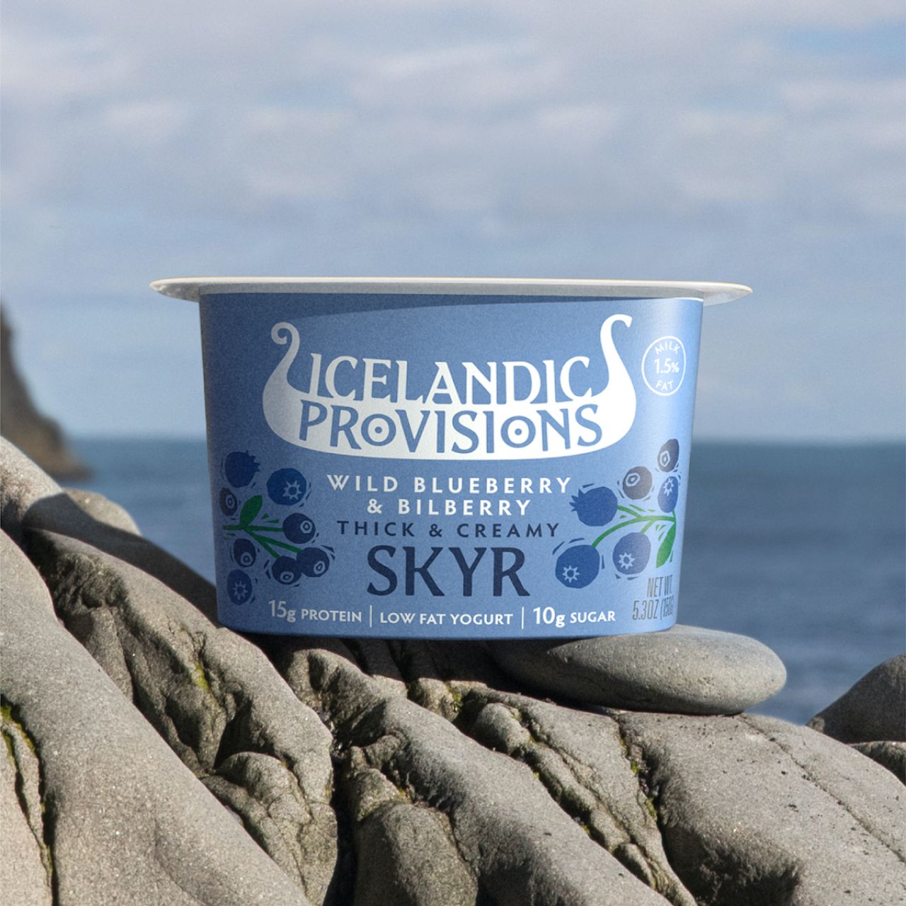
The agency was briefed to create new branding that acted as an "iconic expression" that tells the story of Iceland and its values, provisions and foods. "We want people to really feel the heritage and connect with it in a powerful way," says Dan Hickle, Icelandic Provisions' chief marketing officer. "Our Skyr is made with heirloom cultures that stretch back to the age of the Vikings."
Turner Duckworth drew on that idea of Viking heritage to create the new brand icon, which takes the form of a Viking longship. It also created a bespoke typeface, Edda, inspired by traditional Icelandic letterforms, or runes. The character shapes' "trailing" serifs also nod to the boat graphic, aiming to echo the forward movement of a ship. Illustrations of fruits, berries and nuts native to Iceland use the same hand-crafted aesthetic.
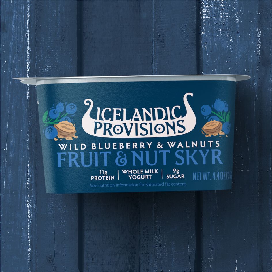
"It's one of those great right-brained marks, that works at lots of levels," says Turner Duckworth design director Matt Lurcock of the logo. "It's a symbol of strength, and journeys, fitting the brand. The word 'provisions' sits neatly in the hull, where provisions would be stored – the Os in provisions even gave us two shields to hang from the sides, Viking-style! But the mark also has this smooth, creamy quality, evocative of the Skyr. It's full of great discoveries, which in itself is a very Viking thing."
Editor's Picks


Trending


](https://www.creativeboom.com/upload/articles/90/908fdb6378db1e95d12595416f54e6336d5e80b8_732.jpg)
Podcasts


Editor's Picks
Further Reading