Sofia Pusa's quirky festival branding summons the spirit of Scandinavian dance
The Finnish creative director explains the thinking behind her visual identity for the festival, Ice Hot Nordic Dance.
If you live outside of Scandinavia, contemporary dance isn't something you naturally associate with the region. But the Nordic countries are brimming with cutting-edge dance talent. And so, in 2010, dance organisations in Finland, Denmark, Sweden and Norway joined forces to hold Ice Hot Nordic Dance, a festival in Stockholm promoting its greatest practitioners.
The event has continued to grow, with further events held in Helsinki in 2012, Oslo in 2014, Copenhagen in 2016 and Reykjavik in 2018. And this summer, Ice Hot Helsinki 2022 brought 200 Nordic dance professionals and almost 300 theatre and festival directors from around the world to the Finnish capital.
To brand the event, held at Dance House Helsinki and other venues in the city from 29 June-3 July, the organisers approached Sofia Pusa, whose brand refresh for a Finnish photography agency we featured back in February.
Based between London and Helsinki, Sofia is an independent, multi-disciplinary creative director, designer and illustrator specialised in branding in the lifestyle, arts and culture, fashion and music industries. Her work has been recognised with multiple awards from national and international competitions, and she has served as part of the jury for the Finnish design contest Vuoden Huiput.
The brief
"Ice Hot Nordic Dance is an international dance platform and event presenting Nordic contemporary dance to hundreds of international programmers, presenters, programmers and other professionals from all over the world," Sofia explains. It includes more than 20 stage performances, 15 pitch presentations, and a series of talks and seminars, where artists, producers and presenters discuss burning questions in the field.
"As the event usually takes place in wintertime, in the darkness of the North, the brief was to highlight Nordic nature in the visuals," says Sofia, "as well as embody the event's ability to bring light to the darkness and create a uniquely warm atmosphere, despite the cold winter."
The concept
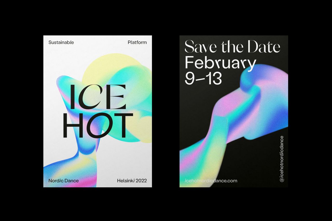
In response to the brief, Sofia drew a parallel between the movements of the dancers and that of the famous Aurora Borealis. In her words, "The visuals and colours of the new visual identity are inspired by the natural wonder of the Northern Lights, dancing in the winter sky."
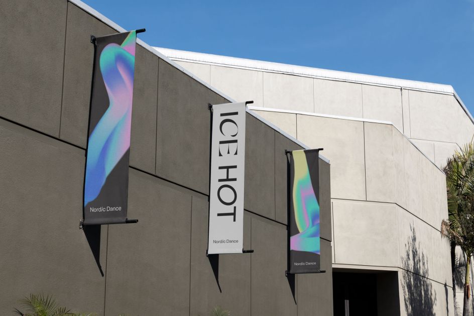
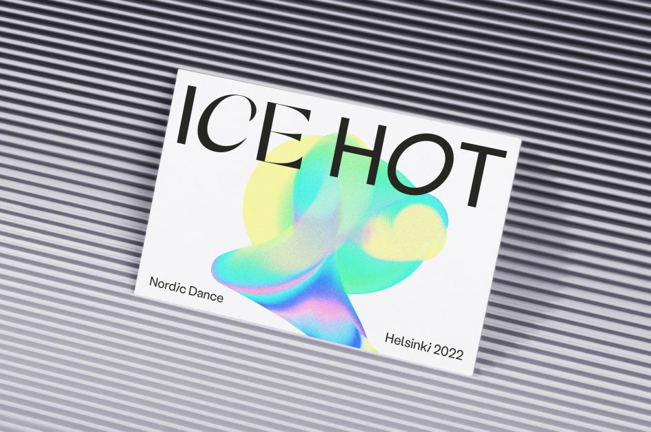
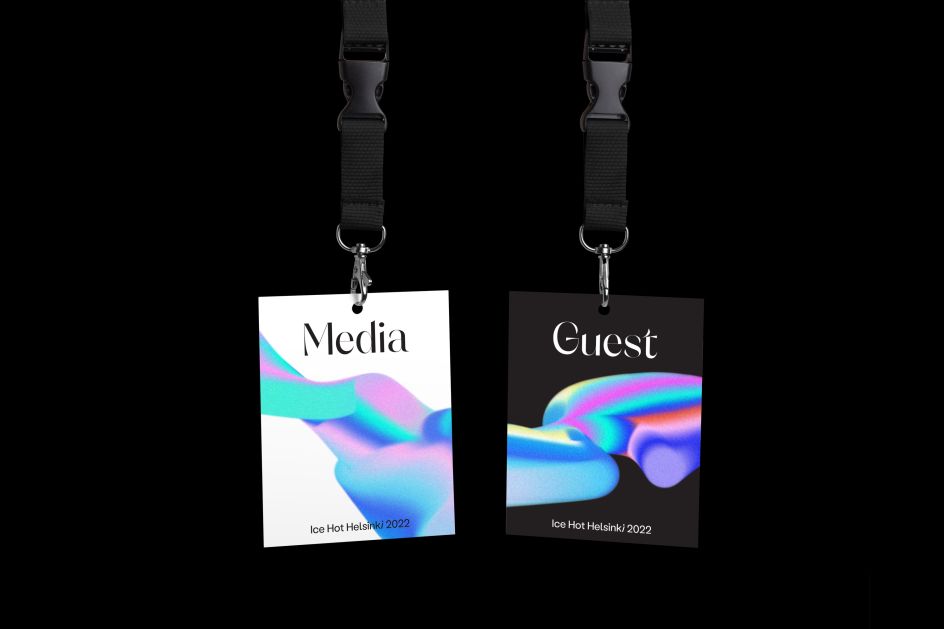
She was also inspired by the juxtaposition of hot and cold, bold and delicate, suggested by the event's title. "This has been translated into the typographic treatment and a memorable logo," she says. "The logo can live on its own when required, but also becomes inviting and lively when the illustrations and animations start to come into play."
The primary typeface, Labil Grotesk by Kometa, is a quirky sans-serif with tilting and rotation. This plays with the themes of balance, gravity, movement and self-expression, reflecting the nature of contemporary dance and the platform itself.
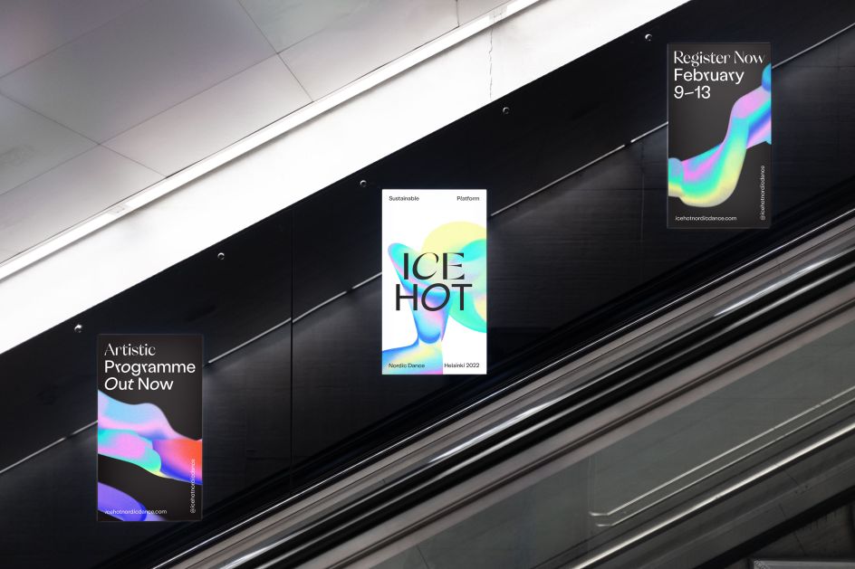
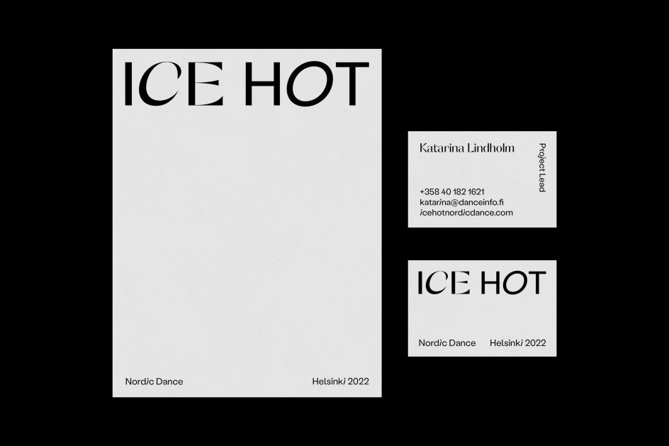
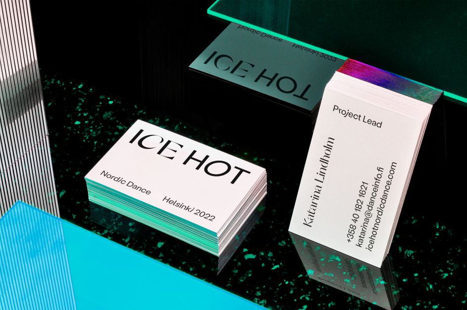
Sofia teamed it with the high contrast font Orelo, by Pizza Typefaces, to position the visual identity for a modern audience, while her illustrations are endlessly adaptable, creating visual variation throughout different touchpoints.
Why we like it
The results speak for themselves. We love how this visual identity incorporates the sense of colour, life and movement that a major dance festival demands in an original, offbeat and inventive way that avoids the beartraps of cliche and genericism.
We also appreciate the fresh and inventive way the Aurora Borealis is used as inspiration, without an overly literal interpretation drowning the design in familiarity. And the typographical treatment walks the line beautifully between quirkiness and legibility.
Editor's Picks


Trending


Podcasts


Editor's Picks
Further Reading