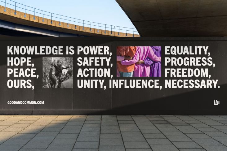
Landscape's identity for a disability-inclusive housing startup uses a palette based on skin tones
San Francisco-based creative agency Landscape has unveiled its new identity and website for a California disability-inclusive housing startup, The Kelsey.
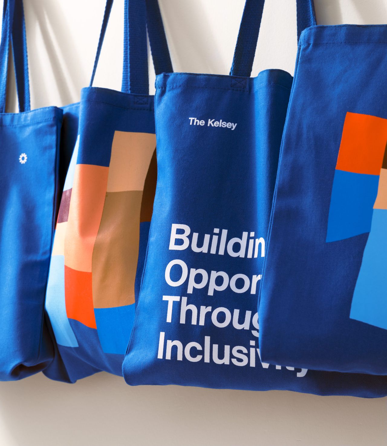
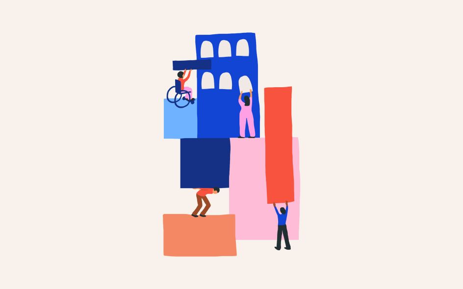
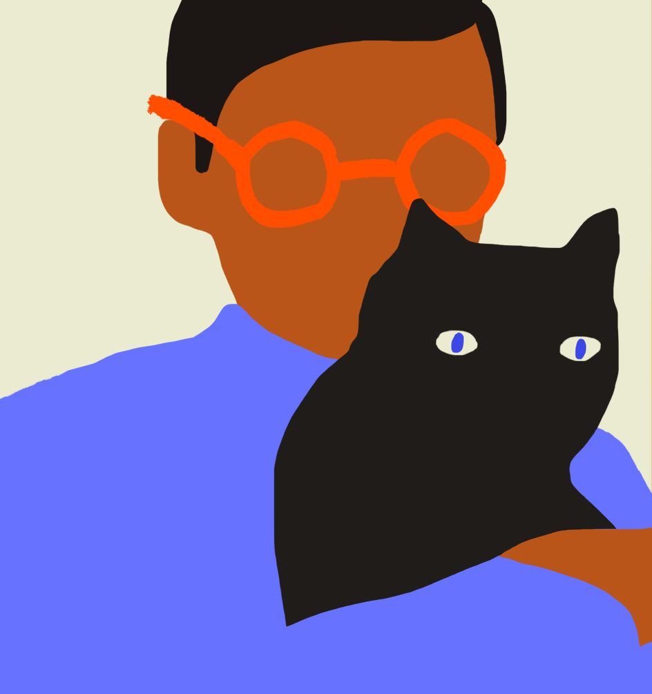
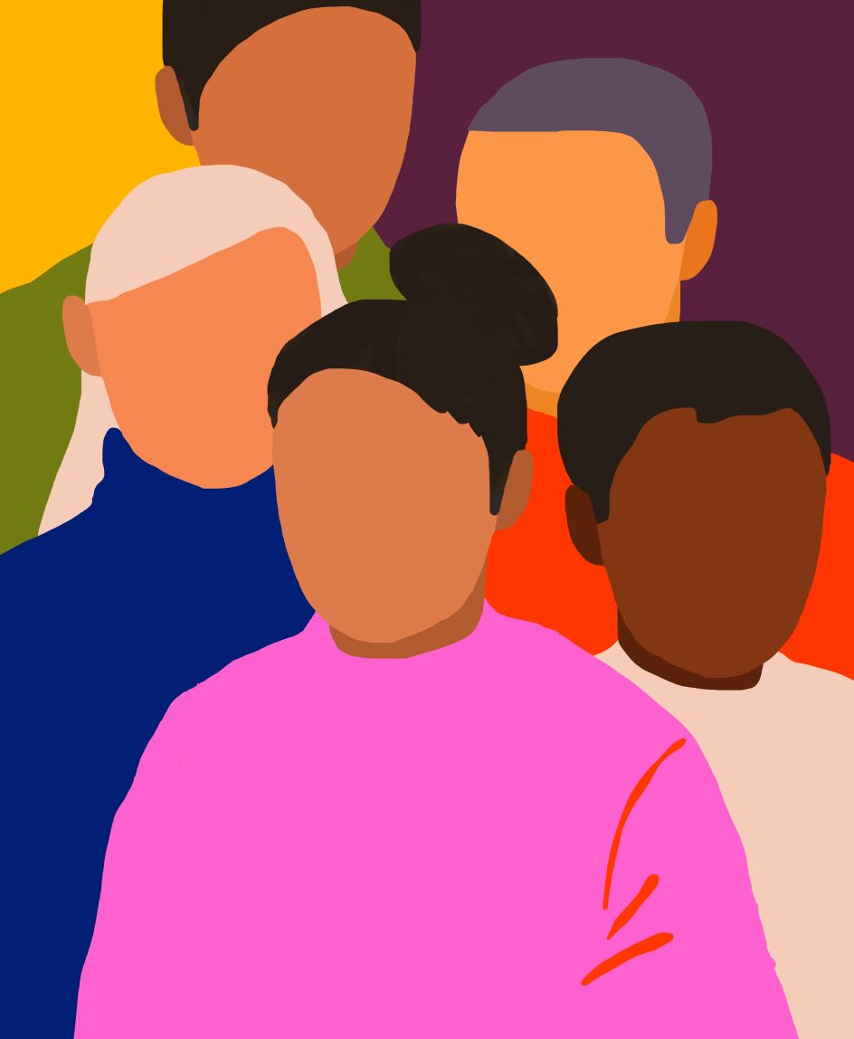
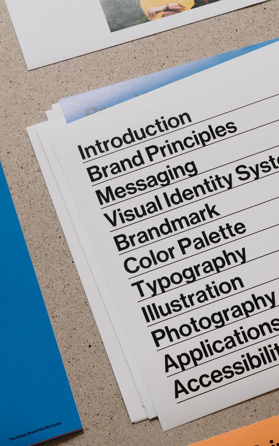
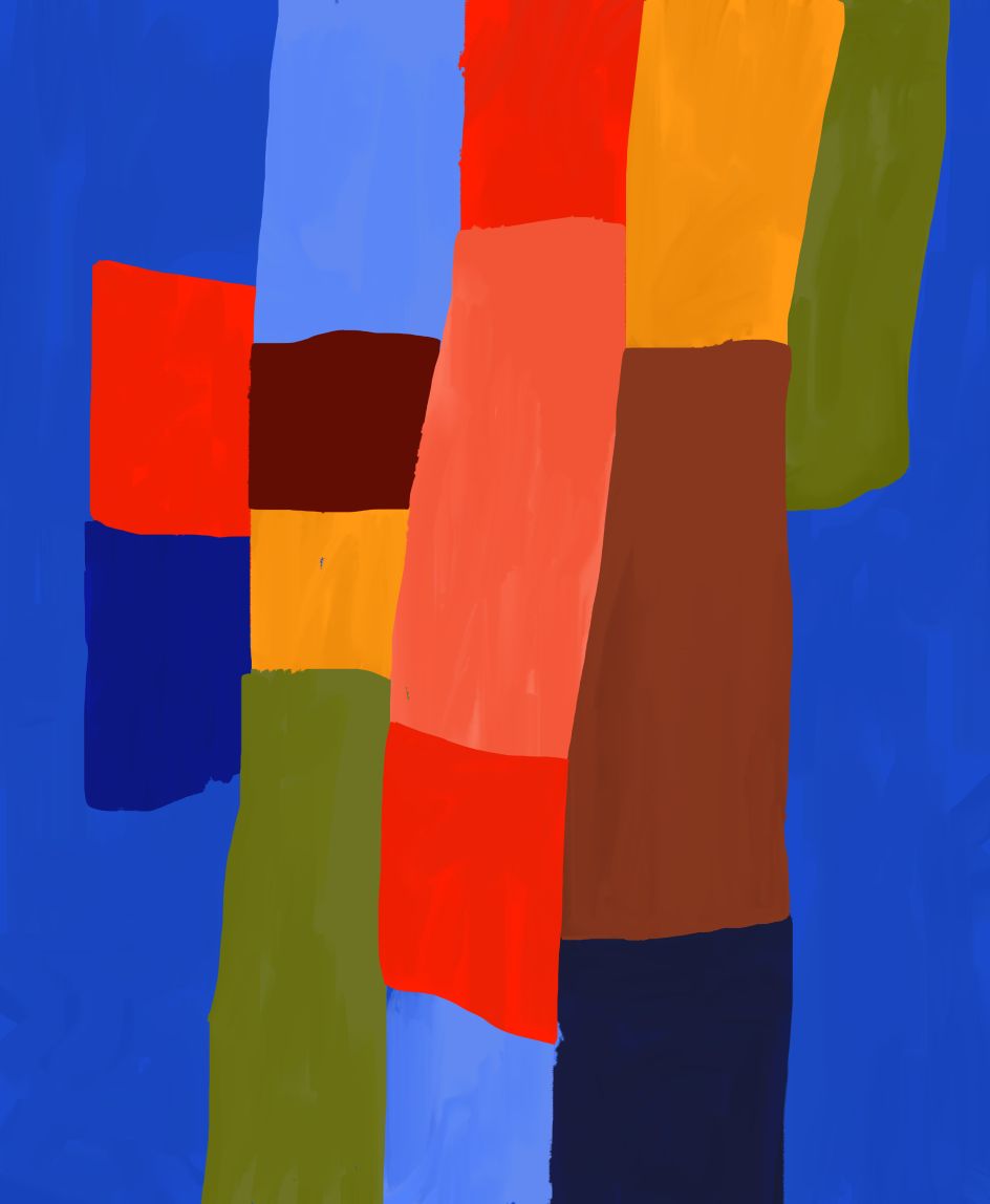
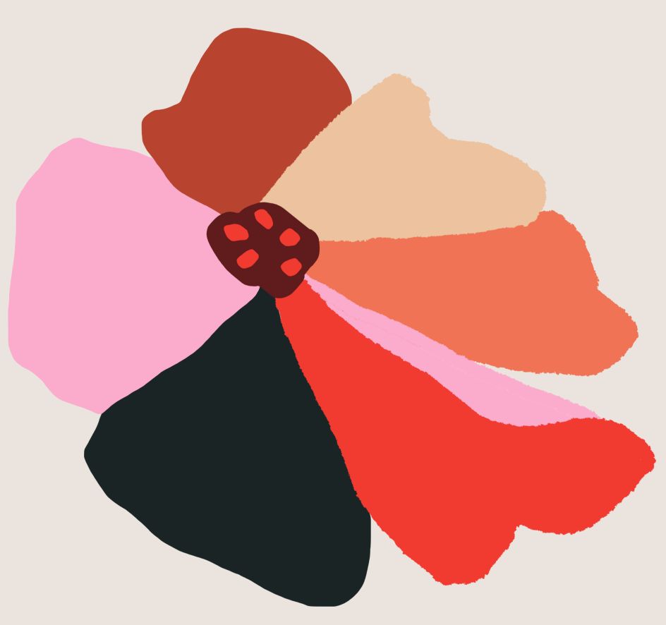
The new-look brand centres on the idea of "building opportunity through inclusivity" through whimsical illustrations, bold, universal typeface selection, and a colour palette based on skin tones. "It is grounded in vibrant colours reflecting the creative power of diversity and helping The Kelsey to break the visual stereotypes in the non-profit sector," explains Landscape.
It reinforces the "drive, attention to detail, scale and seriousness of the organisation's work", as the agency puts it. And positions The Kelsey as an innovative and credible brand that brings together diverse communities, funders, and policymakers for positive change.
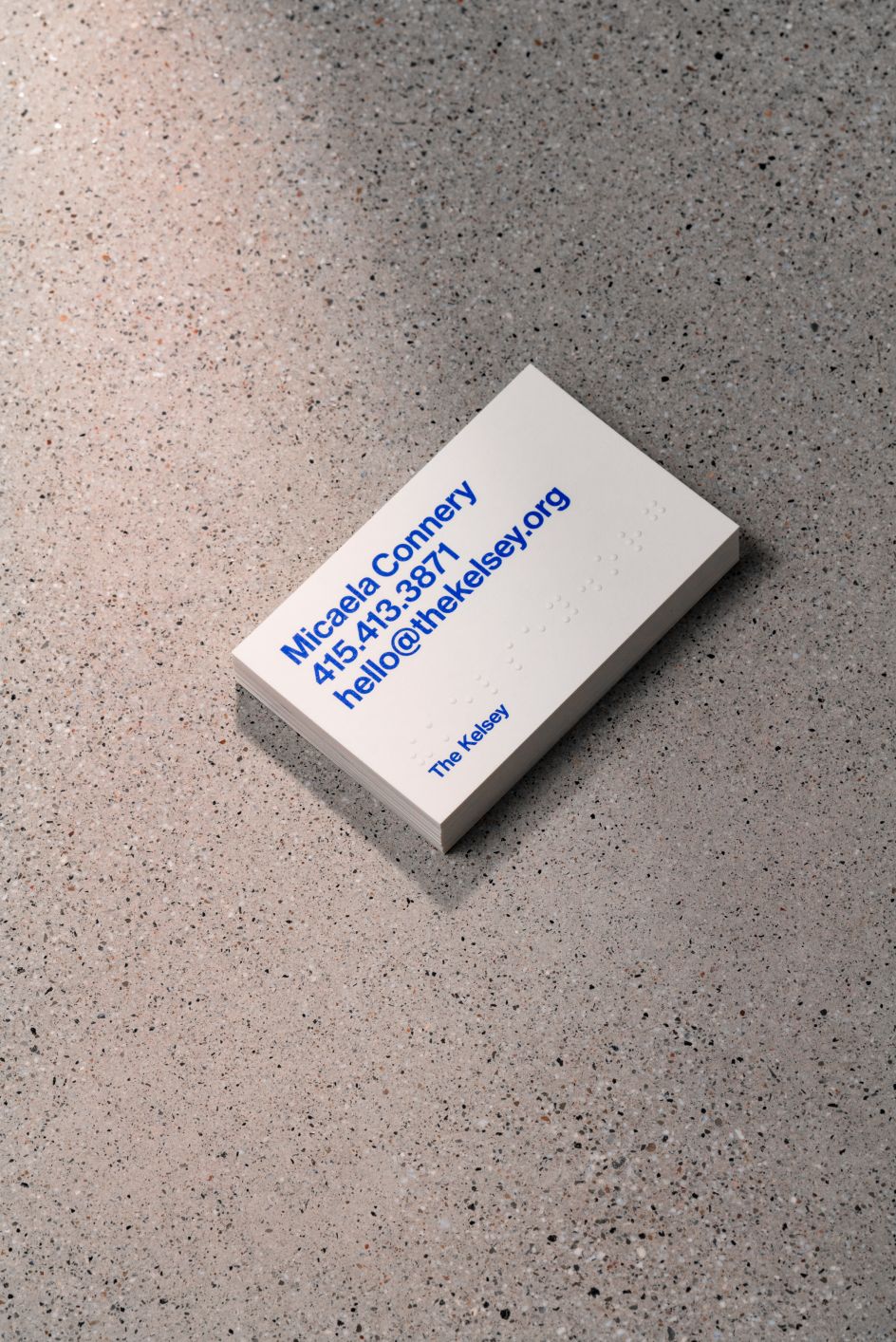
“Our new identity reinforces The Kelsey's mission to advance disability-forward, innovative, thoughtfully designed housing solutions," says Micaela Connery, co-founder and CEO of The Kelsey. "It now reflects all the impactful work underway here, the community that we serve, and the growth that we've experienced since our launch in 2018. Landscape dug into our mission, examined our impact to date, and talked to all our partners and allies to design a brand that reflects where we are today and where we’re going in the future."
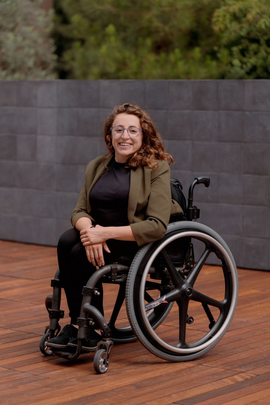
The accompanying brand photography hopes to portray the lived experience of people with disabilities in a genuine way and "conveys the power of their ideas, actions and voices", says Landscape.
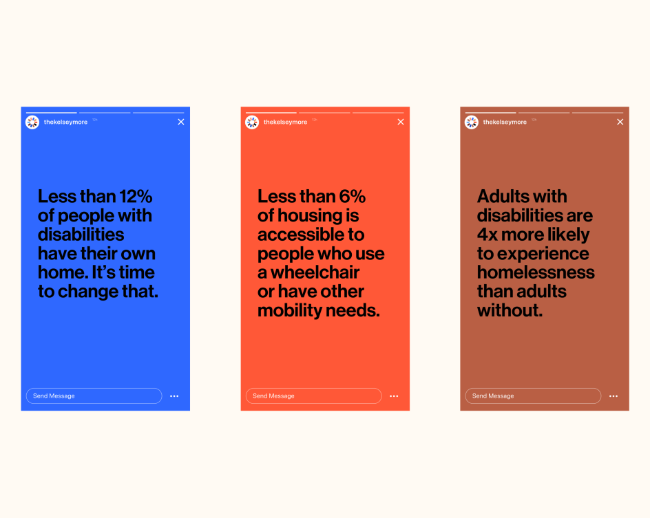
"Design – which includes language – can play a critical role in making complex social topics accessible to broader audiences," adds Adam Weiss, creative director of Landscape. "But as importantly, good design also makes these topics easier to act on for everyone, inspiring more diverse groups of people to participate in positive social movements or changes.
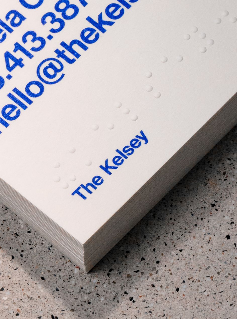
"In the case of The Kelsey, designing for inclusivity also meant designing for and with people who have disabilities. Our team worked with disability advocates and external consultants to ensure that the design of the brand and site, from the user experience to colours, images, and words was designed to be as accessible as possible to people with a broad range of abilities."
“We design buildings that are representative of their community, welcoming to everyone and best-in-class; our brand should do the same," adds Micaela. "Too often beauty is dictated and is reserved for the select few, and not inclusive of the communities they serve. We don't believe that should be the case."
Editor's Picks


Trending


](https://www.creativeboom.com/upload/articles/90/908fdb6378db1e95d12595416f54e6336d5e80b8_732.jpg)
Podcasts


Editor's Picks
Further Reading