Hey Studio turns the simple circle into an international design language
When it comes to designing guide books for international regions, it's all too easy to rely on familiar imagery such as buildings and landscapes. Barcelona-based agency Hey Studio dodged this trap in its latest collaboration with global affairs studio Thalby by turning the humble circle into a versatile, yet uniform, piece of branding.
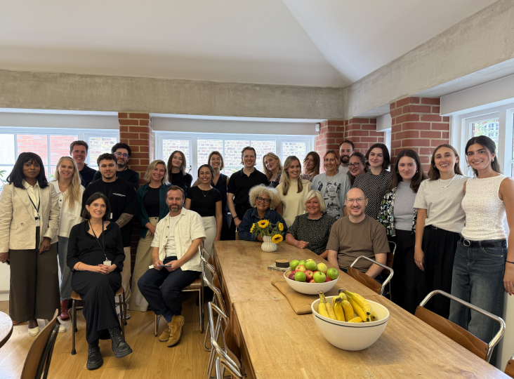
Designed by Hey Studio's lead designer Verònica Fuerte and designer Sebastián Londoño, the Thalby guide books needed to encompass its values. In this case, that meant catering to Thalby's status as a company with local collaborators in a variety of regions. Its name is even a reference to two great explorers, Wilfred Thesiger and Harry Saint John Philby, who were both deeply committed to the regions and people they encountered.
"Continuing on that premise of exploration, we needed a concept that reflected this core value of the brand," says Hey Studio. "So, we created the pin-dot concept, based on how travellers used to pin their maps manually." It's a subtle gesture, but the pin-dot that appears on the arm of the letter 't' in the Thalby logo gave it some character and a circular symbol to build a style around.
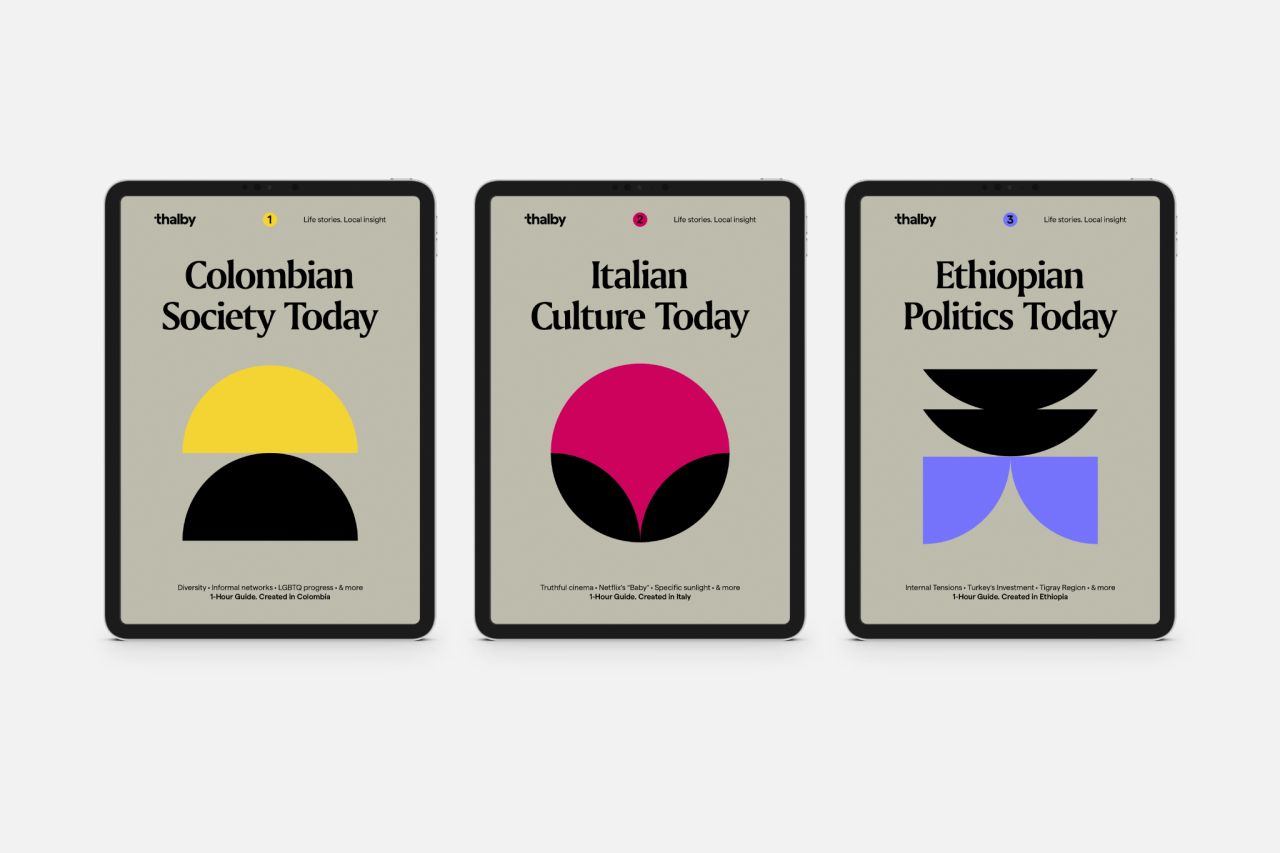
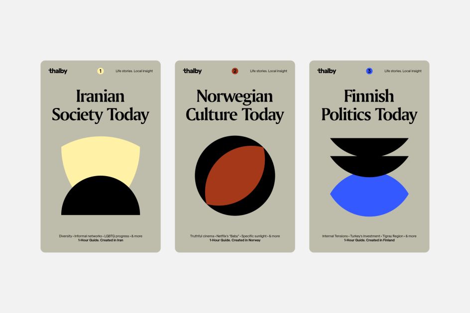
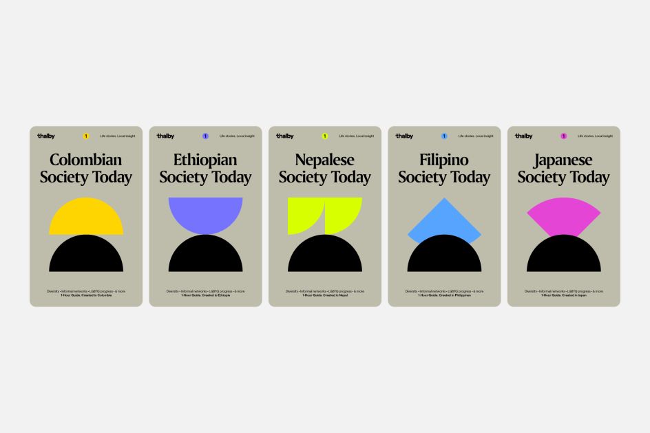
Each country that Thalby covers has its evidence-based guides split into three volumes, one for Society, one for Culture, and one for politics. This meant there was a vast number of designs to be created, and they all had to look and feel like part of a greater whole – no easy feat.
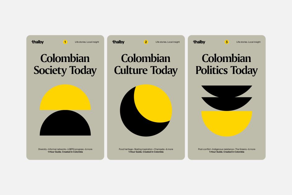
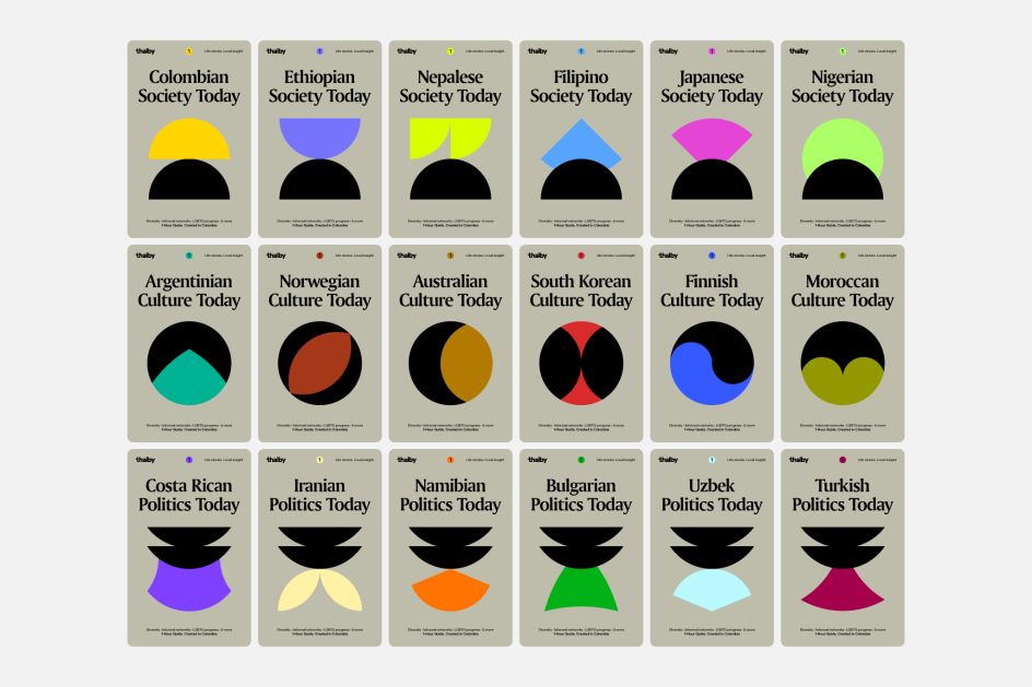
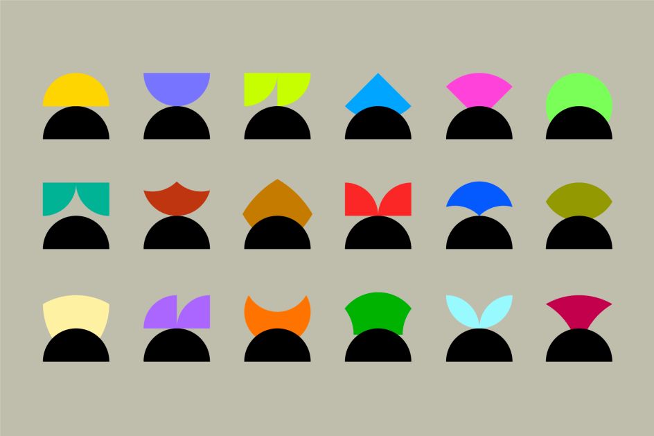
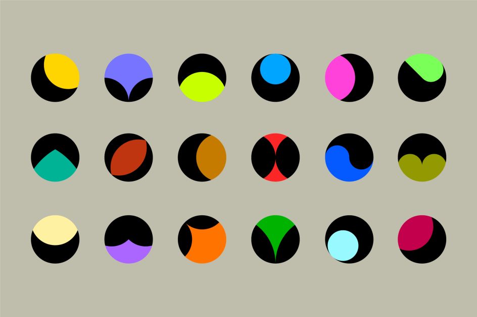
"The need to categorise these guides yet keep cohesion across the Thalby catalogue led us to create a system of illustrations derived from the pin-dot concept, all created from circles," adds Hey Studio. "Overlapping, cropping and merging the circles gave us the opportunity to be playful along the process. Resulting in a wide library of different illustrations that could be assigned to the guide covers, no matter the country."
It's a deceptively simple but highly effective idea. By breaking down circles into segments, altering their colours and rotating their positions, Hey Studio had created a bold brand that will pull all of the different Thalby subdivisions together.
"This recognisable look of the covers, combining the Roman-inspired typography and the bold abstract illustration, is what we were aiming for since the beginning of the project - to stand out and not rely on the clichés of the travel guides universe."
Editor's Picks


Trending


Podcasts


Editor's Picks
Further Reading