&Walsh's clean and nature-inspired identity for the world's most advanced designer proteins
Jessica Walsh and her team have crafted a fresh new identity for Geltor, an "earth-conscious" biodesign company that's behind the world's most advanced designer proteins. Taking inspiration from nature, the brand refresh hopes to give the impression of "humanness, warmth and innovation", as &Walsh describes it.
Geltor approached Jessica Walsh's creative agency earlier this year with a brief to create a new brand that would "fully capture the uniqueness of its products and the possibilities of its ingredients as a service offering".
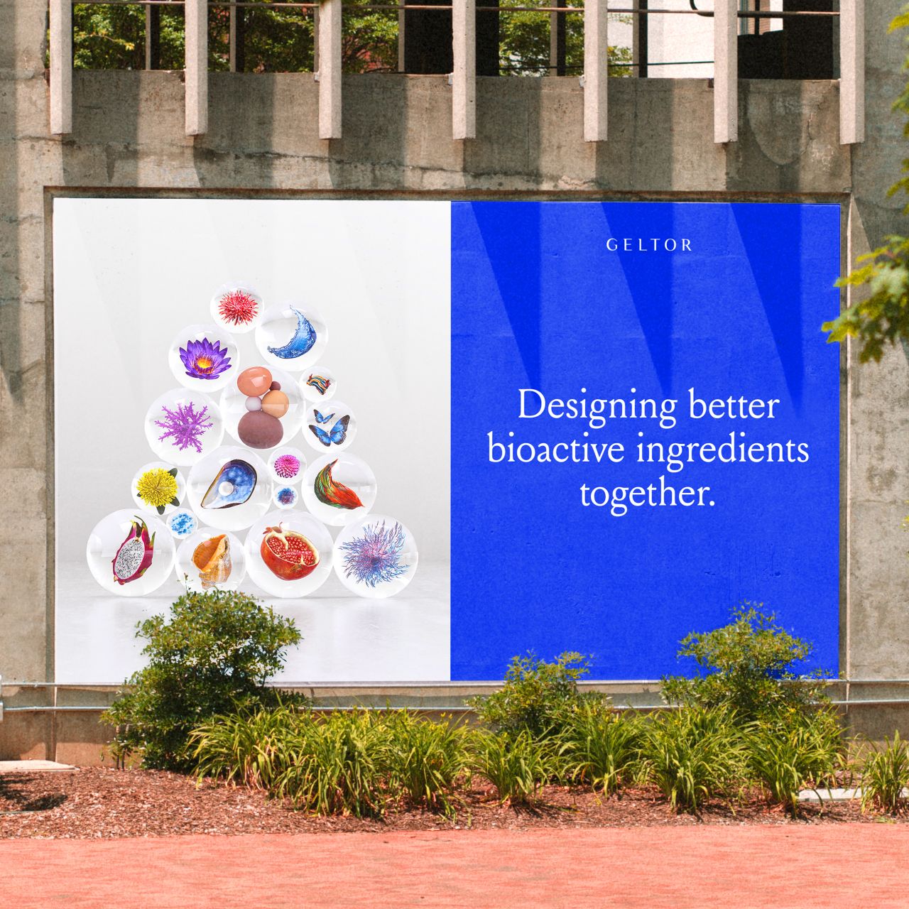
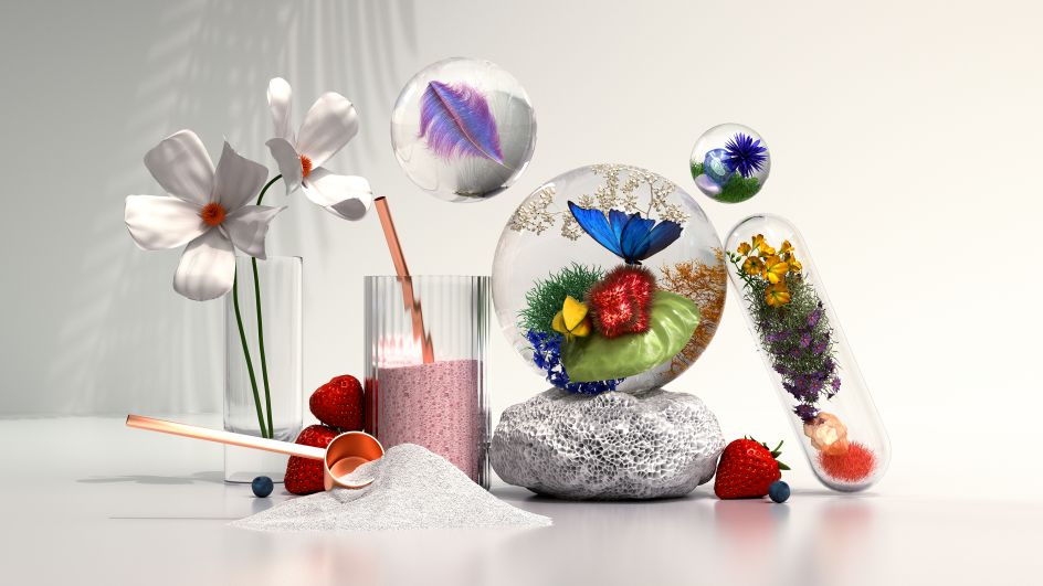
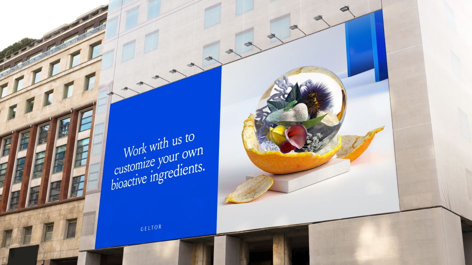
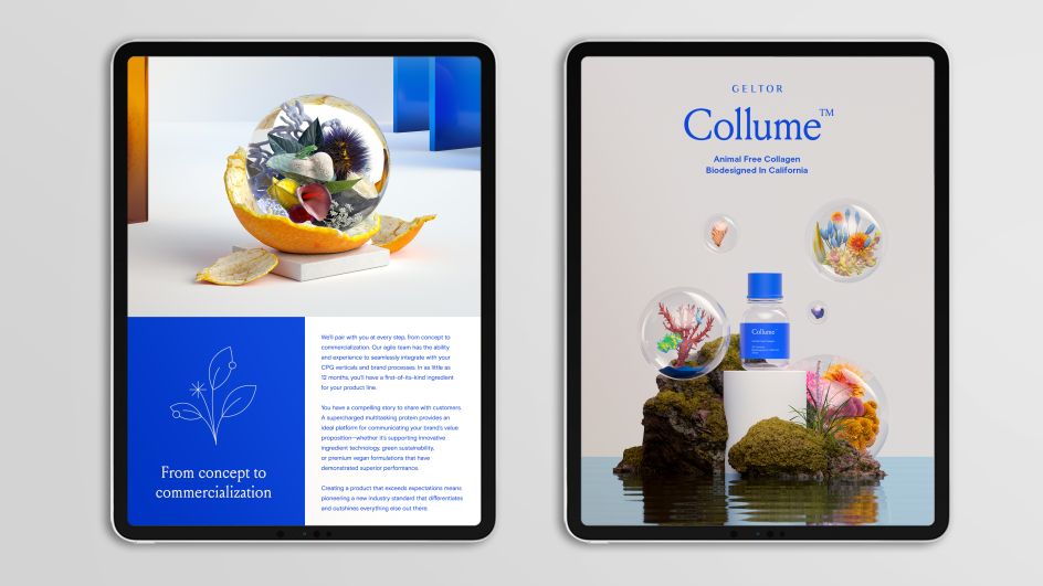
&Walsh was asked to keep its existing logo and develop a visual language around it – such as the typefaces, colour system, illustration, and imagery – all centred around a series of 3D images that explore the beauty and lively habitats of each protein origin and its cellular inspiration.
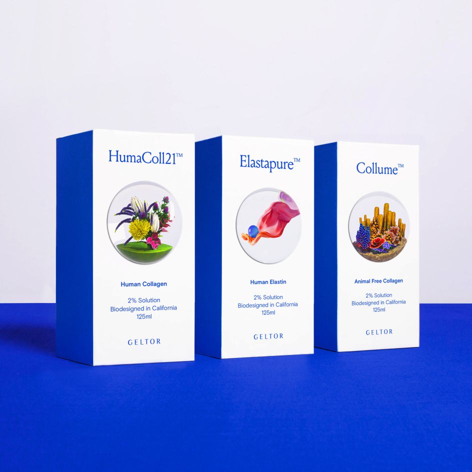
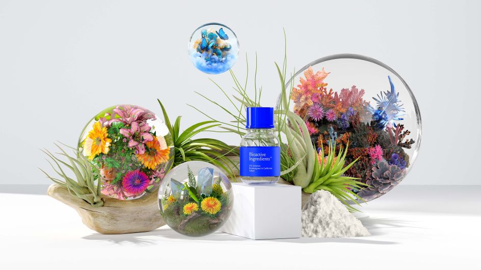
"We took inspiration from the shapes and groupings of cells to create the otherworldly orbs while highlighting scenes from the tree of life within them," explains the agency. "The vivid hues and natural elements within provide realism and freshness throughout the branding, while the orbs themselves provide a surreal view of each individual protein. Our goal was to provoke the imagination, similar to the way Geltor engages its clients."
In addition to its range of products and innovations, Geltor is often considered to be a thought-leader within the biodesign sector. As such, to make its processes and thought pieces more approachable, &Walsh developed a bespoke illustration and iconography set. "We leveraged clean line styles to bring simplicity and ease to rather complex information," it adds.
On creating such a fresh, nature-inspired identity following lockdowns and restrictions for so long, Jessica Walsh admits it was a feel-good project: "The beauty from nature is endlessly mesmerising. However, when it shows up in branding or advertising, it's often used in a really cheesy way. We challenged ourselves to include inspiration from nature in this branding in a way that felt fresh, new, and ownable."
In terms of typefaces, Geltor previously used Brasley and Luxia in its identity. For the rebrand, &Walsh switched the primary typeface to Louize: "It's a serif font that gives the brand a warm, human feel," says Jessica. "It is mainly used for titles and headlines. Geltor's secondary typeface used for body copy and subtitles is Basic Grotesque Pro. It's a clean sans serif used to communicate complex information in a digestible way."
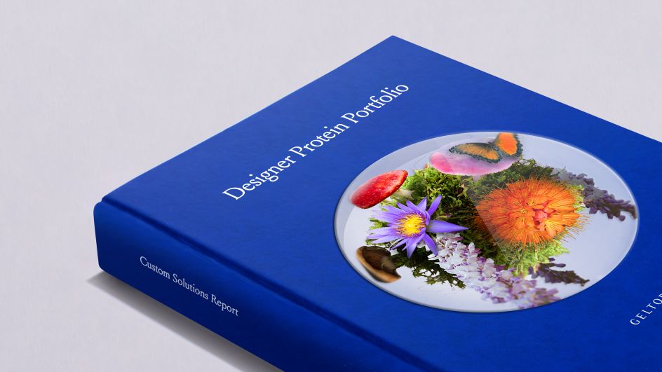
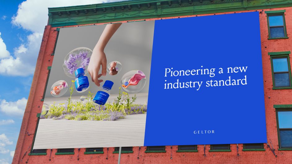
Looking at the brand's colours, &Walsh chose a bright blue, moving on from Geltor's original palette which used various subdued shades of blue. "Given that there was so much colour being used within the photo illustrations, we decided to scale back the branded colour to a single brighter blue that complemented the imagery," says Jessica. "The advantage of honing in on a single colour for branding is that you can really own it and become known for it much easier."
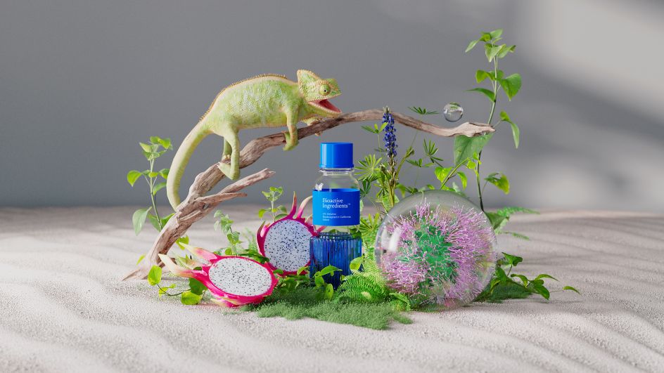
"Most branding in the biodesign and science fields are cold and impersonal," Jessica adds. "Picture stock imagery of scientists in white lab coats in sterile environments, this is the type of imagery typically used in these fields. We wanted our imagery to nod to science, while also feeling more warm and human. We did this by spending a lot of time on the craft of each image. We created photo illustrations that merge inspiration from biodesign, science, nature and art.
"Various orbs represent different products from Geltor and their benefits, or elements from nature that inspired the creation of the proteins. While their proteins are completely animal-free, they take inspiration from the tree of life: nature, marine life, animals, etc. We wanted our visual worlds to celebrate the inspiration behind each product, and the custom ingredients that they create with their clients."
Editor's Picks


Trending


Podcasts


Editor's Picks
Further Reading