Design Bridge gives a hot dog shop a frankly fresh identity covered in sauce
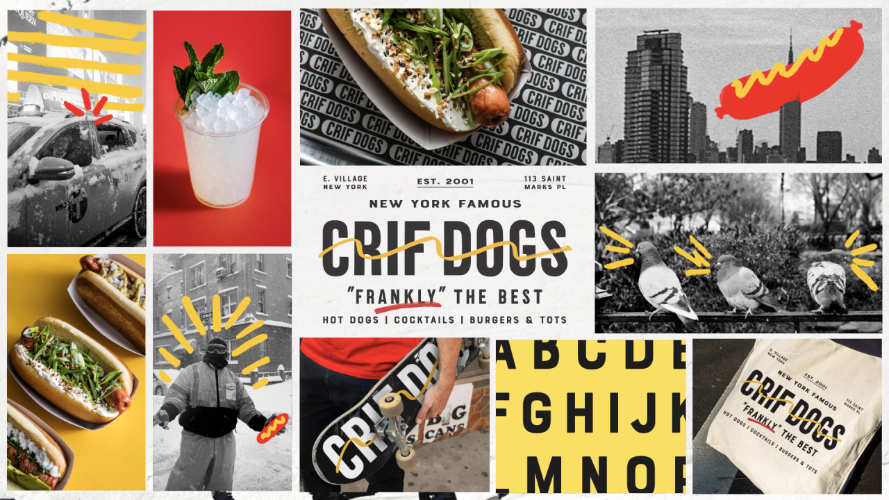
Design Bridge in New York has had some serious fun with its newly designed identity for a beloved hot dog spot and iconic Manhattan institution, Crif Dogs. Featuring doodles in ketchup red and mustard yellow, it's a visual overhaul that adds lots of experimental play across the brand.
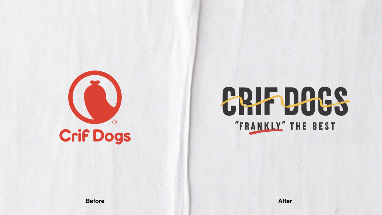
Founded in 2001, the previous identity for Crif Dogs relied too much on "easy, immature humour" and the physical space was in need of a refresh. Managing Director Jeff Bell recently purchased the business after working for PDT and Crif Dogs for over a decade and approached Design Bridge to update the brand to reflect the true identity of the business: "an iconic NYC hot dog shop, that frankly makes the best dogs in the city".
From the logo to the full interior design, and everything in between, Crif Dogs now has a new look that aims to retain and grow its audience. "They went deeper than I thought would even be necessary to understand the DNA of the brand to reimagine it, but still remaining true to its New York City roots," says Jeff. "I provided too much info and they were able to mine the important gems. Our new branding is perfectly on brand, but in no way that I ever could've imagined."
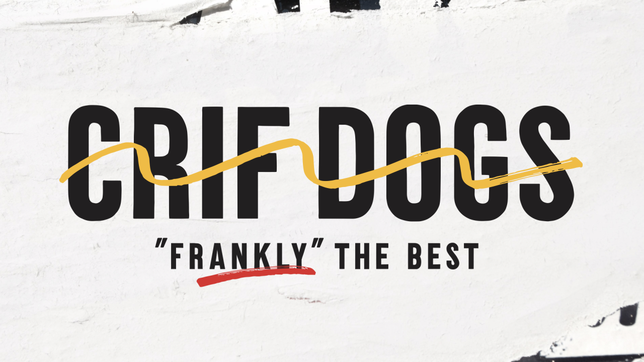
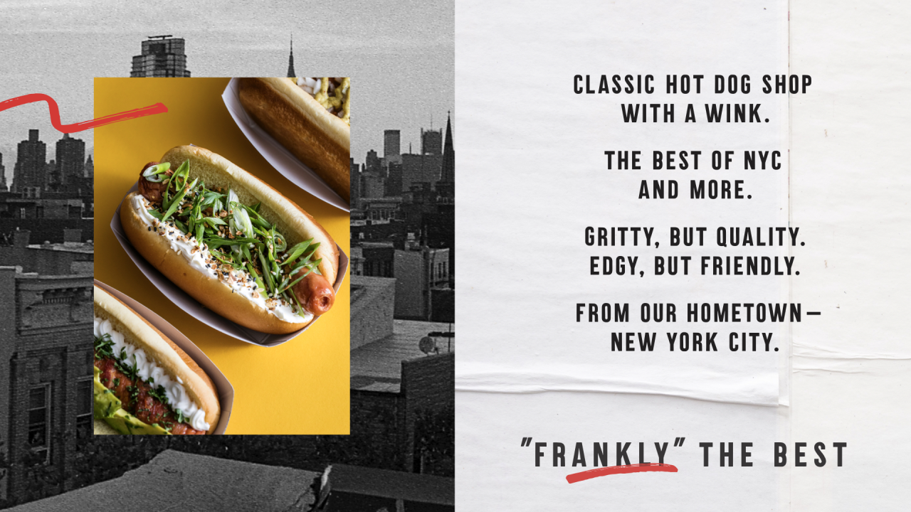
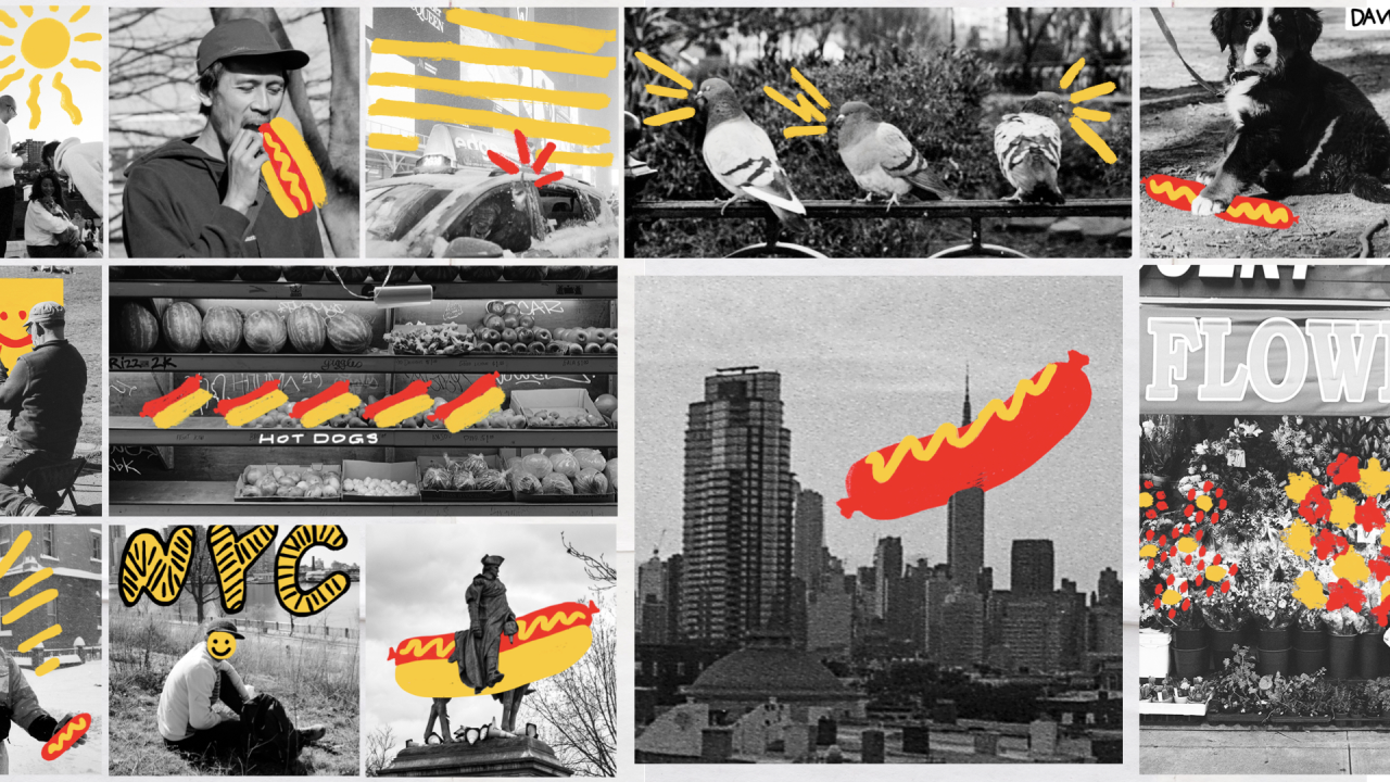
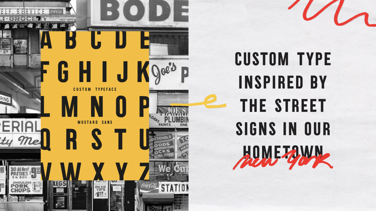
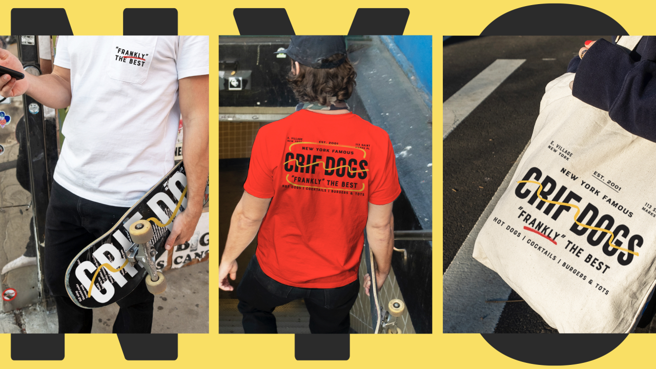
According to Design Bridge, Crif Dogs was looking "immature, tasteless and dated", particularly when you knew it was the gateway to Please Don't Tell, one of New York's coolest bars and a popular speakeasy. The agency created a new logo, signage and merchandise along with a visual language featuring evocative street photography that captures the fun and "never sleeps" spirit of NYC. Imagery is overlaid with playful doodles in mustard yellow and ketchup red, implying a "DIY street artist vibe as a wider metaphor for the way the city works: never finished, always in a state of play," as Design Bridge puts it.
"We wanted to create a brand identity that employees and customers could have fun with," says Design Director Marlee Bruning. "Our simple black and white logo is just the starting point – it's the ketchup and mustard doodles that bring the brand to life and keep it constantly changing and relevant. The doodle system also works tactically in the kitchen – orders can be circled on menus, names written on hot dog bags, etc. The result is a cohesive yet dynamic brand that feels classic, but always with a wink."
"By expressing the brand's spirit in a grown-up style, we've successfully revived a New York institution and helped Crif Dogs reclaim its iconic status," adds Creative Director Mike Perry.
Editor's Picks





Trending






Latest Jobs
Graphic & Motion Designer at The SHARP Agency
Full-time·Leeds·£26k–£33k
Junior Project Coordinator at Colorido Studios
Full-time·Twickenham·£28k–£32k
Digital Marketing Executive at Arise
Full-time·Sheffield·From £23,750
Senior Graphic Designer at MoMA Retail
Full-time·New York·$72k-$80k
Senior Brand Designer at Analogue
Full-time·Leeds·£38k-£45k
Head of Technical & Facilities at Midlands Arts Centre
Full-time·Birmingham·£40,210