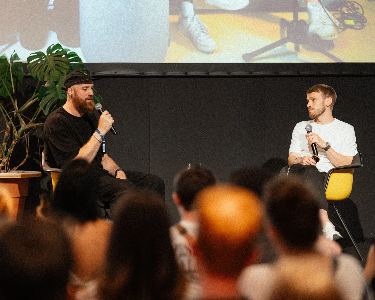
Sofia Pusa's brand refresh for a Finland photography agency is inspired by the crucial F-stop
In her brand refresh for a photography agency based in Helsinki, Sofia Pusa went back to the basics of photography and the concept of the F-stop, crafting a visual language that considers why light is always needed to capture the perfect picture.
The independent creative director, designer and illustrator is a branding specialist with her work winning multiple awards since she graduated in graphic design from the Lahti Institute of Design. Based in London and Helsinki, she was approached by Fotonokka earlier last year to help refresh its identity and website. The photography agency represents a curated mix of rising stars and established names and needed a rebrand that would "highlight their diverse roster of talents while still positioning the agency as a more premium, international brand," Sofia explains.
"At the beginning of the design process, I started immersing myself in technical and scientific details of photography. How does a lens refract light? What colours are there in the electromagnetic spectrum? What happens inside the camera when we take a picture? It brought me back to the fundamentals of photography and the F-stop," she says. "It's quite simple: No light. No picture. It's like trying to see into a dark room. In photography, the process is a bit similar: you need to let the light into your picture to exist, and how that light gets into your camera will determine your final result. The lens aperture works like a window, and the aperture is represented by the letter ƒ followed by some number."
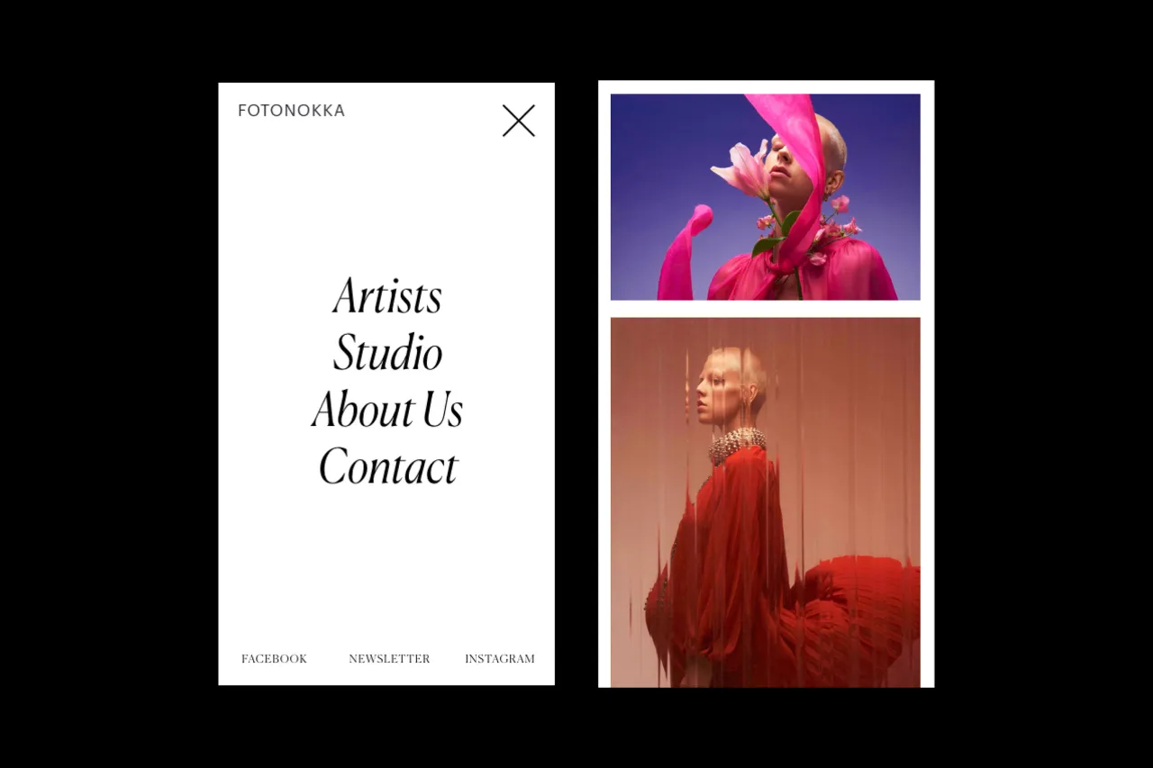
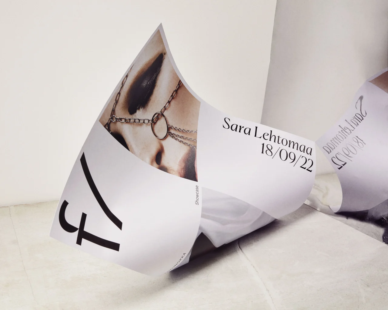
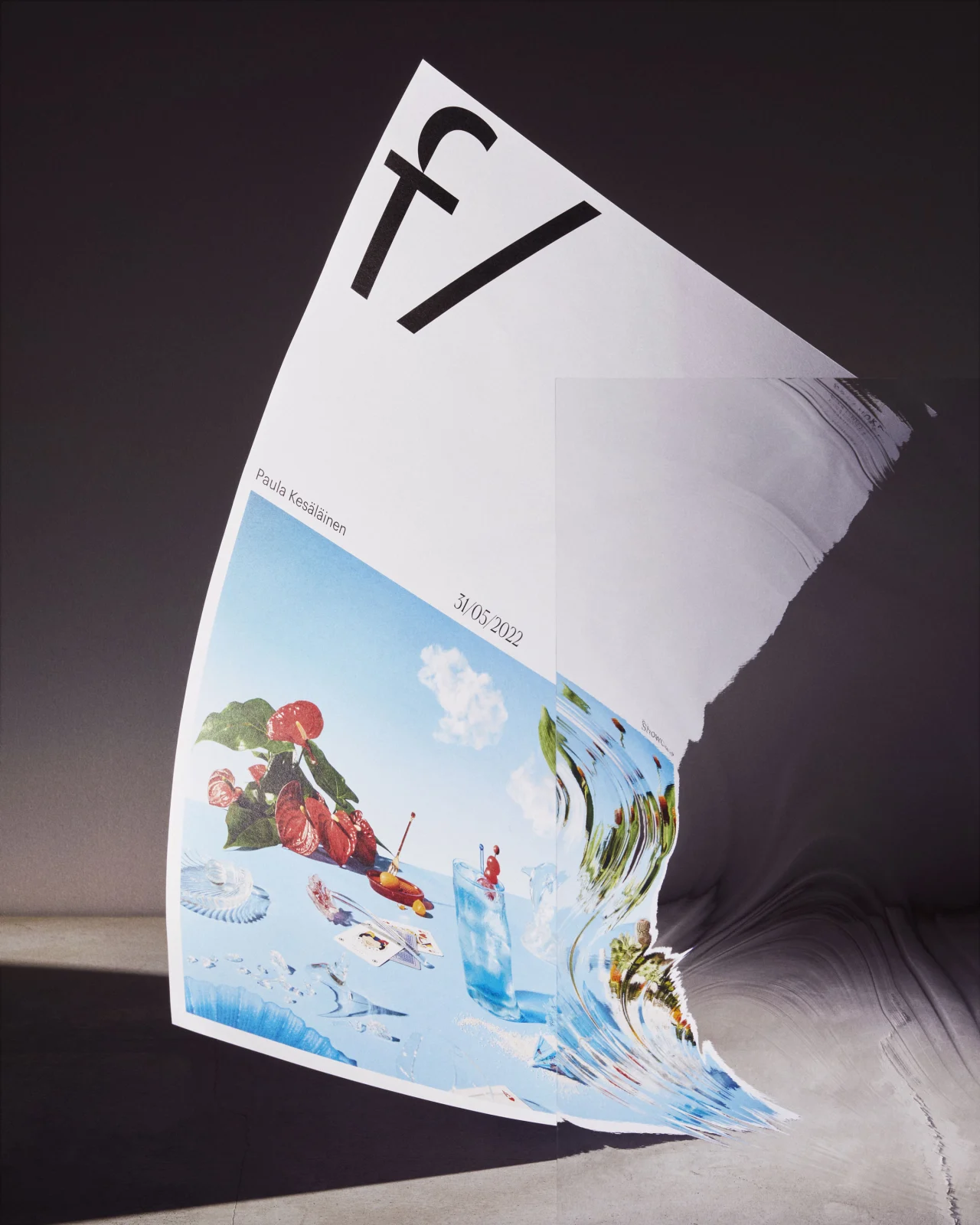
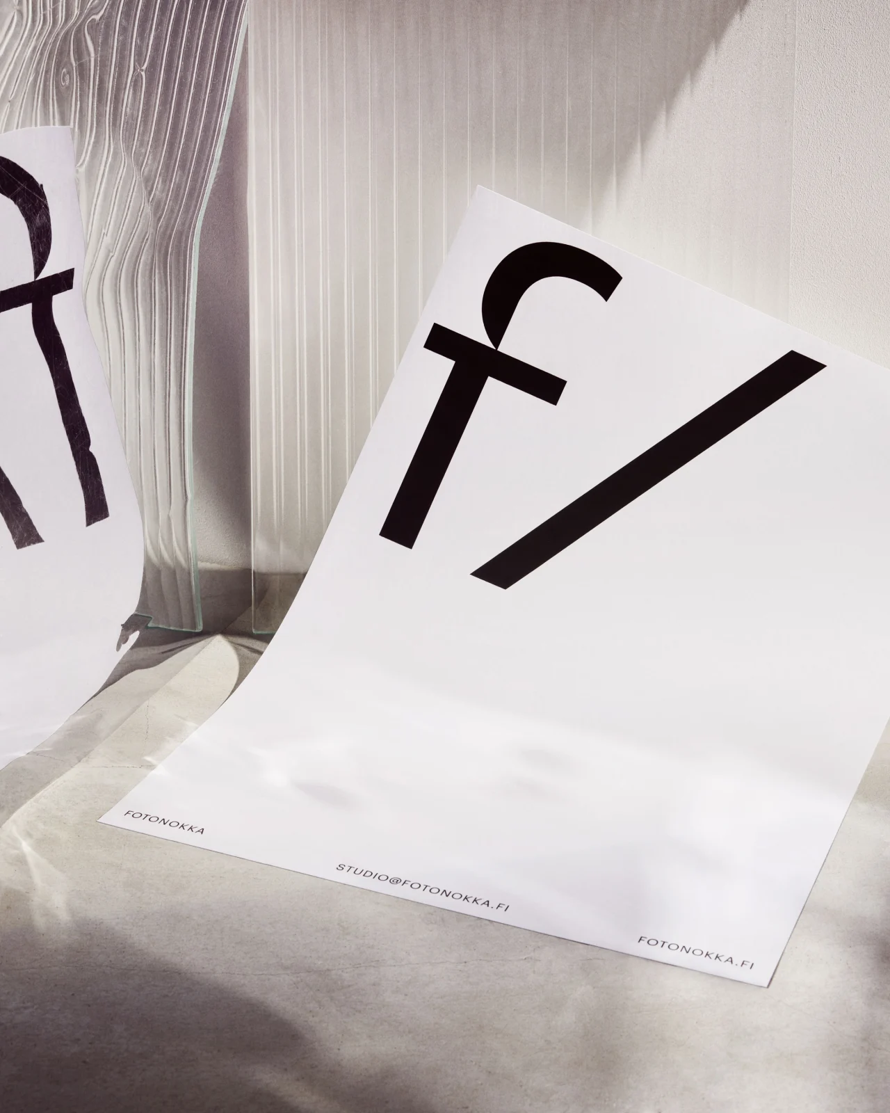
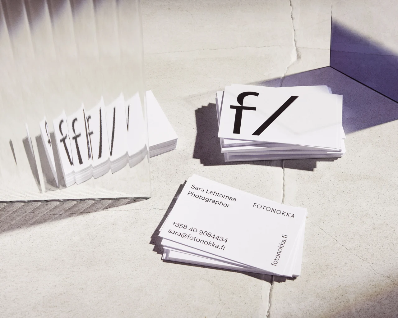
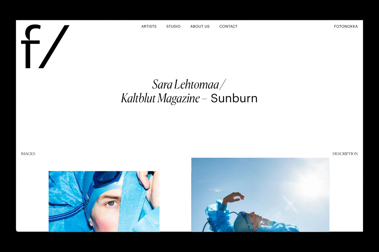
As such, the final identity captures the concept of F-stop in a bold, contemporary wordmark that is a metaphor for the process of creating a photo and illuminating your ideas with visual storytelling. The design of the letter 'f' is inspired by the shape of the aperture blades inside a camera lens.
"By using this simple symbol of F-stop, I was able to capture many complex ideas into one powerful brand mark," Sofia continues. "The letter 'f' followed by slash has a double meaning standing not only for F-stop but also Fotonokka's role as an umbrella brand representing a diverse roster of artists."
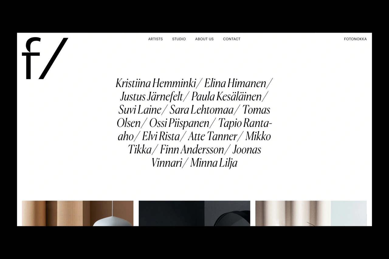
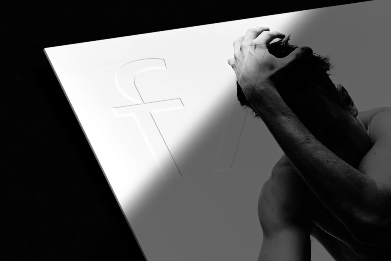
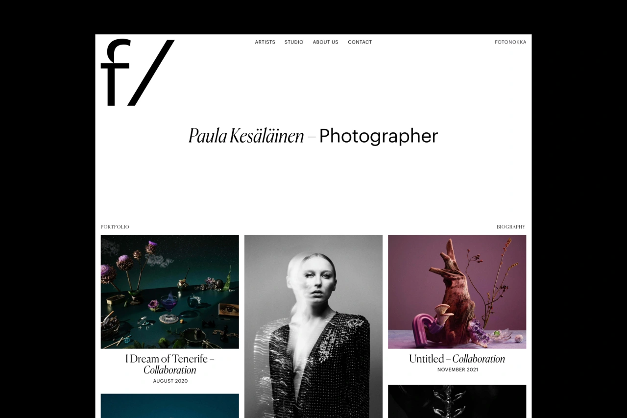
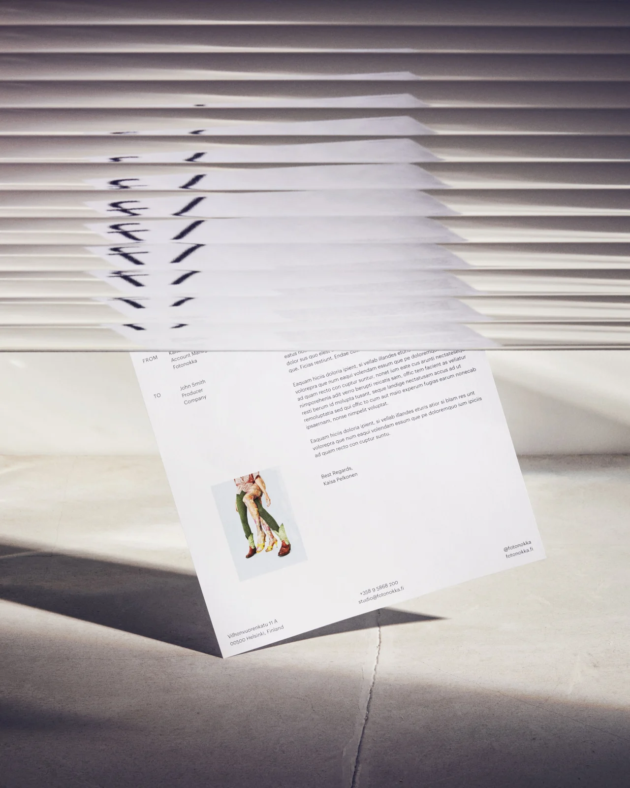
The final identity is recognisable but subtle enough to act as a backdrop for their creative talents' work. The unapologetic logo is complemented by a minimal colour palette and elegant and refined typography that put the talent at the forefront.
Credit for all creative direction and motion graphics goes to Sofia with still life photography by Paula Kesäläinen, web development by Oscar Goméz, and featured typefaces are Canela and Graphik by Commercial Type. Discover more of Sofia's work at www.sofiapusa.com.
Editor's Picks





Trending






Latest Jobs
Senior Copywriter at Human After All
Full-time·London·£48k–£66k
Head of design at Cog Design
Full-time·London·£55K
Senior Digital Designer at 3800
Full-time·Sheffield·£40k-60k
Brand Copywriter at Origin
Full-time·Porthleven, Cornwall·£35k–£40k
Art Director at The New York Times
Full-time·New York·$120k–$130k
Senior Designer at Jubba
Full-time·London·£50k-£60k