Classic and modern pop art forms the inspiration behind Studio Koto's rebrand for Yellowpop
Global home décor brand Yellowpop has a bold new look thanks to London creative agency Studio Koto. Counting a new logo, typeface and signature colour scheme amongst the company's refresh, the overhaul is striking and upbeat, featuring visual references to classic and modern pop art and culture.
Yellowpop approached Studio Koto last year, briefing the London studio to create a new identity representing its core creativity and self-expression missions. The task was to strengthen its positioning as a home décor brand as it plans to expand its product offerings this year.
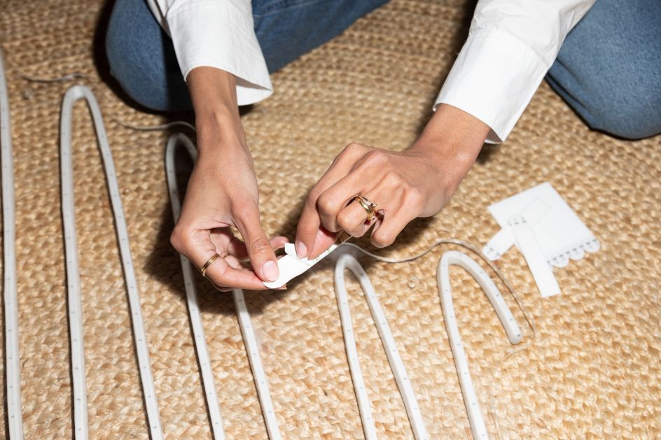
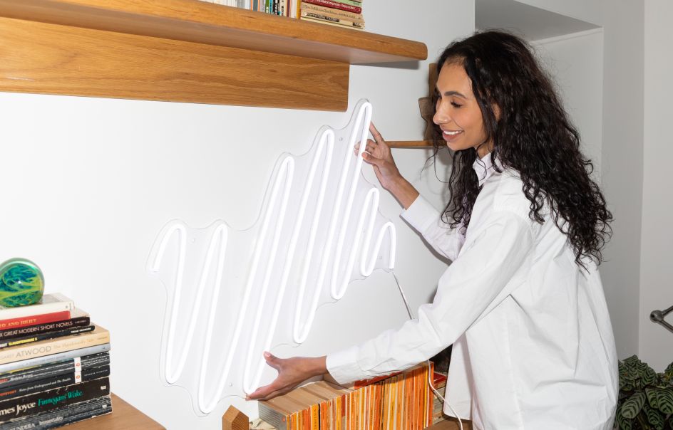
A driving force in the neon art resurgence, Yellowpop has collaborated with world-renowned artists and designers including Jonathan Adler, Bobby Berk, Keith Haring Studio, Sarah Bahbah, André Saraiva, Susan Alexandra and Gregory Siff thus far. Last year, it closed a $4 million Series A funding, allowing the brand to build on its success and expand its global reach and product offerings.
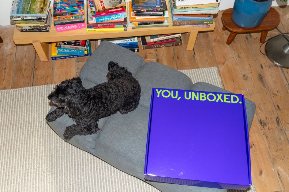
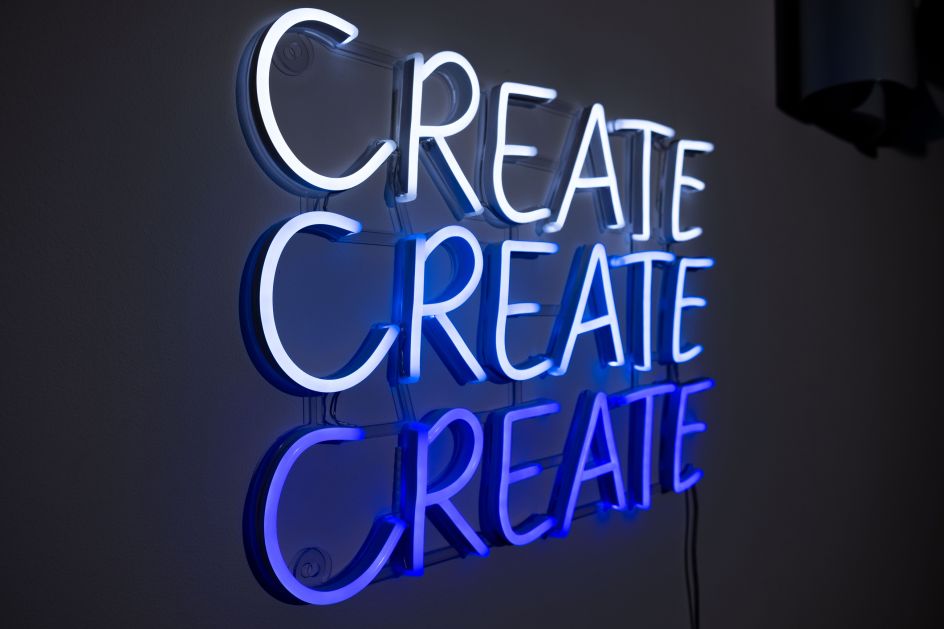
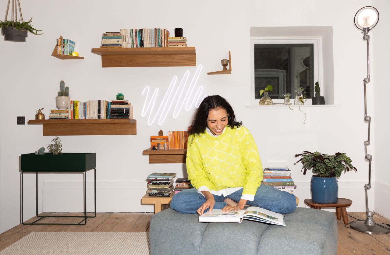
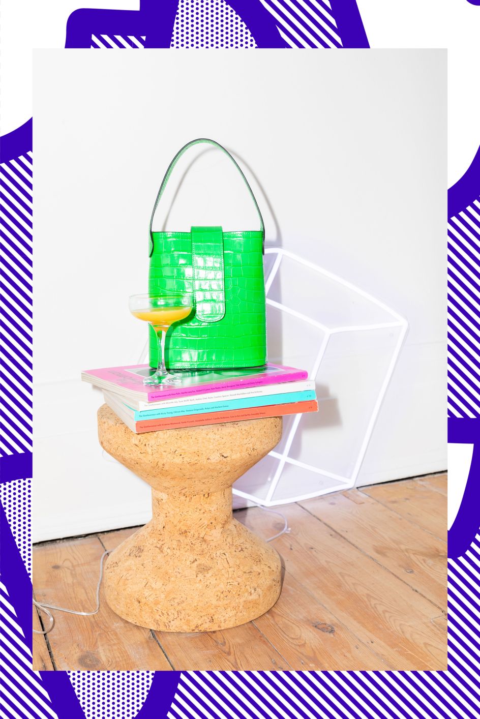
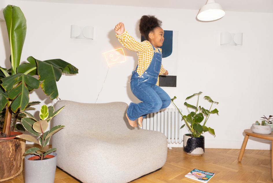
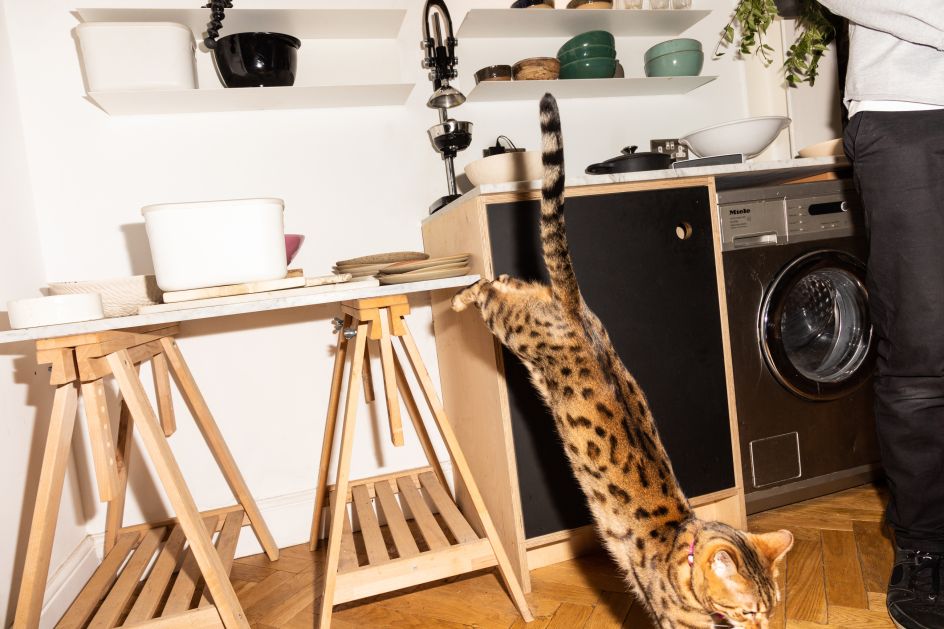
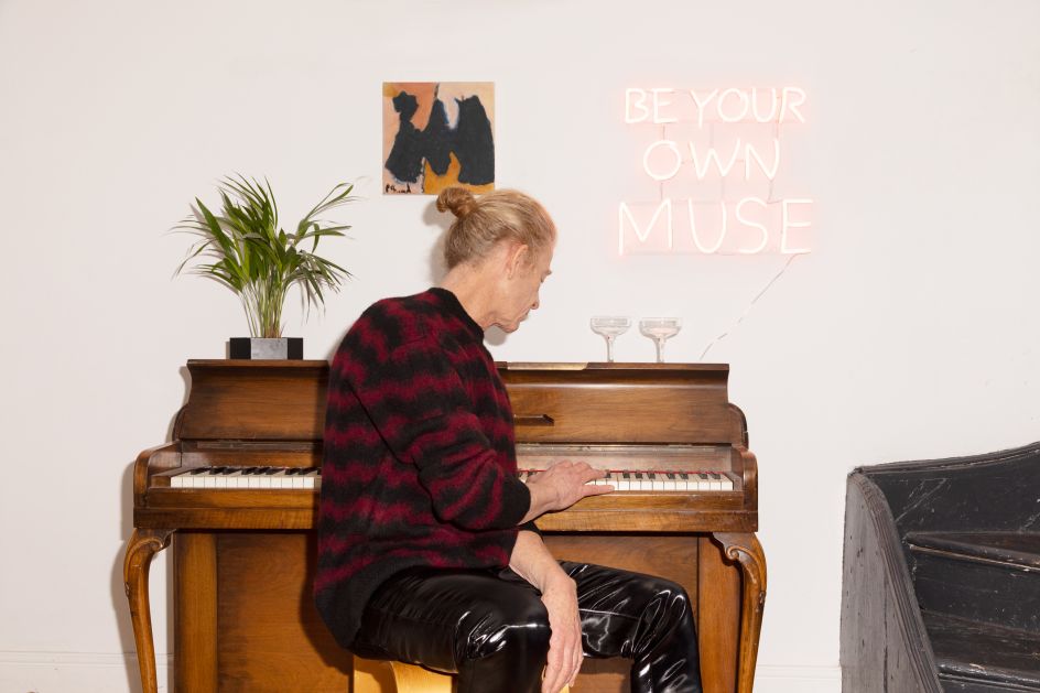
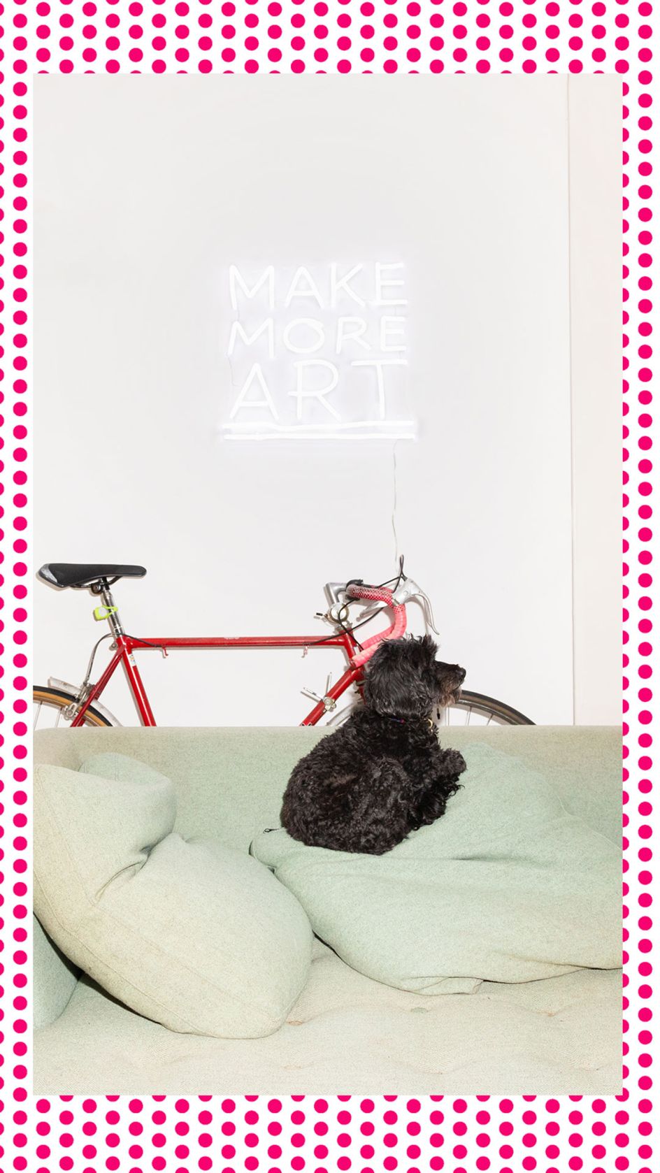
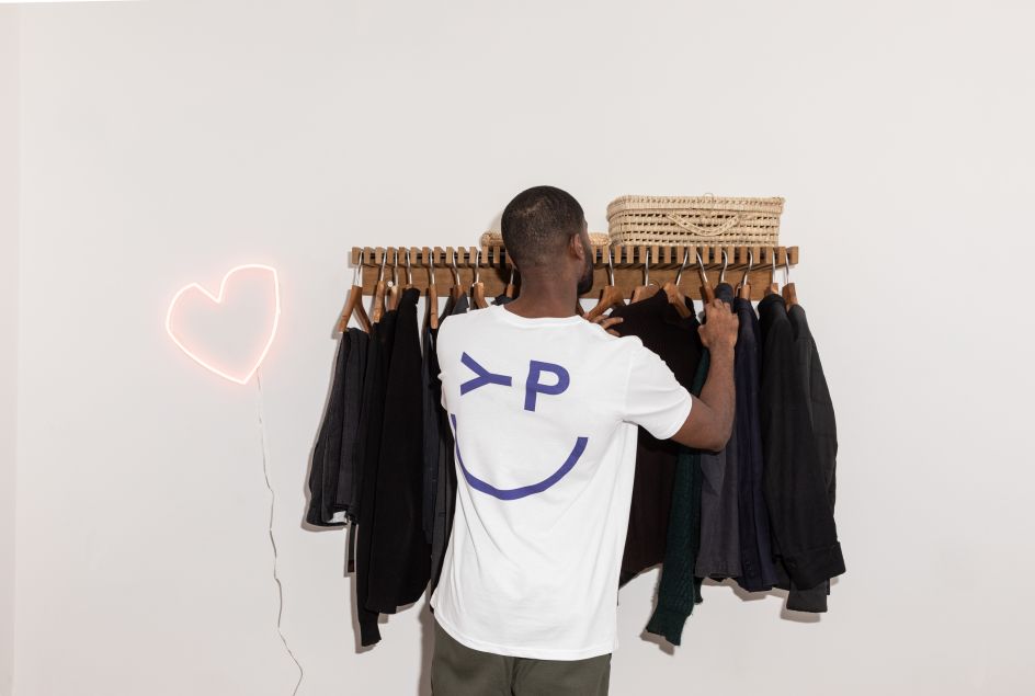
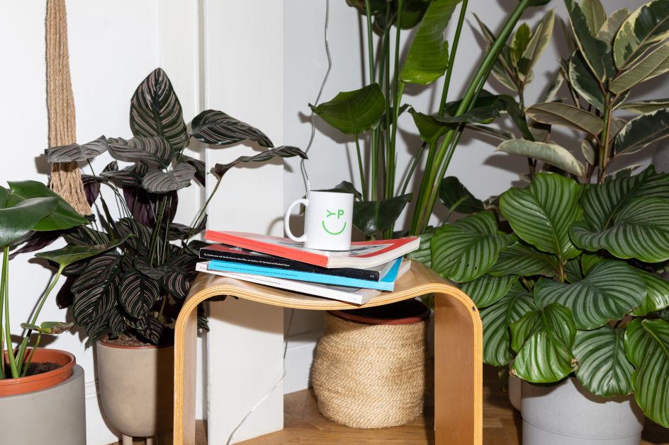
Koto was very much inspired by its impressive roaster of collaborating artists, with visual cues throughout pointing to its creative spirit. Graphic elements, such as spotted and striped patterns and bold contrasting colours, take the brand's name literally to create "visuals that pop". Koto also re-vamped Yellowpop's photo imagery, which now features products in "authentic and dynamic scenes" representing real, lived-in homes but with a playful touch.
"We immersed ourselves in the world of interiors and homewares so that we could confidently create clear space for Yellowpop to stand out in its category," Koto tells Creative Boom. "We collaborated with them to create a brand that focuses on self-expression and celebrate that in all its forms. The brand centres around the belief that ultimately we all are creative – only most of us don't know it. So the purpose of Yellowpop is to spark that creativity. The brand was inspired by classic and contemporary pop art, arguably one of the most accessible art forms. It mirrors Yellowpop's mission to produce affordable neon art and beyond. We loved working with Yellowpop to create a brand that matches its ambition."
On the rebrand, Yellowpop co-founders Jeremy Cortial and Ruben Grigri say: "This new branding is a perfect illustration of who Yellowpop really is. We are on a mission to spark creativity and push people to create spaces that make them feel good. 2022 will be a very exciting year for Yellowpop to support this new brand. We are launching new products and will continue to collaborate with amazing artists and creatives around the world."
Alongside the rebrand, Yellowpop launches its latest collection of original neon designs. Titled Playroom, it's inspired by "unapologetic playfulness" and nostalgia for the "endless creativity of childhood". Later this year, the brand will also introduce a new set of products for the home.
Editor's Picks


Trending


Podcasts


Editor's Picks
Further Reading