Supple Studio takes Gradcore rebrand in new direction with a bespoke typeface by FontFabric
Bath's Supple Studio has given early talent and graduate employability specialists Gradcore a new identity based on journeys and pathways.
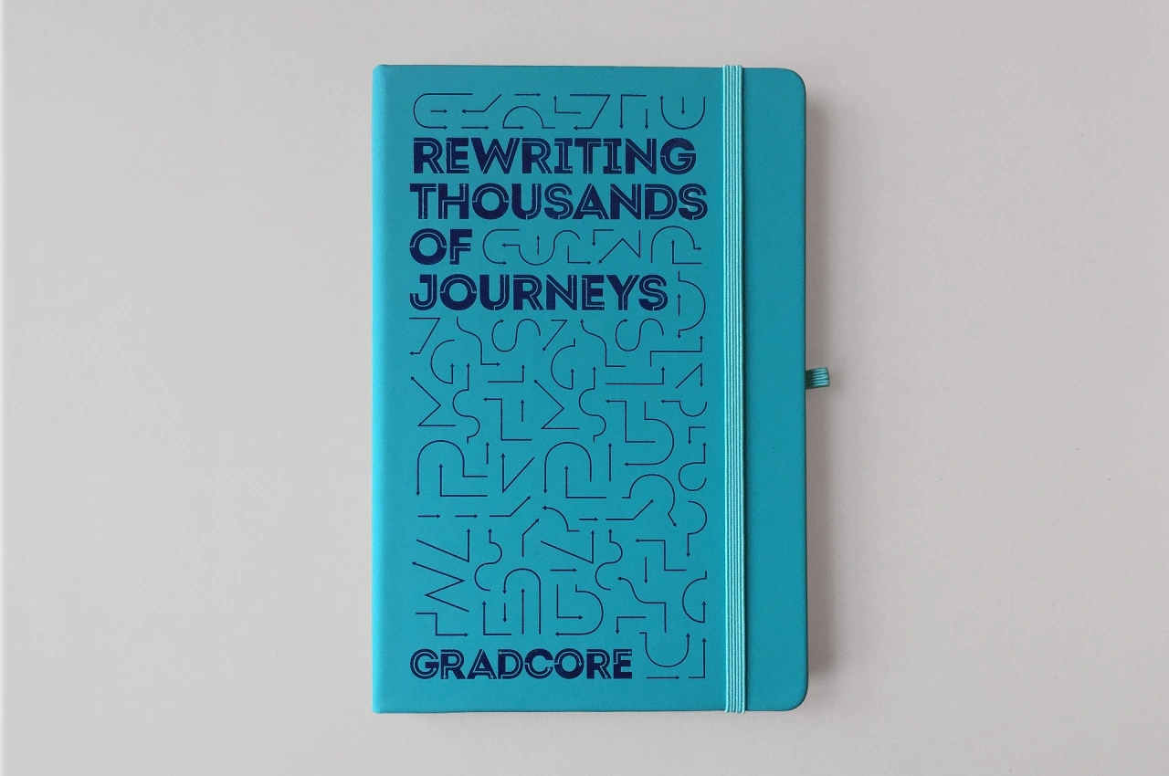
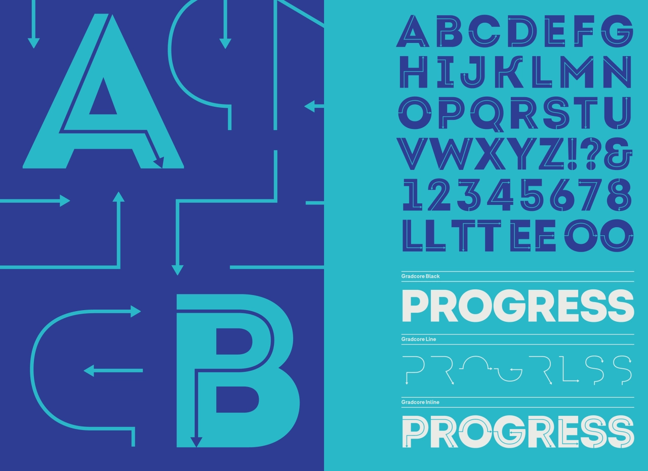
It centres around a bespoke typeface, designed in collaboration with typeface designers FontFabric in Bulgaria. The studio's Design Director Phil Skinner tells us more; "Gradcore came to us as they felt its brand was dated and lacked the energy it brings to the graduate employability and early talent sectors.
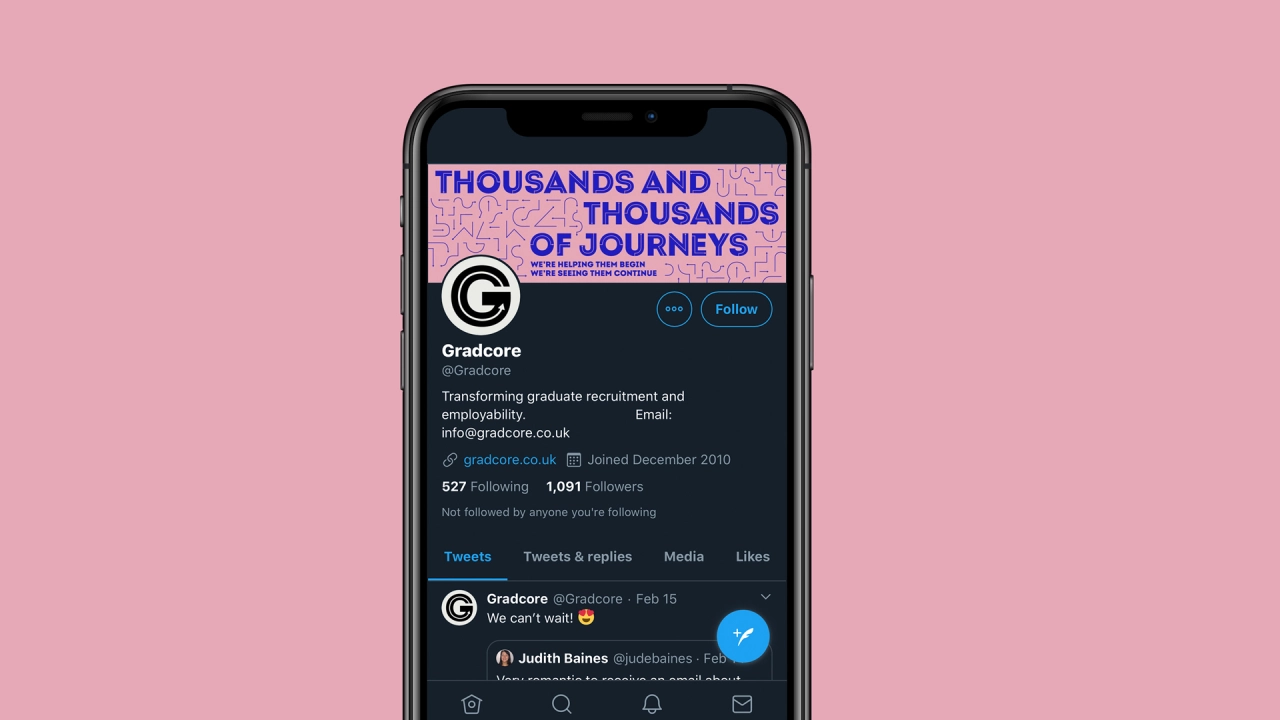
"It had already worked with a writer/strategist to put together the positioning, 'Thousands and thousands of journeys. We're helping them begin. We're seeing them continue', and wanted us to bring this new message to life. Gradcore is uniquely positioned – intersecting with graduates, employers and universities together. So the new identity needed to appeal to all three audiences."
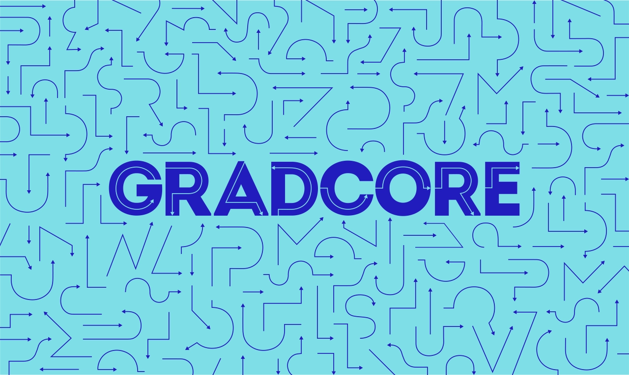
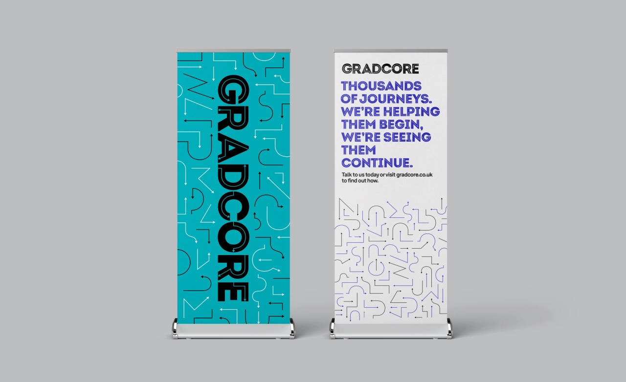
That solution is based on arrows and pathways as a "shorthand" for journeys. To make the identity easy to rollout for Gradcore, Supple worked with FontFabric to create a bespoke version of their typeface Intro Inline. Jamie Ellul of Supple explains: "We took Intro Inline and worked with the creators FontFabric to tweak some of the letterforms before creating a bespoke arrow inline that makes the font unique. FontFabric then split the typeface into three – a solid, inline and solid with inline – which means we can create interesting colour combinations and layered typography very easily."
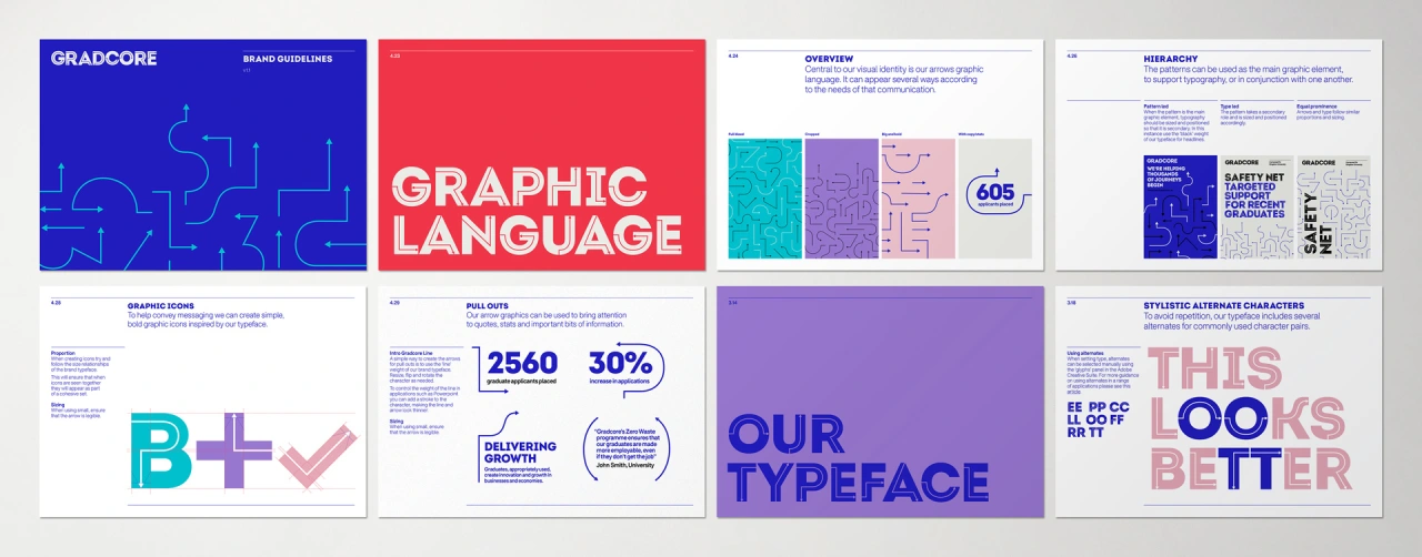
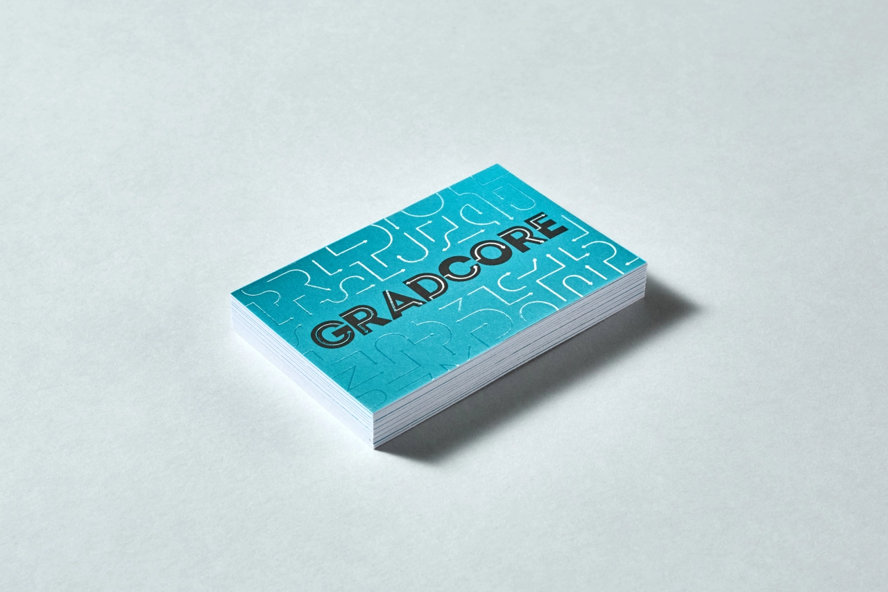
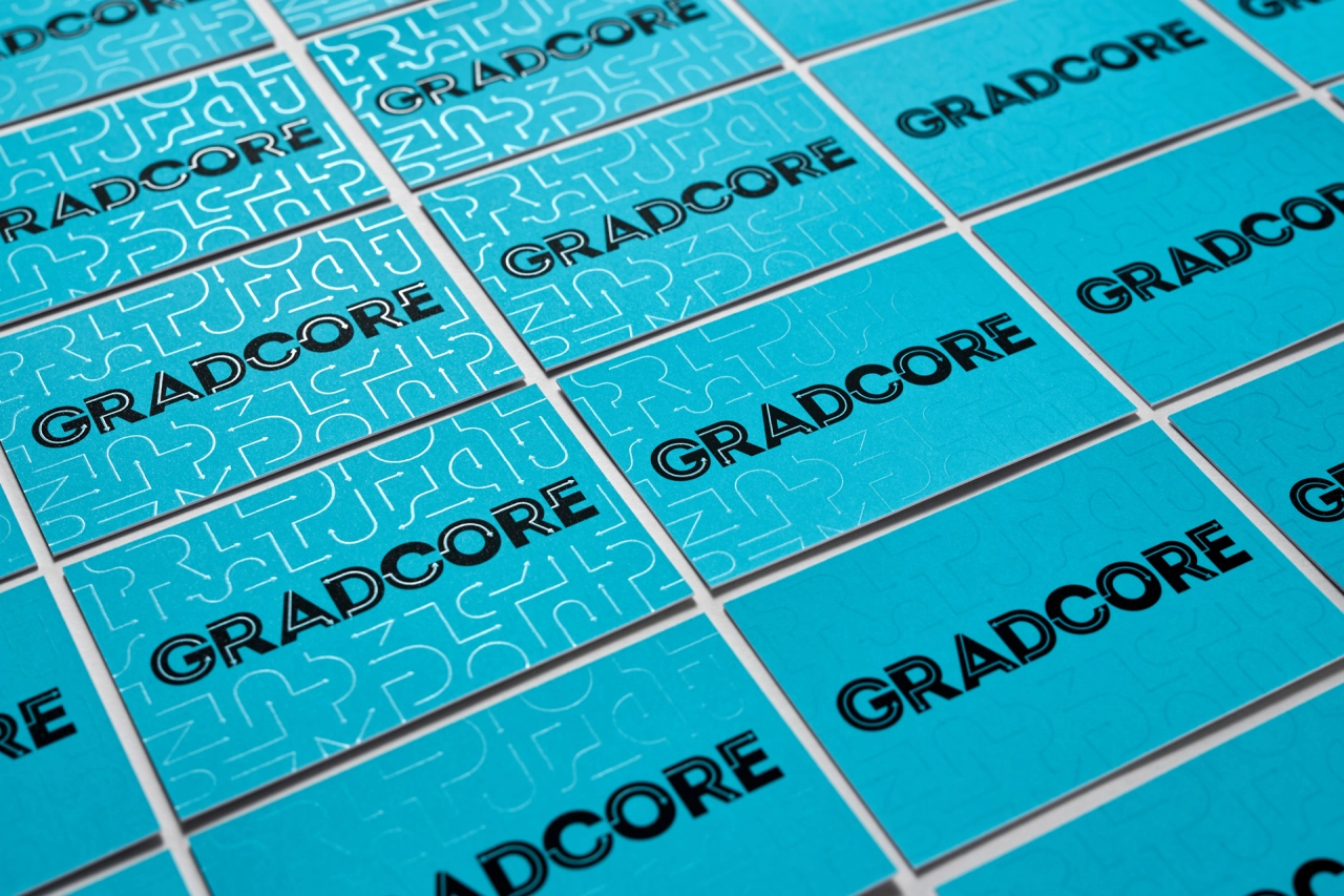
Supple's new identity has been rolled out into full guidelines, stationery, print materials for events, animations and a new website designed and built by digital agency Mud.
"The new brand identity is built to flex to suit different audiences – so some iterations use more pattern and bold colour, while others are purely typographic. Gradcore has been very brave with the rollout of the identity, forgoing the usual photography of students that their competition favour. The result is a very graphic look which makes them stand out from the crowd." says Phil.

Editor's Picks





Trending






Latest Jobs
Talent Agent & Producer at The Jacky Winter Group
Full-time·Los Angeles·$70k-$85k
Digital and Marketing Manager at Manchester Art Gallery
Contract·Manchester·£38,126 pro rata
Senior Operations Manager at BIG Partnership
Full-time·Glasgow·£45k–£50k
Midweight Designer at All Purpose
Full-time·London·£30k–38k
Brand Designer at Adfin
Full-time·London·£30k–£50k
Midweight Full Stack Developer at Bureau for Visual Affairs
Full-time·London (Open to remote)·£35k–£50k