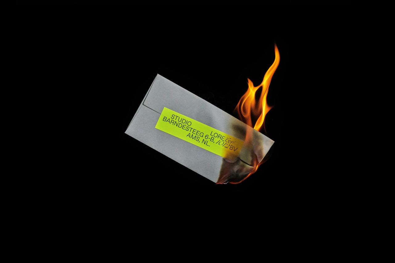
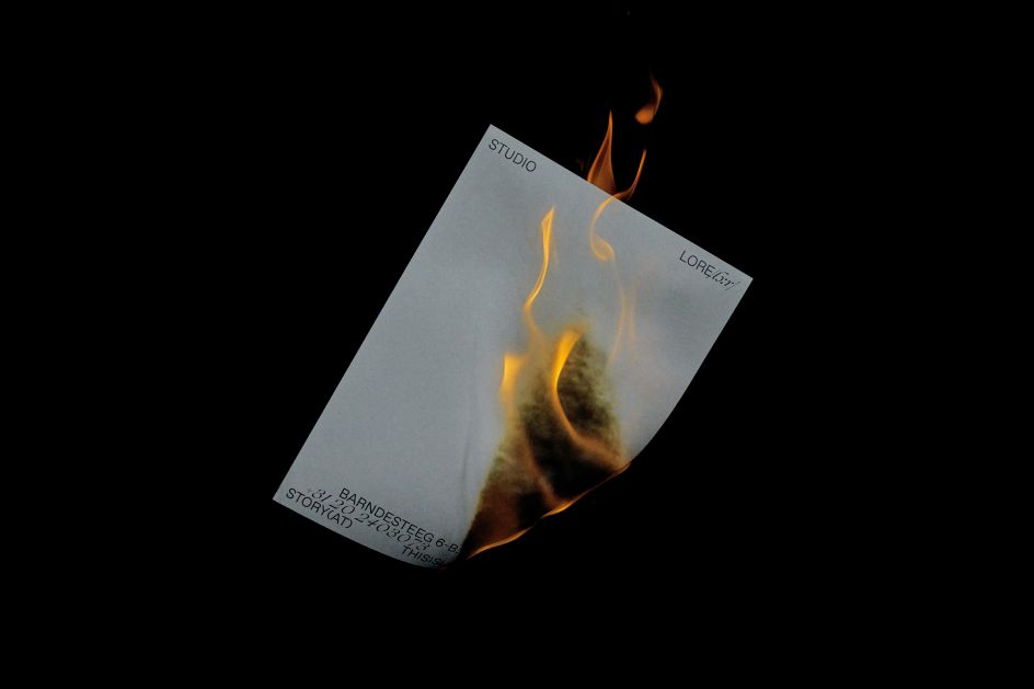
Branding that's literally so lit it's on fire
The unusually named AMATEUR(DOT)ROCKS is an Argentinean art direction and design duo, Jose Bessega and Ivo Pallucchini, who founded the agency in 2013 and since then have established themselves as leading creatives when it comes to working from innovative conceptual standpoints.
Their work not only looks great in its smart, detail-oriented aesthetic; but also emerges from an ethos that focuses on the idea of directly impacting culture and "stimulating critical debates about social issues," according to the studio.
Much of this is informed by the pair's global perspective, garnered from having lived and worked in several places across Latin America, Europe and the US. Though they're currently based in Amsterdam, Bessega and Pallucchini describe themselves as a "nomad duo".
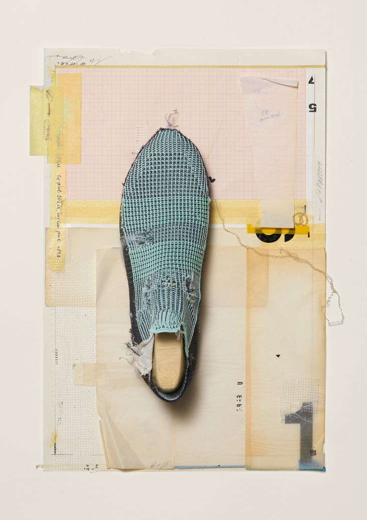
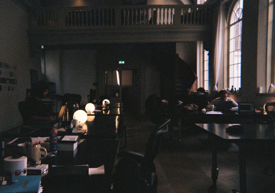
It was in Amsterdam, however, that this excellent work for local creative studio of artists and writers, Studio Lore, emerged.
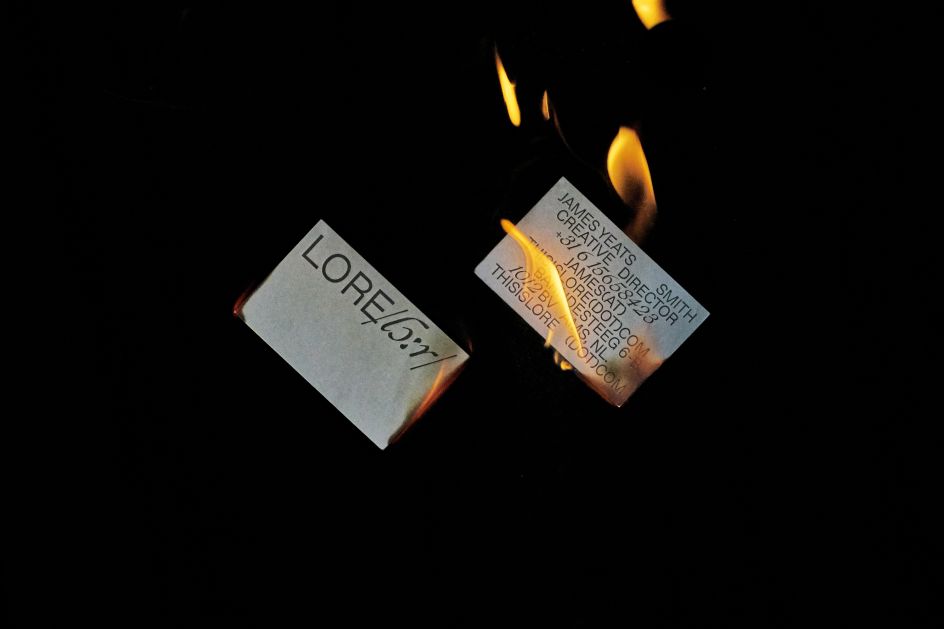
AMATEUR(DOT)ROCKS was tasked with creating new art direction and design work for Studio Lore and decided on an approach based around a concept that's very hot indeed.
"Ever since humans discovered fire, we've gathered around flames to tell stories. Flame and fable stir something powerful deep within all of us," say Bessega and Pallucchini. "Harnessing this power, Studio Lore, ignites modern-day campfires, stoking conversation with stories that transcend race, culture, and creed. The new company needed a visual identity to express this idea."
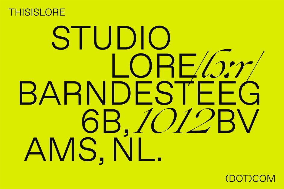
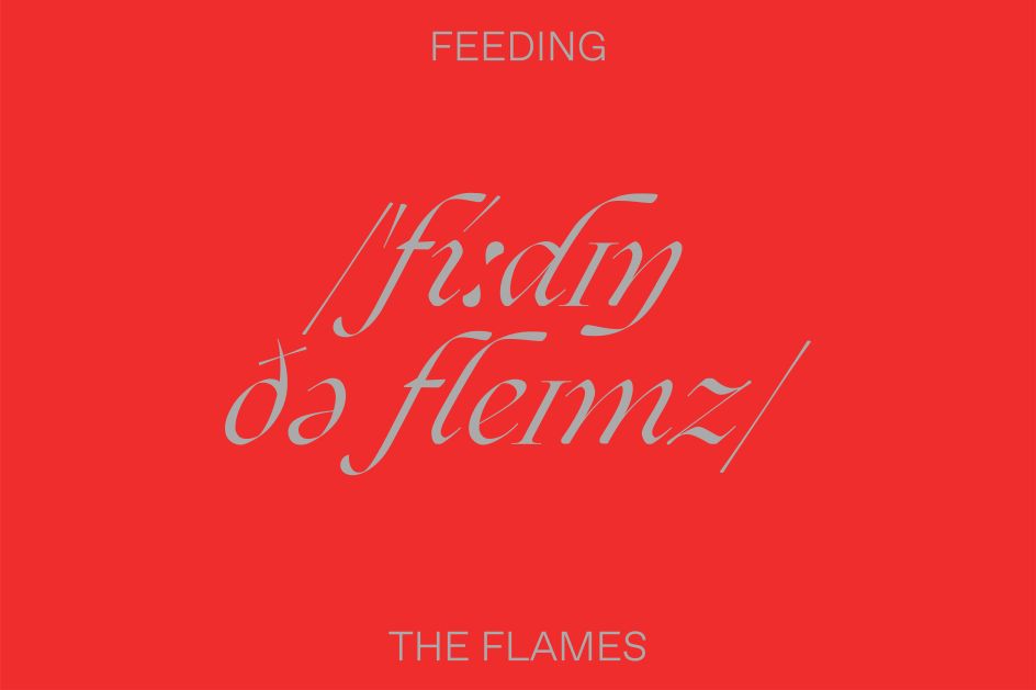
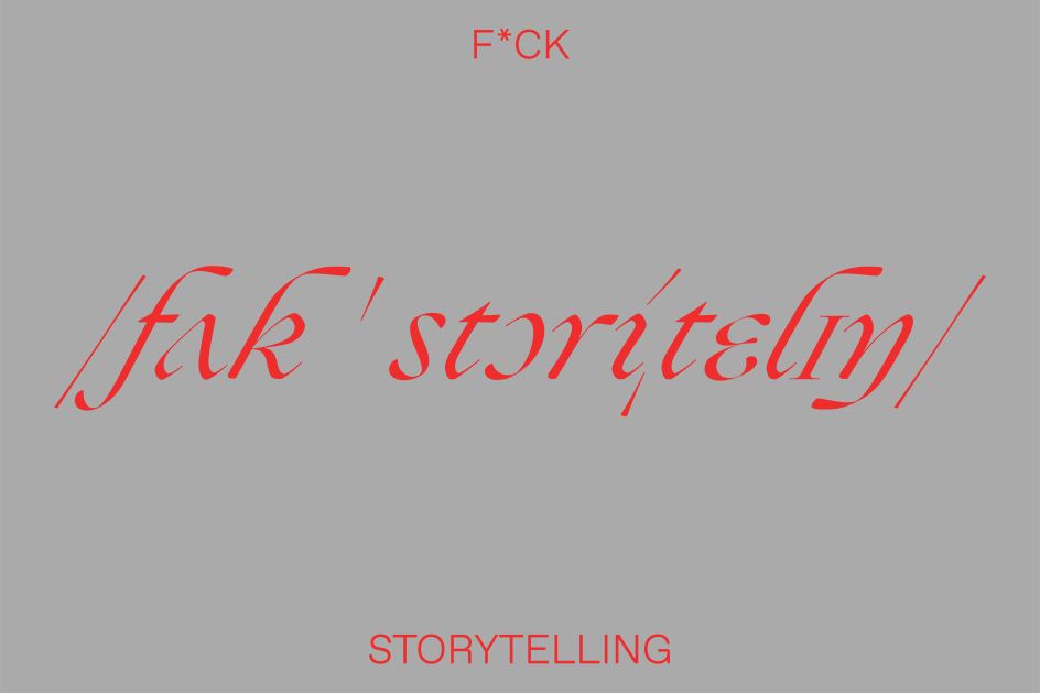
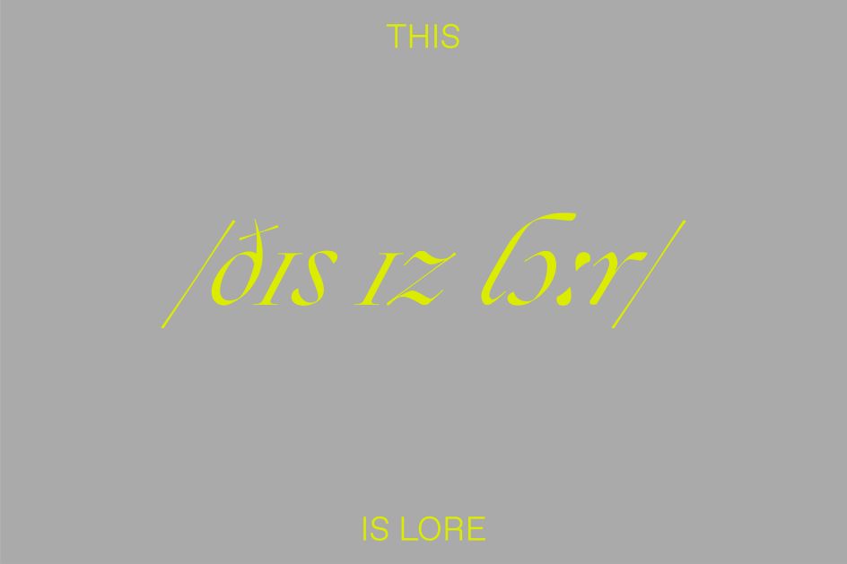
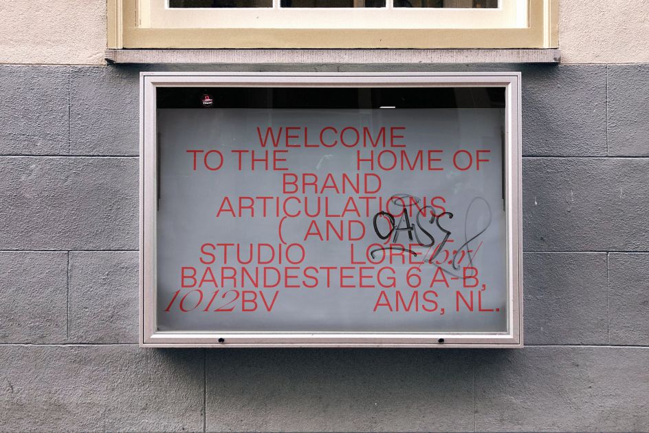
The other main starting point was the studio's name itself, taking the idea of lore as ancient, spoken-word narrative passed down orally through generations and represented it in graphic form. "We decided to take the phonetic language, a universal system that opens language up to everyone, as our visual and written tool," say Bessega and Pallucchini.
The pair used the International Phonetic Alphabet (IPA) to form the foundation of the new, dynamic typographic visual identity; collaborating with typographer, Lucas Sharp to develop a bespoke 53 characters phonetic alphabet that was applied across the brand identity.
This system mixes regular characters with phonetic ones to create a look that feels both familiar and strange, surprising and original. The branding also uses typefaces by Sharp Type and Dinamo.
AMATEUR(DOT)ROCKS worked with photographers Bart Oomes, Jonathan Krijgsman, Douglas Guillot and Matthew Thorne on the project, as well as coder Arturo Castillo Delgado.
Editor's Picks


Trending


Podcasts


Editor's Picks
Further Reading