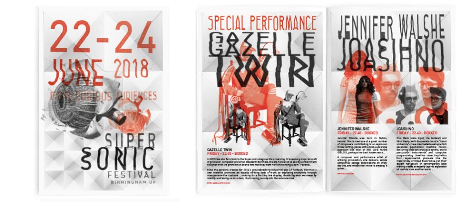
The designer 'f**king about with type' for the 2018 Supersonic Festival identity
"I’m happiest working with design that’s formed out of accented or at least from a process of experimentation," says David Hand, who once again has worked on the graphics and branding for Supersonic Festival.
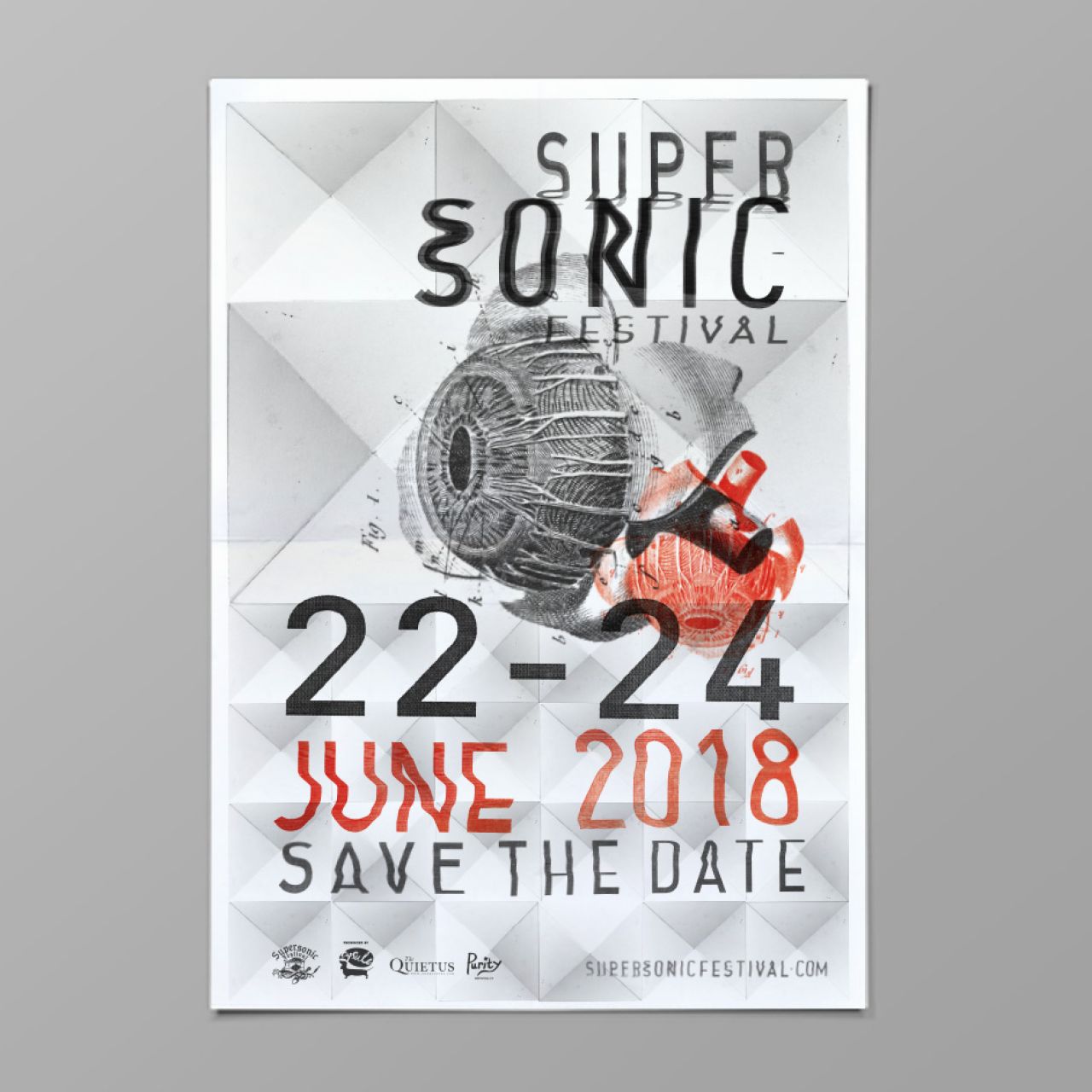
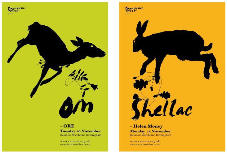
The festival is an annual Birmingham-based celebration of experimental music and art, so it’s only fitting that the designs to promote it are equally so. The imagery for last year’s event used hand-painted type created to resemble a very wonkified version of industrial signage, which sat alongside a version of Futura spaced to create a disquieting and unusual spin on the system font.
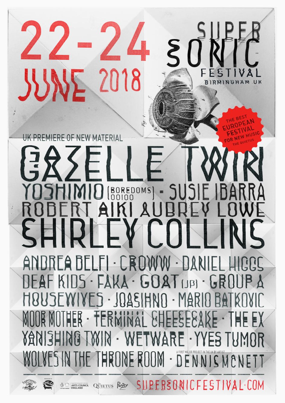
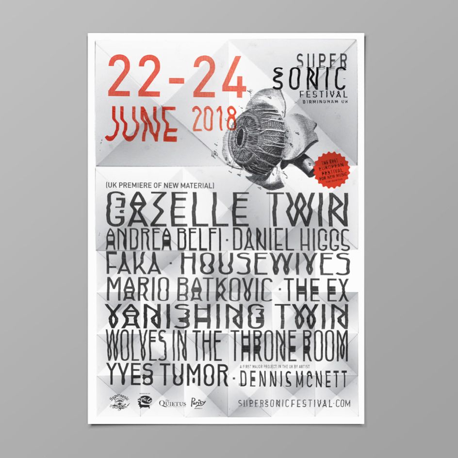
For the 2018 event, Hand says he was "keen to play around with type more this year, with the end result being that you have to set a lot of band names and information. I was keen to make this a strong part of the identity of the festival."
He adds: "I was trying various type designs, initially for the main Supersonic wording. I wanted some movement or interference, so I ended up fucking around with printed out letters in the scanner. From those early experiments, I worked out a way of treating all the main type."
That very hands-on approach (pun semi-intended) meant that no two letters look the same – a brilliant touch, but one that had the designer wonder, "at what point do you cross the line of illegibility?"
Hand’s background is in type design, so for him, it felt natural to begin the identity design from a perspective of playing with letterforms. "With so much type to play with, it sort of feels like a cop-out to not create something new,” he says, "maybe because of my background, it’s just a default setting that I want to create a new typeface or style of font for the project."
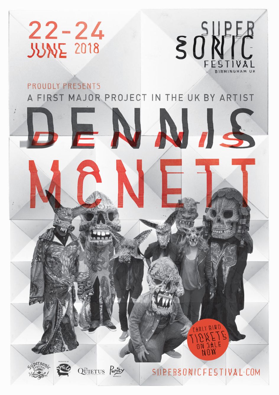
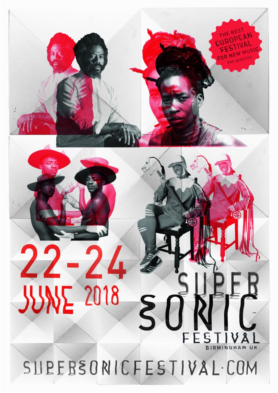
Hand’s designs are used across all the usual festival accoutrements, from guides to signs, line-up posters, and merch.
Editor's Picks


Trending


Podcasts


Editor's Picks
Further Reading