Shanti Sparrow's abstract, minimalist identity for annual NYC food festival is a real treat
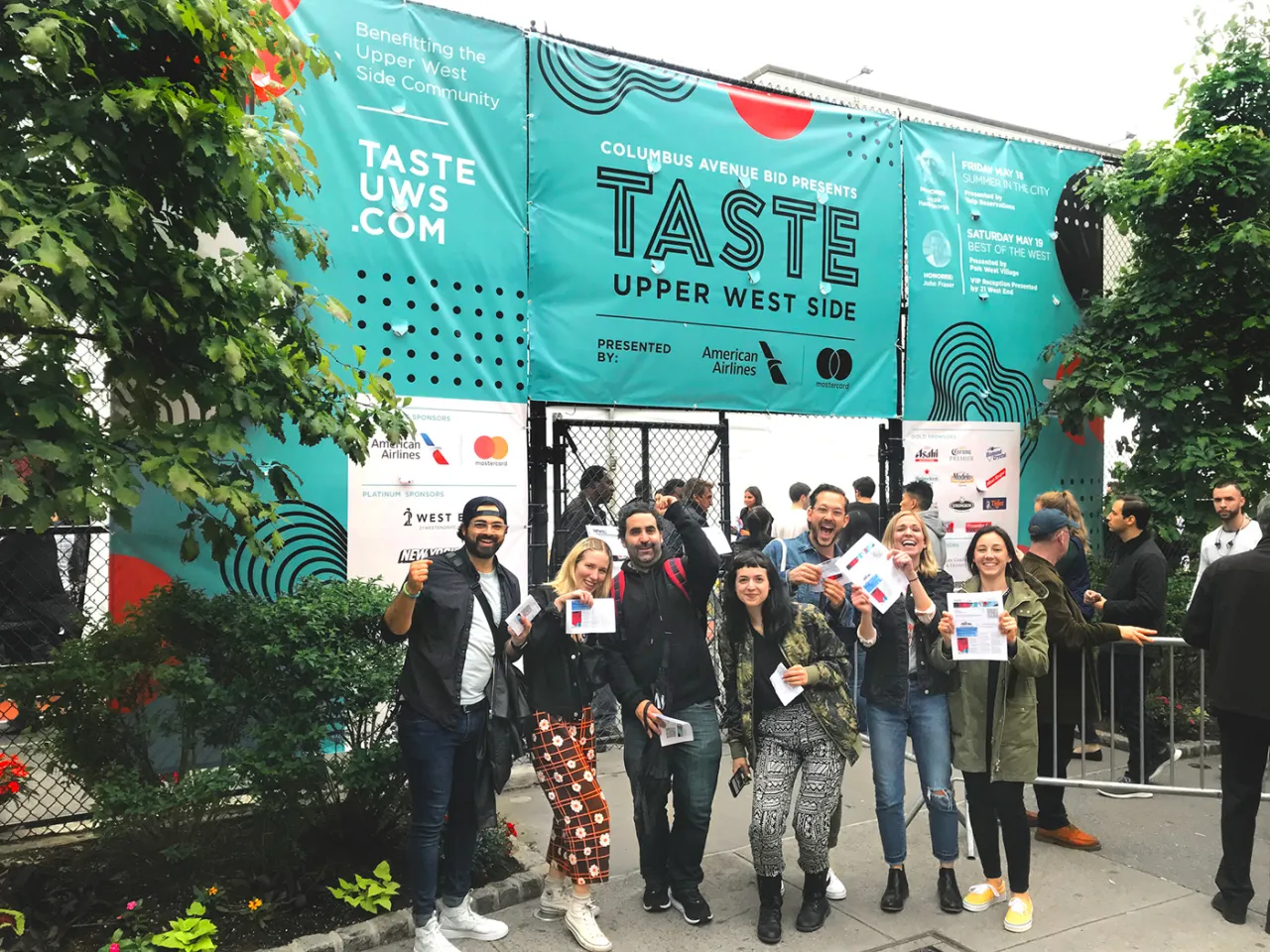
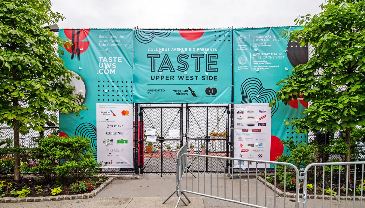
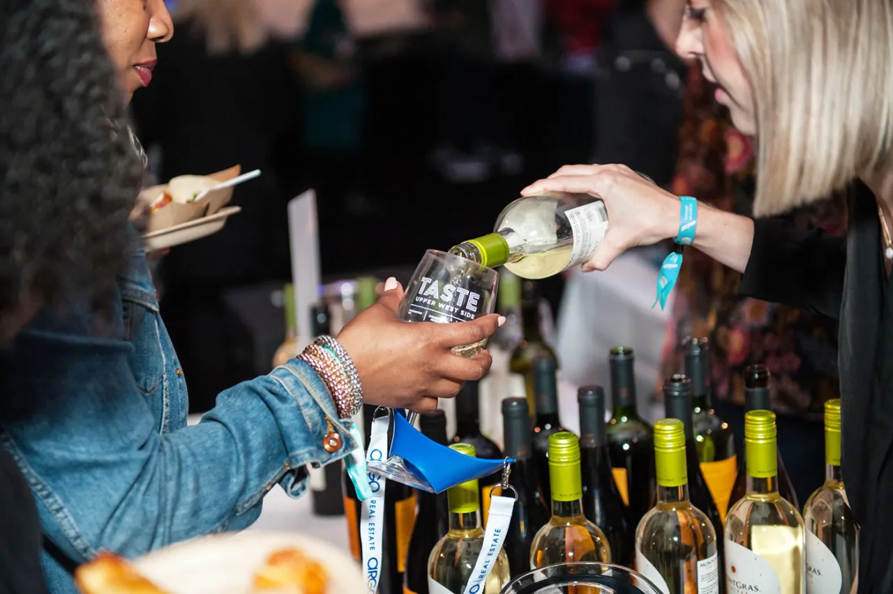
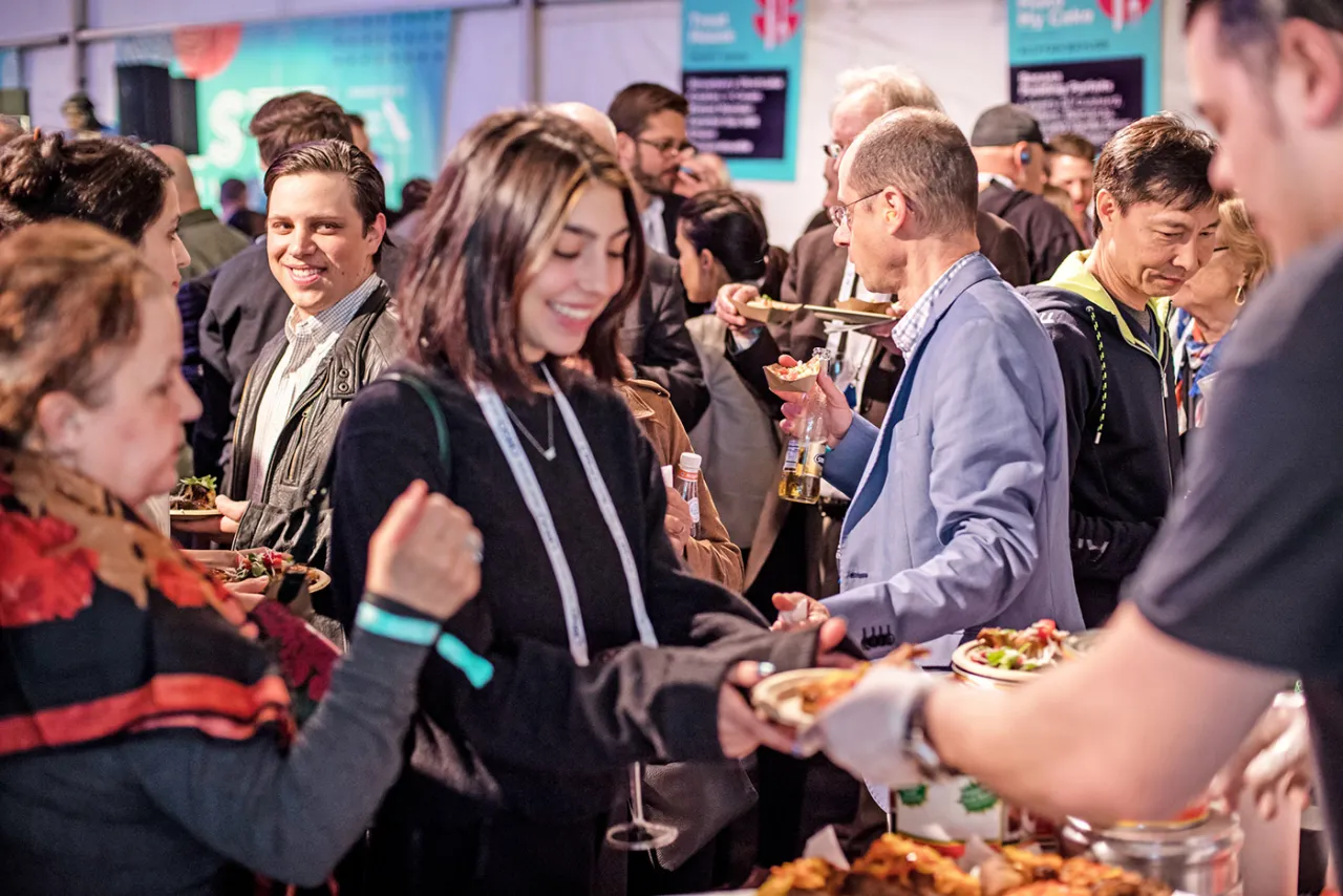
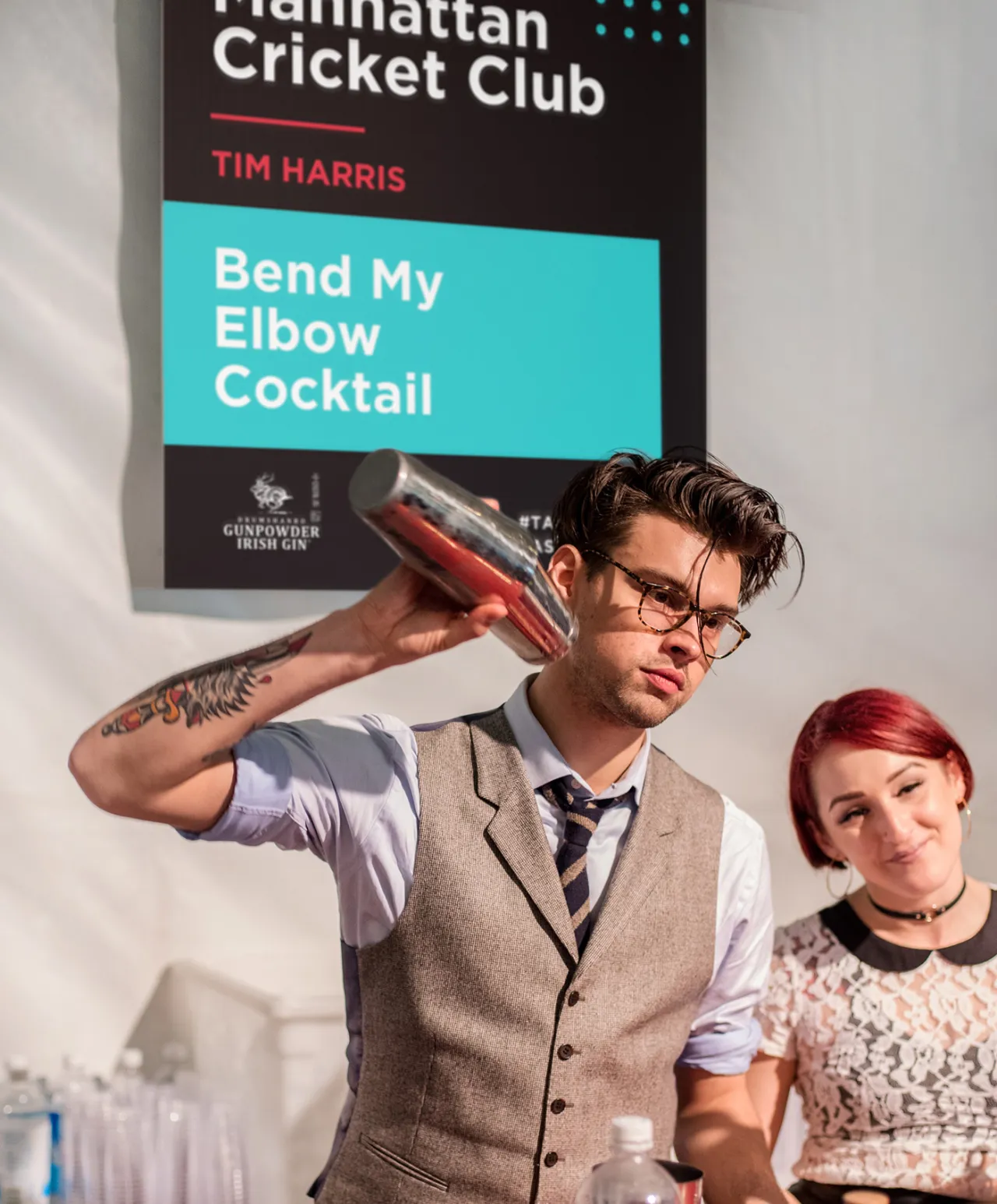
Taste of the Upper West Side is a large-scale food tasting even by the Columbus Avenue Business Improvement District. A much-beloved neighbourhood festival in New York, it showcases the significance and scope of the Upper West Side’s culinary community featuring over 80 chefs from the district's best restaurants.
Running for two nights, it attracts more than 3,500 guests and invites new restaurants each year, some that haven't even opened yet, to give the community a chance to meet the chef and sample their foods. The range is deliciously diverse, and proceeds go back into the community and help fund selected neighbourhood projects.
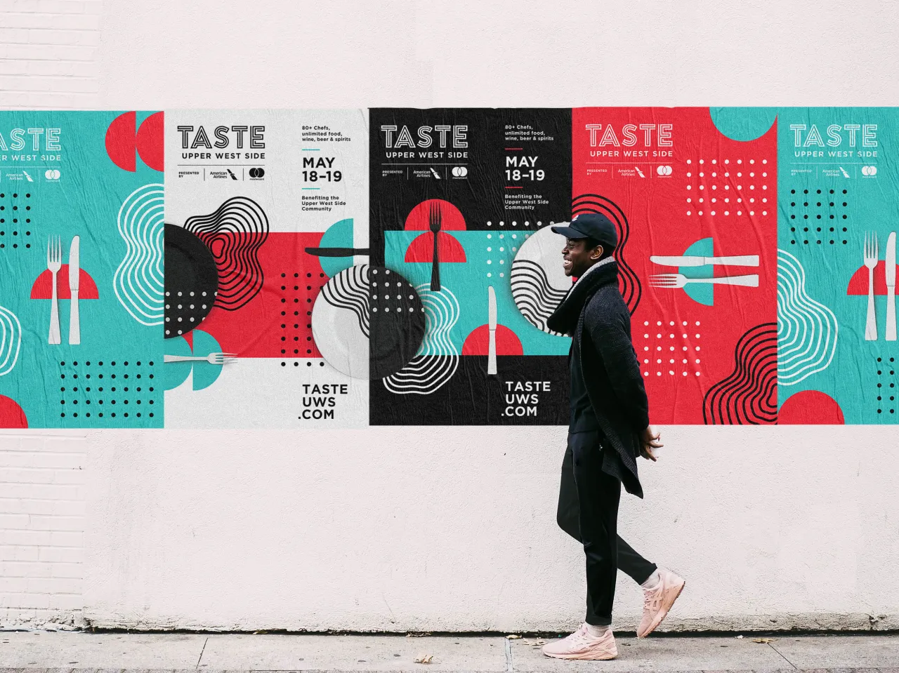
For its brand identity, Taste of the Upper West Side called upon the talent of Shanti Sparrow, the Australian illustrator, designer and lecturer based in NYC. Known for her vibrant and bold approach to design, she creates brands filled with individuality and personality. And her expressive typography and confident colour palettes create memorable and iconic identities.
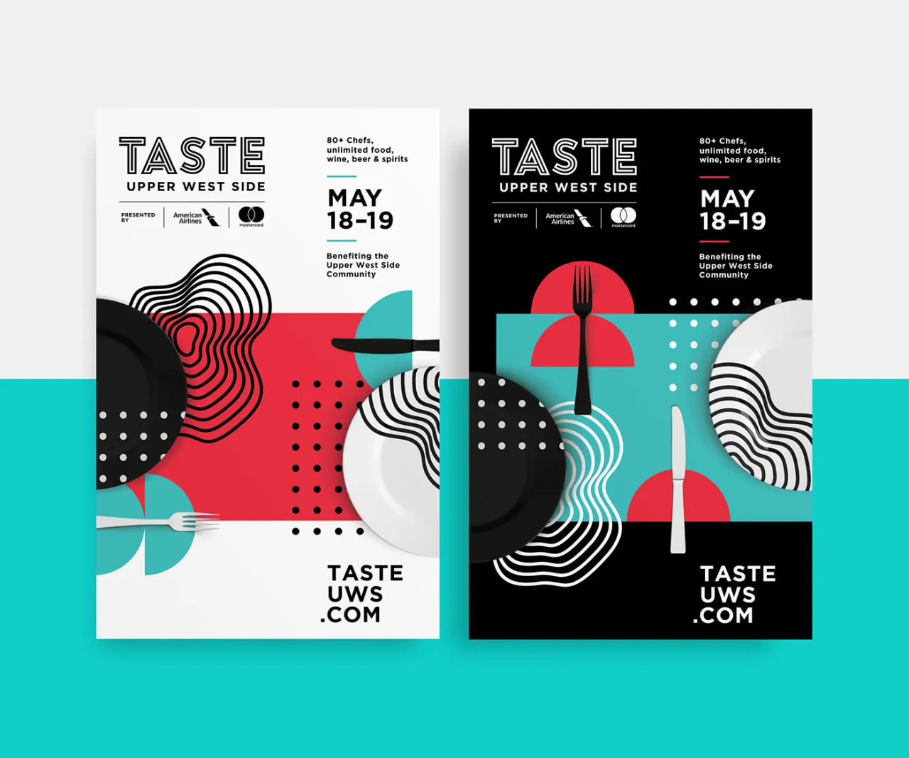
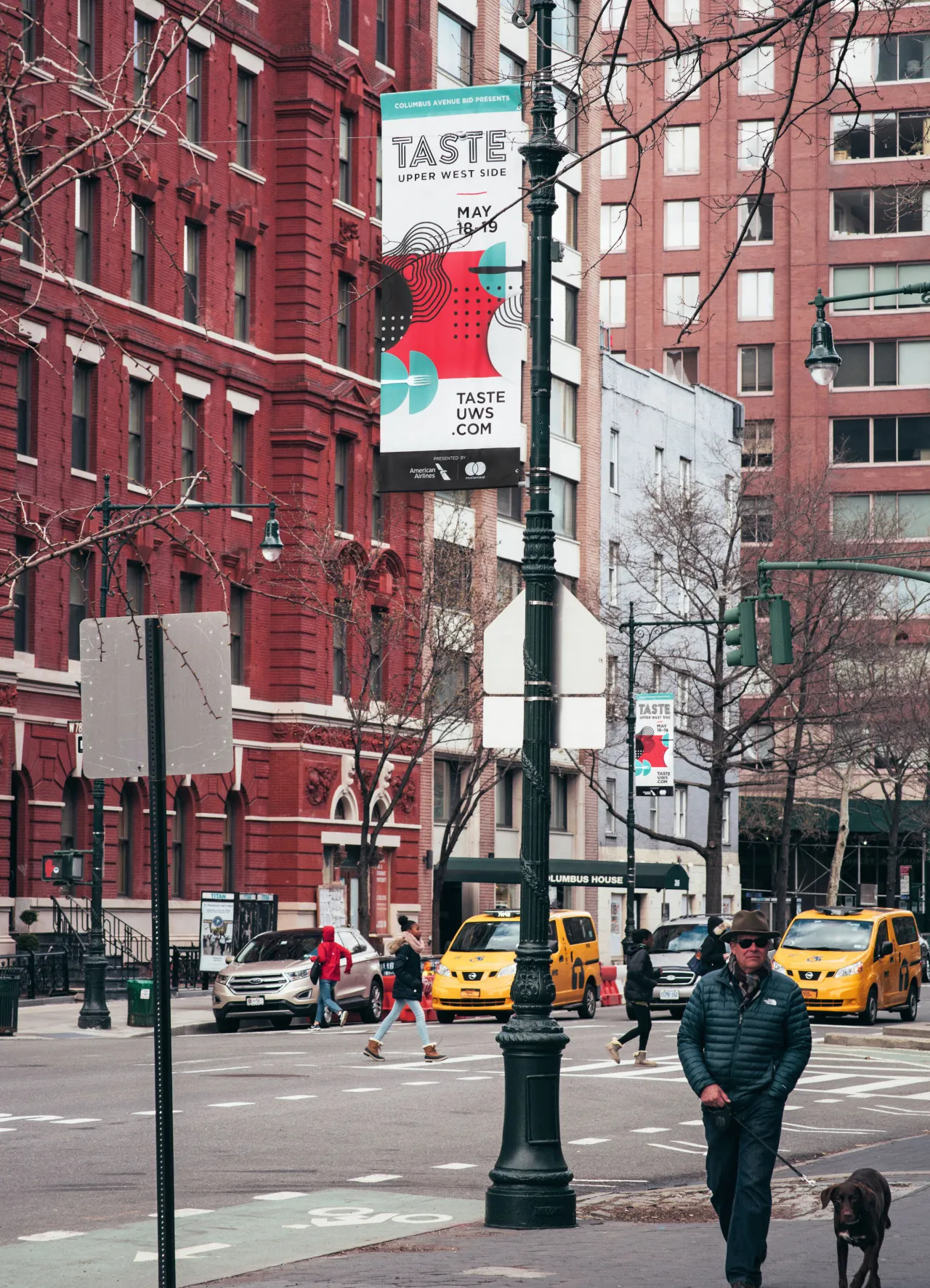
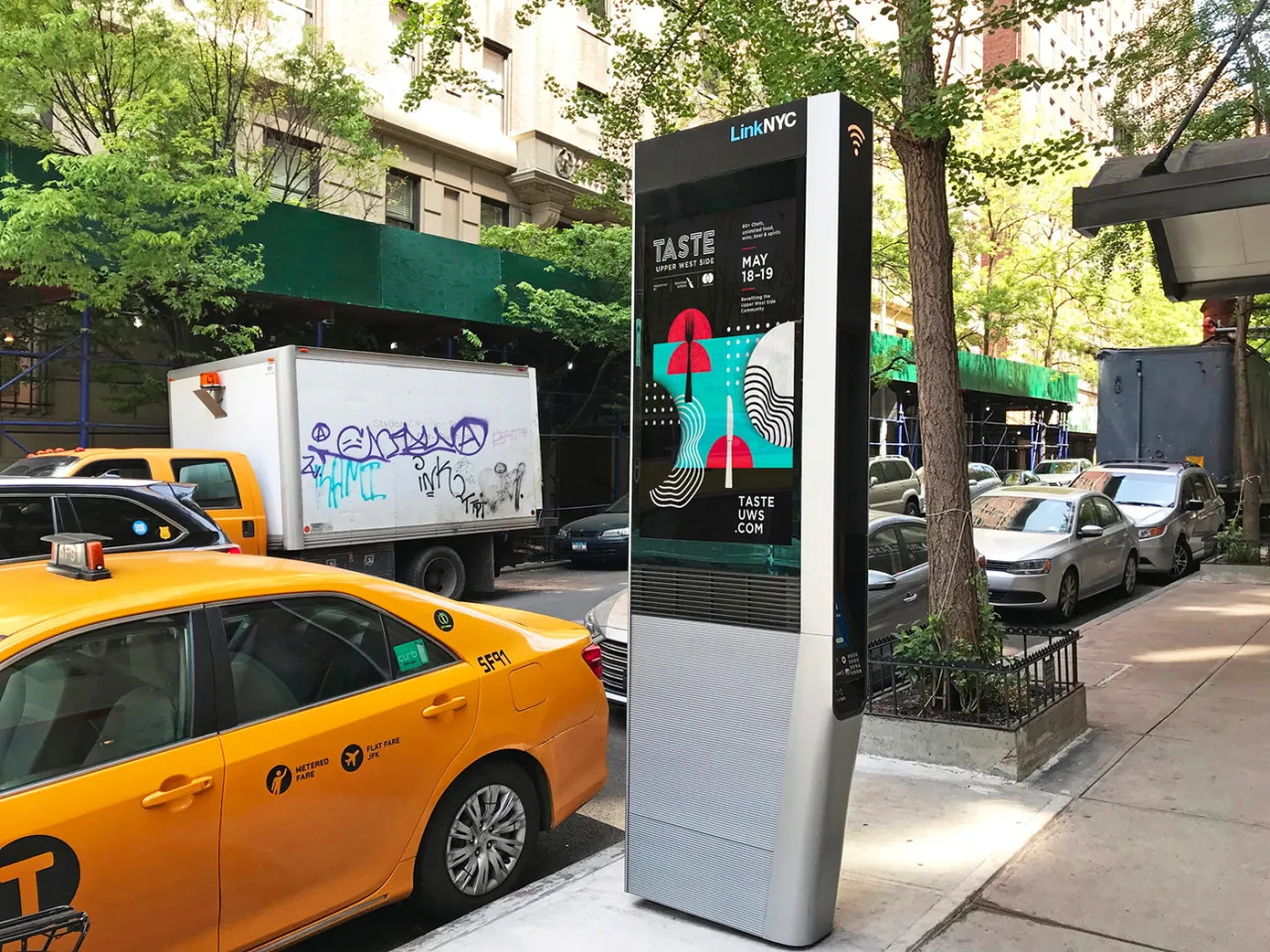
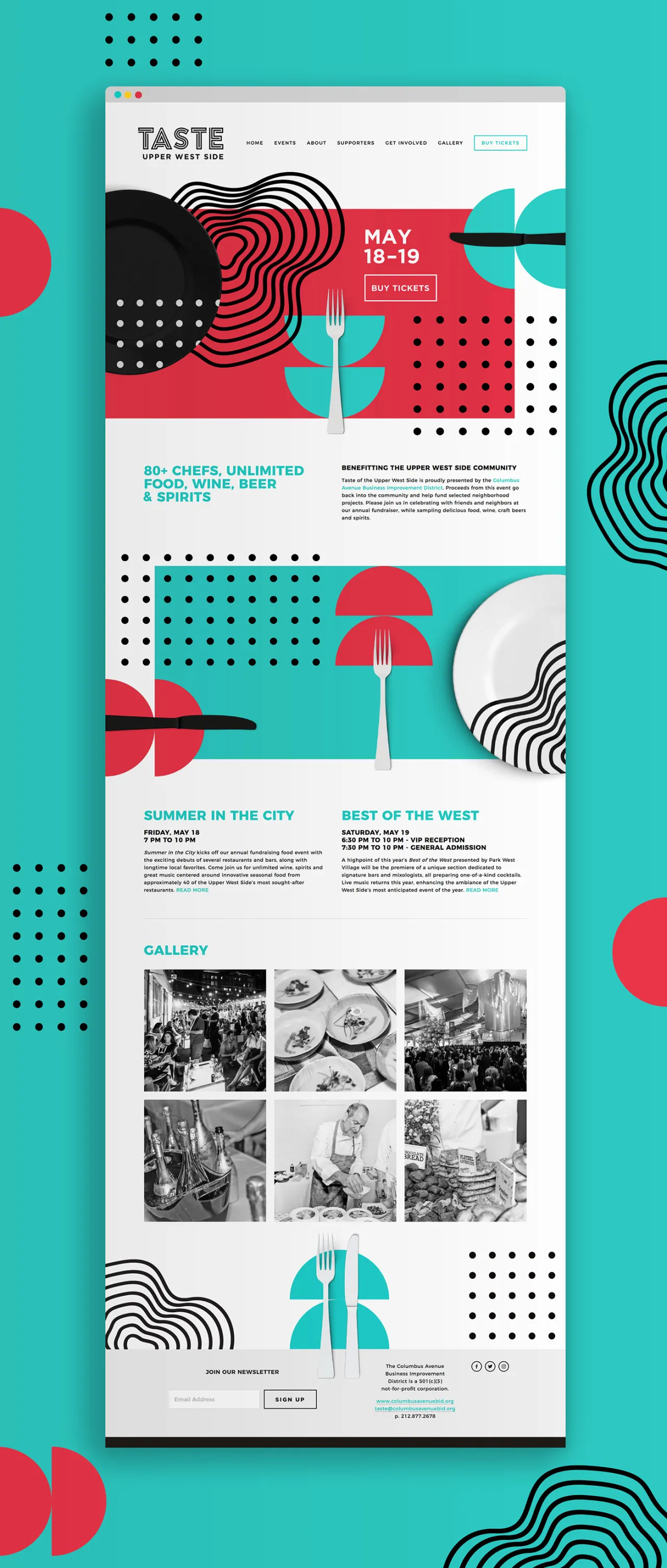
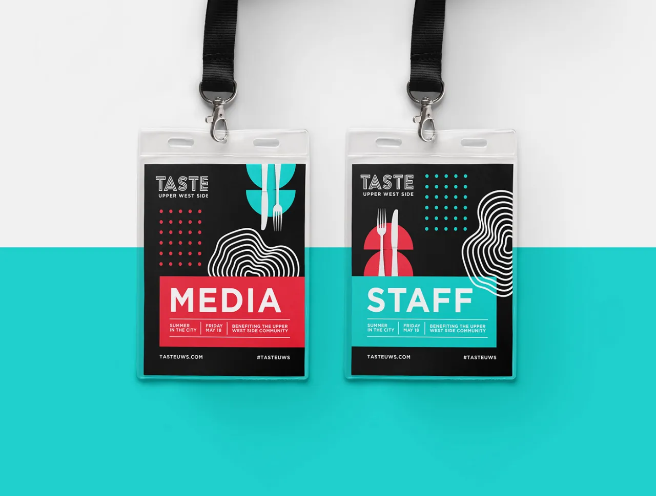
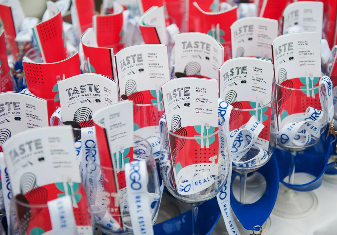
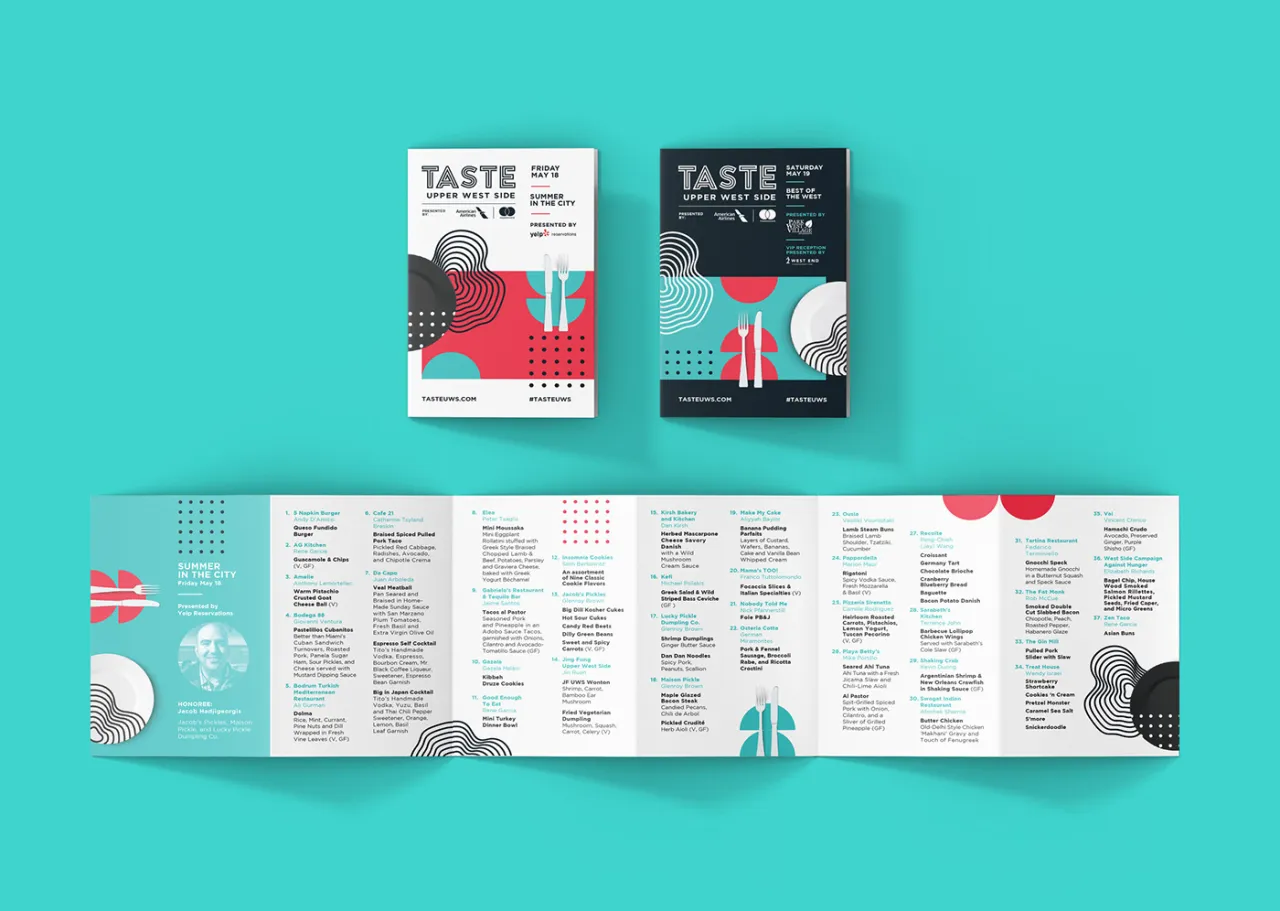
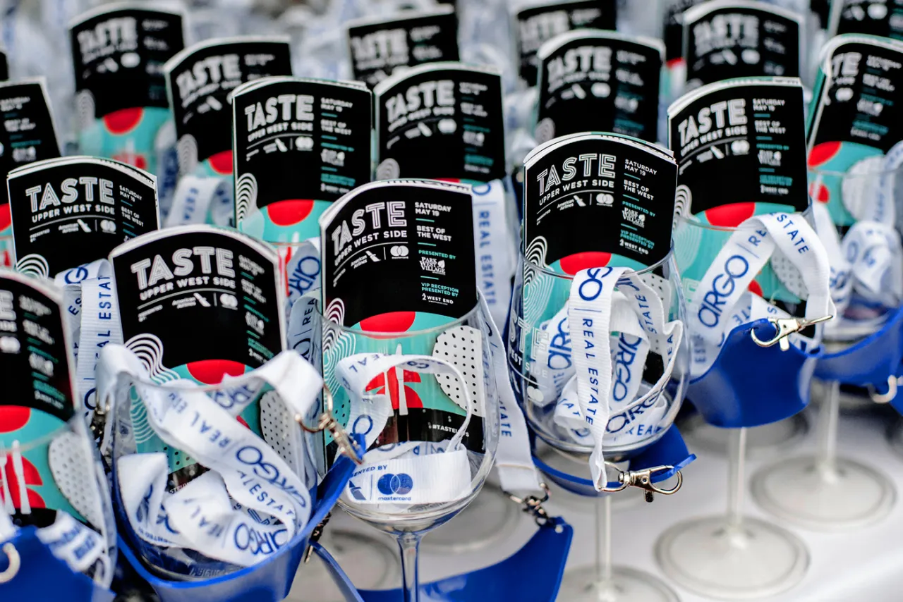
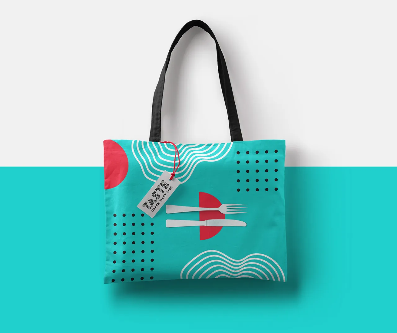
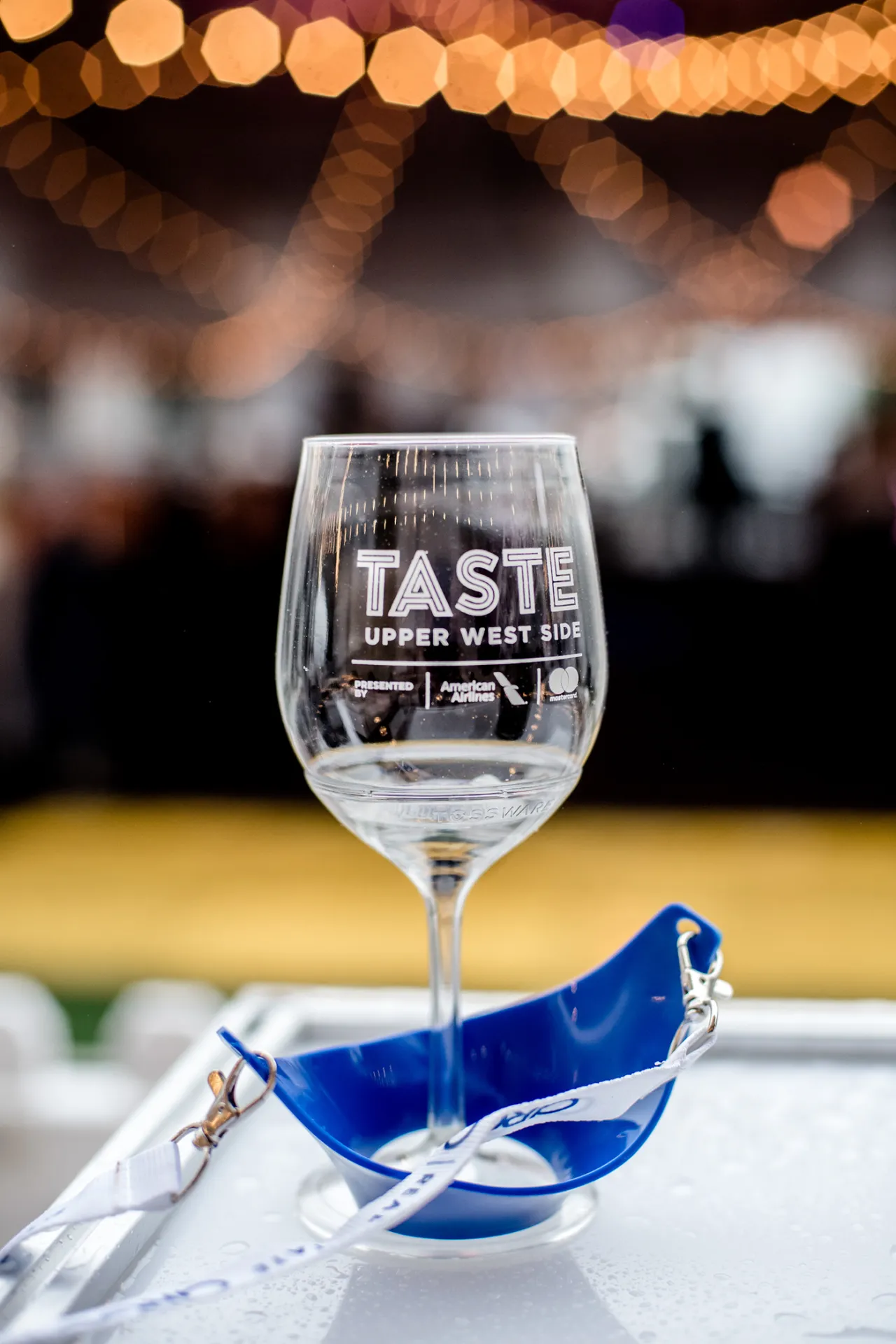
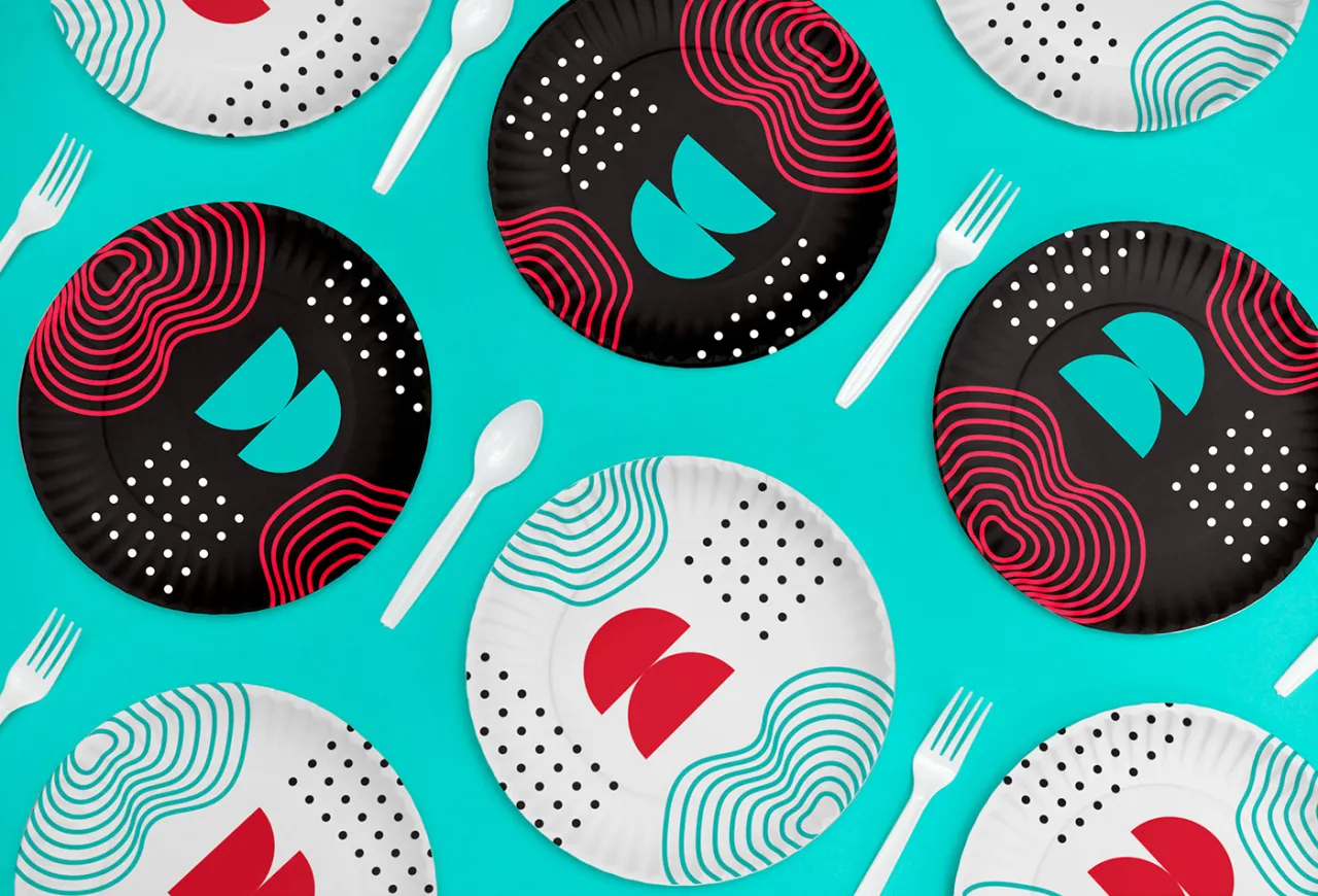
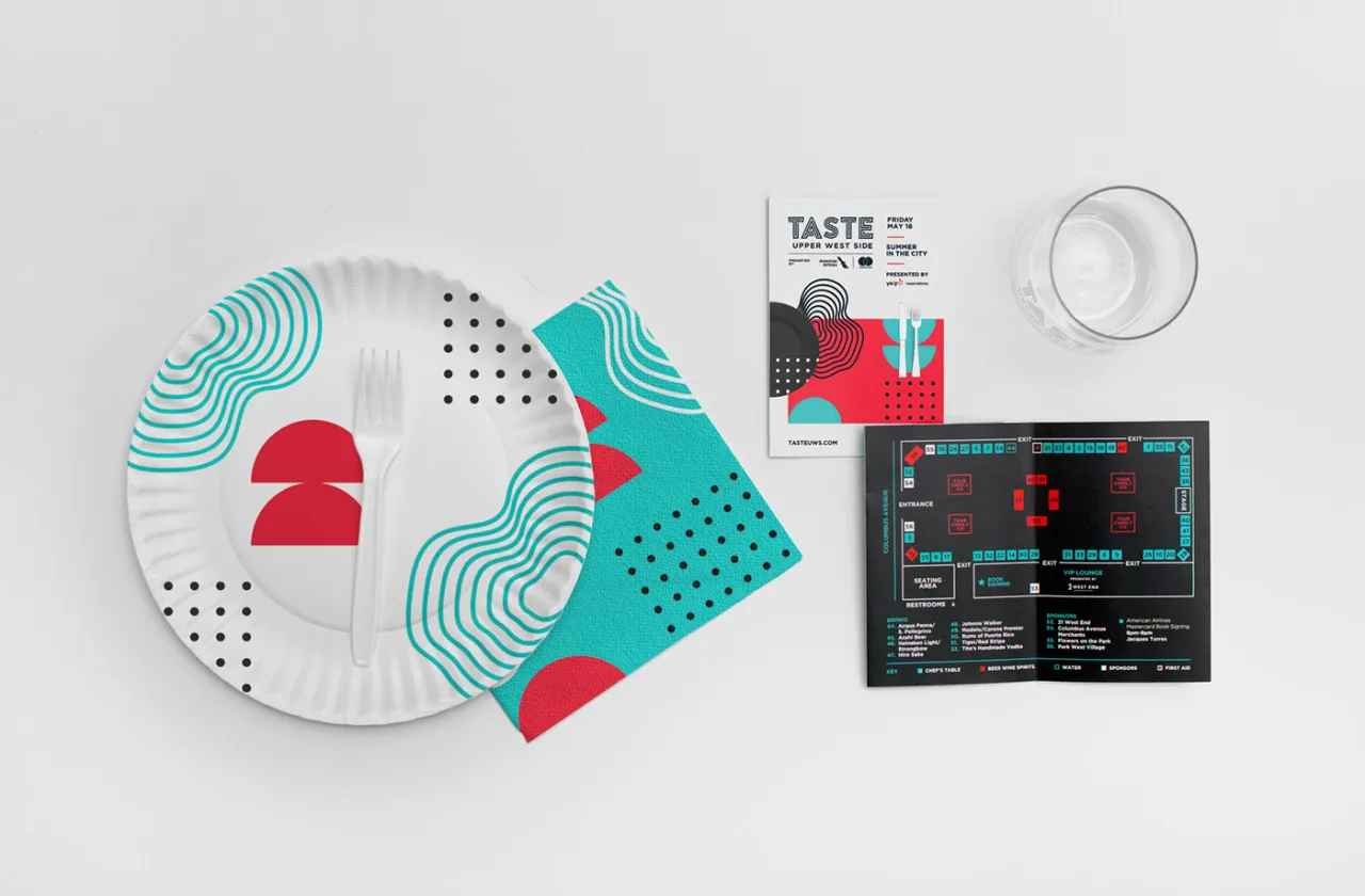
This particular identity is based on the concept "cooking/baking is as much a science as it is an art". "The overall brand mimics the styling of an art exhibition and the graphics are inspired by abstract minimalism," explains Shanti.
"The graphic elements are representative of the duality of precision and freedom within cooking/baking. The precise ordered, regimented elements are illustrative of the mentality of perfect fine dining and science of baking.
"While the organic, unstructured wave elements speak more to the artistic style of cooking. These opposing styles come together to create a beautiful harmony in their differences much like they do in cooking." More inspiring work at shantisparrow.com.
Credit: Tim Seguin
Credit: Tim Seguin
Credit: Tim Seguin
Credit: Tim Seguin
Credit: Tim Seguin
Credit: Tim Seguin
Credit: Tim Seguin
Credit: Tim Seguin
Credit: Tim Seguin
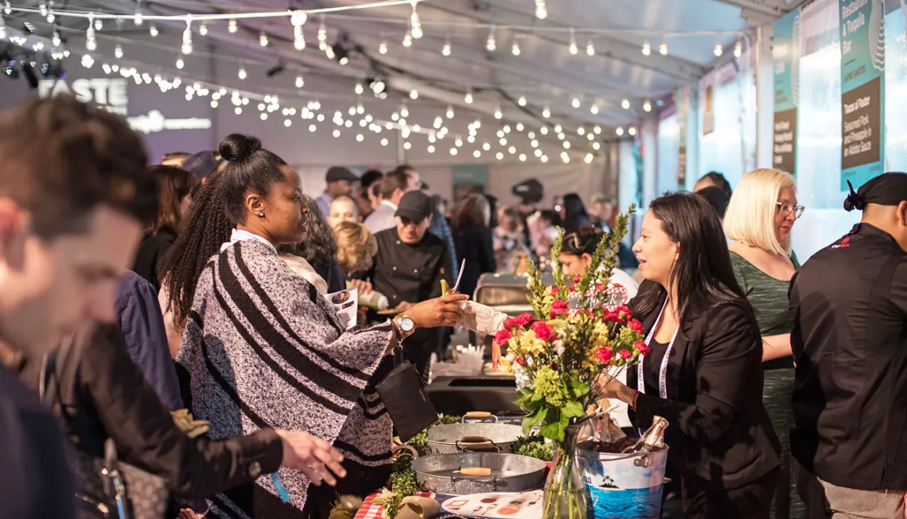
Credit: Tim Seguin
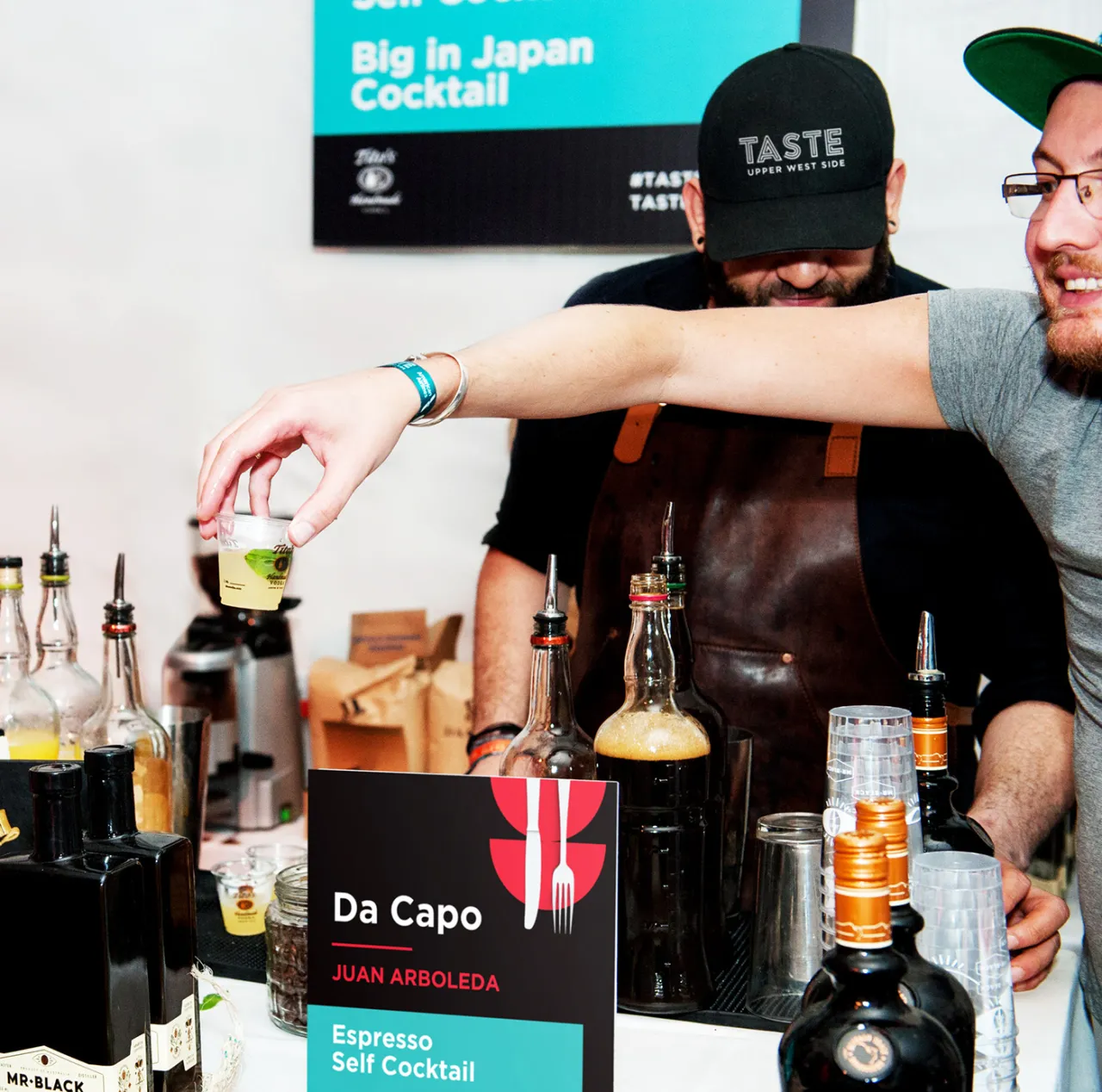
Credit: Tim Seguin
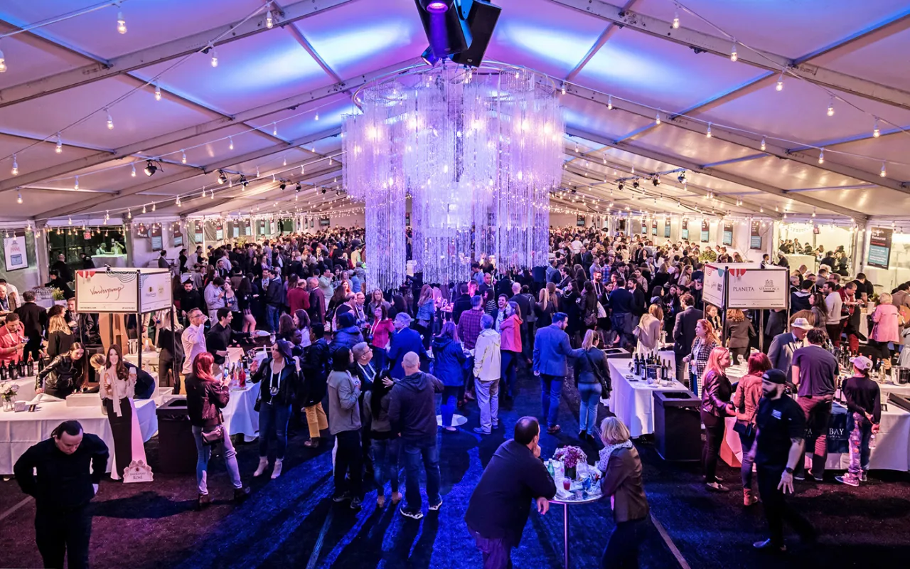
Credit: Tim Seguin
Editor's Picks





Trending






Latest Jobs
Midweight Graphic Designer at We Are Your Friends
Full-time·London·£36k–£44k
Midweight Designer at All Purpose
Full-time·London·£30k–38k
Design Director, Opinion at The New York Times
Full-time·New York·$160k–$180k
Account Manager at Moxie and Mettle
Full-time·Cheltenham·Up to £35k
Brand Strategist at DNCO
Full-time·London·£45k-£60k
Senior Operations Manager at BIG Partnership
Full-time·Glasgow·£45k–£50k