Studio.Build's new identity for the Harewood House Trust’s Useful/Beautiful: Why Craft Matters
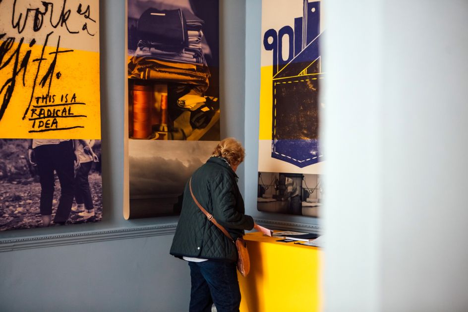
The Harewood House Trust has launched its first ever Harewood Biennial exhibition, Useful/Beautiful: Why Craft Matters, with a visual identity designed by Studio.Build.
All photography by Helena Dolby
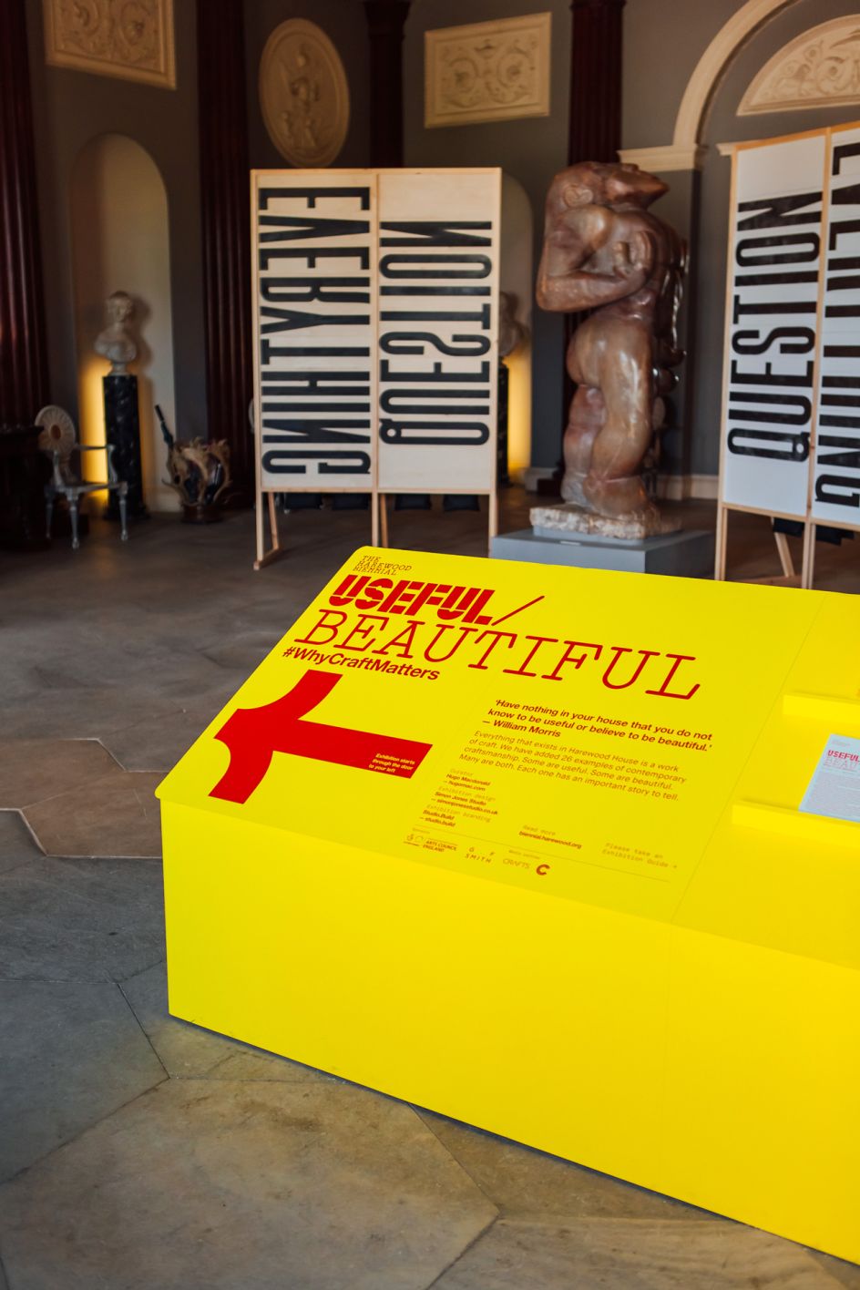
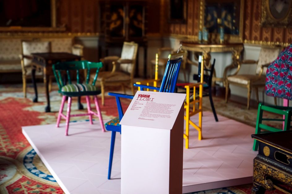
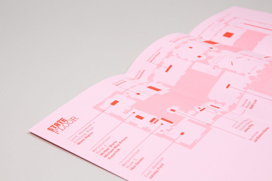
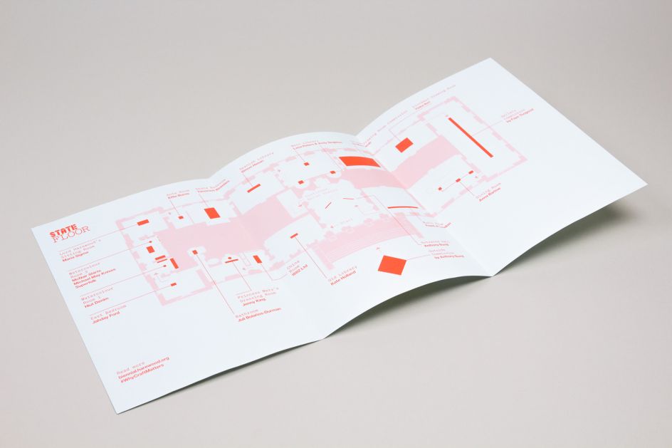
The inaugural show, which has been curated by design critic, Hugo Macdonald, aims to challenge preconceptions, spark interest and inspire debate about the role craft can play in culture, identity and society. Featuring 26 of the most exciting British craft makers today, names include Anthony Burrill, Juli Bolaños-Durman, Hiut Denim, Freed of London, Max Lamb and Yinka Ilori, each showcasing their craft within different rooms of Harewood House.
Looking at the question of why craft matters, whilst also reflecting the breadth of work within the exhibition, Studio.Build created a bold identity system, one that is super flexible for a multitude of uses.
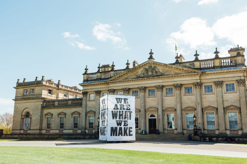
"This whole exhibition is about engaging with different audiences to create a forum of debate about craft," said Michael C Place, creative director and founder of Studio.Build. "We approached the visual identity in much the same way. We wanted it to be unapologetic in its outlook, in some ways we felt like the visual identity should also be something that could be debated too. We wanted to create something that was very bold, not only to be eye-catching but also to stand out as a stark contrast in the house. In short, the world of contemporary craft is incredibly exciting, and this exhibition identity also needed to reflect that."
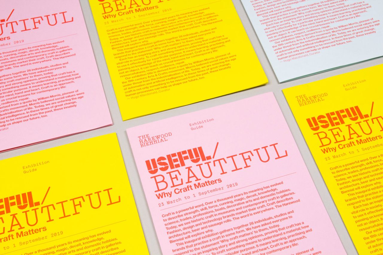
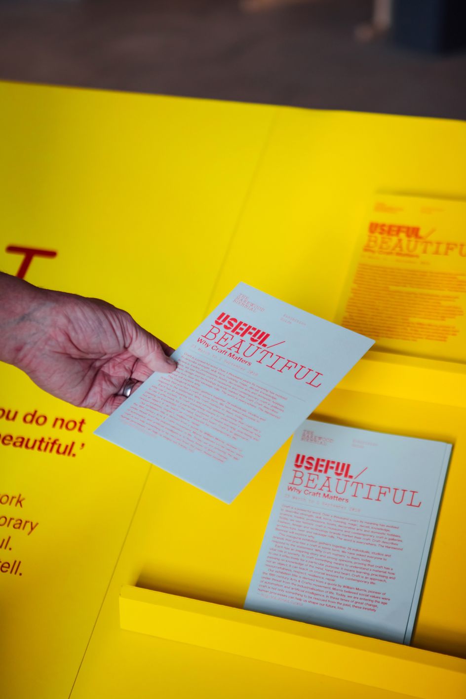
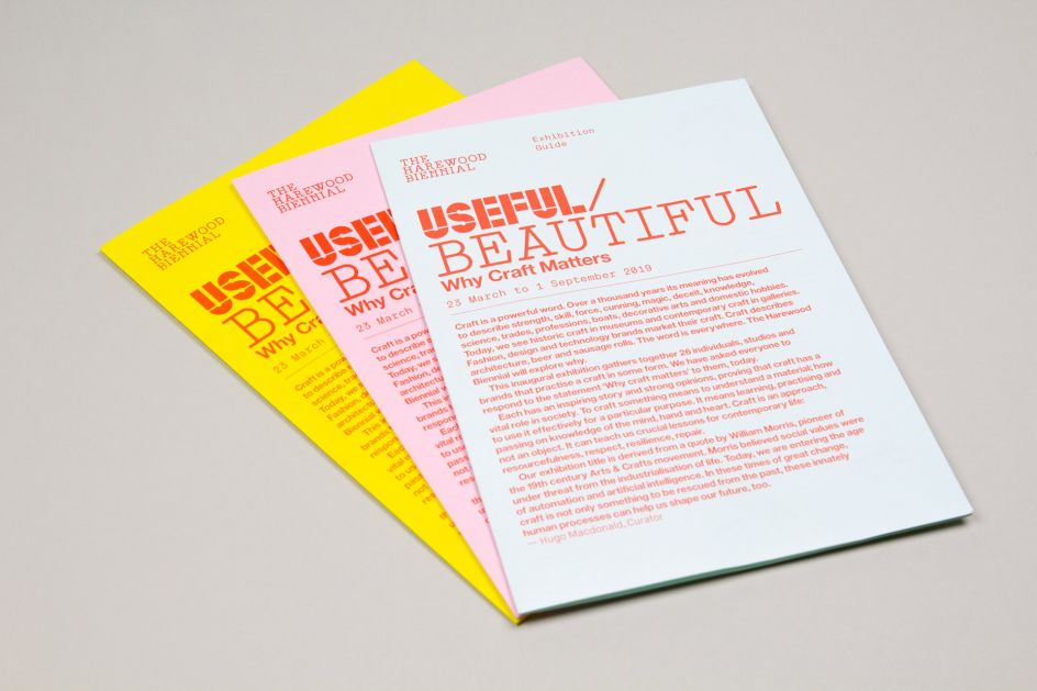
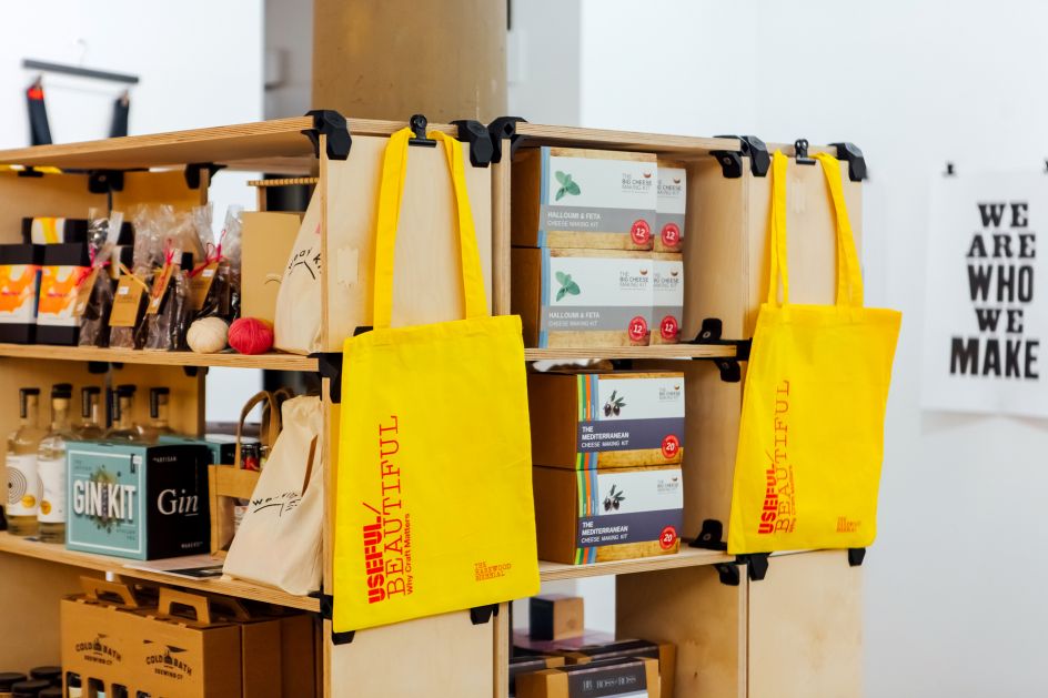
The visual identity spans a logo/marque, bespoke typefaces, supporting typefaces and colour palettes and was applied to a range of exhibition and outdoor banners, plinths and interpretation boards, website, social media and flyers.
"Duality is at the core of the visual identity," added Place. "We designed two bespoke typefaces- one very simple/utilitarian (useful) typeface, with the other being much fancier/eccentric (beautiful). This visual hook fed directly into all the material providing a strong marker for the exhibition and a solid graphic framework that fed into the interpretation and social media around the show."
Studio.Build worked closely with curator Hugo Macdonald as well as London-based exhibition designers Simon Jones Studio to bring the visual identity to life.
Hugo Macdonald, curator of Useful/Beautiful: Why Craft Matters, said: "The identity has succeeded in both capturing the spirit of the exhibition and elevating it into something more interesting, too. It is a robust and very significant creative response to the statement we are seeking to explore with the show: why craft matters in 21st century life. It has transformed a series of intriguing visual and verbal stories into a collective, narrative that is loud and clear."
Editor's Picks


Trending


](https://www.creativeboom.com/upload/articles/90/908fdb6378db1e95d12595416f54e6336d5e80b8_732.jpg)
Podcasts


Editor's Picks
Further Reading