'Be More Panda' is the resounding cry in This Way Up's rebrand for an all-natural candy
This Way Up has created a playful new identity for all-natural candy brand Panda Liquorice, enticing younger audiences to "be more Panda". The London-based agency, which specialises in branding healthier food and drink, was brought in to work on the project in 2020, working across the visual identity, packaging, website, and broader brand world.
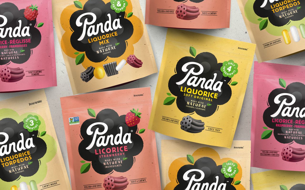
A big requirement of the brief was to ensure Panda's branding "reflects and retains its position as the category leader while helping it secure new store listings and dialling up stand out on-shelf," according to the agency. "Panda's competitors all look the same: a round, black logo and white type," says David Pearman, This Way Up's creative director. "Panda is the original liquorice, and it needed to better communicate its role as a brand leader."
Currently sold across continental Europe, the UK, the US and Canada, Panda was founded in 1927 in Finland, which gave This Way Up plenty of rich heritage and material to play with while finding a balance with a more modern feel. "We needed to find the sweet spot between the familiar cues of the category and some of the more emergent codes of healthier indulgence," explains Amber Hart, account director at This Way Up, who led on the project. "Panda natural liquorice has a short ingredients list, and there are no real nasties in there, so if you're going to indulge in confectionery, Panda is a positive choice."
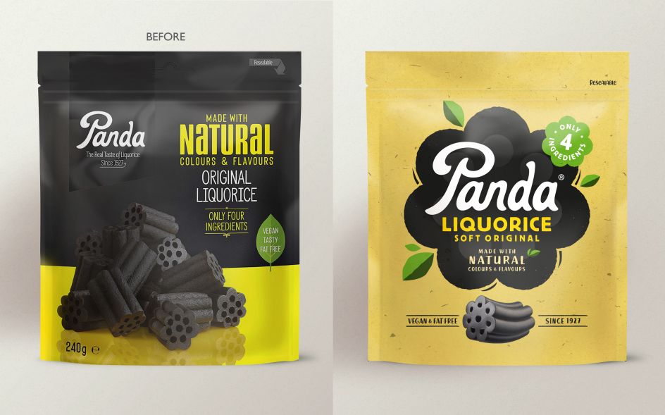
Another challenge was consumers' perception that liquorice is for older people, which is why the new designs looked to target younger people who "prioritise balancing indulgence and pleasure with wellbeing," so says the agency. "We wanted to play on being natural on the pack without using brown paper bag effect like everyone else," says Pearman. "That can look very old-fashioned – a little bit 'old school retro' – and doesn't play into capturing a younger audience."
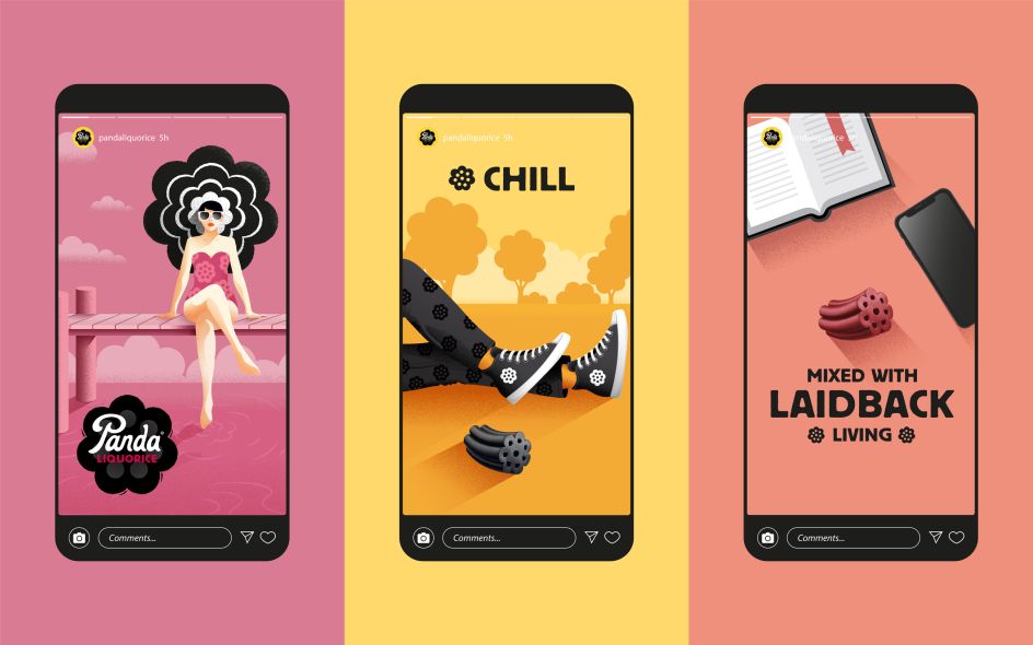
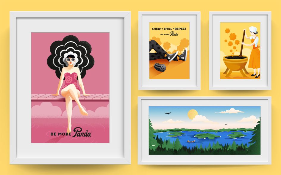
The overriding idea centres around "rediscovering life's simple pleasures", with the resulting designs being joyful, colourful and vibrant, packed with energy and positivity.
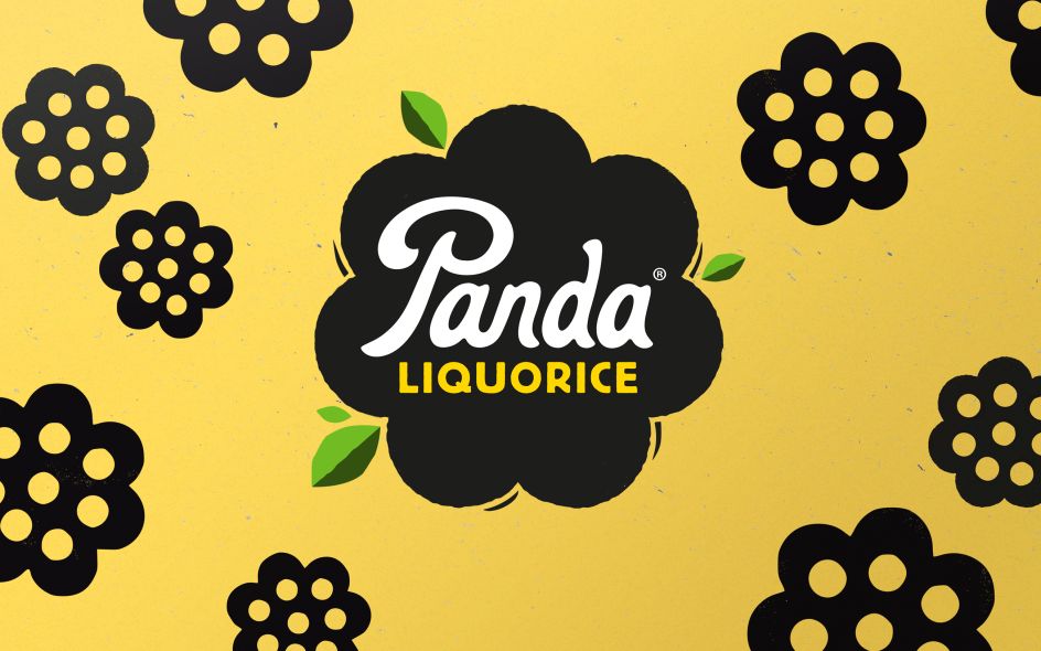
The packaging also needed to be distinctive, as some of Panda's products, such as the liquorice bars, are so small. "Panda has a very distinctive product shape which actually makes it a better chew, so we wanted to really hero that," says Pearman. This flower-like 'revolver' shape acts as a lockup device for the new identity. It works alongside organic textures and leaf details to underscore the short, natural ingredients list.
A suite of illustrations and animations completes the refresh, splashed across various touchpoints such as social media assets, all centring on the new 'Be More Panda' proposition around simple pleasures and "little moments of joy". Imagery includes a woman enjoying some time by the lakes, a nod to the brand's Finnish heritage. "It's about saying 'just put your feet up, relax a bit more', bringing Panda into your life in a subtle way," says Pearman.
The designs launch this month, with the new digital look and feel landing in Spring.