Studio Blackburn creates brand identity for new agency collective Hello Finch
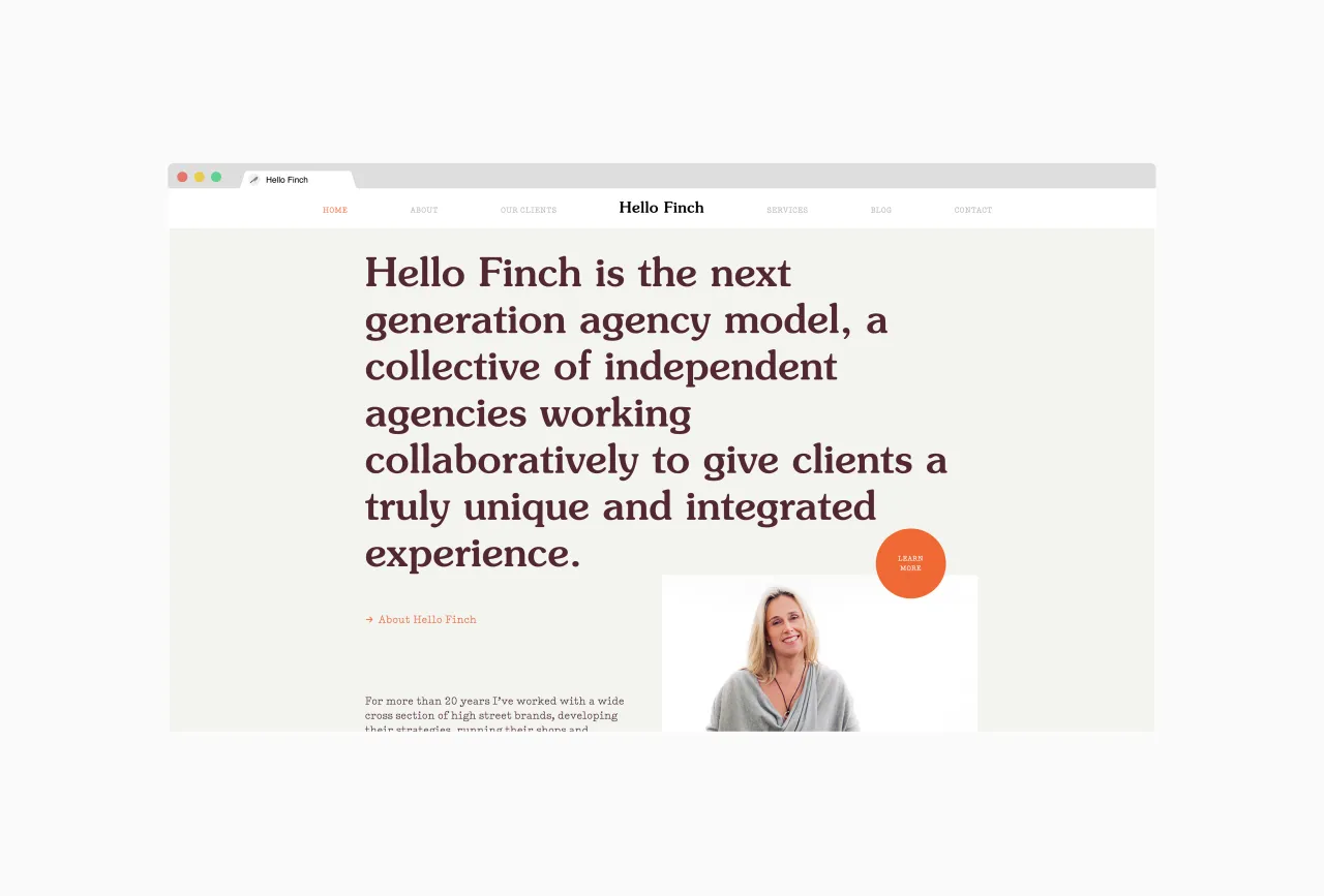
London creative agency Studio Blackburn has designed a rather warm and friendly identity for Hello Finch, an integrated agency collective – the brainchild of Jemima Bird, who aims to pioneer a new era of marketing that values speed, agility and choice.
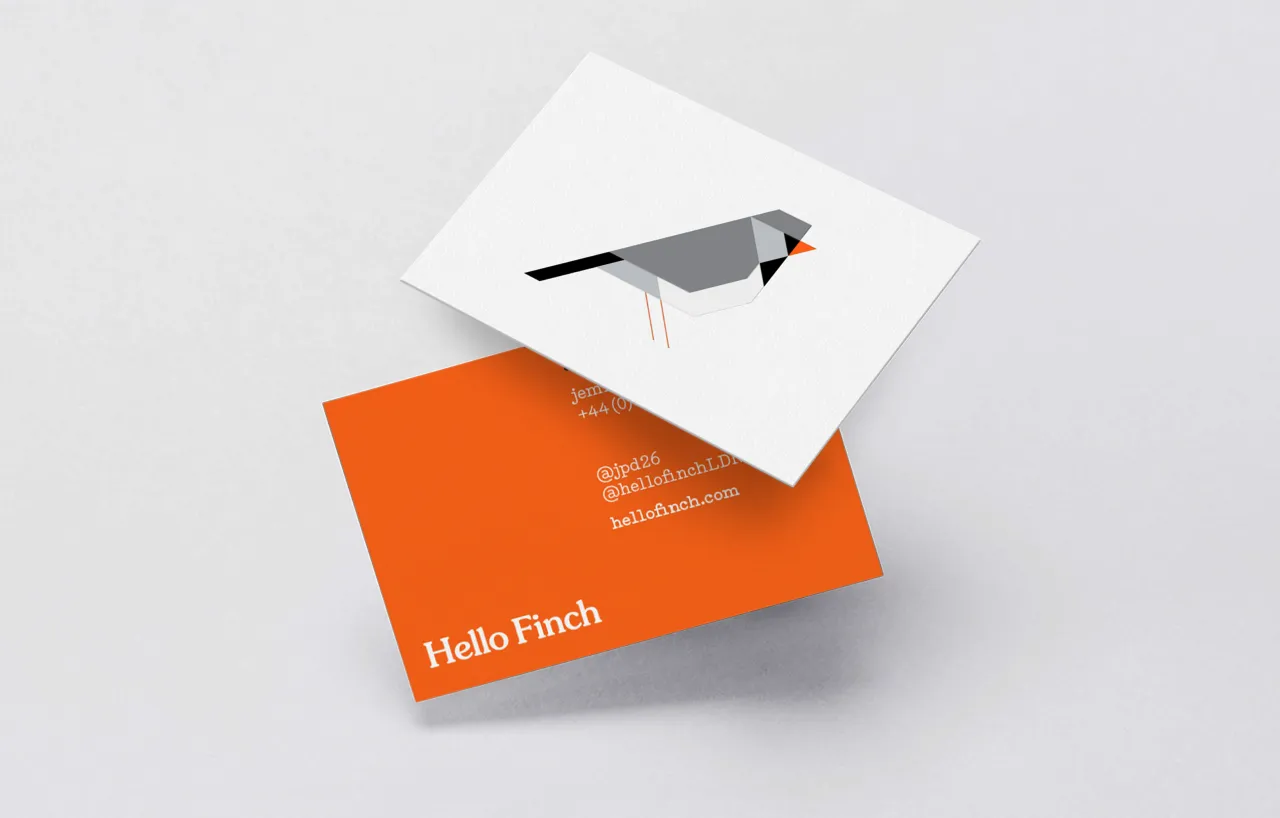
Driven by an ambition to push the boundaries of marketing, Jemima asked Studio Blackburn to design a bold identity that would capture the essence of her business.
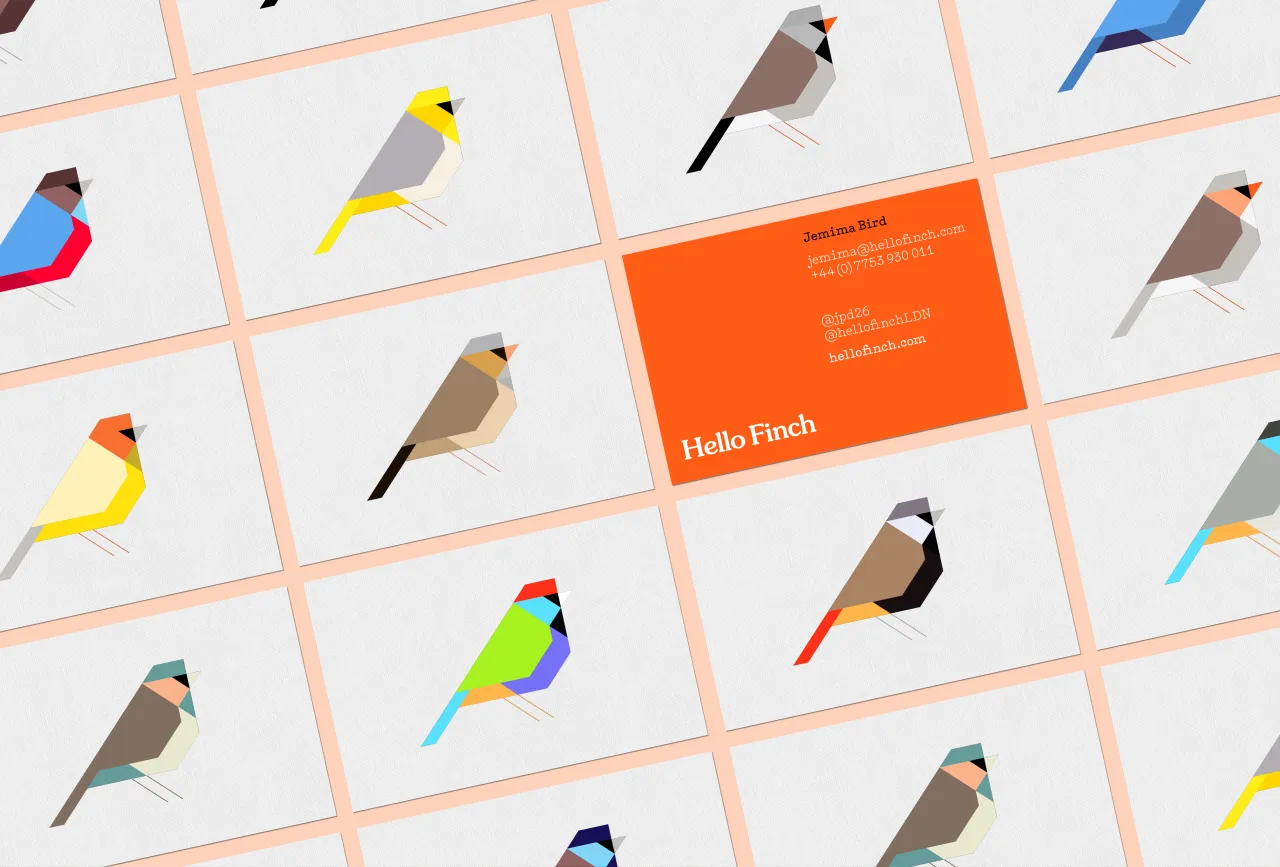
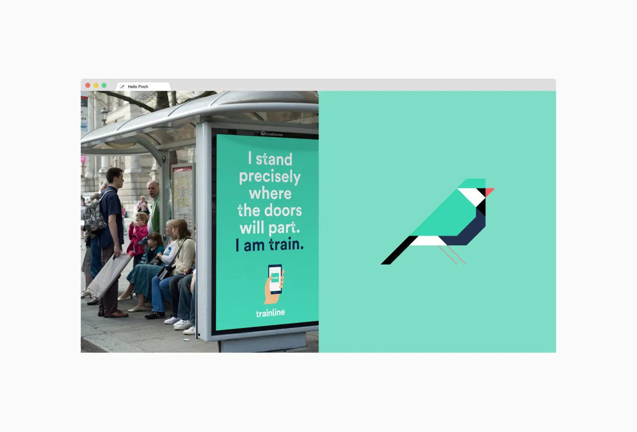
The resulting logo plays on the company name, incorporating a finch in a wide range of vibrant colours, each apparently representing the colours of the brands that Hello Finch has so far helped transform. "This flexible identity reflects the contemporary outlook of the collective and the ability of the agency to adapt to and answer the needs of its clients in a fast-moving digital world," explains Paul Blackburn, studio head.
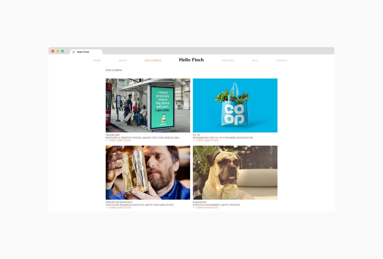
The identity will be rolled out across different media, and Studio Blackburn is among the first companies to join the Hello Finch roster – which includes Butterfield Harris, Third City, Forever Beta and Public Inc.

Editor's Picks





Trending






Latest Jobs
Agent & Producer at The Jacky Winter Group
Full-time·London·£35k–£40k
Account Manager at Moxie and Mettle
Full-time·Cheltenham·Up to £35k
Senior Digital Designer at 3800
Full-time·Sheffield·£40k-60k
Senior Brand Designer at Analogue
Full-time·Leeds·£38k-£45k
Midweight Designer at All Purpose
Full-time·London·£30k–38k
Growth Strategist (Ecommerce) at Tribe
Full-time·Exeter / London·£50k + Bonuses