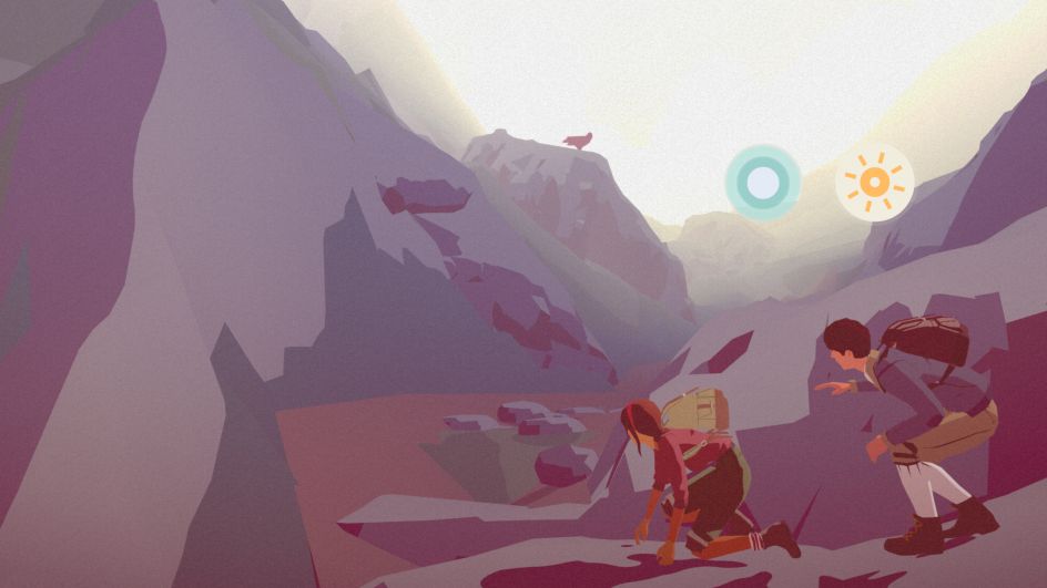
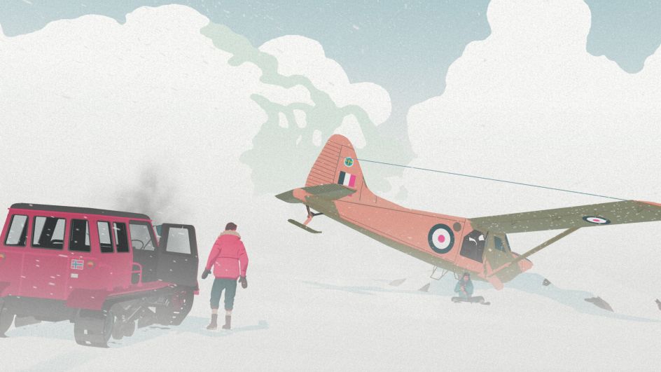
Lose yourself in South of the Circle's vintage screenprint world
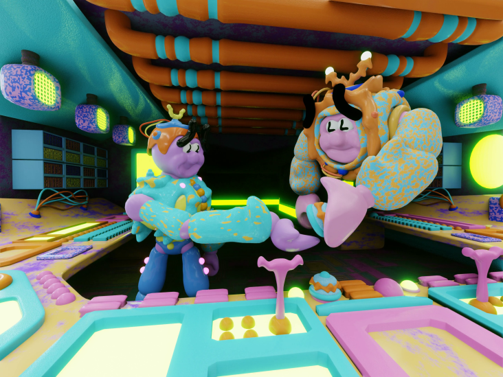
Set between Cambridge (UK) and Antarctica during the 1960's Cold War, South of the Circle is a game whose aesthetic is influenced by the screen printing art style from that period.
The release is written and directed by Luke Whittaker, co-founder of game studio State of Play, which recently released the narrative adventure onto iOS and Apple Arcade. Luke has been screen printing for a large portion of his life, his infatuation for the technique prompted by his grandfather, Ray Whittaker, whose influence spilt over into Luke's design and concept art for the game.
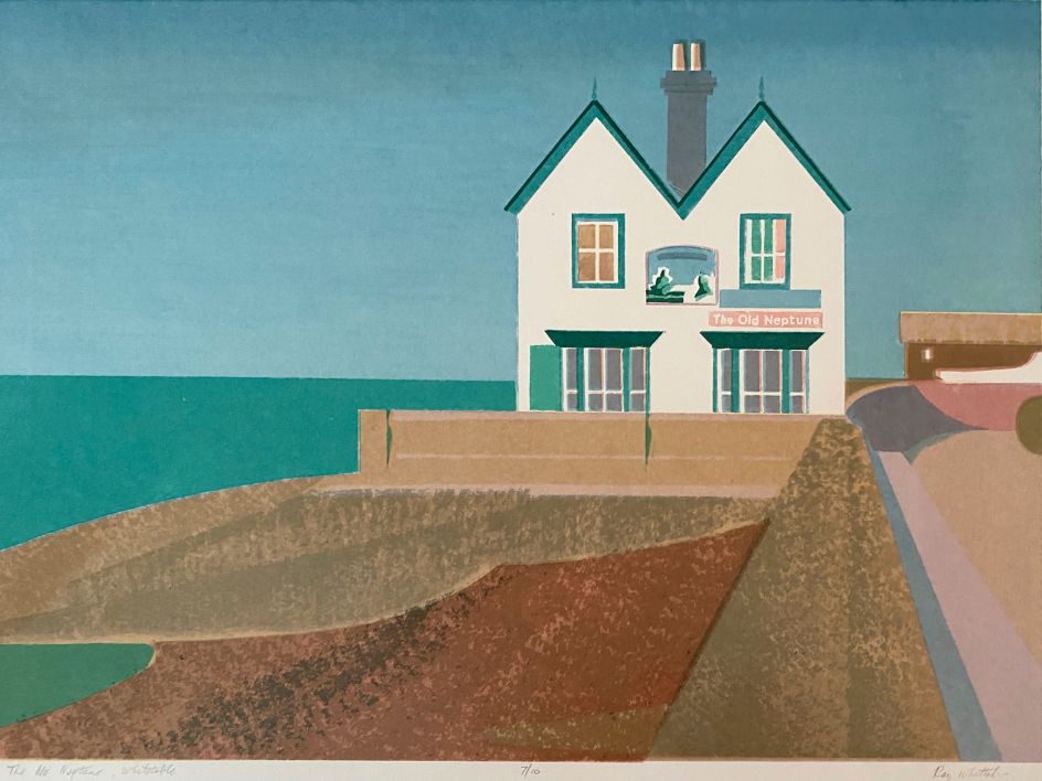
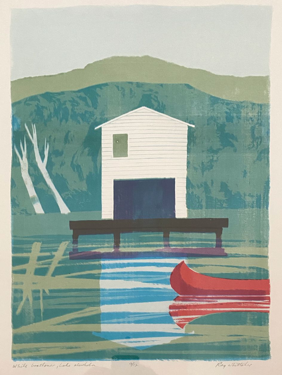
"I wanted a style evocative of the mid-century period in which the game was set. I'd been working on my own designs when I discovered some of my grandfather's screen prints, which he used to make on an old 19th-century screen printing bed."
Ray Whittaker
"There were images of boats, boathouses, seaside promenades and beach huts, all composed with a designer's eye for symmetry and balance. It was fascinating and quite emotional to discover that we shared a similar eye for composition and colour. He died when I was young, so I can't have learned this directly from him, so it made me wonder if it was something innate, something he's handed down without knowing it."
To emulate this style digitally, Luke worked on concept art in 2D first, digitally illustrating scenes with graphic shapes, just as he would when making a print. To get the feel of a hand-made screen print placed in motion, 3D models for the game were not textured, but hand-coloured in-engine on a scene by scene basis, with individual pieces of geometry being given highlight, mid and shadow colour values, selecting colours in a way a printer might be selective with his inks.
"Ted Grimes, our Technical Artist, came on board to develop tools and shaders in Unity which would achieve the look," Luke explains. "To achieve the 'soft bleed' between colours that you might get with screen print, everything in the scene is very slightly blurred before a custom animated grain shader is applied to give the images the tactile, relatable quality we were after."
Luke reveals South of the Circle was an intensely personal project for many of the team, including co-founder of State of Play Katherine Bidwell. It was also an epic one in terms of adventure.
"The game was originally set in the 1930s until Katherine discovered her friend's father John used to work as a scientist in Antarctica in the 1960s. Her friend recommended we talk to him and it was a revelation, we had no idea how fascinating this period of history in Antarctica was."
"I ended up travelling to Antarctica with him for research. Some of the artwork I created there directly inspired the look of the game."
Luke hopes players of the game come away thinking about the issues the games explores regarding concepts of masculinity.
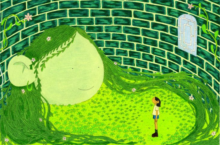
"There's a scene where you flashback to being a boy and being put to bed by your mother and father after what we feel could be traumatic bullying at school. The scene is mostly in shadow, with a rectangle of light at the door. It's simultaneously in keeping with the style and also similar to how we might see the scene if we really were a child looking up at your father."
"The father is struggling to communicate with his son, finally telling him that he needs to match up to his idea of what a man is, to use violence to counter it. With this art style, I could frame the father side on, his profile silhouetted in the light, his demeanour both unreadable and threatening. Using only a few colours, with simple graphic shapes, I could say something about these ideas of masculinity, and it's more powerful to me than it would have been given all the colours and detail in the world."
Ray Whittaker
Editor's Picks


Trending


Podcasts


Editor's Picks
Further Reading