Inspiring work by the 'Type Champions' in Monotype's second annual award
Type library Monotype has just announced the winners of its second annual Type Champions Award, which recognises and celebrates brands that "elevate the value of typography in developing and maintaining brand identities".
City of Helsinki
The winners were selected by a panel of 19 international branding experts (from the likes of Pentagram, Sudtipos, Collins, Interbrand, Ogilvy, and more) who considered the role of typography in building brand messages, marketing and advertising efforts, and overall customer experiences.
The 2020 Type Champions include Actual Source, Adidas, Australian Centre for the Moving Image, Baemin Vietnam, City of Helsinki, Duolingo, IBM, MoMA, Naturalizer, and Studio Dumbar.
"This year's nominations were incredible. I feel honoured to have seen such a wonderful display of type use and font creation to further the field and build awareness on what typography can do to bring brands to life," says judge Kristine Arth, founder and principal designer at Lobster Phone.
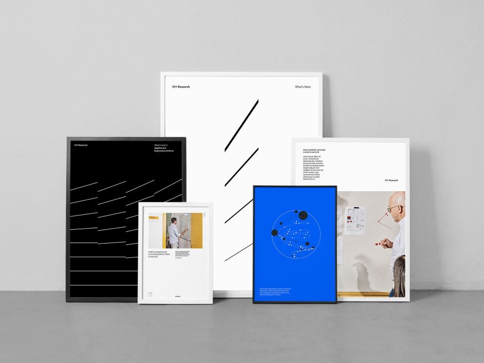
IBM
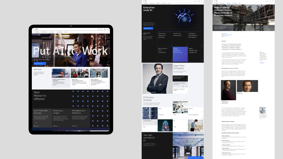
IBM
"Typography is both architecture and music," adds Brian Collins of Collins. "It should explode with clarity and delight, elevating a brand's voice above an increasingly noisy mess of customer interfaces and experiences. More than any other visual element, typography can be the most potent technology a company has to distinguish itself and deliver its promise to the communities it serves. This year's winners demonstrate how type can be smartly leveraged by brands – both big and small, neighbourhoods and nation-states, local cultural organisations and world culture at large."
Looking at some of the winning work, we see Duolingo, the education app founded in 2011. It worked with London-based agency Johnson Banks as well as Monotype to develop the award-winning custom typeface, Feather Bold, that became central to its recent brand refresh. "With every aspect of Duolingo's brand identity informed by and conveying Duo's personality and rounded feather form, it is a true embodiment of how brands can create a unified visual language and tone of voice around a central theme," remarks Monotype.
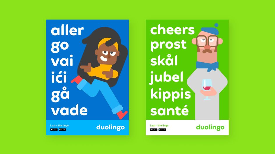
Duolingo
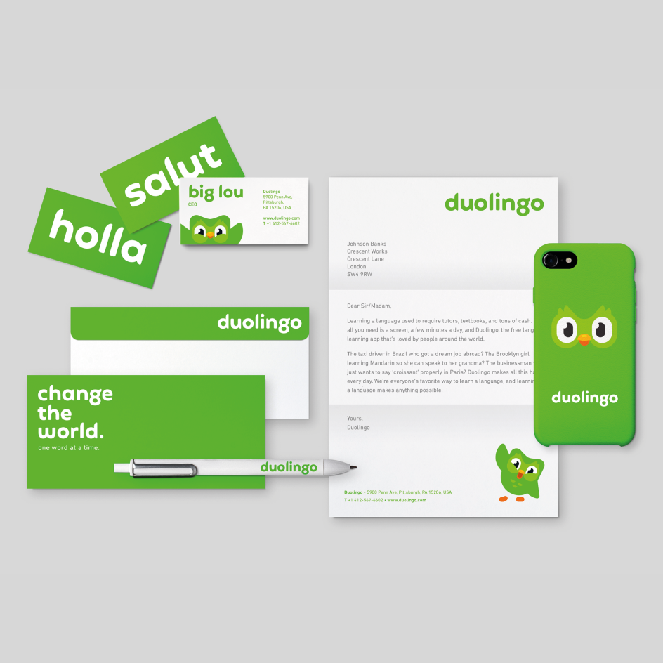
Duolingo
While The Museum of Modern Art (MoMA), ahead of its reopening in 2019, decided to overhaul its typographic voice, trading a disparate batch of sans serifs for a cohesive type family to cover all its typographic needs. It created MoMA Sans, a bespoke typeface that is more modern but retains its distinctive Gothic voice. "While art is the hero of the experience, typography is the silent supporting counterpart that helps the art shine, which led our panel to select MoMA as a Type Champion for 2020," says Monotype.
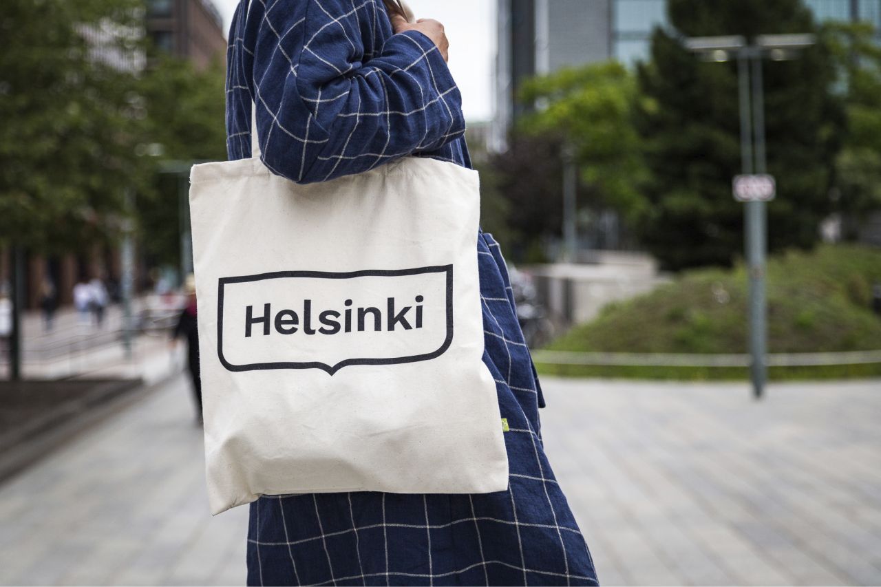
We also have to mention the City of Helsinki's new logo, crafted by creative agency Werklig, based on Finland capital's most recognisable symbol: the crest of its coat of arms with a graphic wave motif. Werklig selected a bold font, with the help of type foundry Camelot, to form a memorable brand. And then there's London-based studio North's incredible wordmark for The Australian Centre for the Moving Image (ACMI) in Melbourne, formed by framing the letters within squares, which mimics the edge of a cinema screen. Coupled with the workhorse Px Grotesk, it's a worth Type Champion.
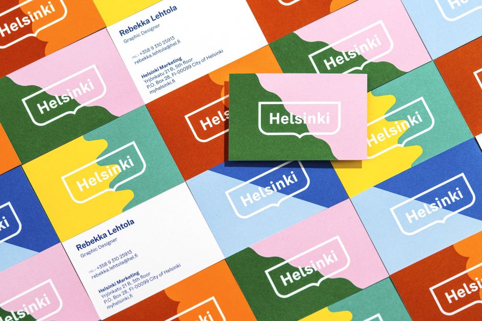
City of Helsinki
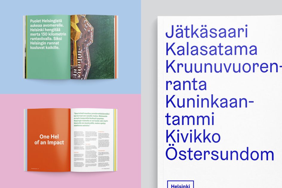
City of Helsinki
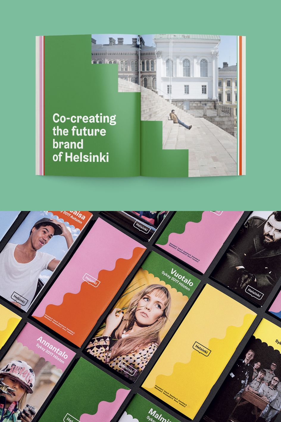
City of Helsinki
"As the world shifts dramatically to digital experiences, the role of typography becomes ever more critical for brands looking to deliver consistent, meaningful experiences," says Charles Nix of Monotype. "Of the many submissions, our panel selected a set of winners that represent how powerful, albeit varied, the use of type can be in crafting identity."
Editor's Picks


Trending


](https://www.creativeboom.com/upload/articles/90/908fdb6378db1e95d12595416f54e6336d5e80b8_732.jpg)
Podcasts


Editor's Picks
Further Reading