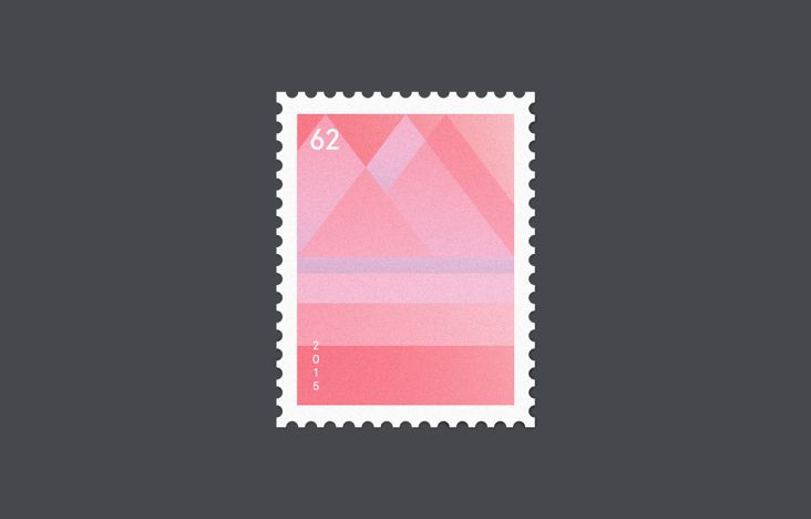
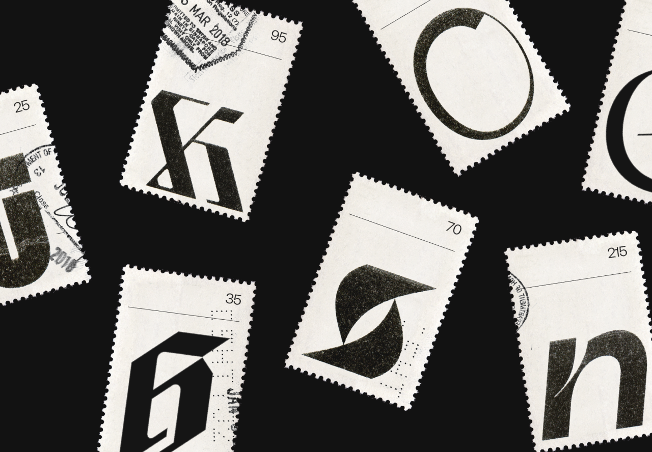
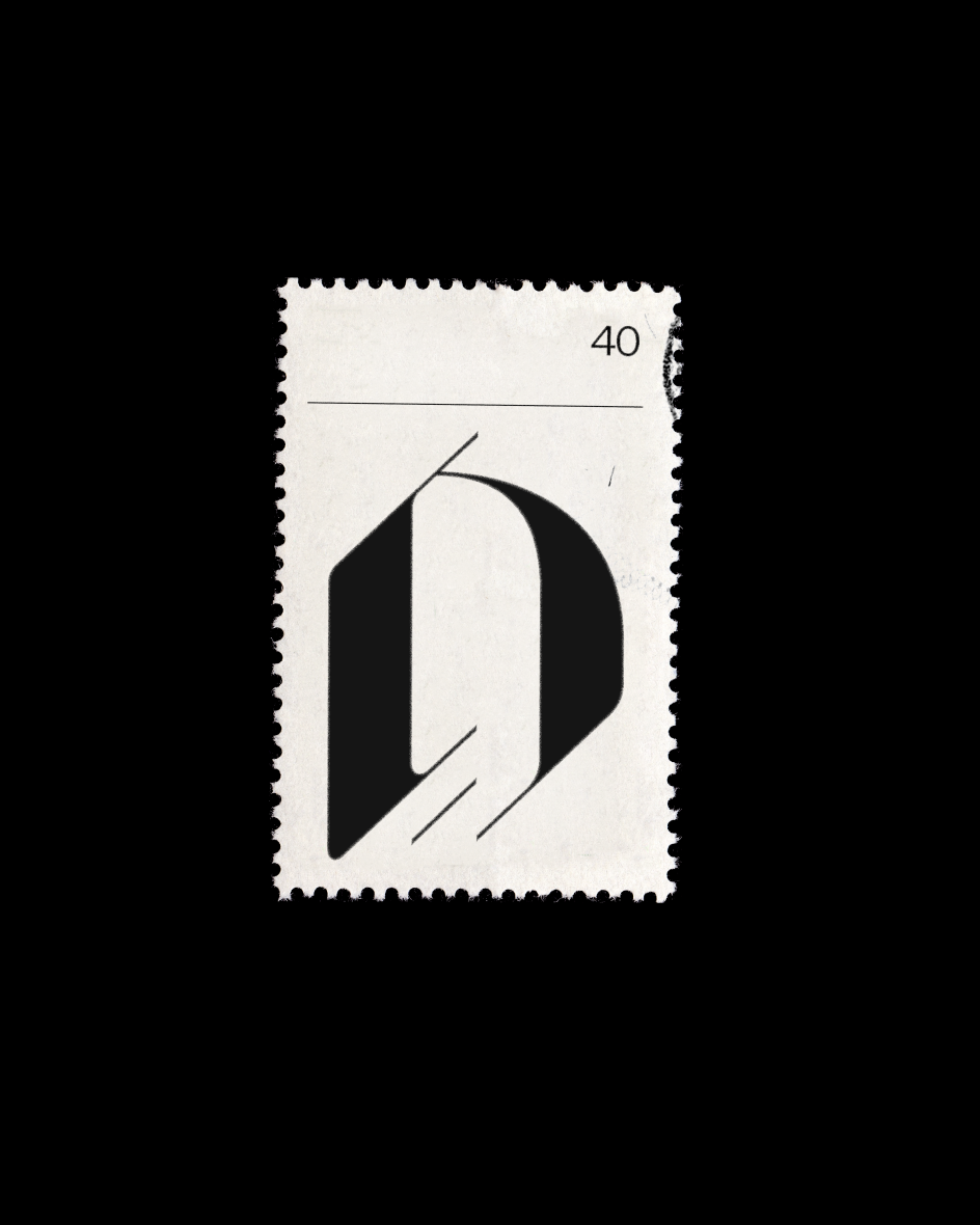
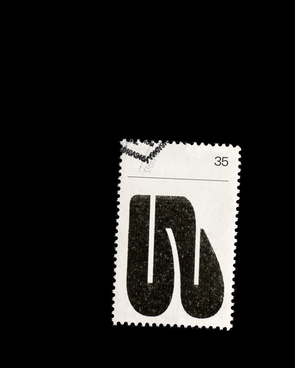
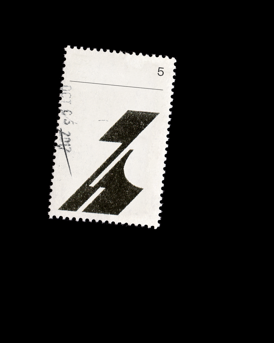
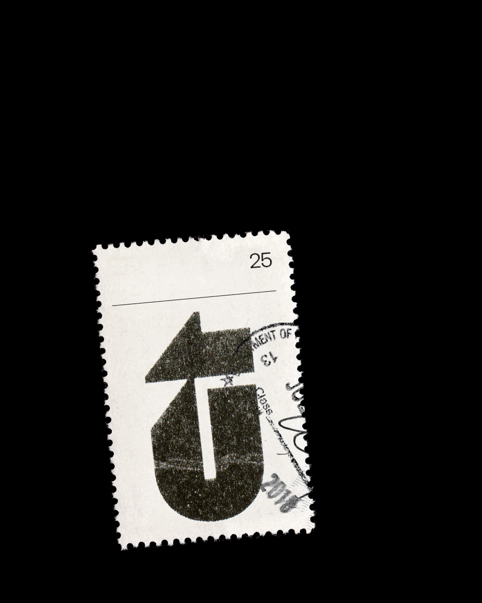
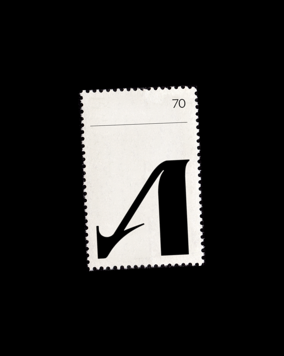
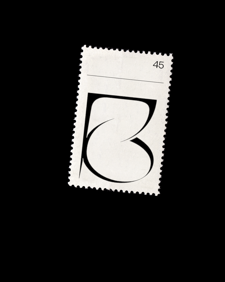
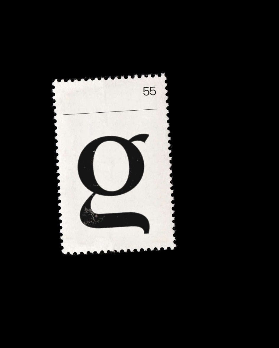
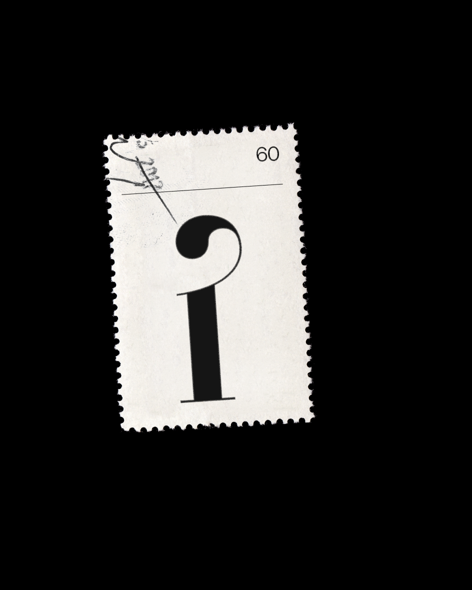
Typographic stamps by Lennard Makosch inspired by shop receipts and soda cans from Bangkok
During his travels around South East Asia, German designer Lennard Makosch launched a side project to embrace his love of typography, creating a series of stamps inspired by old train tickets, shop receipts, and soda can labels from Bangkok.
Stuffing these small printed artefacts into his jacket pockets, Lennard would, more often than not, forget about them until later discovery. "My pockets became time capsules, committed to preserving the written word," he explains. "A practice that transcended language and geography."
On returning to his studio, he would take these little pieces of paper and design stamps in their honour. "They are meant to be a subtle nod to these collected pieces from all over the world," he says. "This project is about doing something without the intent of getting somewhere. Making something simply because you enjoy making it."
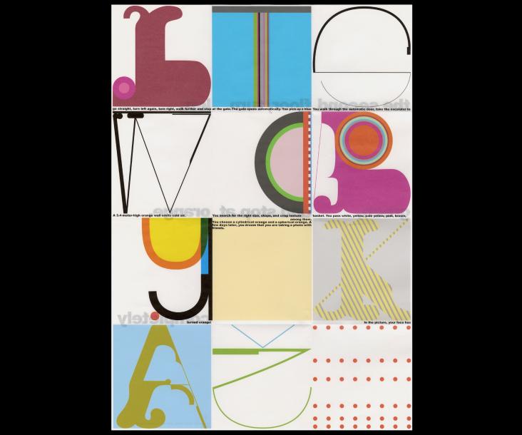
Part of the inspiration also lies in not understanding another country's language. "When seeing other alphabets – especially those for which we have no proficiency – our perspective forces us to see the letters in their simplest form; how they curve and jut, where the lines intersect, or what they mean from a purely typographical standpoint," Lennard adds. "I find inspiration in this idea that we can be immersed, yet lost, in the sense of illegibility. To find beauty in what we cannot understand."
Typography is one of Lennard's biggest passions. "I fell in love with it the moment I learned about it," he says. "As with all things that pique my curiosity, I jumped in headfirst and wanted to learn how to do it 'properly'. I gobbled up as much knowledge as I could retain and immediately started drawing full typefaces. Not in a professional capacity at all. I don't want to step on the toes of actual type designers here. But I learned to respect typefaces and the work behind them and the concept of a beautiful collection of letters, rather than a collection of beautiful letters and what this difference means."
Based in Frankfurt, Lennard is a designer and art director who focuses on branding and typography with some 3D visualisation "thrown into the mix", as he puts it. After seven years of working freelance for clients across Europe and the United States, he began working for Terra Kaffe in 2019, a startup that levels up home coffee. As you'd imagine, the company has taken off during the pandemic, and Lennard is enjoying being part of the fast-growing team.
His Stamp Project, meanwhile, is ongoing, and we can expect more additions in future. "Throughout my schooling, the refrain 'form follows function' was an oft-repeated phrase," he says. "In many ways, it stuck with me in my career. To that end, there's always been an imperative to create work to do it properly. Because of this, I've sometimes found challenges in pursuing projects just for the joy of doing them. I wanted to throw 'function' out the window and just focus on form. I wanted to approach type through a clear lens of pure fascination and appreciate letters for the beautiful shapes they are."
Editor's Picks


Trending


Podcasts


Editor's Picks
Further Reading