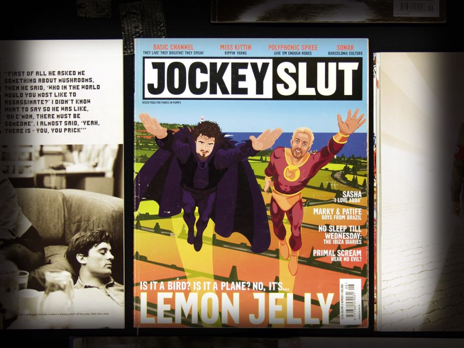
The designs behind seminal dance mag Jockey Slut and its new incarnation, Disco Pogo
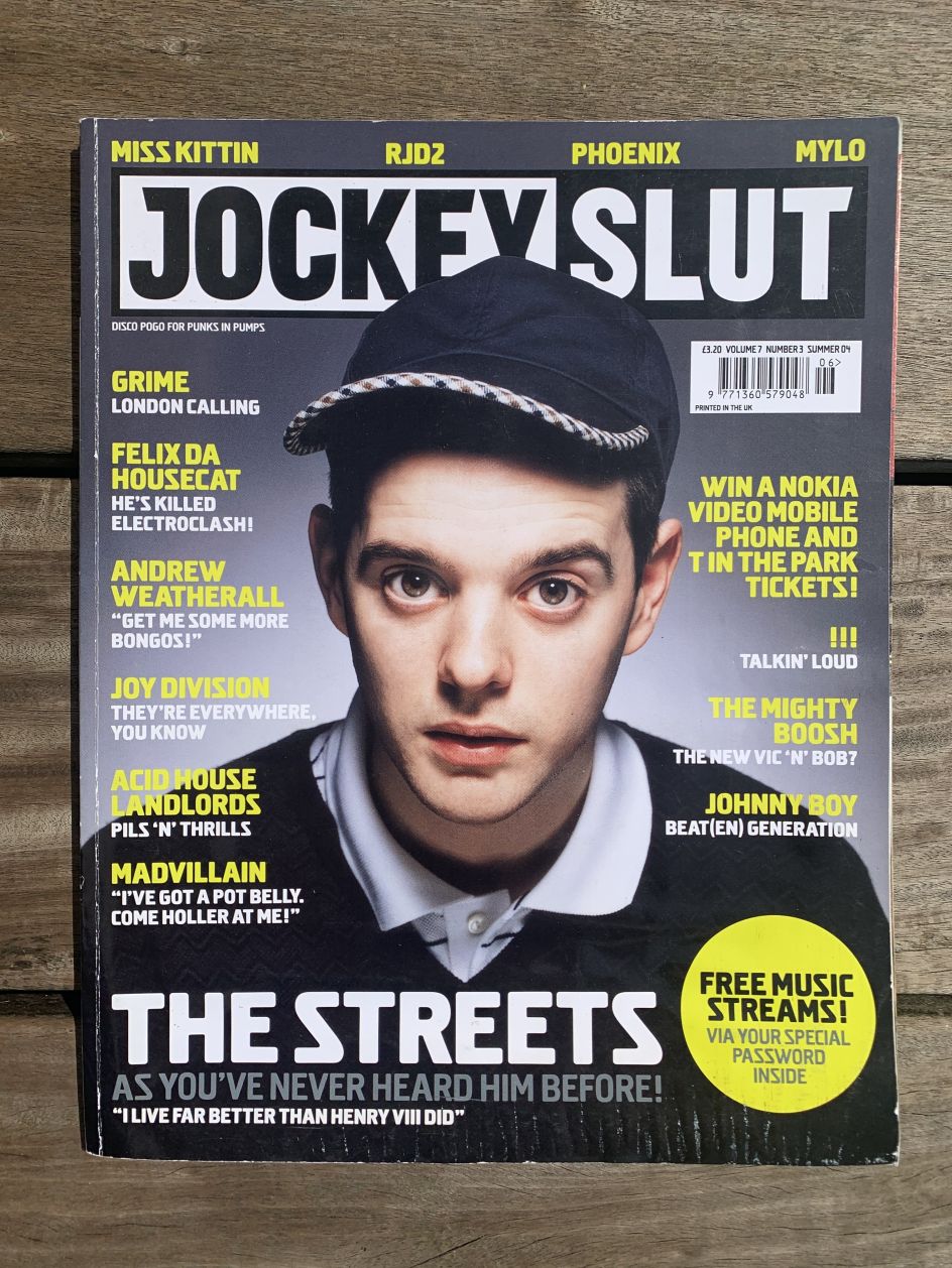
A lot can change in two decades. Jockey Slut launched in 1993 as a printed forum for dance music and club culture, riding the wave of the sonic and youth-movement revolution catalysed by the "second summer of love" in 1988/89. It landed just ahead of the infamous government act, effectively looking to ban "sounds wholly or predominantly characterised by the emission of a succession of repetitive beats".
Those were different times – for alternative culture, music, print and more. Jockey Slut soon became a seminal addition to newsstands, evolving from a self-published bi-monthly fanzine in 1993 to a monthly by 1999, following a buy-out by Swinstead Publishing. Despite good ad sales and generally still doing well, in 2004, that same publisher called time on Jockey Slut, much to the surprise of those who worked there.
But the landscape in 2004 was very different to the heady days of the early '90s, and in the years since, it's arguably only become more and more difficult for print titles to survive in commercial climates. Yet the flip side of this has, of course, been the resurgence of indie titles taking advantage of the innovative new ways to publish outside of traditional gargantuan media machines.
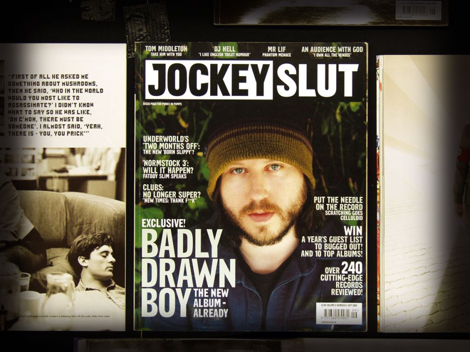
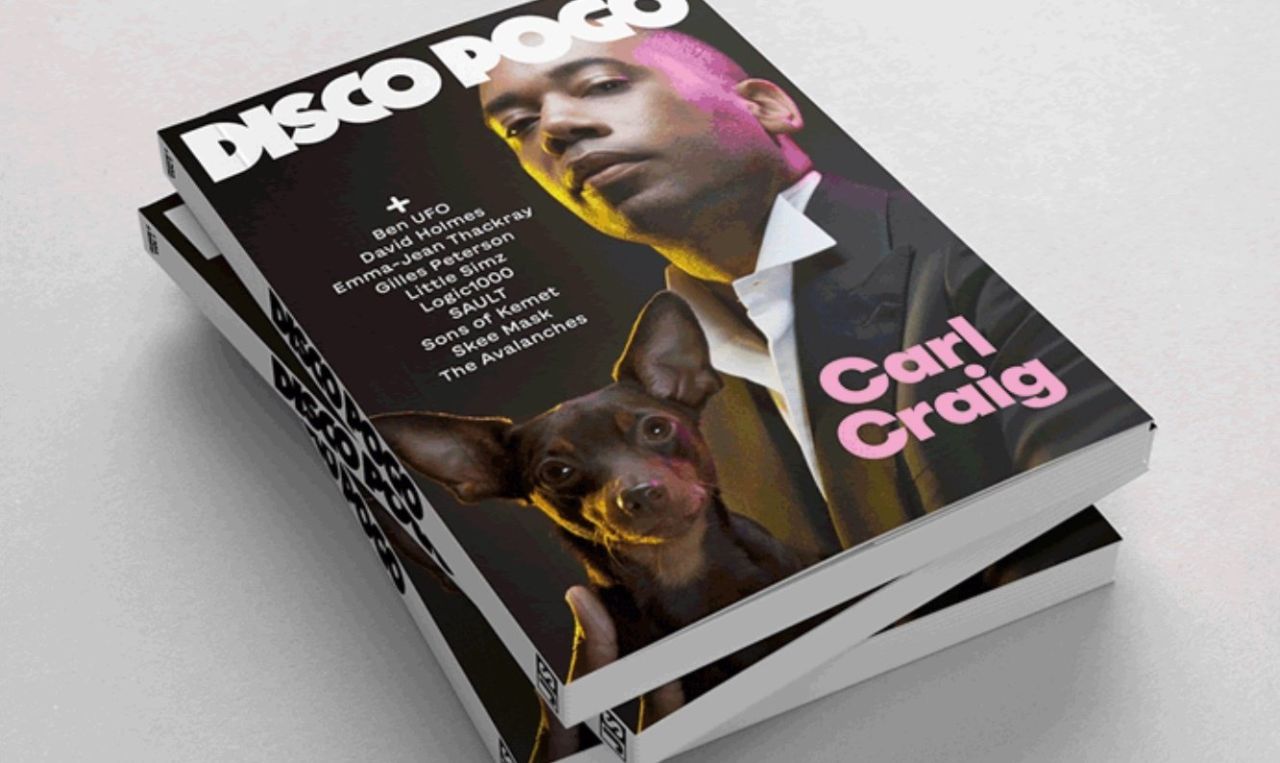
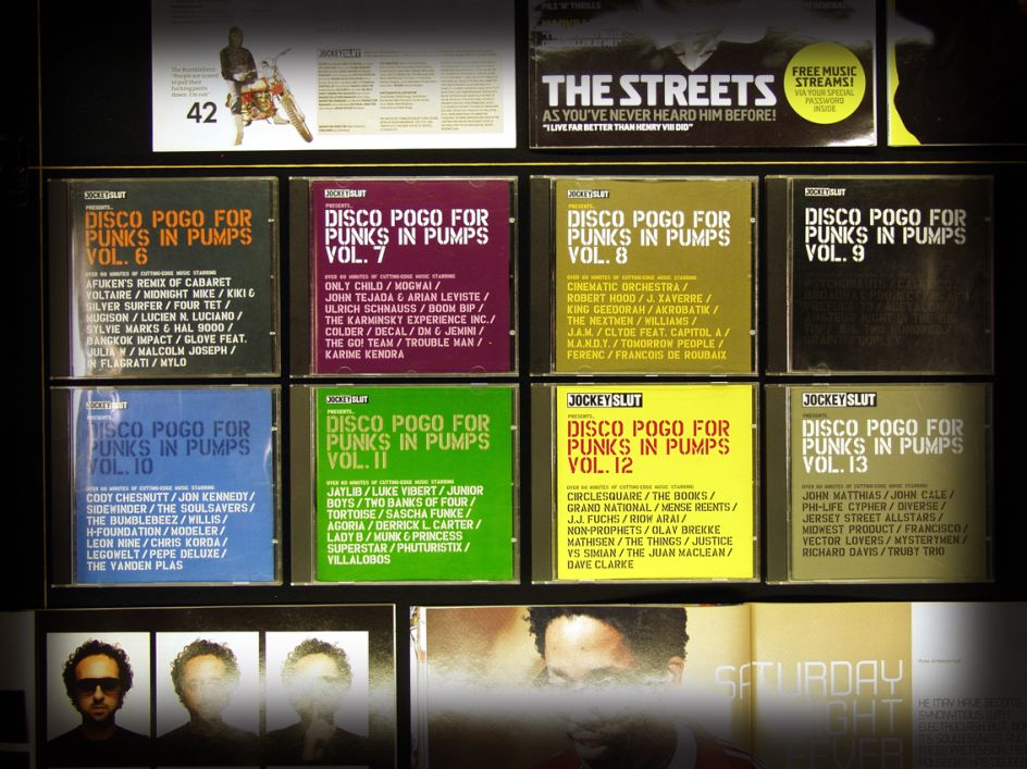
Now, nearly 30 years since the emergence of Jockey Slut, its descendent Disco Pogo is born, borrowing its title from the strapline for Jockey Slut's second-ever issue: "disco pogo for punks in pumps".
Disco Pogo, which is currently seeking funding, is helmed by Jockey Slut's founders Paul Benney and John Burgess, and Benney says the more niche resurgence of print is "perfect" for the mag. "You can launch a high-quality print magazine now, aimed at a relatively specialist audience without having to worry about people picking it up in a newsagent at a train station," he says. "And the people that are into print are prepared to pay for a quality magazine, with great writing, design and photography."
It aims to cater for a broad range of people – likely those "who remember Jockey Slut and feel like there isn't anything currently catering to their tastes and interests". But also new readers who are into current electronic music and keen to learn about its roots in genres and scenes from the past half-century or so.
Disco Pogo was partially born thanks to the success of the recently published book A Jockey Slut Tribute To Andrew Weatherall, which revealed a keen appetite among its readers for a regular publication that filled the void left when Jockey Slut closed.
The reason it's being reborn with a new name, rather than as a straightforward revival, is because "Jockey Slut represents for us a specific time, place and feeling," say the founders. "[Disco Pogo] is a new magazine for a different time. We are also aware that the phrase 'jockey slut' has been co-opted by some people as a misogynistic term, and we don't want that to distract from our new mission or create a grey area as to our stance on the unfair treatment and sometimes abuse of women in the electronic music scene."
Chris Jones was the art director of Jockey Slut from 1999 until the mag's closure, taking over from Graham Peace, and is now taking care of the design for Disco Pogo. When he started at Jockey Slut, he initially looked to open up the logo and "give it more breathing space, a less cluttered look," he says.
"I loved the irreverent pop edge the magazine had, but we were just coming out of the '90s lads mag era. Jockey Slut was moving with the times, and I wanted to reflect that in its look. My design at the time was influenced a lot by Raygun, which was a bit of a cult mag of the time. David Carson was the art director. Black and white type against colour photos, a stripped-down approach that gives prominence to photos and words rather than the design. I didn't have the balls to rip it up quite as he did – we wanted people to still be able to read the mag."
Since Disco Pogo is still very much in its early stages, Jones hasn't got any designs for spreads to show as yet but has created some cover mock-ups and the new logo. "We are having a production meeting soon, after which I will have more of an idea of the direction the team want to take this," says Jones. "What I can say is that for me, my design usually starts with a typeface. I have a stash of fonts ideas hidden away just waiting for the right project."
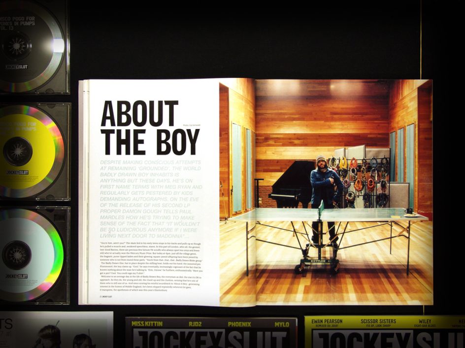
Aside from the broader vast shifts in the climate around dance music and culture more generally since 2004, the machinations of magazine-making also look very different today. "Back then, we were using Quark Xpress, on small Macs with not enough memory to be able to design using hi-res images," Jones explains. "Everything had to be outsourced to a repro house, so we had less control. You couldn't just make adjustments and make a new PDF – PDFs didn't even exist yet! We were reliant on couriers, hard proofs, wet proofs for covers. It was a very long process involving a lot of people. We didn't have time to use retouching or image manipulation, so what you see is what you get – DJs and musicians as real people.
"It cost a lot of money to produce a magazine, whereas now it really is desktop publishing, and it can be achieved with a much smaller budget and team. Printed matter has almost gone back to fanzine stage: anyone can do it if you've got the cash for print."
He adds: "As a result, the potential for independent publishing has increased significantly. Most of the publications we currently produce don't have to sit on a busy newsstand. The mag doesn't have to be covered in attention-grabbing cover lines. Instead, we can focus on our core audience, create a more refined product. I guess what's changed - we can now produce even more of the same – but better!"


](https://www.creativeboom.com/upload/articles/90/908fdb6378db1e95d12595416f54e6336d5e80b8_732.jpg)


 in Manchester. Photography by Ash Young](https://www.creativeboom.com/upload/articles/47/479095bdd525062e5cf4c8296b1e60372780e6b7_732.jpg)