SomeOne behind the first rebrand in 10 years for the House of Commons
This week, we've seen the first brand overhaul in a decade for the House of Commons, launched at a time when it's more important than ever to clearly communicate its work.
Via Creative Boom submission. All images courtesy of the artist/studio
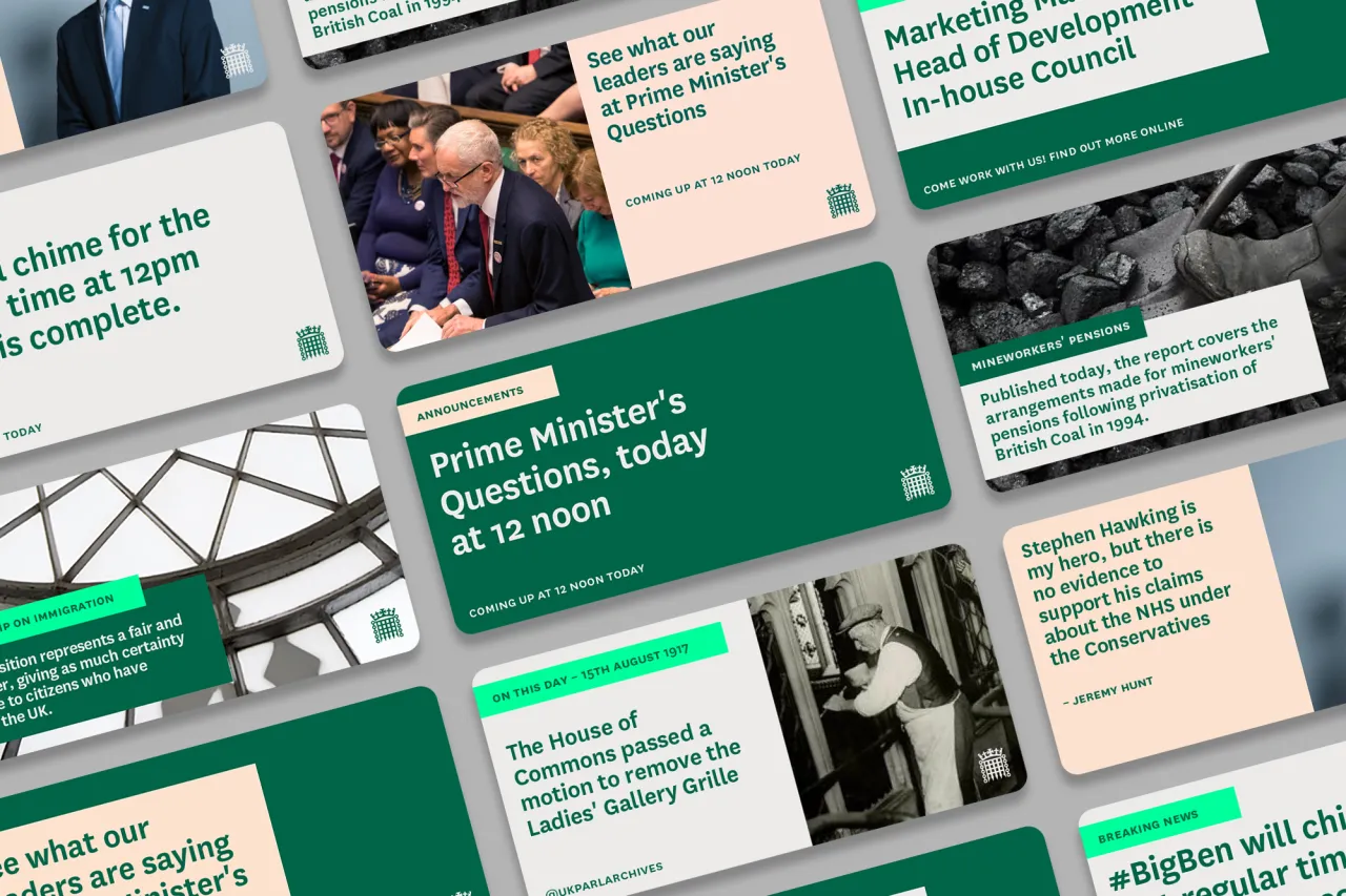
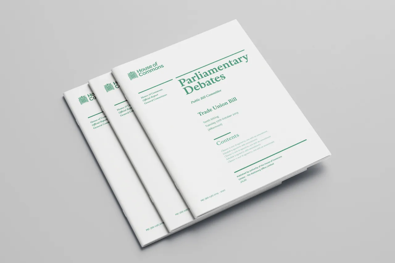
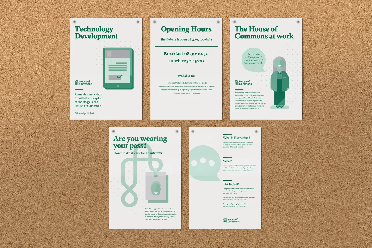
SomeOne is behind the new identity, which replaces a system produced in 2009 – two years after the first iPhone was introduced – and focused predominantly on traditional print publications and stationery. It didn't really address anything else like signage, commercial or importantly, digital – social media, apps or external sites. So, as you can imagine, the design system had become inefficient.
"A rigorous audit conducted by SomeOne of the current visual identity in use across the House of Commons highlighted particular challenges and opportunities for the new design systems," says Simon Manchipp, founder of SomeOne. "The new connected identity system will help the House to communicate far more effectively on digital platforms."
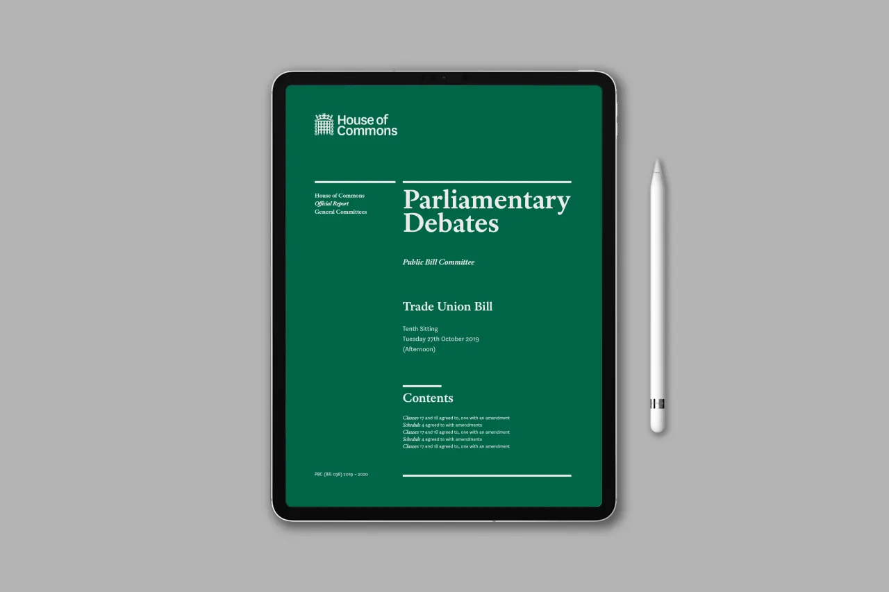
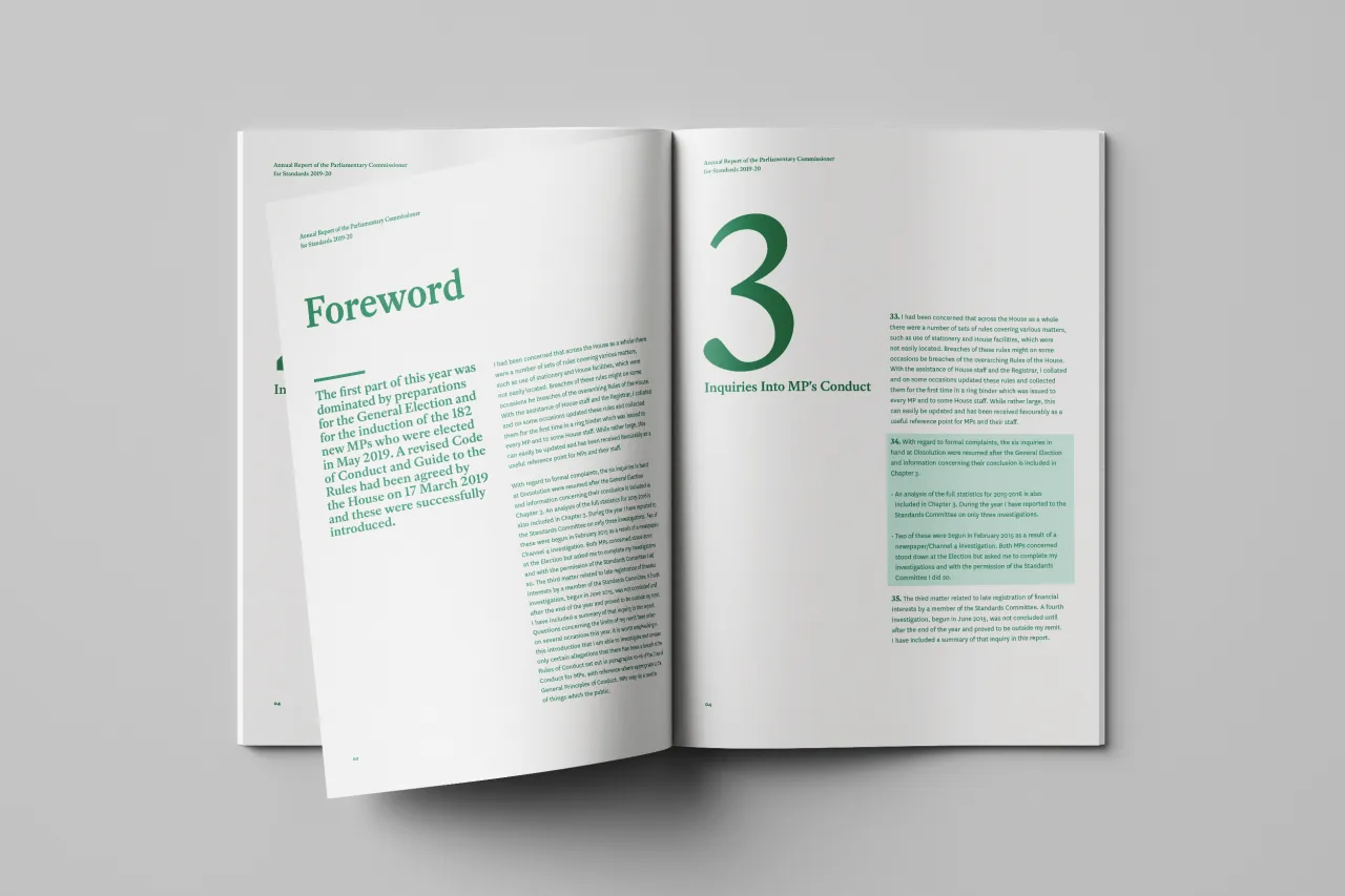
There's a new typeface called National, which works to support and develop an adaptable wordmark system for House of Commons, designed to work across application types and at all sizes for better reproduction on screens, surfaces and at scale.
"The operating system we’ve developed for the House of Commons remains respectful of the past while welcoming current and future demands," adds Cosmo Jameson, design director at SomeOne. "Surrounding the central design elements are new aspects created to build greater engagement with the public and help them to stay in touch with the parliamentary landscape."
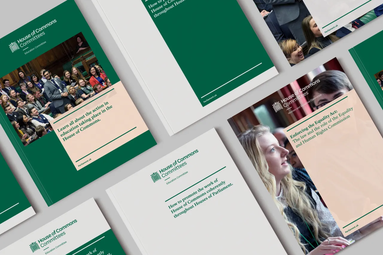
A new House of Commons colour system has also been introduced. The famous core green has been developed to improve the contrast of elements and legibility of type in all formats.
Cosmo adds: "We looked to deploy an identity designed to work seamlessly across digital and print, while also supporting House teams in their work through the delivery of robust design systems, including lock-up structures, and communication materials. Enabling them to concentrate on the content, now matters of design are taken care of."

Editor's Picks





Trending






Latest Jobs
Senior Operations Manager at BIG Partnership
Full-time·Glasgow·£45k–£50k
Growth Strategist (Ecommerce) at Tribe
Full-time·Exeter / London·£50k + Bonuses
Senior Designer at Creative Spark
Full-time·Manchester·£35k-£50k
Account Manager at BUILDHOLLYWOOD
Full-time·London·£34k–£38k
Art Director at The New York Times
Full-time·New York·$120k–$130k
Client Partner at Halo
Full-time·Bristol·£30k–£36k