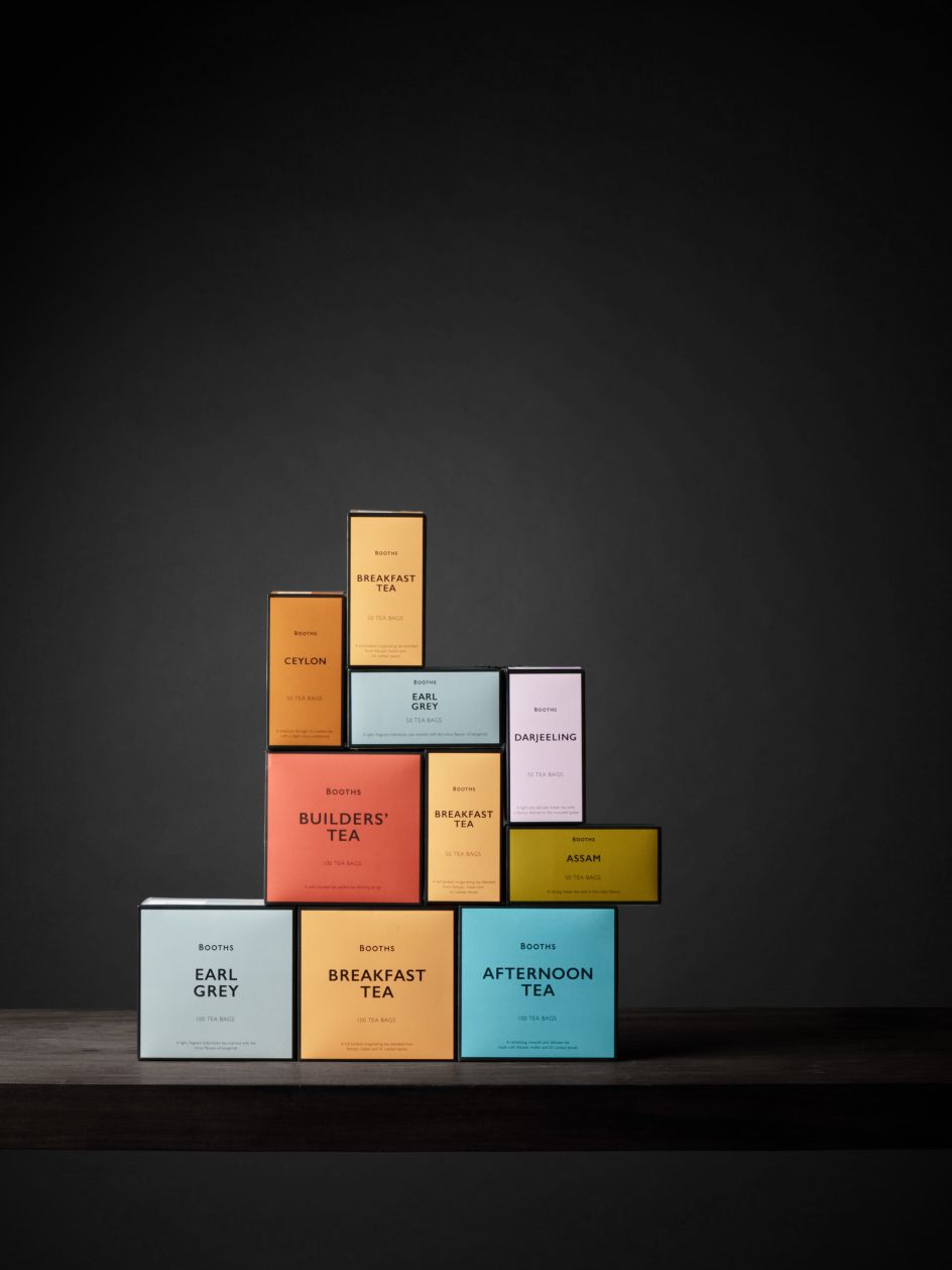
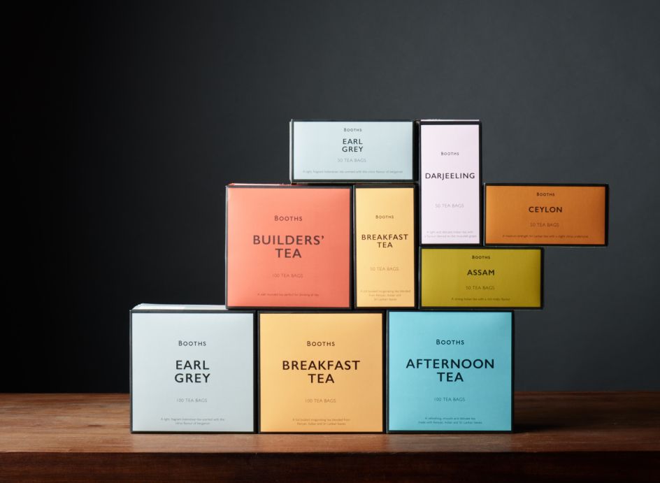
Smith&+Village rebrand Booths tea range with a brewed up bold colour palette
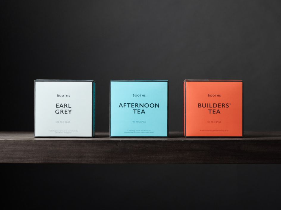
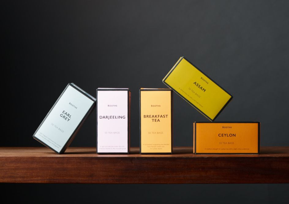
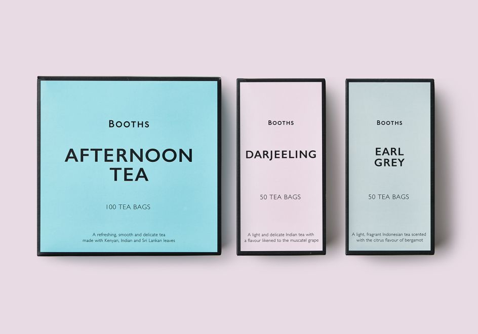
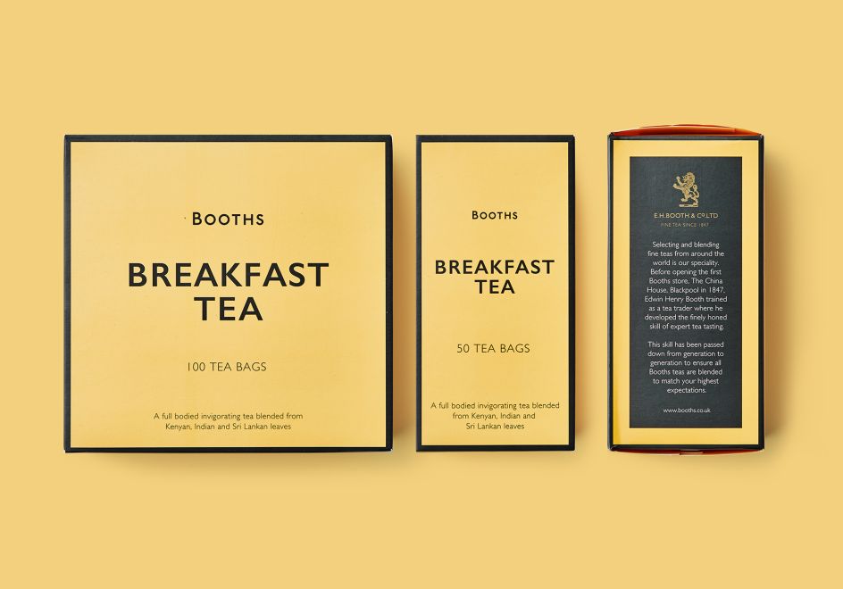
Smith&+Village has redesigned Booths' range of teas, calling on the retailer's origins as a tea importer in 1847. The bold and eye-catching packaging features a strong and simple mix of typography, colour and a unique Booths twist. There are no photos or confusing category language.
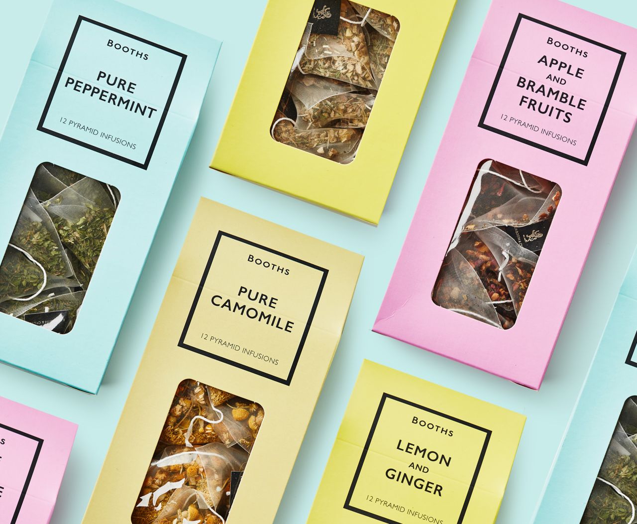
Today, tea is apparently still graded and packed on the premises in Preston, so the range is fundamental to the business. Debrah Smith, Creative Director, Smith&+Village, says: "The tea range totally embodies Booths as a business. The jewel-coloured boxes of the different tea varieties sit together as a strong family and have real presence on shelf amongst the brands.
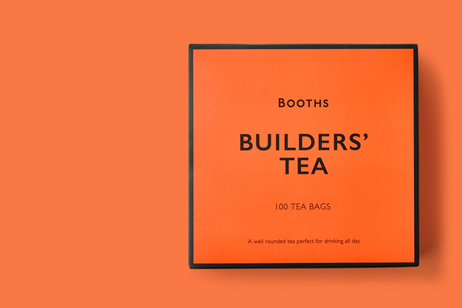
"The piece-de-resistance is the packaging for the strong afternoon tea bags, which we called Builders’ Tea, because after all, that’s what we all call our favourite brew."
The strategy for the brand and the design reflect Booths' premium and heritage positioning, while making it relevant for the modern consumer. Richard Village, Director, Smith&+Village, adds: "Booths’ own label branding communicates the quality of the products. The new, simple, consistent and monolithic look we devised boosted customer recognition by reflecting the values of the retail brand, as well as its reputation for high quality."
A range of loose leaf teas is set to hit the high-end supermarket’s shelves later this summer.
Editor's Picks


Trending


](https://www.creativeboom.com/upload/articles/90/908fdb6378db1e95d12595416f54e6336d5e80b8_732.jpg)
Podcasts


Editor's Picks
Further Reading