Skin-care routine gone wrong? Studio Frith designs a suitably 'lumpy-bumpy' identity for new film Woaca
Morning: wash your face with water only, apply a Vitamin C serum, moisturiser and SPF. Evening: start with an oil cleanse, then move on to foam cleanser, toner, essence, serum, and moisturiser. Maybe an exfoliant, oil or mask, depending on the day. Maybe you'll use a roller or gua sha.
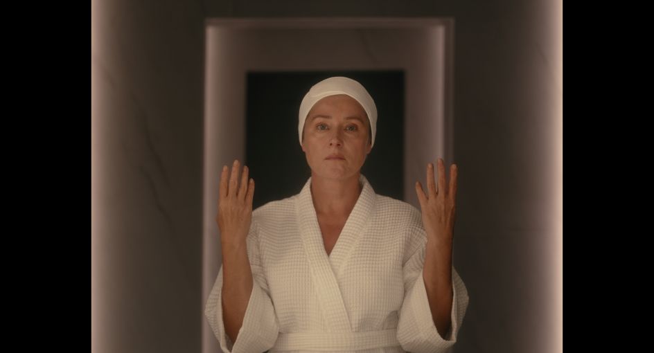
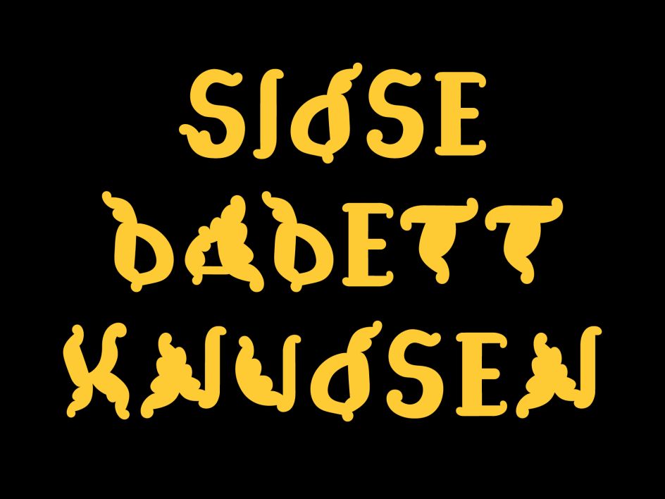
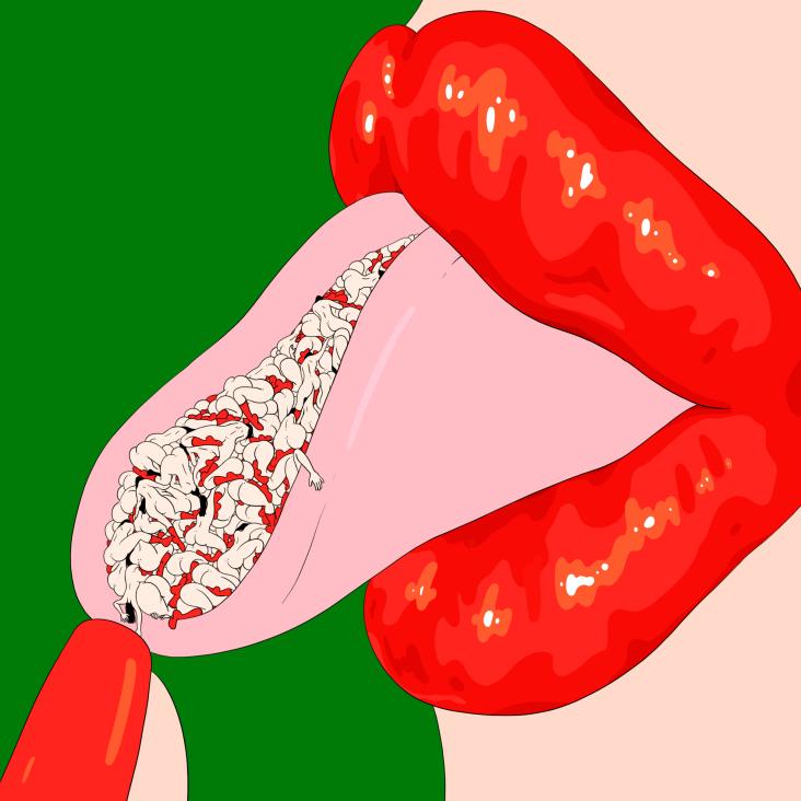
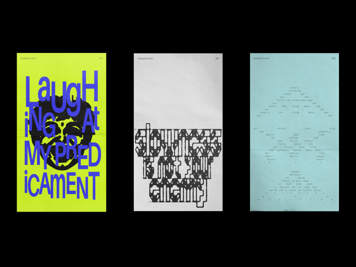
WOACA Trailer TIFF 2023, bespoke typeface designed by Studio Frith
Although long and complicated, the 12-step (and more) skincare routine is widely known and practised by many. It's become such a habitual event that it's just as normal to spend an hour each day scrubbing and slugging as it is to drink a cup of tea. But is it really any good for us? In a new short film entitled Woaca, written and directed by Mackenzie Davis, this topic is firmly and humorously addressed: a woman's skincare routine goes wrong; she repeatedly puts lotion on her face – again, again and again – until, eventually, she puts lotion on the floor.
Premiering at the Toronto International Film Festival, Woaca is a creepy and comedic depiction of the beauty rituals we undergo to keep young and ultimately shave off the years. It's dark and awakening, and the film needed an equally unnerving identity to match its energy. Studio Frith was called in to design the titles, posters and overall visual language of the short film. "We were excited to explore the film's intersection between horror and cartoon in order to develop a bold new language," says the studio.

In a moody yet classy palette of burgundy, gold, white and black, the aesthetic nods to classical shapes and forms from the Renaissance period, as well as a more modern, horror-inducing deep tone of blood. It's not your typical palette of what you'd expect from the world of skincare. "We complemented the bathroom's cool, sterile colour palette with an explosive yellow and rich red," says the studio. "These are prominent colours within the film."
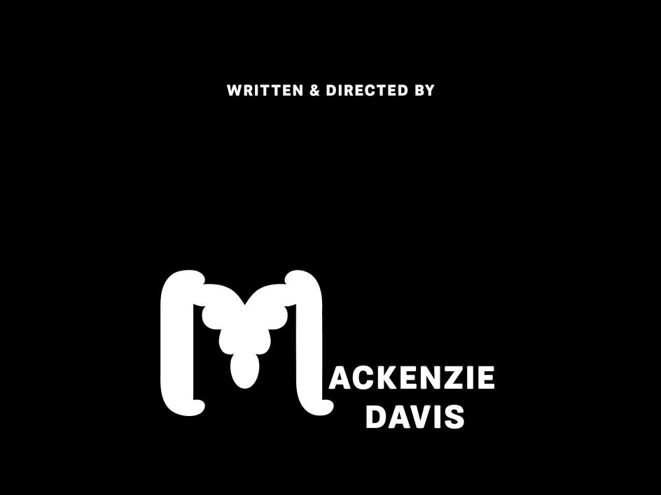
These unexpected hues are paired with an impressive bespoke typeface inspired by The Zit, a cartoon by Tom Bunk. The cartoon originally appeared in MAD #345 and follows a teen popping a spot in a bathroom mirror. "It is about the tension and relief that most of us have felt towards our skin at one point," shares Studio Frith. As such, the typeface feels suitably oozy, with "lumpy-bumpy fluid curves" developed from a prominent scene in Woaca. "The letterforms are grand and grotesque… we called them 'Voluptuous Ick'."
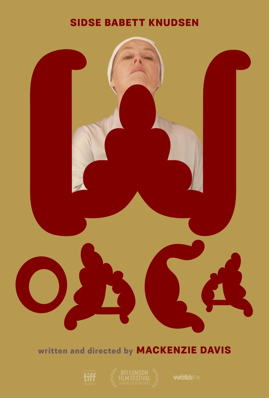
The feeling you get when looking at the identity, and trailer for that matter, is purposefully unnerving. But what else can you expect when combining two juxtaposing genres of laughs and thrills? "We felt joy and horror simultaneously when we watched Woaca," says Studio Frith. "Hopefully, the titles reflect this." We couldn't agree more; the same goes for the film's creator. "Studio Frith anticipated and decoded my deepest desires for my titles and poster design, taking everything I spoke to them about and expanding it into a universe," says Mackenzie. "I am now in the position of wanting to make another movie as soon as possible just to get to collaborate with them."
Editor's Picks


Trending

Podcasts


Editor's Picks
Further Reading


](https://www.creativeboom.com/upload/articles/cd/cdf6ac47279cf409ae1d755948ff62b7cc7e0a10_732.jpg)