A new signage project from Studio n.io.s challenges the seriousness of office environments
Before we delve into the distinctive world of Studio non.iodized.salt – an independent graphic design studio based between Prague and Shanghai – it's essential to understand the roots from which this creative powerhouse emerged.
Founded by Ki Yan, a visionary designer hailing from Shanghai, Studio n.io.s fuses art and design to deliver powerful projects for clients. But perhaps more importantly, the studio aims to tackle a lack of equality in design; as it stands, Studio n.io.s is one of the 0.1% of female-owned creative agencies.
Yan's journey has been marked by a relentless pursuit of balance, beauty and innovation. Studio n.io.s, therefore, emerged as a way for the designer to carve her unique path in the world of visual aesthetics. Such is the case for a recent project for Blooming Showroom, a platform and home of designer brands in the world of clothing, accessories and lifestyle products. With a brief to create an interesting office signage system for its new office located on Wukang Road, Yan was inspired by the vibrancy of the building's location and strove to breathe new life into the traditional office environment.
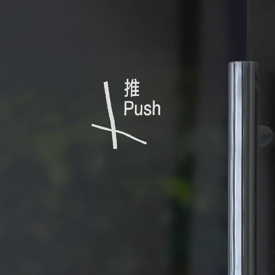
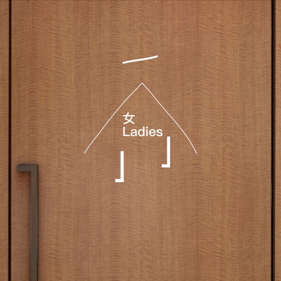
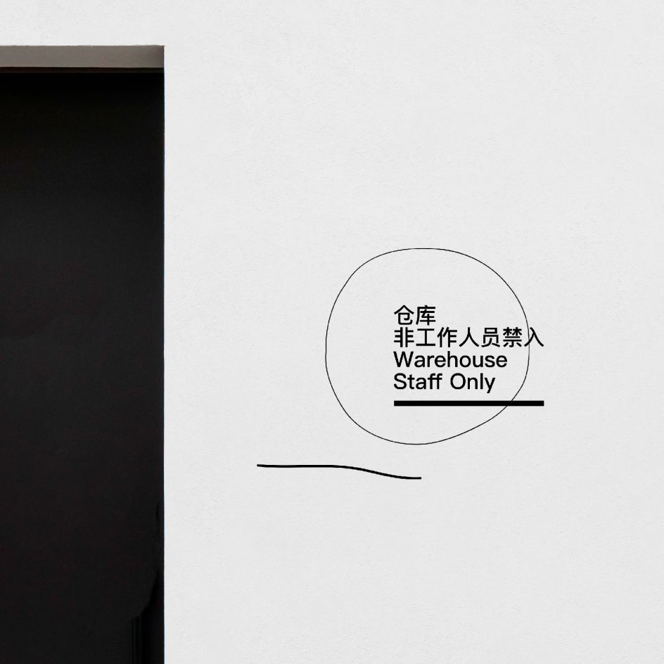
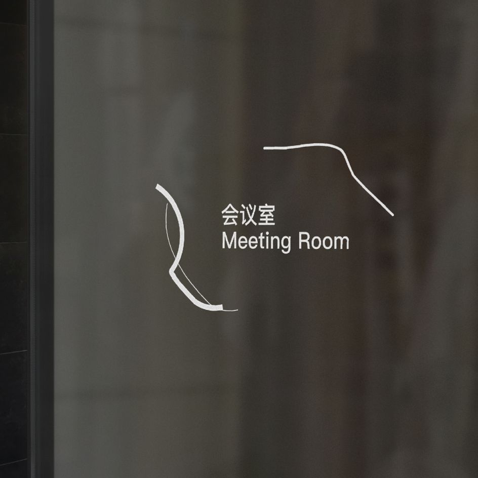
When considering the direction of the signage system, Yan decided to avoid anything too serious and wanted to infuse the workplace with a refreshing, relaxing and energetic atmosphere. As such, Yan landed on an engaging office signage system that would resonate with young employees and fit the brand's ethos. "Based on this brief," she examples, "firstly, I took their logo and visual identity into consideration because the signage system is also part of the branding."
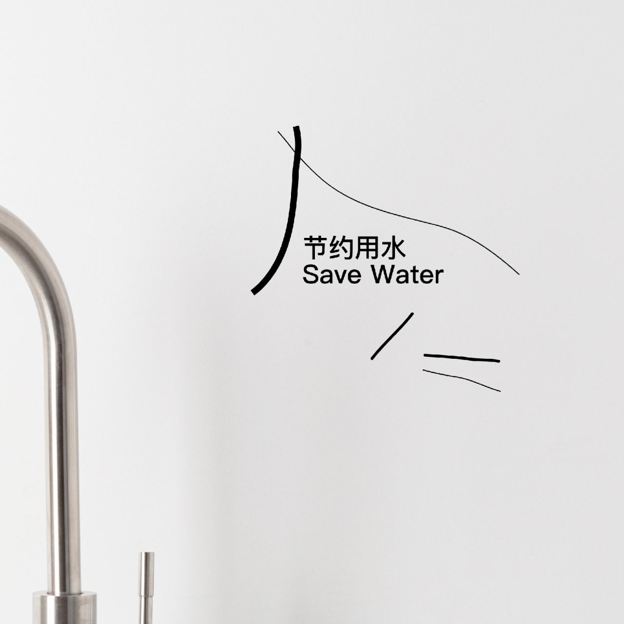
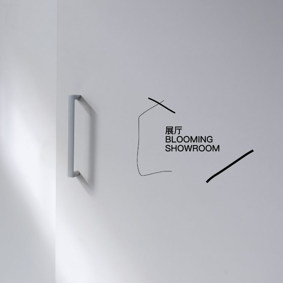
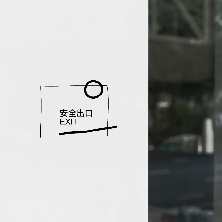
The logo itself – which "consists of bold lines that look like two abstract blooming flowers" – presented a unique challenge. To reference the logo in the signage, Yan wanted to strike a balance between seriousness and relaxation. As such, she expertly toyed around with line thickness and offered three distinctive visions for the client. They landed on a vision that balanced recognisability and craft in equal measure. "If I use all bold lines in this project," she continues, "it will be serious, not relaxed. That's why the lines vary in thickness."
Creating a signage system is no mean feat. For Yan, the process mirrors her other projects, with the central tenet being that the outcome should seamlessly align with the brand's ethos. "My belief in works is that the outcome should fit the brand first, both in content and styles, then as pioneering as possible," she explains. In the case of Blooming Showroom, the signage needed to be customised and easy to orchestrate.
"There are two main considerations: one is to ensure the whole size of single signage fits the space; the other is to ensure the width of the finest line that could be manufactured," she says. The choice of a typeface significantly impacts the overall aesthetic, too. Yan opted for PingFang, a "modern and delicate" typeface that seamlessly integrates with the project's vision and reflects the core message of the client.
At its heart, the Blooming Showroom project is an invitation to experience relaxation and fun in the workplace, challenging the conventional seriousness of office spaces. "I hope workers and visitors in this space can feel relaxed and refreshed," she concludes.
Editor's Picks


Trending


Podcasts


Editor's Picks
Further Reading