Skep rebrands a super-fast grocery delivery company as a magical service run by wizards
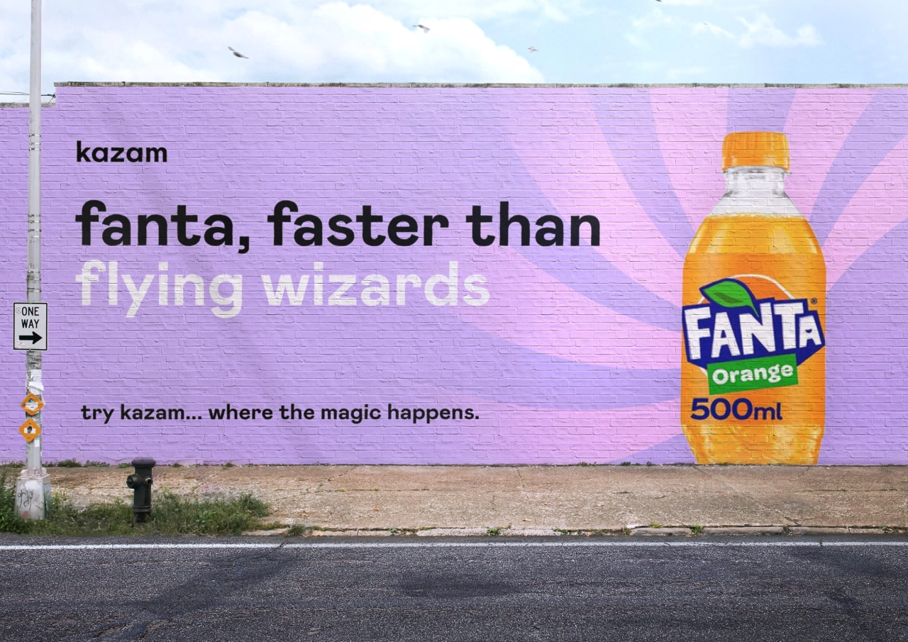
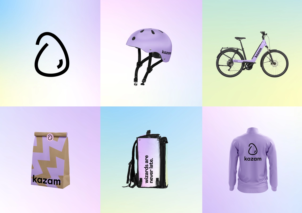
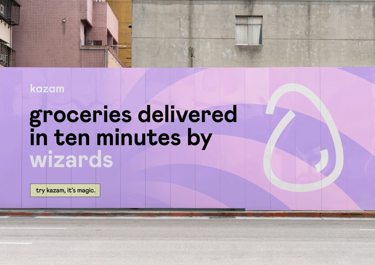
London-based studio Skep has given delivery giant Dija a serious refresh by renaming it Kazam and creating what it describes as a "new magical world, where your groceries are delivered by wizards".
Recently acquired by GoPuff, the '10-minute' grocery delivery company Dija was founded by senior former Deliveroo employees Alberto Menolascina and Yusuf Saban who recently approached Skep to name, design and develop a new identity that would "inject a little magic into the increasingly competitive, but "visually dry" marketplace, with competitors such as Getir, Gorillas and Fancy.
Just in time for Halloween, Skep says it gave a "few waves of the wand and a little hocus pocus" to come up with the new name, Kazam, along with a fresh identity that surrounds a "magical" world where "super-speedy deliveries are brought not by riders but wizards, and dazzling grocery delivery speeds leave customers spellbound," as Skep explains. This is a rather nice description for a branding project and certainly adds to a theme we think will be big with design next year, and that's anything fun, given the time we've had of late.
"There's something wild about the whole 10-minute proposition," says Josh Hailes, Skep co-founder. "When you hit 'order' and the doorbell goes 10 minutes later, that's a pretty magical experience. You'd expect ordering groceries to be a chore, but Kazam turns it on its head, even making it a bit fun."
Fellow studio owner, Chris Smyth, adds: "The instant needs market is seeing rapid expansion, with a number of fast-growing companies competing for market share. And a lot of the visuals in the space don't quite capture the brilliance and wonder of what the product is actually doing. It really feels magical to the user – 10 minutes from order to delivery is seemingly impossible when a supermarket is a 15-minute drive away. So when the order turns up, there's a wonder and lightness to the whole thing. We wanted to bring that feeling across the whole brand, and make every interaction with Kazam feel like you're being reminded of that feeling."
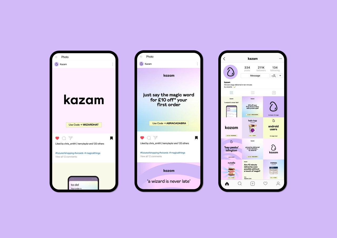
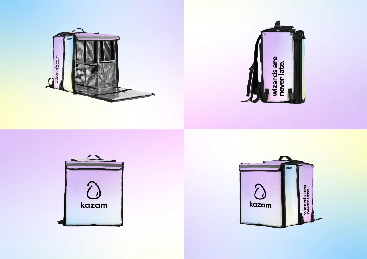
There's a glorious pastel colour palette of pink, yellow, green and blue with soft gradients that suggest potions are being concocted, somewhere. And typography features Magic Mabry, a custom typeface that has "bundles of sparkle and just enough magic". There are glyphs, too with the purpose of leaving customers "starry-eyed". And the tone of voice is focused around a brand that's "full of charisma, life, and a sparkling of stardust". Skep also created some 'Wizard Whirls' within the visual language, drawing inspiration from the "magical hypnotic patterns used by many magicians". And the whole identity has been rolled out across marketing, packaging, delivery bags, website and social media apps. Clearly, a labour of love and one that inspires joy. More of this, please.
Editor's Picks





Trending






Latest Jobs
Mid-Senior Designer at Something Familiar
Full-time·Bristol·£32k–£40k
Designer at New Genre
Full-time·London·£36k–£48k
Account Manager at Moxie and Mettle
Full-time·Cheltenham·Up to £35k
Senior Designer at Definition
Contract·London·£45k–£50k
Creative Project Manager at Analogue
Full-time·Leeds·£28k–£35k
Senior Brand Designer at Analogue
Full-time·Leeds·£38k-£45k