Ryan Chapman's minimal use of colour and detail leads to appealing simple illustrations
Throughout Ryan Chapman's work, there's a consistent theme – the graphic artist and illustrator always reduces colour and detail, bringing everything back to its most basic form. He occasionally creates artwork, then slowly works backwards – removing parts until "just the right balance is achieved and uses a tested limited palette that can lend itself from a heavy editorial topic to a children’s illustration".
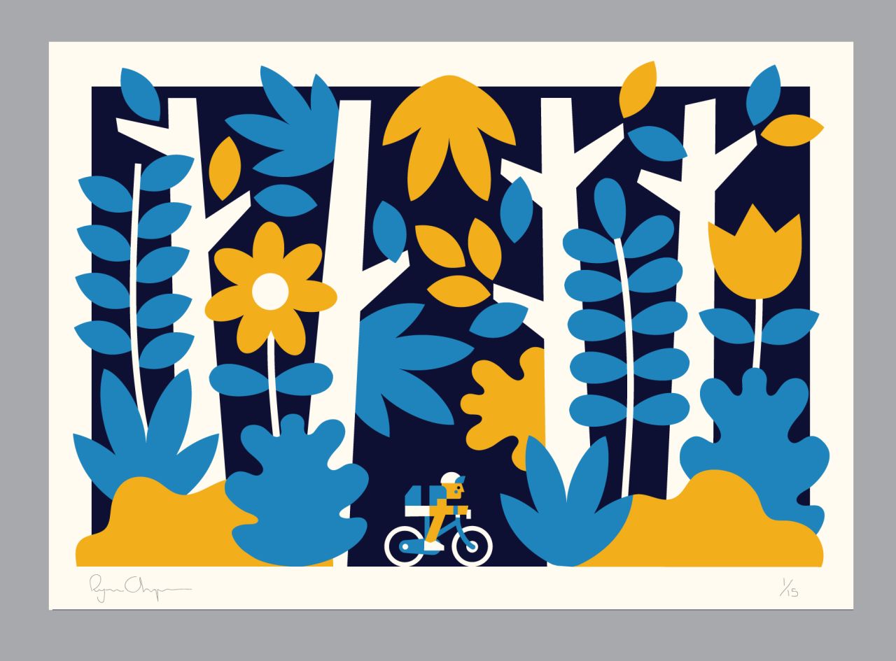
Cyclist
Early on, the Northumberland-born creative was influenced by Mid-Century and Scandinavian illustration. With limited budgets and printing techniques, the two types of design were always direct and striking, and this is what appealed to Ryan the most.
"Recently, I have been trying to look outside the obvious illustration channels for influence on colour and shape," explained Ryan. "Artists like Ellsworth Kelly and Daniel Buren who have worked to a strict set of colours and techniques for fifty or sixty years – to create a simplified consistent visual language."
Based in Tallinn, Estonia, Ryan currently works from his own studio, collaborating on a range of commercial and editorial projects for clients including Google, LEGO, AirBnB, Microsoft and The Guardian to name a few. You can discover more of his work at www.ryan-chapman.com.
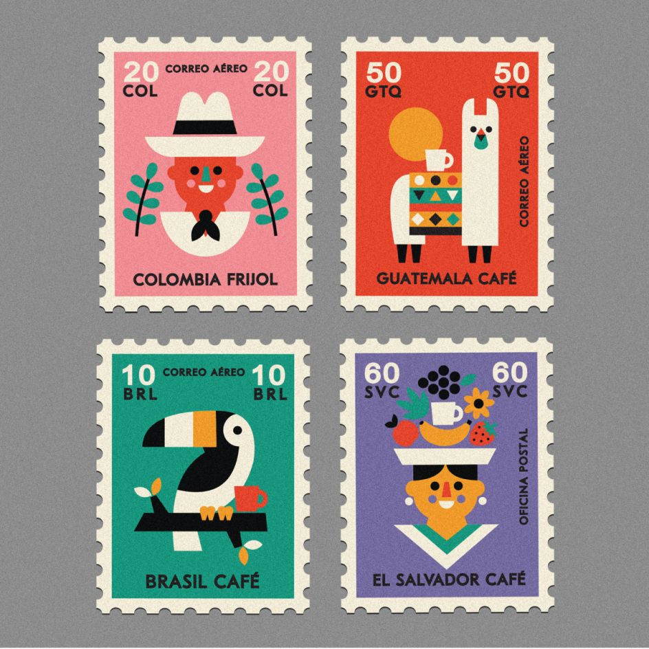
Kokomo Coffee
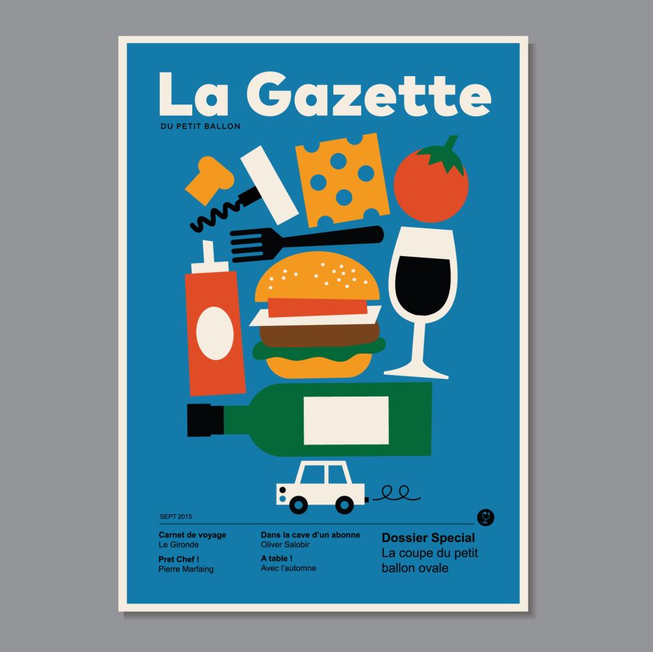
La Gazette
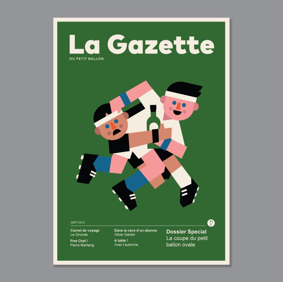
La Gazette
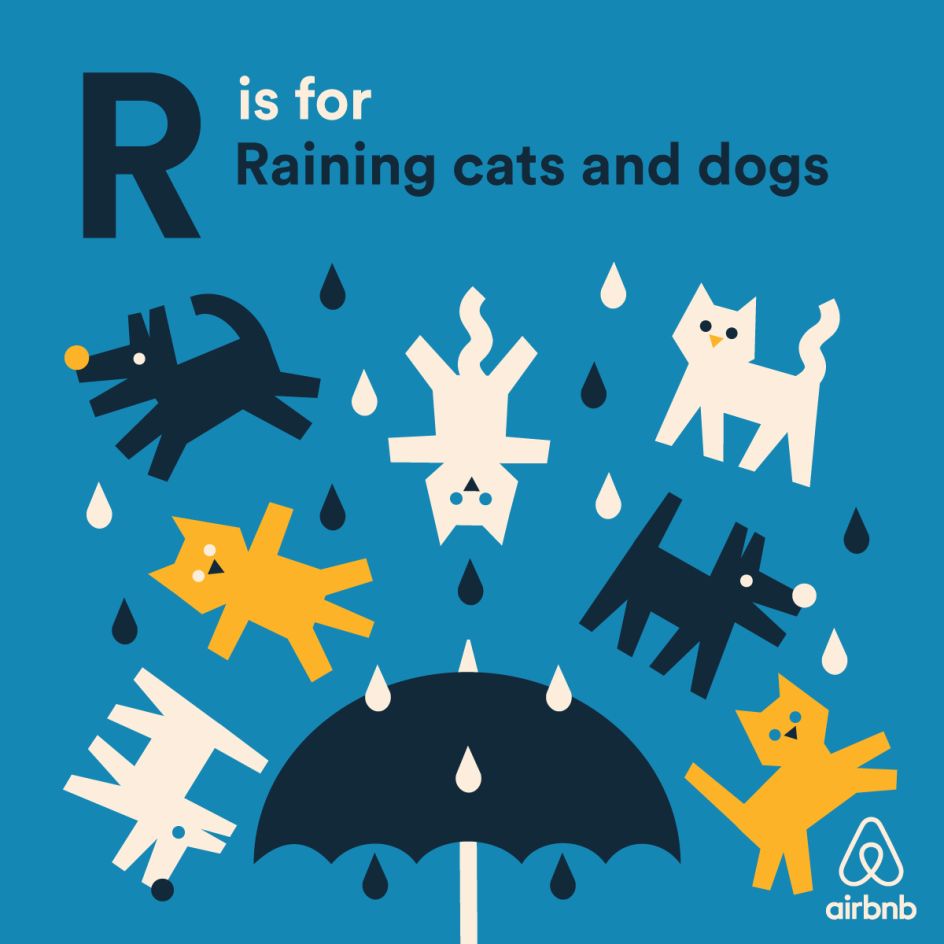
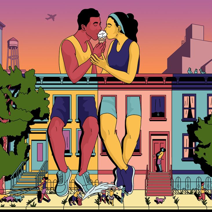
AirBnb
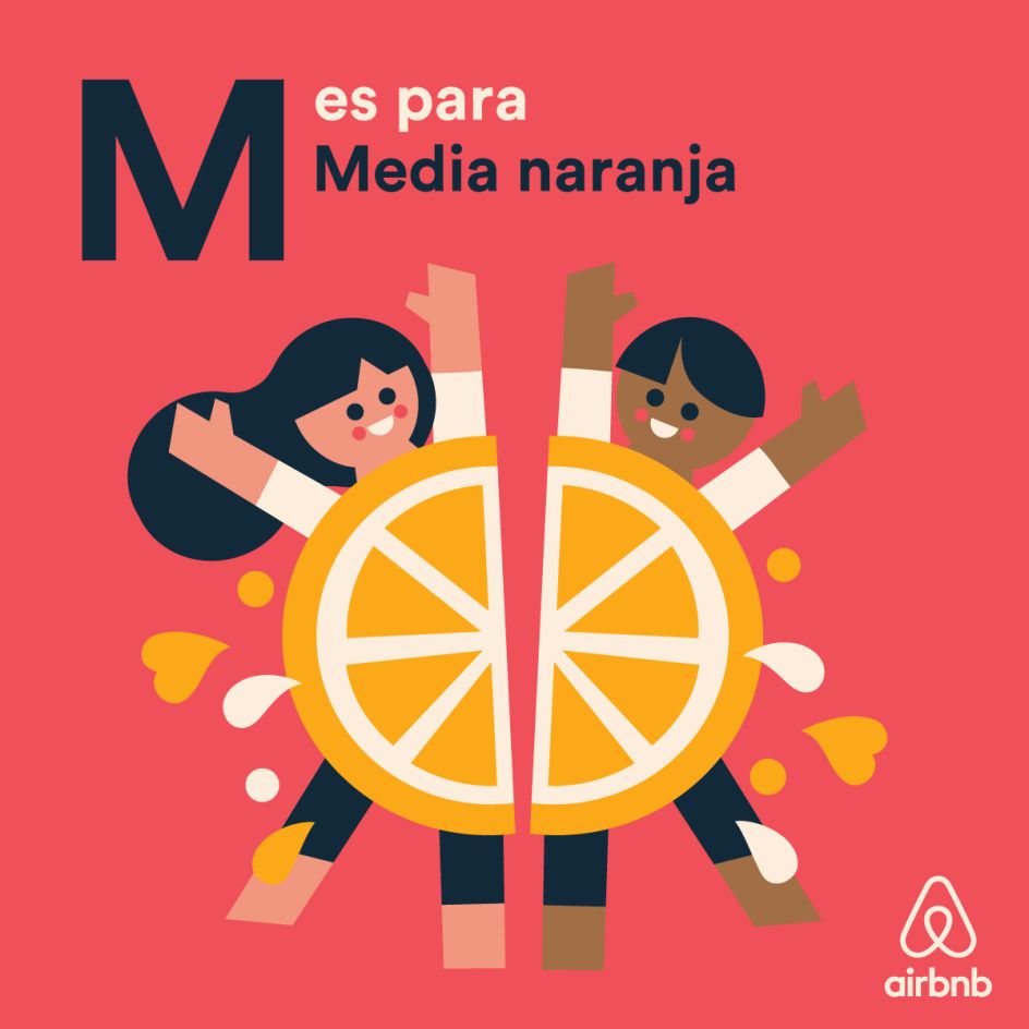
AirBnb

AirBnb
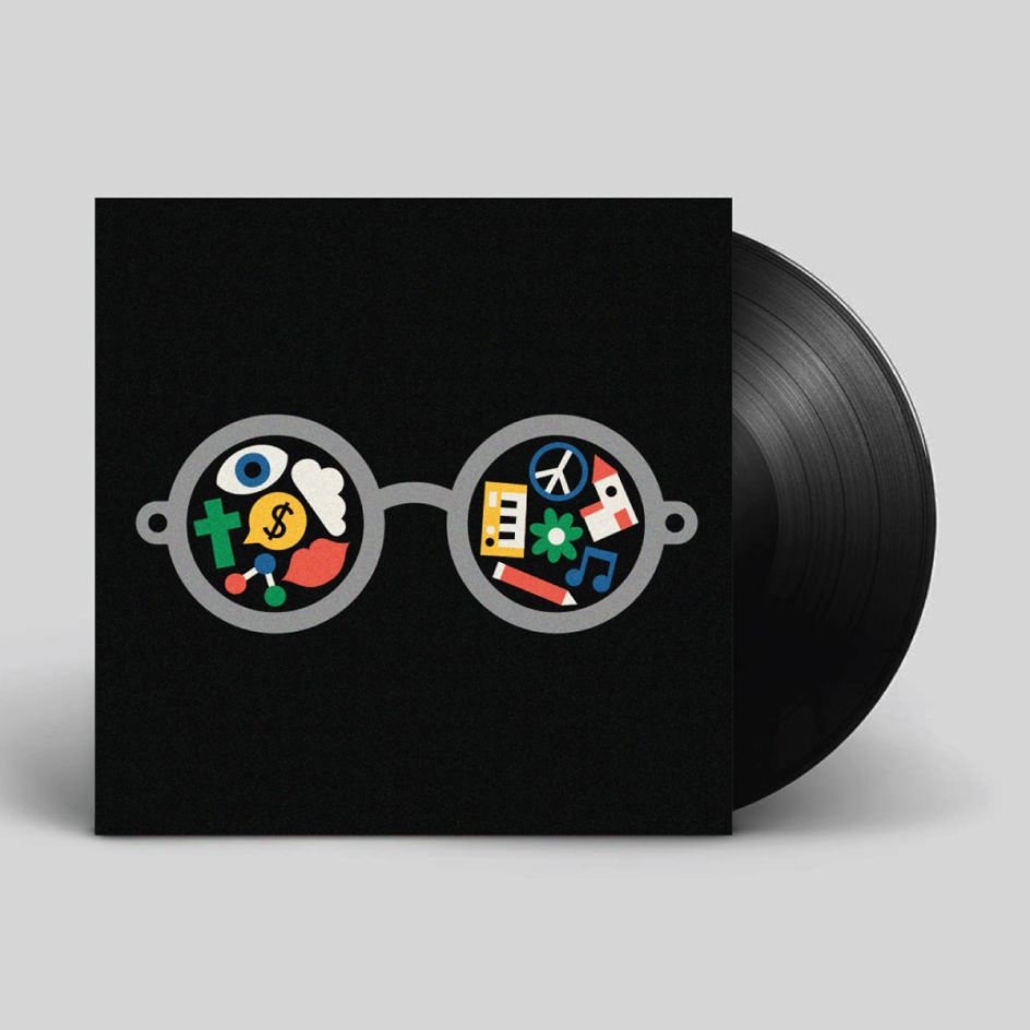
John Lennon – Imagine. Record sleeve artwork for the Secret7 charity exhibition

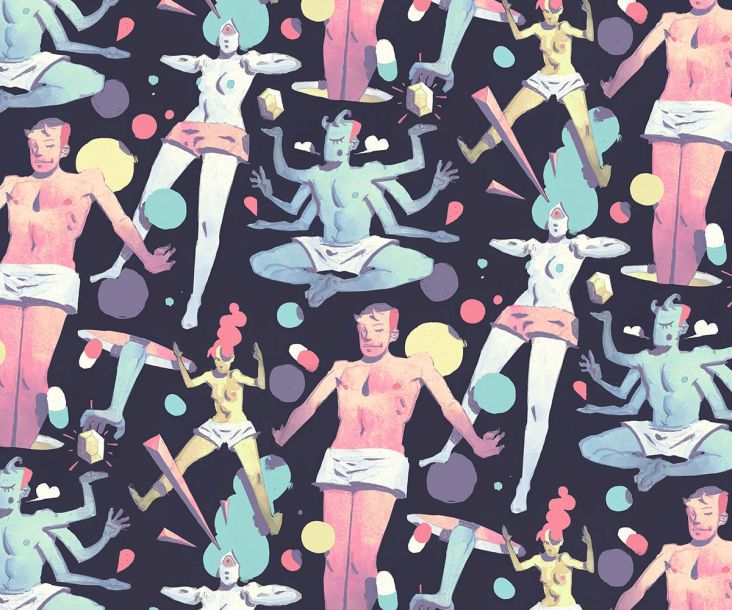
Celebrations
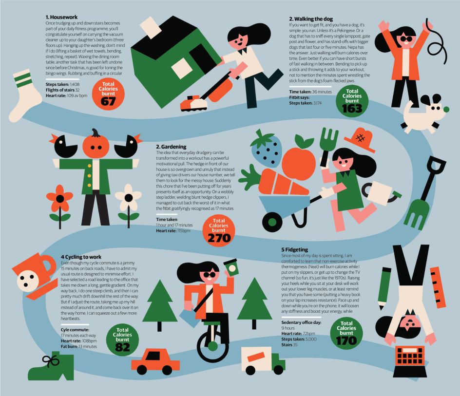
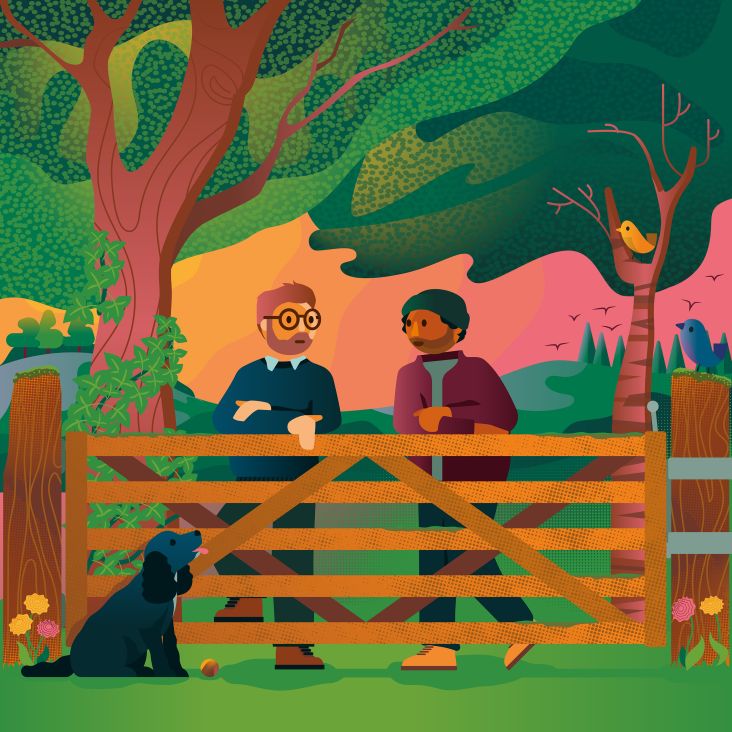
The Guardian
Editor's Picks


Trending


Podcasts


Editor's Picks
Further Reading