How colour, pattern and materials become therapeutic
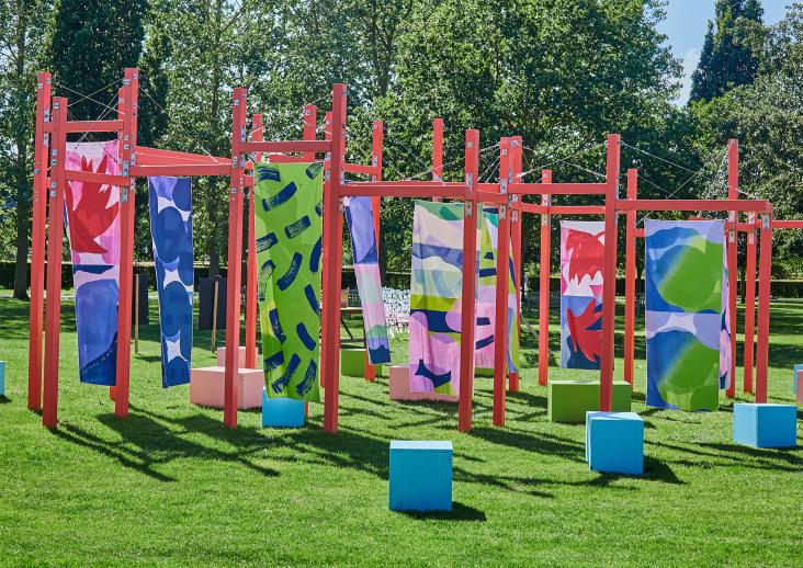
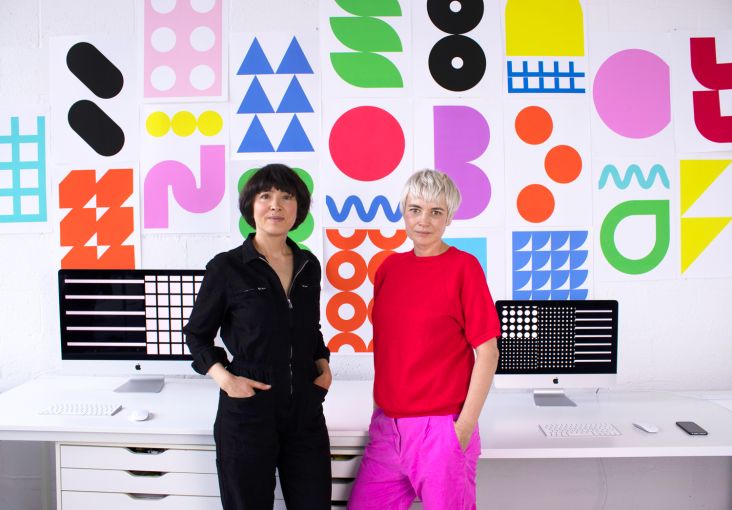
Sisters Petra and Nicole of creative studio Kapitza have just completed a site-specific public art project for the Royal London Hospital that looks to use the therapeutic power of colour and pattern.
The artist and designer duo was commissioned to bring their bold, bright work to the newly refurbished Edwardian building, Ambrose King Centre, at the Royal London Hospital. "Our ambition was to create a positive and compelling space to enhance patients wellbeing," they say.
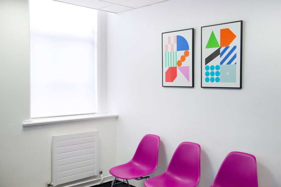
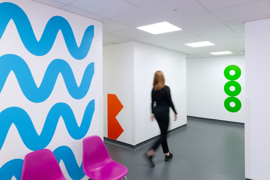
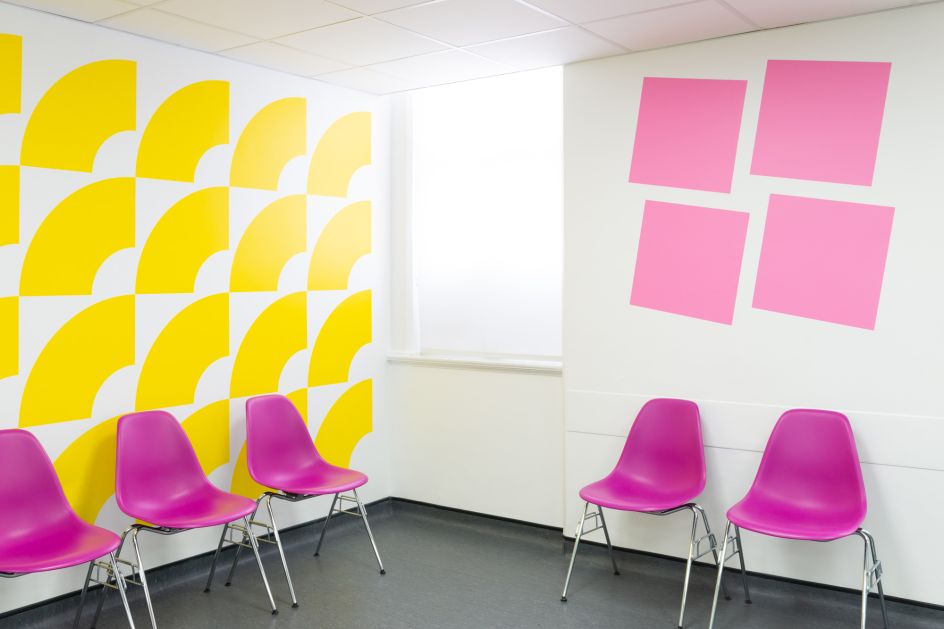
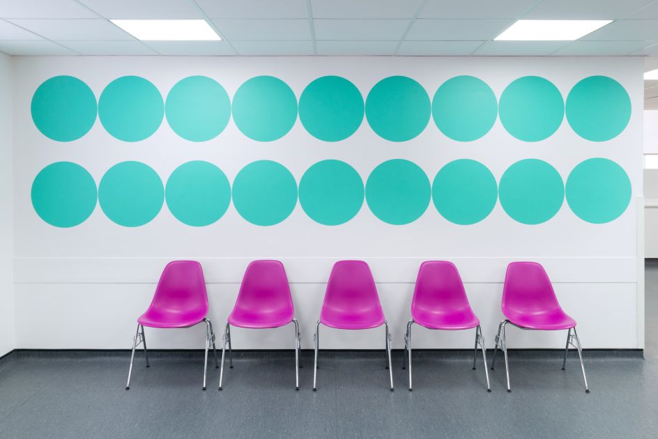
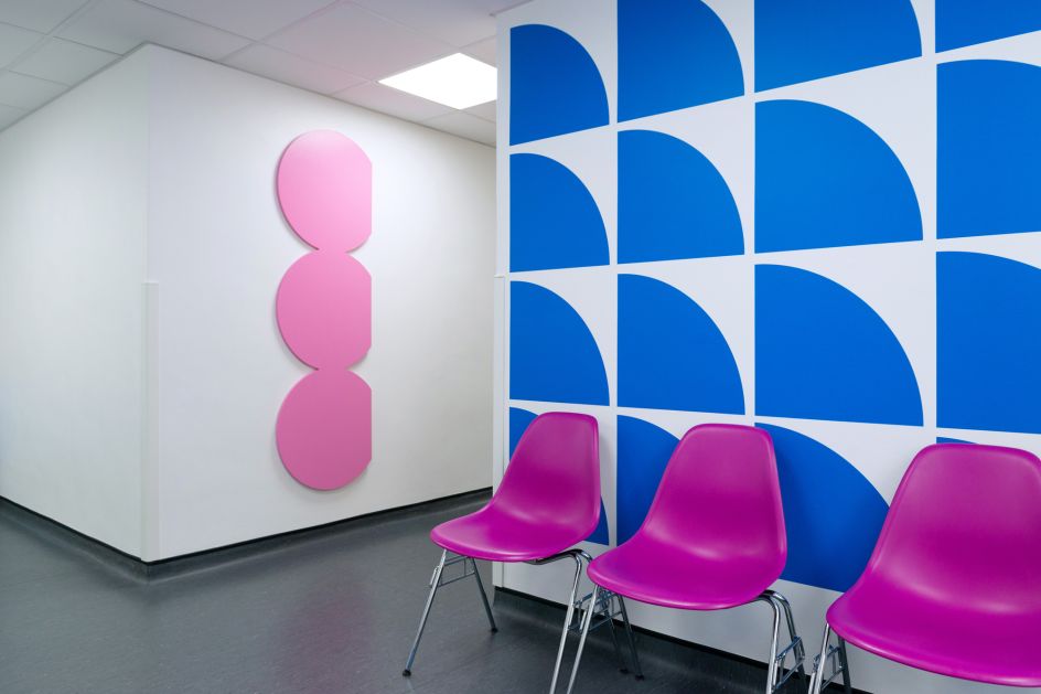
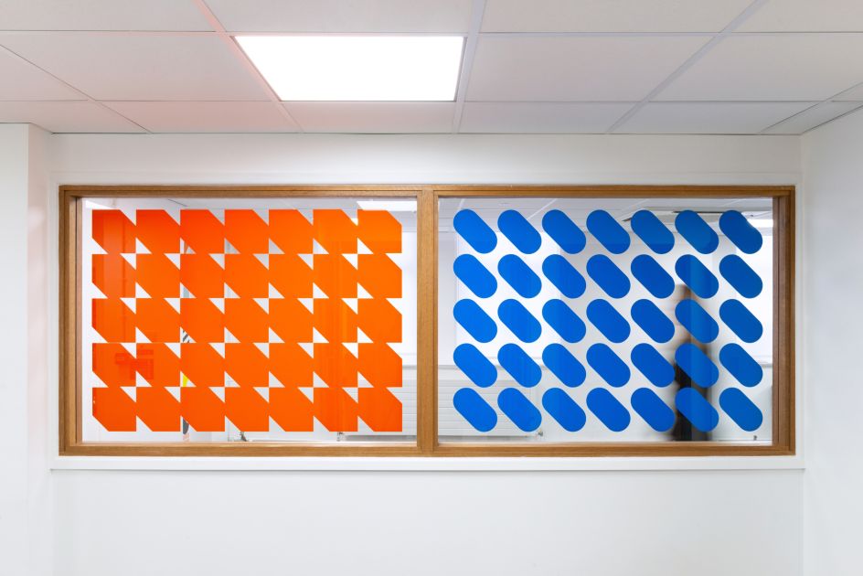
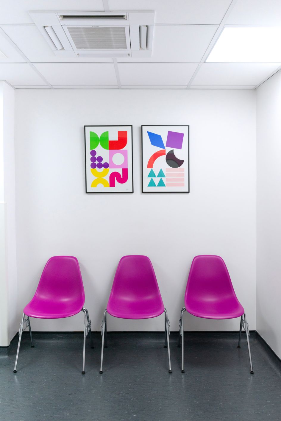
The result – their first public art commission—uses a dynamic mix of colour, pattern and materials that look to provide functional wayfinding assistance, while offering an uplifting aesthetic to help with gently lift patients' spirits.
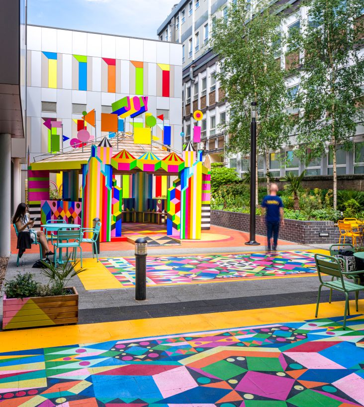
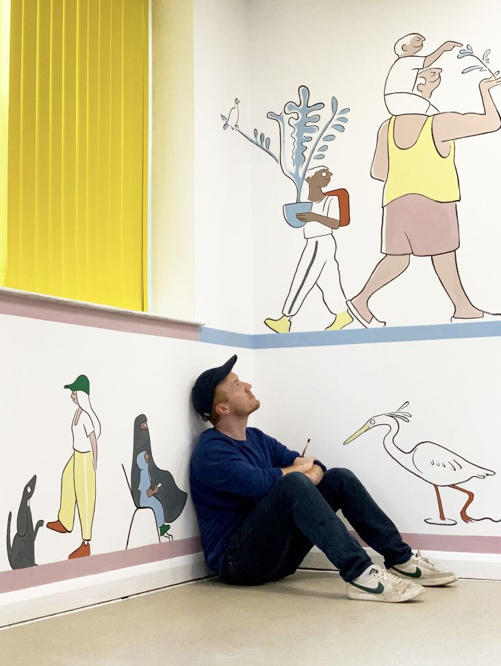
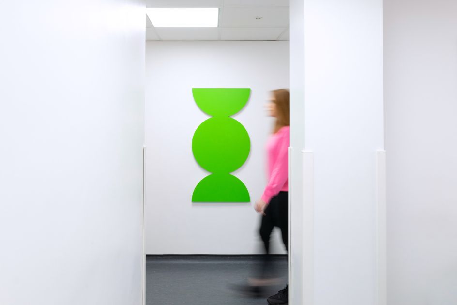
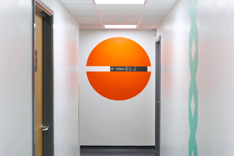
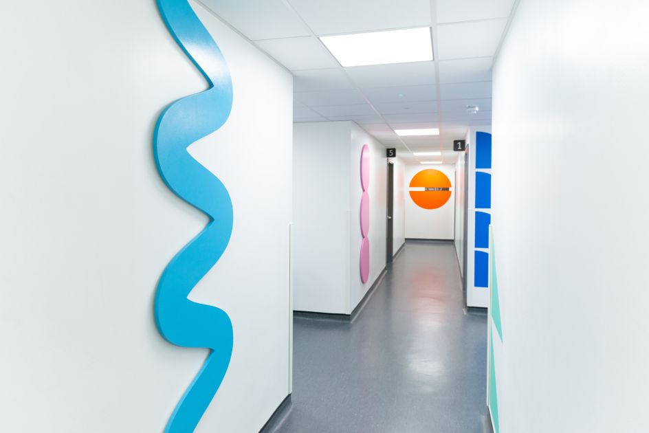
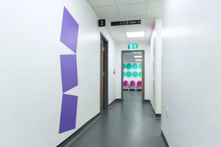
The installation, entitled 'Diversity', runs over two storeys of the building, spanning the centre's reception room into waiting areas and through corridors outside treatment areas.
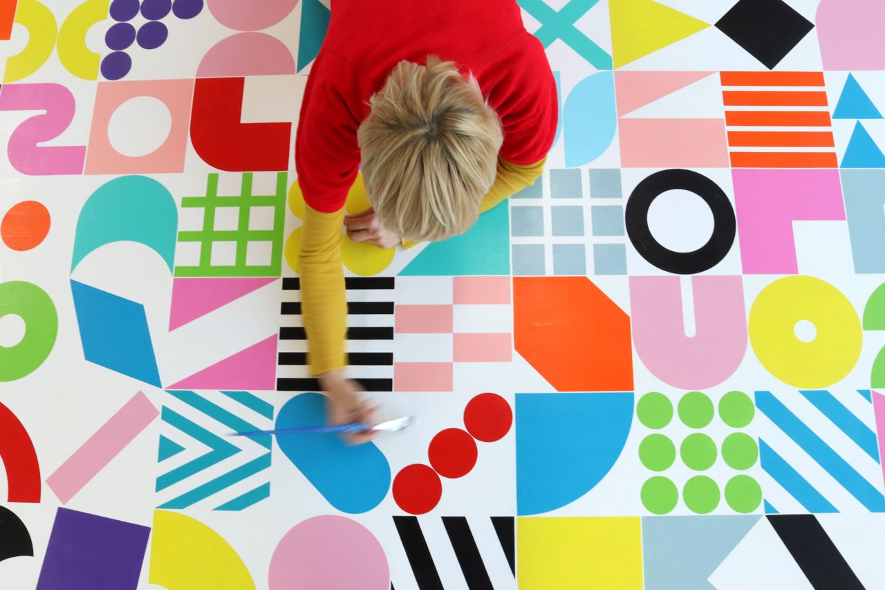
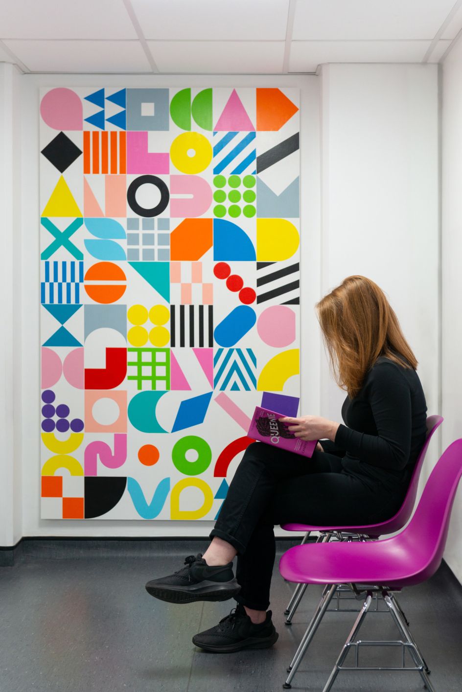
The large painting in the main reception area uses a series of abstract geometric symbols, and "acts as a keystone for the artwork throughout the service," says Kapitza.
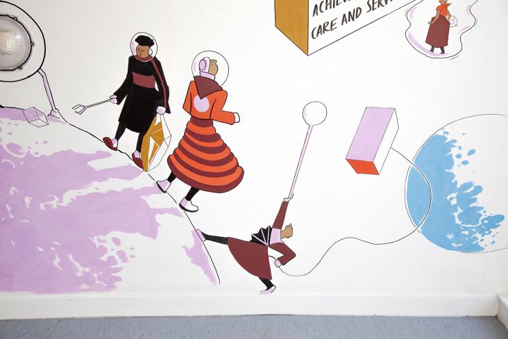
Symbols from this then become recurring motifs throughout the building as repeating patterns in vinyl, wood and framed prints, moving with patients as they navigate the physical space and walk through the service.
The central idea of using these dynamic graphics was that they serve as an alternative system of wayfinding, and in doing so reduce the need for excessive clinical signage to create a more positive, harmonious environment for the patients.
Editor's Picks


Trending


](https://www.creativeboom.com/upload/articles/90/908fdb6378db1e95d12595416f54e6336d5e80b8_732.jpg)


Podcasts


Editor's Picks
Further Reading