Holbeck Together's friendly new identity looks to put community at its heart
Holbeck in Leeds is one of the most deprived districts in the UK, but still boasts an active, thriving network of volunteers and community activists—as exemplified by the charity Holbeck Elderly Action, now renamed Holbeck Together.
"They do loads fantastic job of looking after the Holbeck community by helping to keep people socially and physically active," says Jimmy Smith of design agency Smiths Workshop, which has just created a new visual identity for the charity. "They started out helping older people and have grown into now helping the whole community. In one of the poorest towns in the UK, they are a lifeline for some of the people living there."
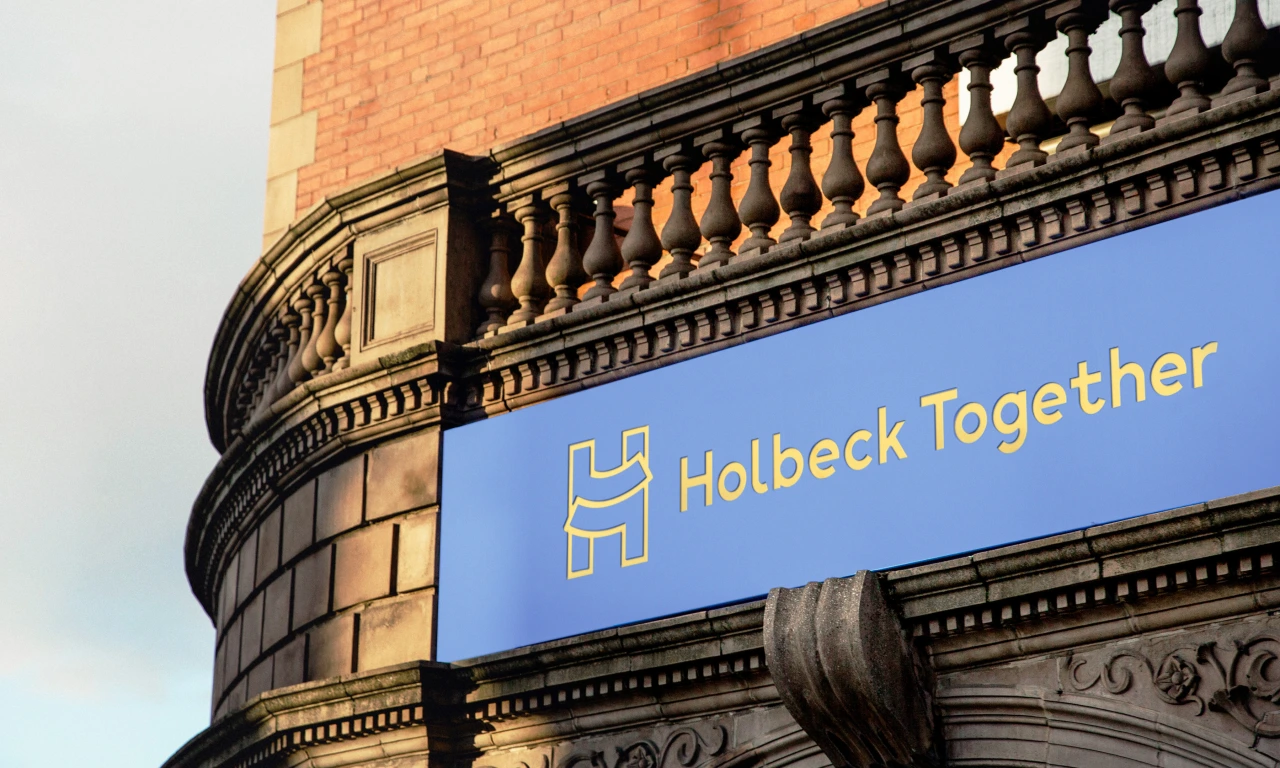
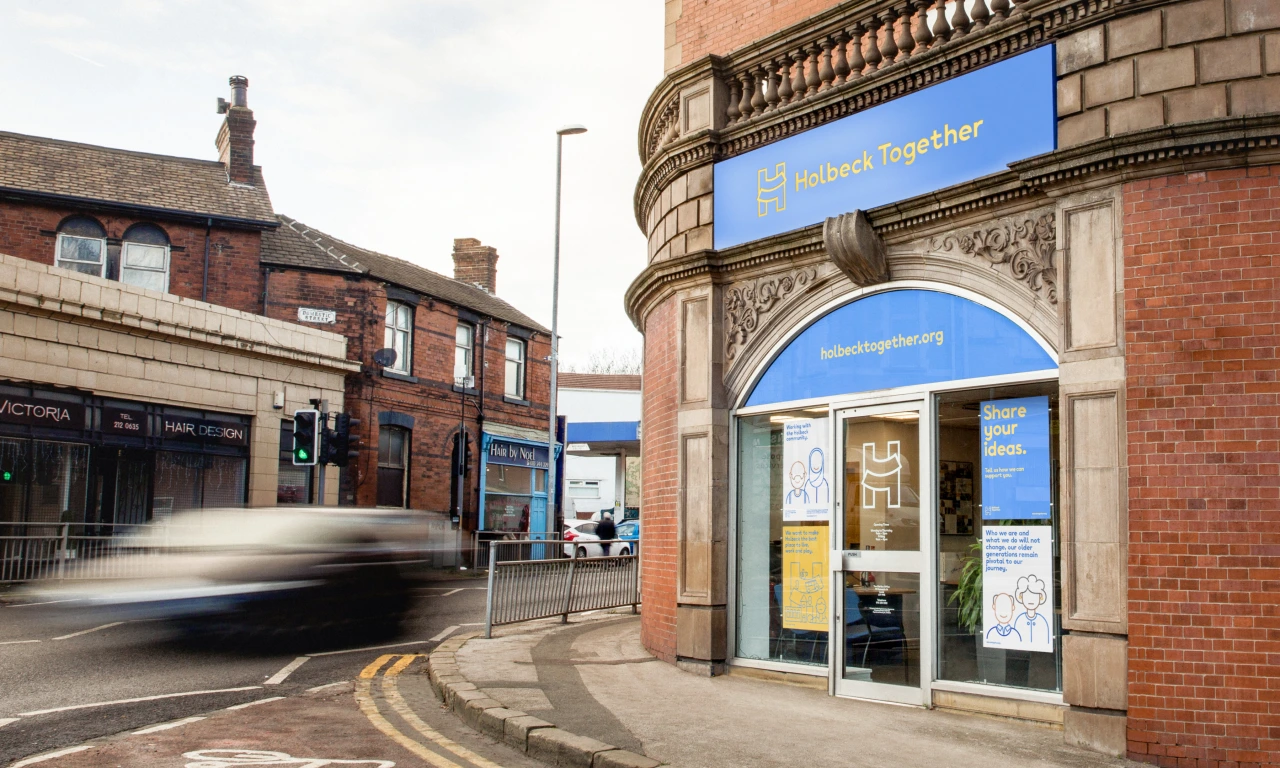
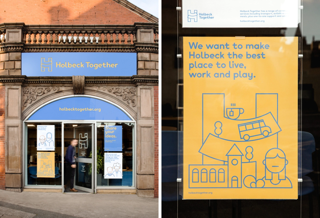
The name change reflected the charity's refocusing in light of its move to help people in the wider community who needed support, not just the elderly. "The brief was to devise a new brand identity that would reflect the new and more inclusive purpose of Holbeck Together while keeping it firmly rooted in this historic part of Leeds," says Smith.
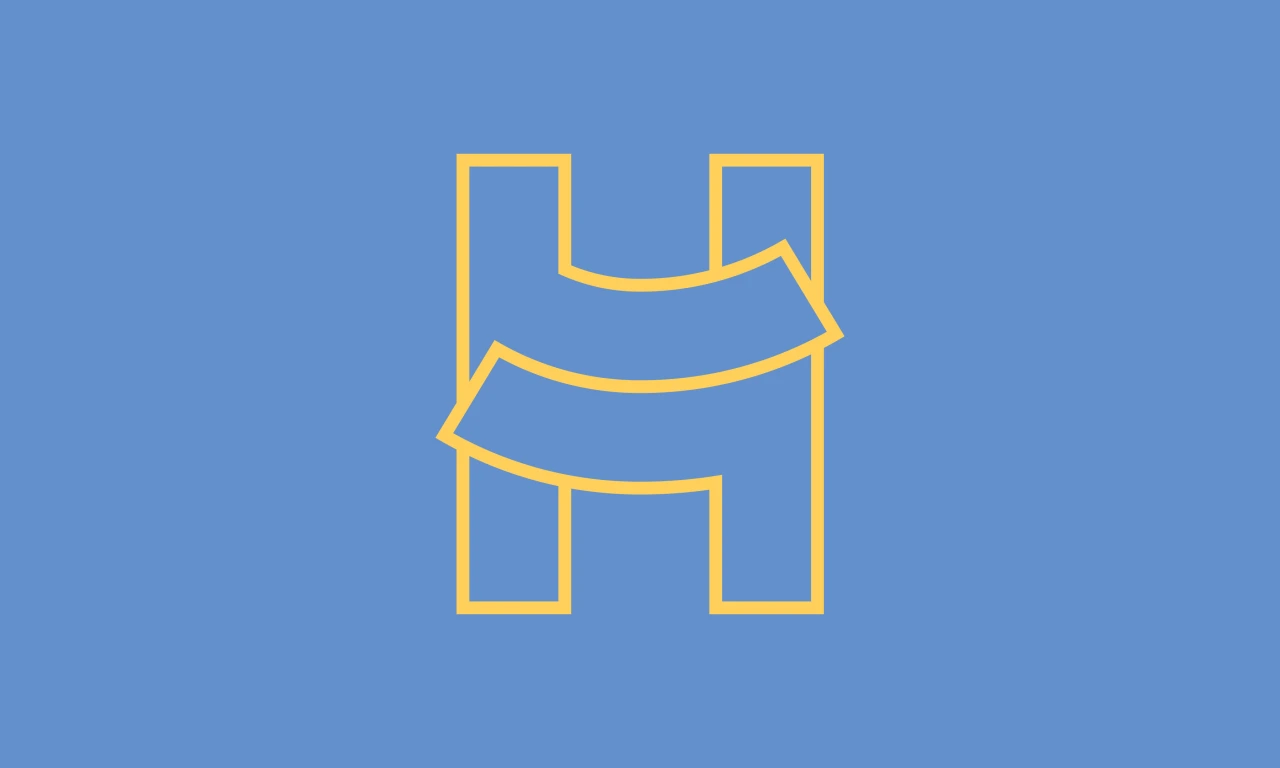
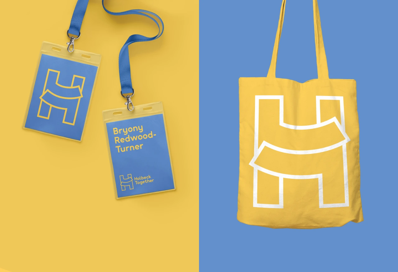
The new H logo aims to give a sense of reassurance in that it can be interpreted as "a warm embrace," says Smith. This works alongside a new colour palette that looks to accentuate the idea of warmth and positivity by using the blue and yellow of the former branding and brightening it to feel more welcoming.
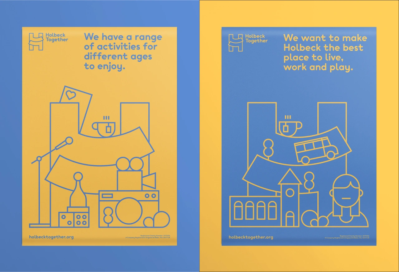
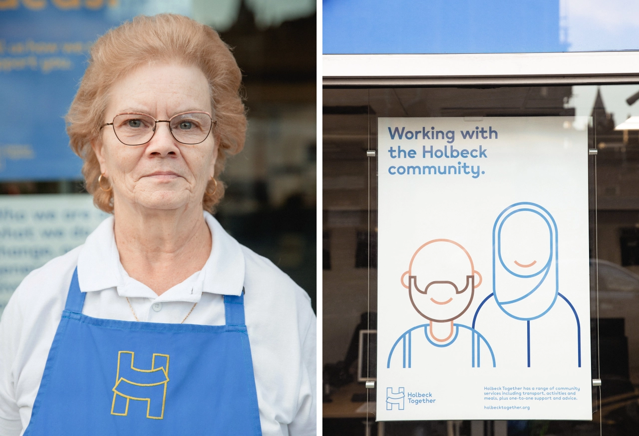
A suite of new illustrations was created that aim to be eye-catching and underscore that idea of friendliness, reflecting the community's diversity and some of its key landmarks. The overall identity looks to "put people at the heart of the charity, and emphasise the welcoming, down-to-earth approach that Holbeck Together prides itself on," says Smith. "Holbeck Together now has a consistent identity that is friendly and instantly recognisable for its scores of vulnerable users, yet professional enough to elevate the brands status within the wider third-sector and corporate contexts."
He adds, "We want the new identity to be a source of pride not just for those who represent and use the charity every day, but for the wider community of Holbeck and indeed the whole city of Leeds."
Editor's Picks





Trending






Latest Jobs
Senior 3D Motion Designer at Art&Graft
Full-time·London·£50k-£65k
Talent Agent & Producer at The Jacky Winter Group
Full-time·Los Angeles·$70k-$85k
Design Director at Koto
Full-time·London·£72k-£90k
Graphic Designer at Crux Product Design
Full-time·Bristol·Up to £36k
Client Success & Growth Director at Revolution Growth
Full-time·Manchester·£60k-£70k
Art Director at SPOKE
Full-time·London·£55k-65k