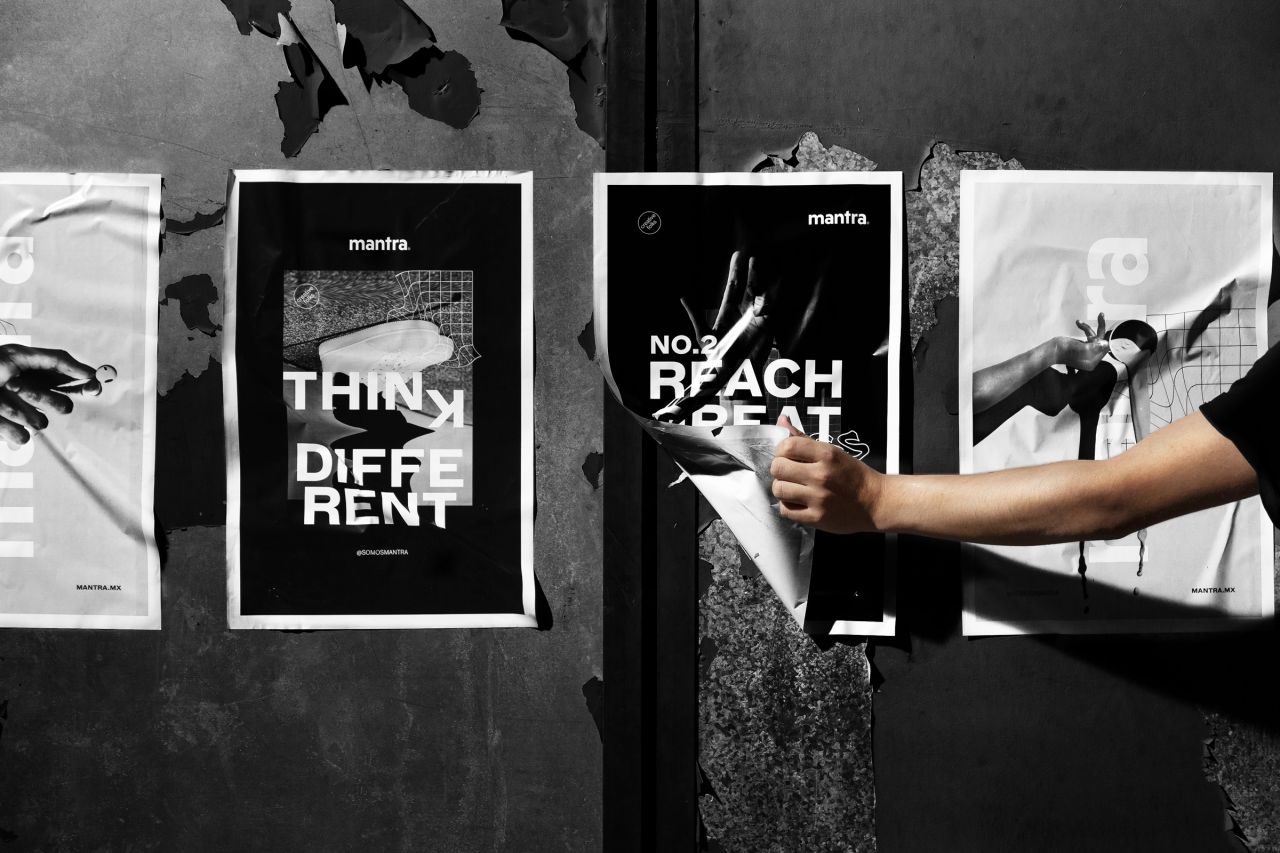
Mexican creative agency Mantra uses repetition to represent the importance of teamwork
Mexican creative agency Mantra has just announced its rebrand; working with itself as the client, rather than its usual work for the likes of jewellery brand Bruna or residential development Matera.
Mantra works across branding and digital, and says that its approach to each project is based on an initial "deep immersion process to establish communication solutions that convey a strong brand DNA and concept" – aiming to ensure its design directions resonate with both the brand itself and its users. The studio adds, "A brand is more than its aesthetics; it's all about the experiences."
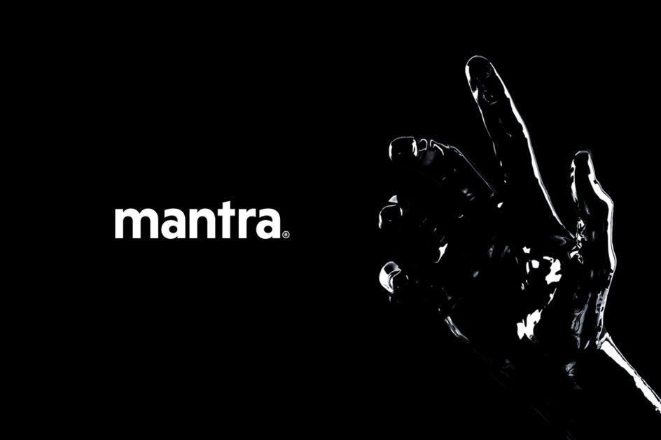
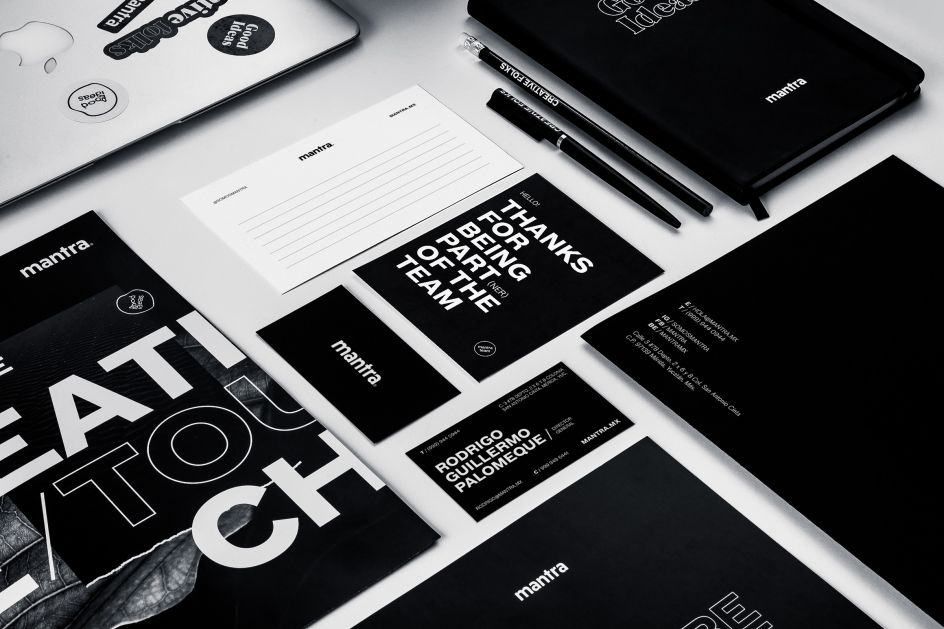
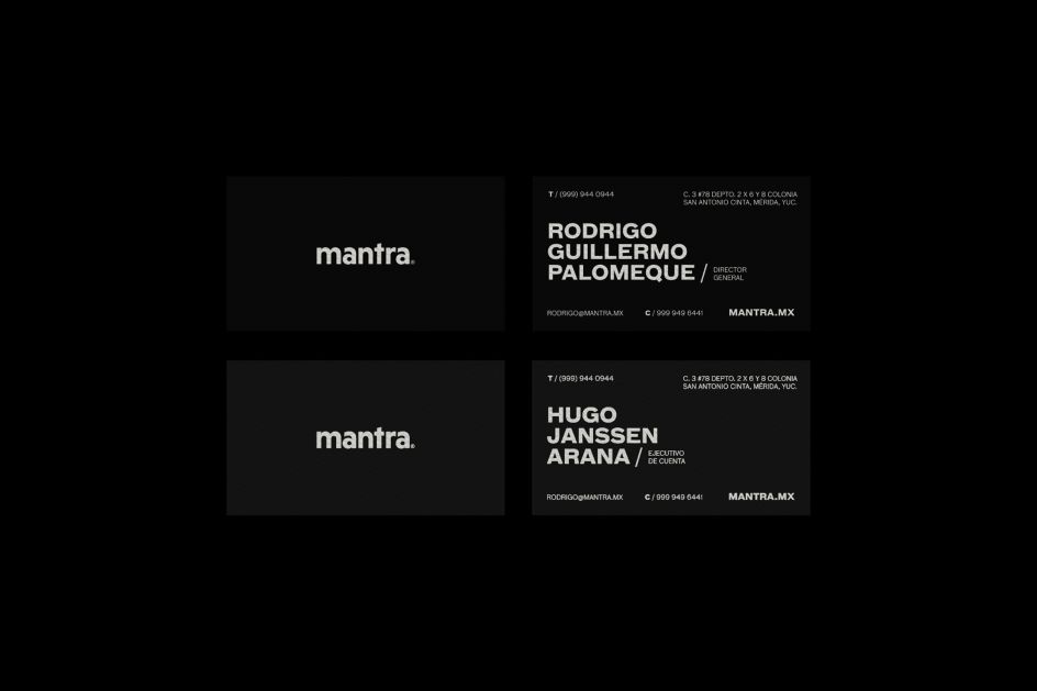
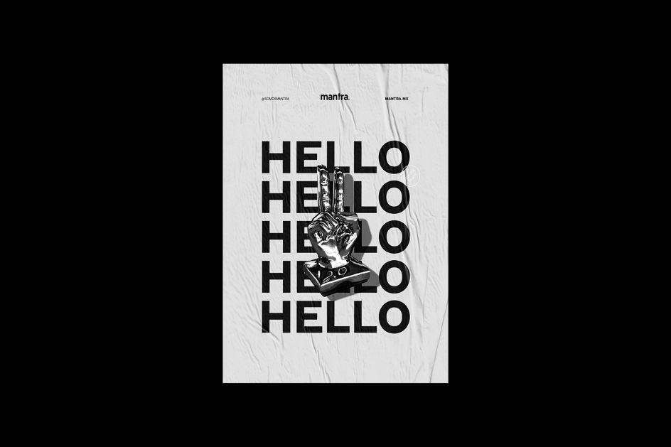
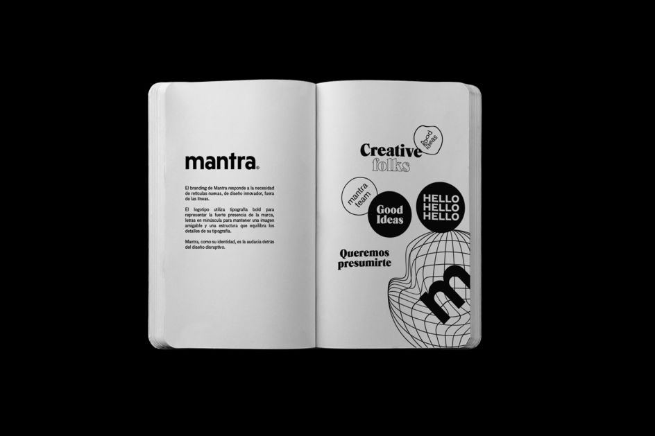
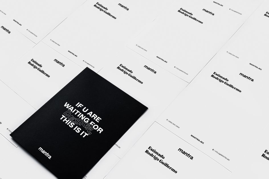
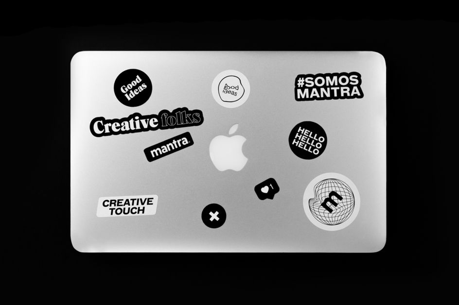
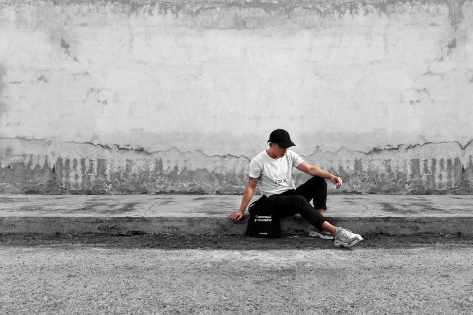
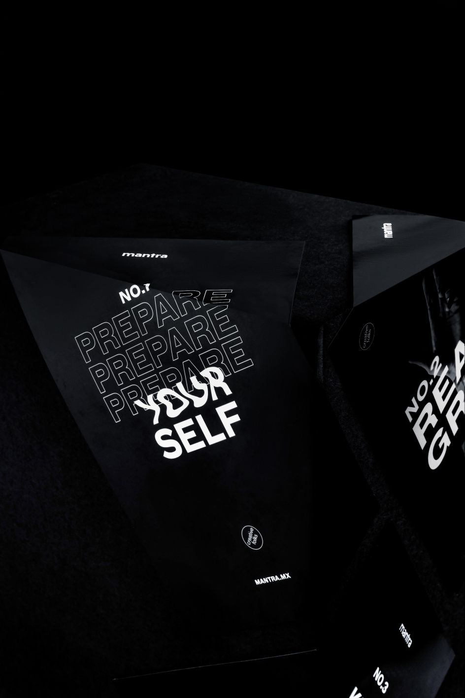
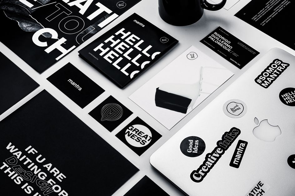
The rebrand was launched to reflect the growth of the agency, and the experience it gained over the years and "the strategy behind the method that distinguishes us," says Mantra. It uses the idea of repetition on things like business cards, stickers and tote bags as a tribute to the many members of its team. Other touchpoints use distortion to reflect its versatility. "Our logo uses bold typography to represent the strong presence" of the studio, it says, which is set in lowercase letters "to maintain a friendly image" and a structure that balances the details of the typography.
The new look for the studio aims to showcase its passion for art, design and strategy—and most importantly, its clients' vision. The design concept is based around the central idea of "functional creativity", which it says captures the essence of its approach.
Mantra explains, "We understand the importance of evolution and have adopted it as a fundamental part of our philosophy. We believe in the mantra of every project, the essence that makes it unique."