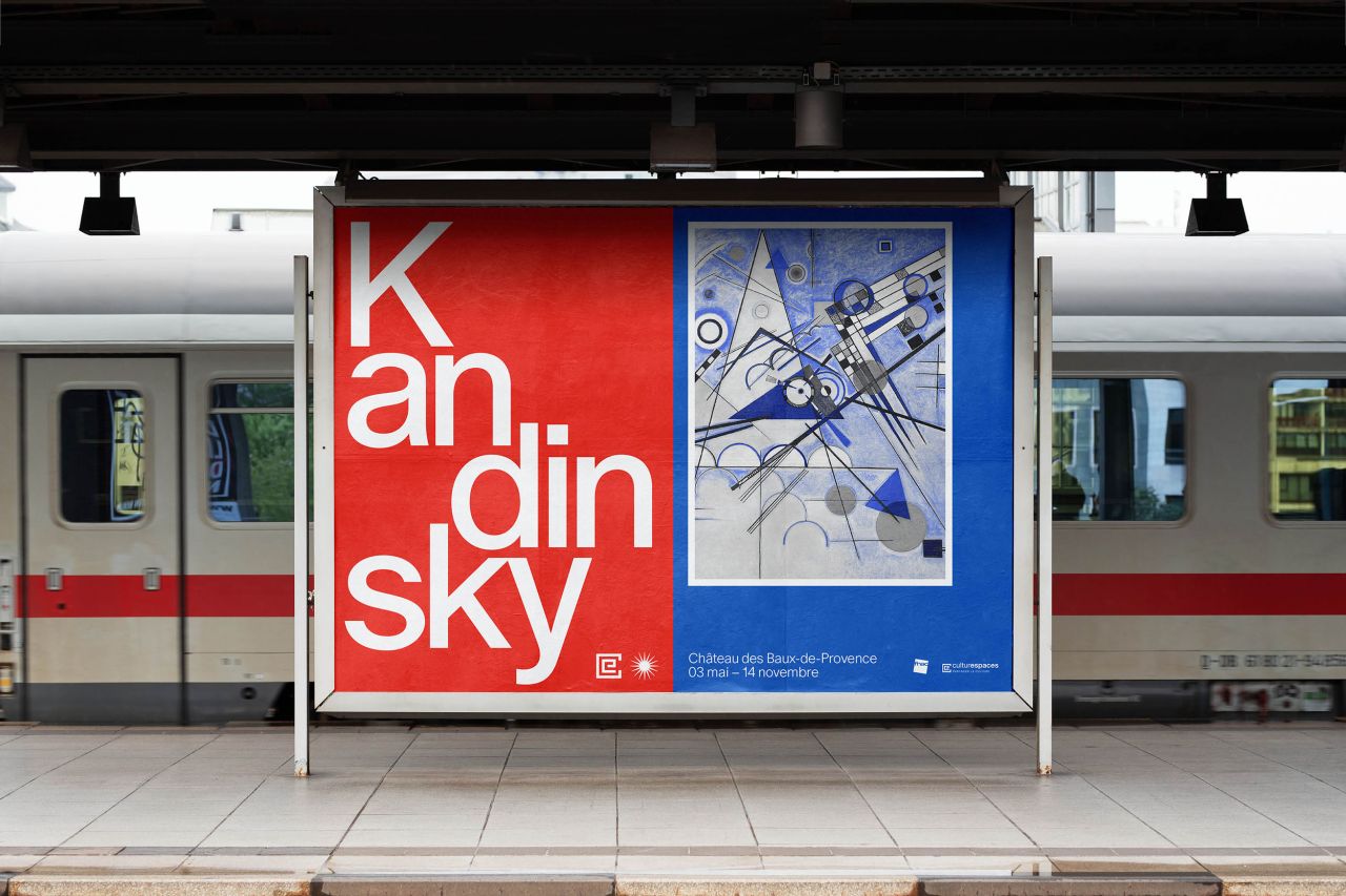
République Studio uses Bauhaus-inspired type to tell the story of Kandinsky
Paris-based République Studio has created the graphics for an exhibition about the life of Kandinsky at Château des Baux de Provence.
The design team had previously worked with Château des Baux de Provence on the 2020 exhibition about Gala Dalí, the wife of surrealists Paul Éluard, a poet, and later of artist Salvador Dalí, as well as a muse to many others.
République Studio was brought in to work on the visual identity, communication posters, brochure and exhibition signage for the Kandinsky show, Pioneer of Abstraction (running until January 2022) at the end of 2020, and started working on the project with the Kandinsky team and curator in January this year.
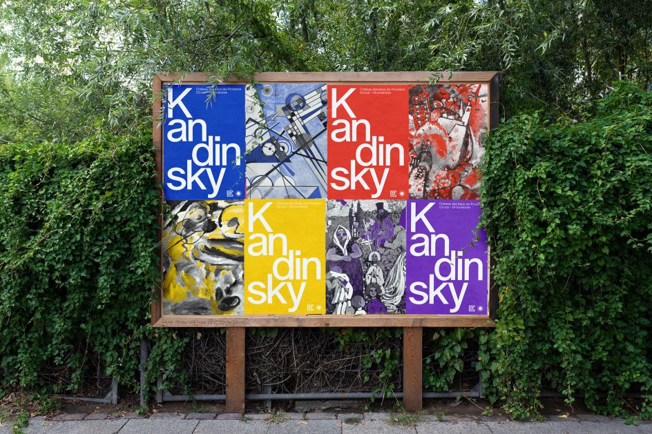
The studio was briefed to "tell the big lines of Kandinsky's life and trajectory, with a colourful point of view," says Tom Uferas, founder of République Studio.
The team initially created three very different propositions for the client, aiming to explore what might be possible as a graphic solution that would work within the unusual space, creating mockups to explore the various routes at scales ranging from small print pieces to huge wall applications.
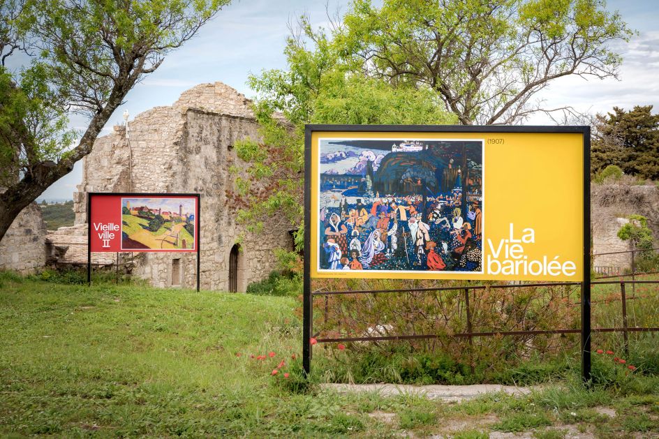
"Exhibitions are something we really like because it offers us the possibility to work at quite a big scale. The bigger the artwork is, the better we feel!" says Uferas. "We like big fonts in action, playing with words and compositions that seem to be 'dancing' around Kandinsky's artwork and big coloured backgrounds inspired by the Kandinsky palette."
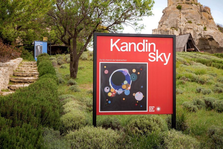
The graphics are based on the concept of large typography, and the team used an as-yet-unreleased font called Oracle from Swiss foundry Dinamo. "When we work on any graphic design project, one of the first challenges is finding the right font that will fit the content and tell a good story," says Uferas.
"We tried several ones, all inspired by the Bauhaus until we finally found Oracle. The font has some Bauhaus stylistic sets that recall the period of Kandinsky's artworks, especially on the 'A', which recalls the 'A' of the Bauhaus logo on the building itself. The funny thing is that in the end, we decided not to use those Bauhaus stylistic sets because it felt a bit too noisy, and we wanted something more neutral to focus on the composition of the text and Kandinsky artworks – instead of on the font itself."
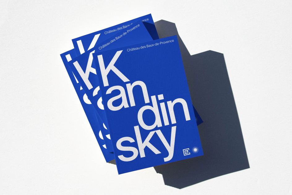
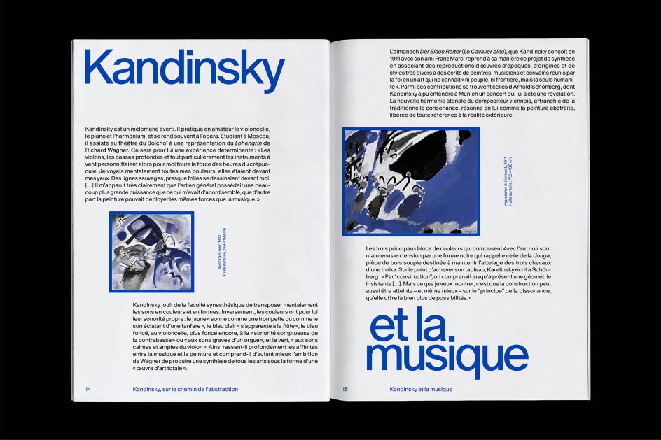
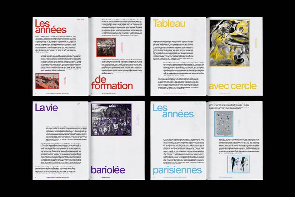
For the catalogue, which is distributed at the beginning of the exhibition, the studio decided to treat the images in ColorLibrary duo tone (created by Maximage) to highlight the composition of Kandinsky's art pieces and enable the designers to focus on the grid systems it developed.
The main challenge for the designers was to create graphics that were very much inspired by the Bauhaus and the "atmosphere" of Kandinsky while remaining clear and legible. "At the beginning, we wanted to go further in the words' decomposition (like the poster), but the client wanted to stay readable knowing that the audience is not specifically used to graphic design tricks like that," Uferas adds. "You always have to respect the content."
Editor's Picks


Trending


](https://www.creativeboom.com/upload/articles/90/908fdb6378db1e95d12595416f54e6336d5e80b8_732.jpg)
Podcasts


Editor's Picks
Further Reading