Pràctica studio on its bold and expressive identity for Chinese delicatessen brand, Santo Cielo
Since launching in 2018, the studio has worked across a medley of projects in the realms of identities and branding. However, its latest endeavour is the pinnacle of the studio's ethos – where craft and concept are valued above anything else.
Pràctica, a design studio based out of Barcelona and New York, was founded in 2018 by four partners – Javier Arizu, Anna Berbiela, Carlos Bermudez and Albert Porta. Before joining forces, the team had previously worked in their respective agencies and studios as graphic designers. This included Mucho and Clase in Barcelona, Studio Blackburn in London, plus Sagmeister&Walsh and Pentagram in New York.
Although some met at university, the studio didn't come into fruition until they'd all started working together at Mucho. "There, we started sharing freelance projects after work and realised we really got along working together and shared the same design vision," explains Javier. "Eventually, as things moved on, it became a natural decision for us to start a practice together."
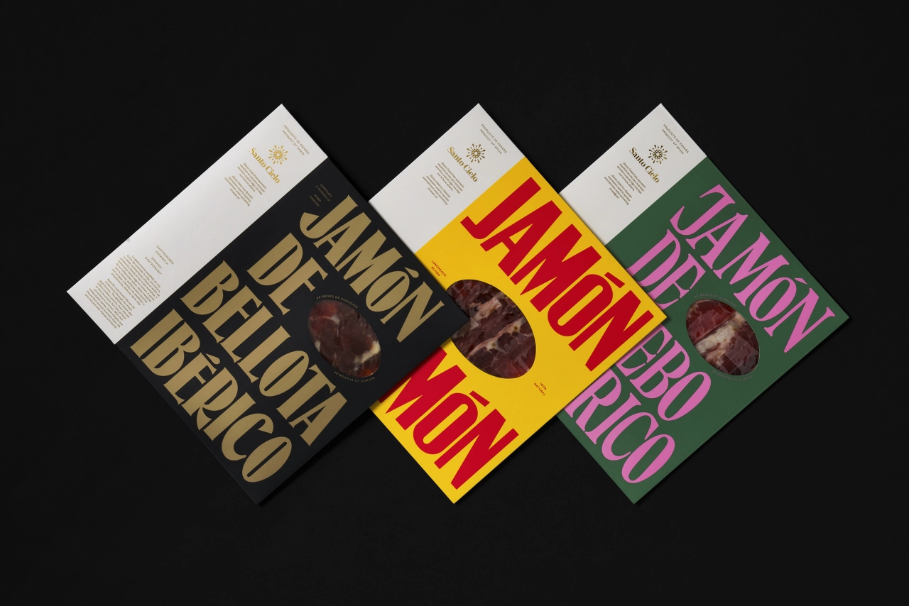
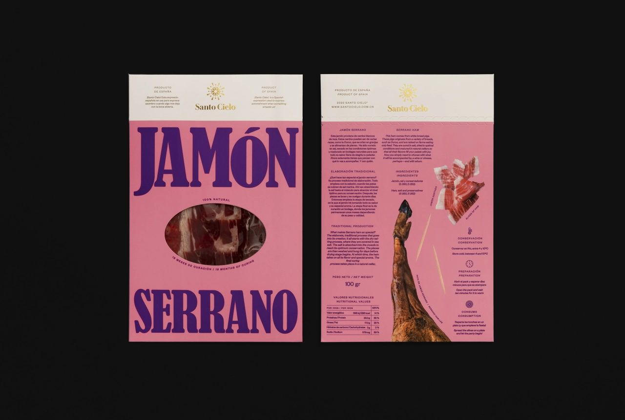
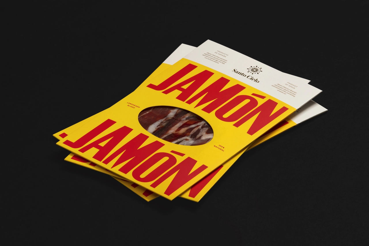
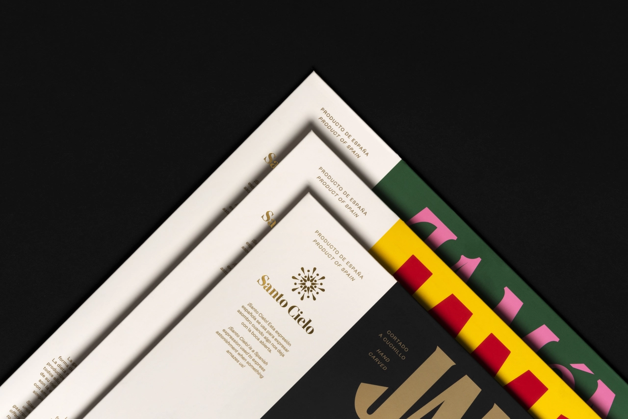
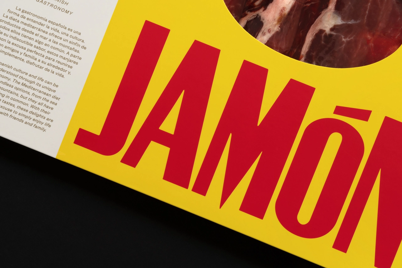
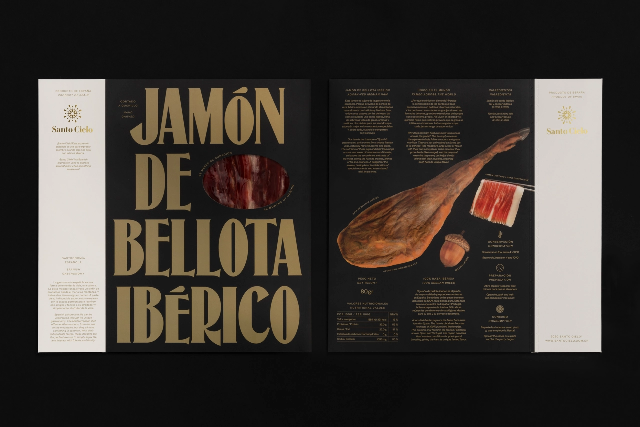
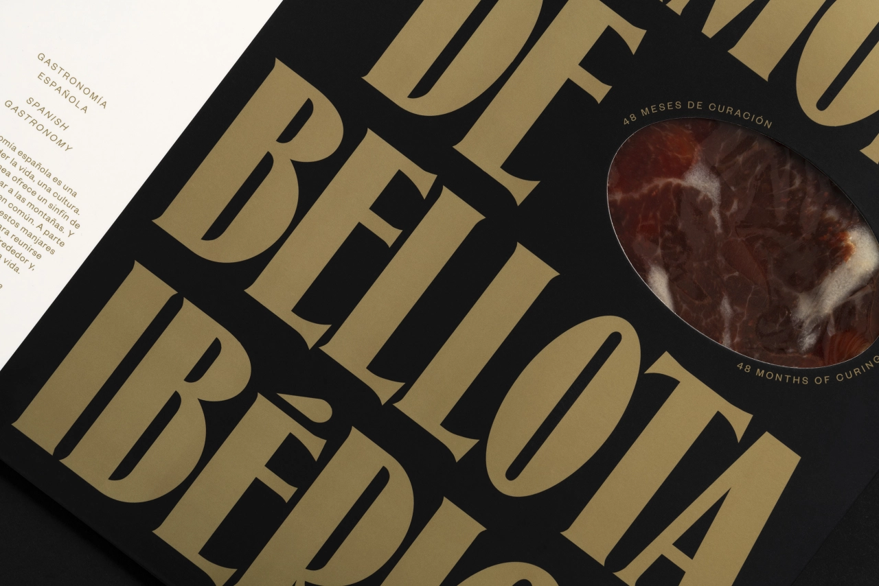
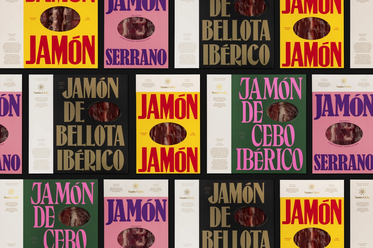
Since launching, the team has worked across a plethora of identities from branding, packaging, editorial and communication campaigns. And now, the studio has released a visual identity and packaging for Santo Cielo, a Chinese delicatessen brand that imports traditional Spanish products into China. Featuring a bold typeface and contrastingly detailed side panel, the identity gives off an almost vinyl-like quality in the way that it's been presented – it's something that you want to touch and keep forever in both the digital and physical world.
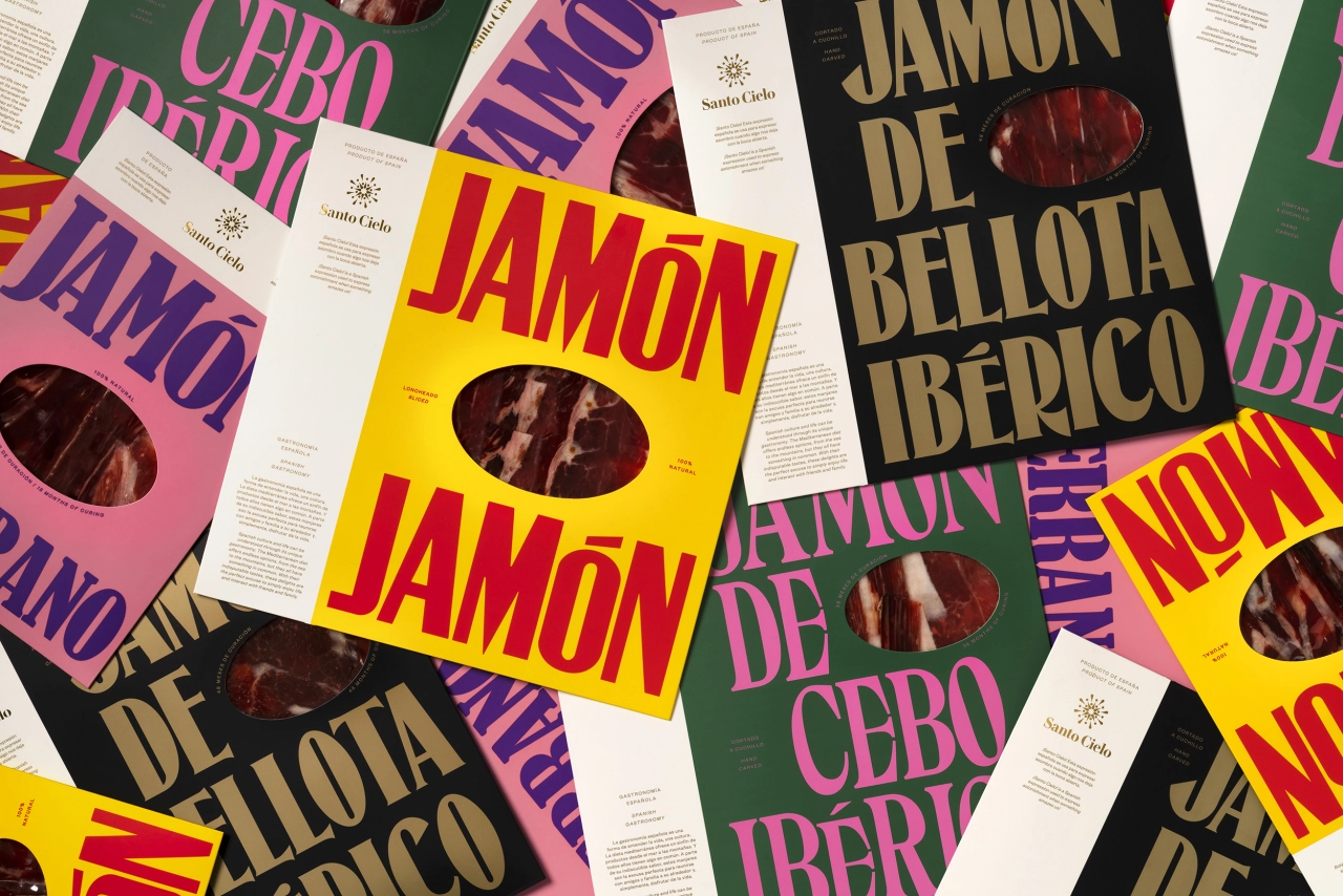
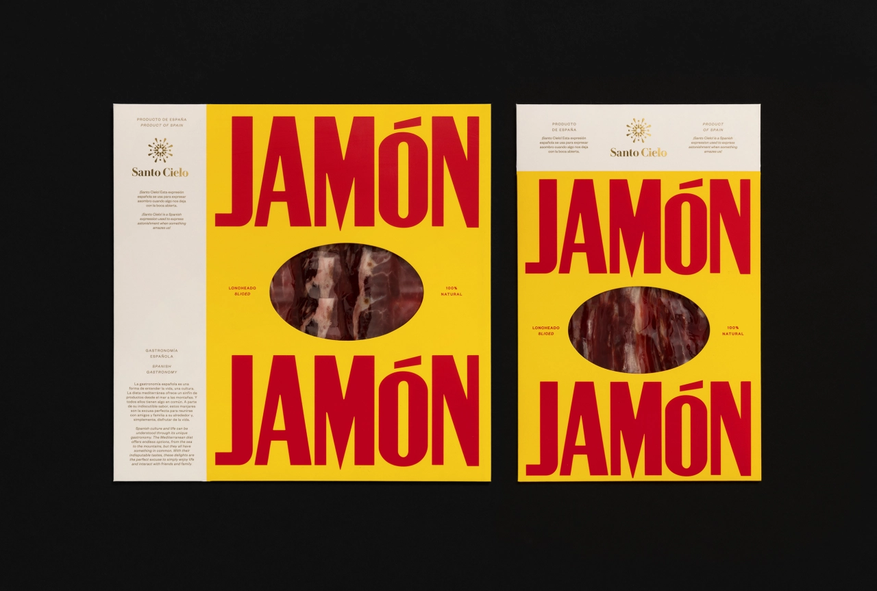
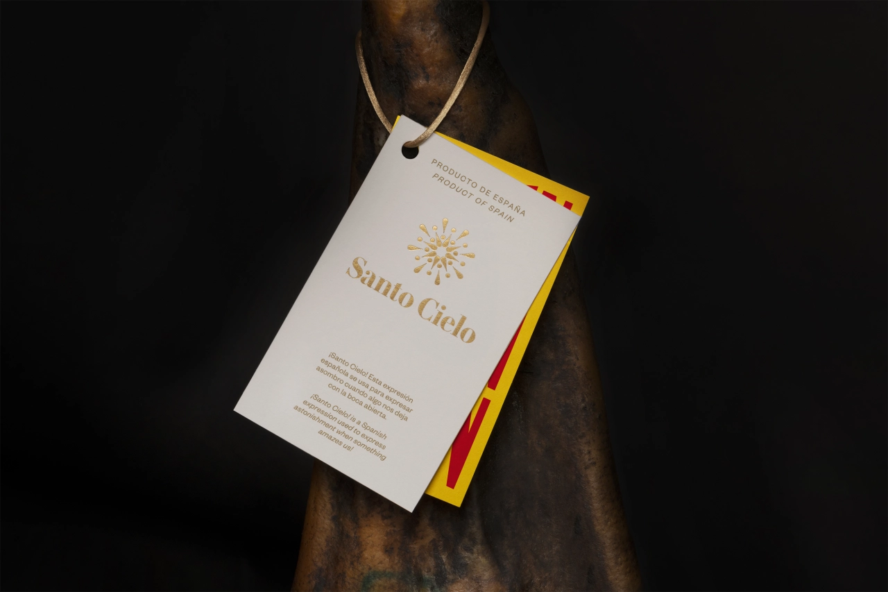
"The project aims to celebrate Spain's culture by capturing the vibrancy of its character," shares Anna. For example, the studio refers to the Spanish expression "¡Santo Cielo!", which is used to show astonishment while being amazed by something, a phrase that's similar to "Oh my God!" in English. "The symbol is made out of exclamation marks to play with this idea, representing a holy halo," continues Anna. "Coming from the nature of the naming, the packaging system is made out of two parts: one reserved to the sacred use of the brand, and the other used to reinforce the Spanish character through the diverse use of typefaces and colours."
Of course, credit must be given to Usted, who helped name the brand, while symbol animation was carried out by Gimmewings and still life photography by Enric Badrinas.
Just like the identity for Santo Cielo, the studio's wider portfolio is equally as bold and conceptual. "We create identities in any form of expression," says Carlos. "As a studio, we understand visual identities beyond corporate formulas and systems." It means that, whatever the project, the studio will always pay close attention to the different attributes and characteristics of a brief, "and therefore its visual identity that differentiates it."
It's why Santo Cielo's visual language is so powerful and expressive, for Pràctica is a studio that values boldness and creativity above anything else. "We strive to craft solid concepts and bold formalisations for all our projects through a process of reflection, exploration and debate that takes the very nature and essence of each client as the base," adds Albert. "For us, a good identity is not a creation, but the result of a process whose objective is to discover something that already existed. We just articulate it in a clear, understandable and innovative way."
With such skilled and like-minded individuals at the helm of Pràctica, it's no wonder the studio's output is as refined and mature as it is. And if you like what you see, you'll be pleased to know there's much more to come soon – much more. This includes a lifestyle technological project, a range of vegan cosmetics, a music album for a basque country band, a double-dating app, a non-profit organisation for a Mediterranean maritime rescue and a bookstore in New York. Oh, there's also a US Cannabis packaging and identity project in the works. Keep your eyes peeled!
Editor's Picks





Trending






Latest Jobs
Frontend Developer at Northern Artillery
Full-time·Leeds·£35k–£45k
Senior Copywriter at Human After All
Full-time·London·£48k–£66k
Growth and Client Development Director at 3800
Part-time·Sheffield·£60k-80k
Head of Technical & Facilities at Midlands Arts Centre
Full-time·Birmingham·£40,210
Paid Media Executive at Munro Agency
Full-time·Glasgow·From £27,000
Project Manager at A Practice for Everyday Life
Full-time·London·£37k-£46k