Ragged Edge rebrands AI notepad Granola with a co-founder's handwriting and a deliberately imperfect logo
The fresh identity trended on X on day one, drove Granola's biggest-ever download day, and helped the company raise $125m in funding. Here's how Ragged Edge did it.
Back in my broadcast journalism days in the early 2000s, I carried a silver dictaphone roughly the size of a house brick. It went everywhere with me around Stoke and Birmingham: council chambers, police press conferences (never fun), the odd celebrity junket. I once pointed it at Will Smith (who was charming). Then came the fun part: sitting in a corner afterwards with headphones on, scrubbing back and forth through the tape, typing out the story with one finger while my editor paced behind me, asking how long I'd be.
So you can imagine my delight when Granola turned up. Ok, it's over two decades too late. And yes, it's AI. But it's one of the few new tools I'd argue is genuinely useful, because it does the bit I never wanted to do and leaves me the bit I did... It takes the notes so I can stay in the conversation. Which is why I was pleased to learn our friends at Ragged Edge had won the job of overhauling its branding.
The new identity became a trending topic on X the day it launched, and Granola recorded its highest daily downloads ever. In the month that followed, it became the world's second-fastest-growing software brand, according to Ramp. Within three months, Granola had secured $125m in funding at a $1.5bn valuation. All this for a logo that looks like it was scribbled on a napkin.
Progress over process
Most productivity brands sell you efficiency and predictability. Granola went the other way. "We're building Granola to actually be helpful in the messiness of modern work, for people who want to be present and prepared even when there's barely a breath between meetings," says Jack Cully, founding marketer at Granola. "It should feel helpful on busy days, an AI notepad for meetings that briefs you beforehand, keeps you present while it captures the details, and helps you get more done after. This rebrand lets us say that plainly: progress over process."
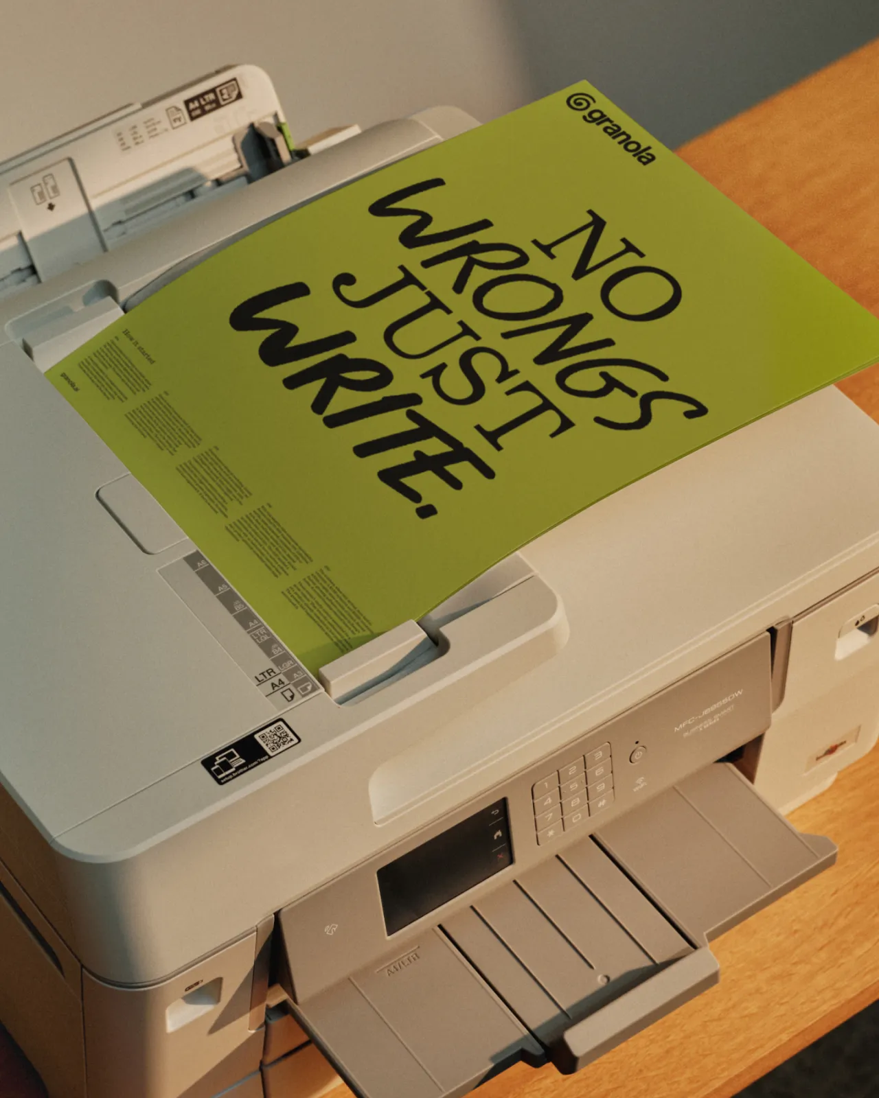
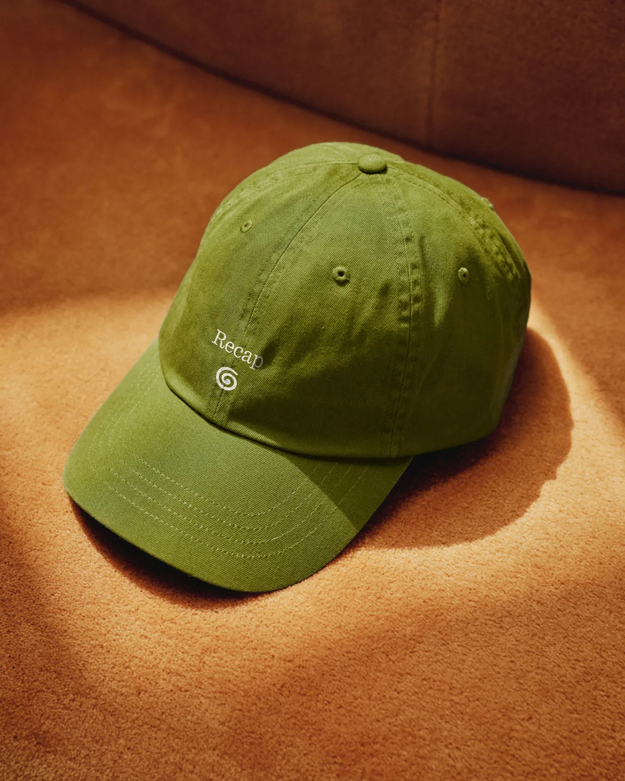
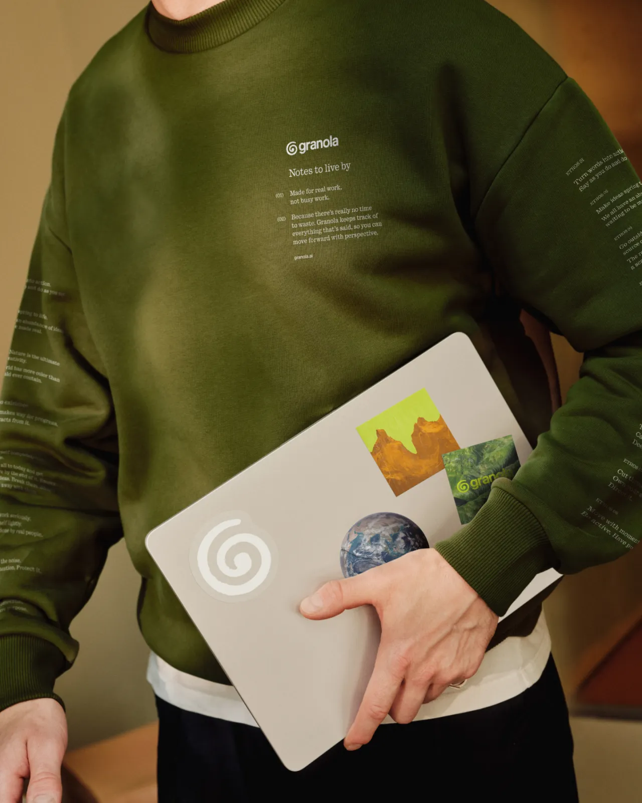
Christy Madden, strategy director at Ragged Edge, puts it more bluntly. "Productivity apps fail to live up to that name. They feel like yet another arbitrary layer, in the way of the actual work. You feel the difference with Granola instantly. By taking care of the notes, it makes space for you to stay present in every meeting and focus on the ideas that matter most. It’s a beautifully designed tool for anyone ambitious about their work."
The brief, then, was to take a product already beloved by Silicon Valley's C-suite and make it a brand that knowledge workers everywhere actually know.
By humans, for humans
The category is full of sleek, frictionless, impersonal design; Ragged Edge went looking for the opposite. The Granola identity is handcrafted, witty and warm.
Take the logo. Yes, it's a 'G', which is practical enough as a reference to the name. But it's organic and freeform, the shape of an idea jotted down fast in a notepad or on the corner of a napkin. It almost reminds me of my Teeline shorthand, which I instantly forgot after my exams.
"It's specifically designed to feel slightly imperfect and unmistakably human, an antidote to the overly sleek and impersonal identities that dominate the category," says Jessica Bong-Woon, creative director at Ragged Edge.
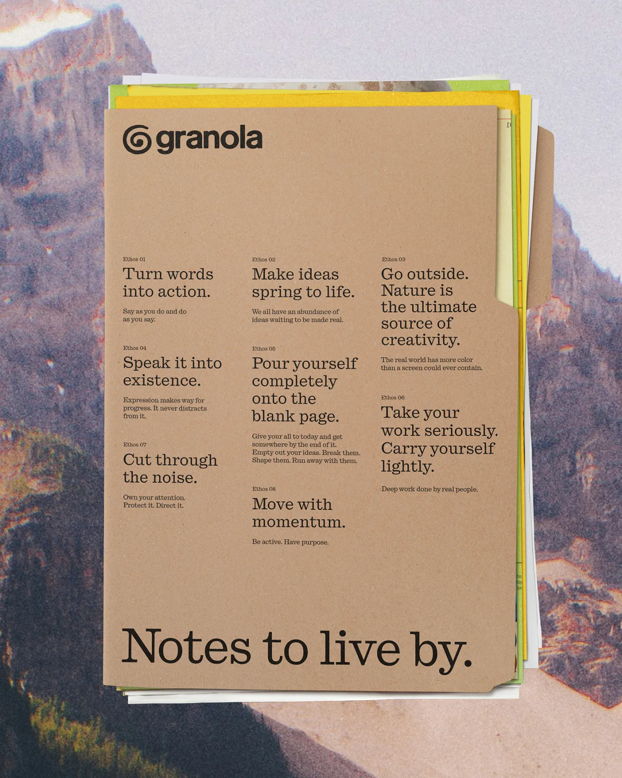
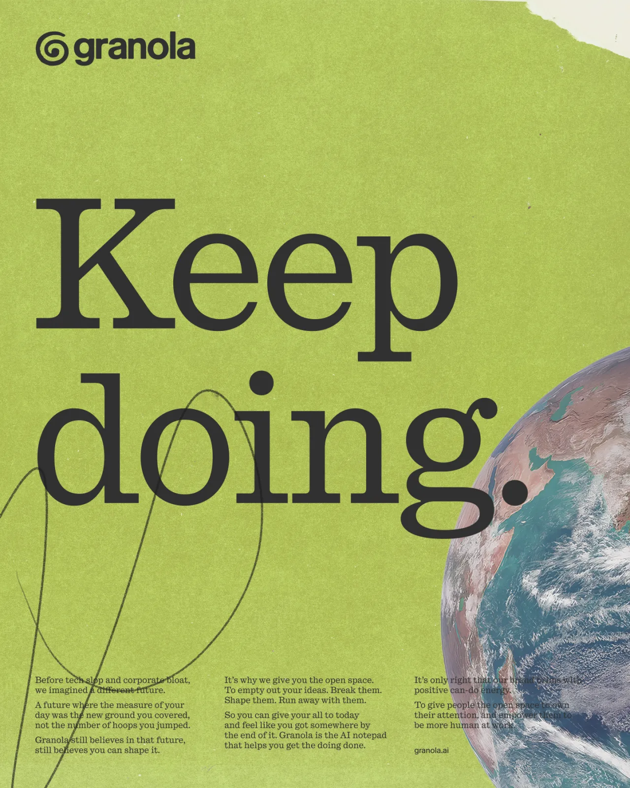
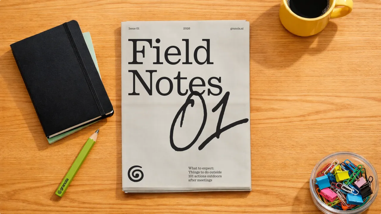
Then there's the type, and this is the bit I love. The identity features a bespoke script based on the actual handwriting of Sam Stephenson, Granola's co-founder. Hundreds of handwritten letters, worked up into a typeface with multiple variants of each character, so it shifts and evolves as it's used, the way real handwriting does. The voice it carries is emotionally intelligent and down-to-earth, and it doesn't mind a joke.
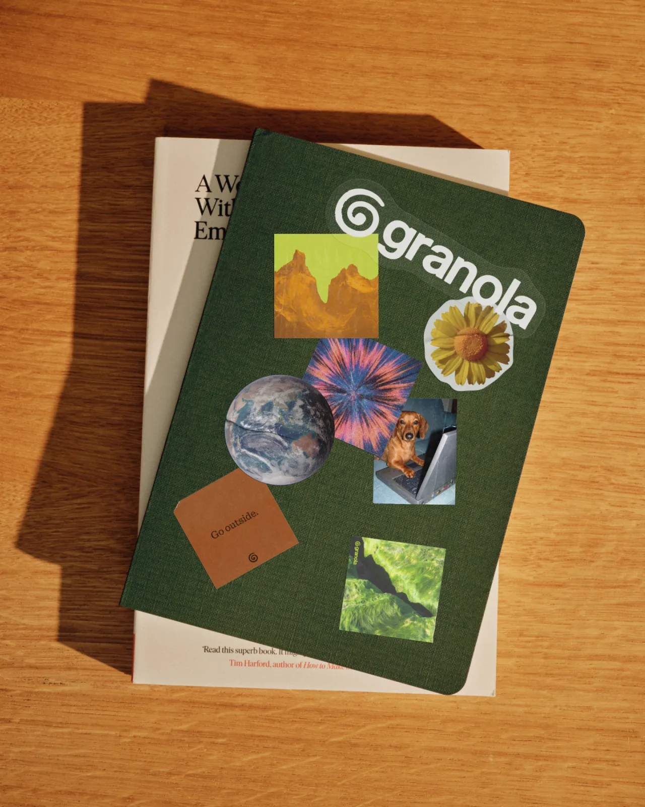
The colour palette evolves what Granola already had: a warm, earthy green that keeps its distance from the vibrant RGBs you see everywhere else in AI. There's also a new illustration style called "findings", which layers texture, colour and photography to capture the feeling of a working day well spent.
"The temptation in AI is to look like everyone else because the market is moving so quickly," says Max Ottignon, co-founder at Ragged Edge. "Granola chose a harder path. To build a brand with a clear point of view about the role AI should play in people's lives. That conviction is what gives the work its impact."
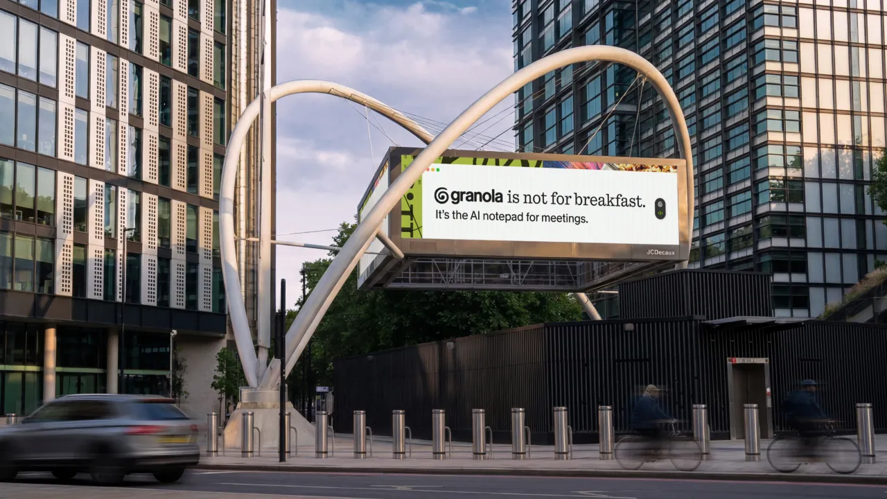
Granola is not for breakfast
In the weeks after launch, Ragged Edge and Granola took the brand out into the streets of San Francisco, New York and London.
The San Francisco campaign spoke to tech leaders while dodging the techno-babble of every other billboard in that city: "Being present is a power move".
New York and London had more fun with the name. "Granola is not for breakfast" ran across billboards, trains, bus stops, and full-station takeovers, introducing an entirely new audience to an AI product committed to doing things differently.
I'll be honest, if a piece of software had told my 2003 self that one day it would transcribe the interview for me, I'd have hugged it. And that silver brick would've happily gone in the bin.
Editor's Picks





Trending




Latest Jobs
Mobile Apps Marketing Executive at Future
Full-time·Bath·£26,500 – £29,000
Verbal Identity Fellow at Interbrand
Full-time·New York·$30 per hour
Senior Project Manager at Engage
Full-time·Leeds·£42,000 – £52,000
Research Media and Engagement Assistant at University of Salford
Part-time·Manchester·£28,031 – £29,588
Creative Director at Koto
Full-time·London·£95,000 – £130,000
Lead Product Designer at Monzo
Full-time·London·£90,000 – £120,000