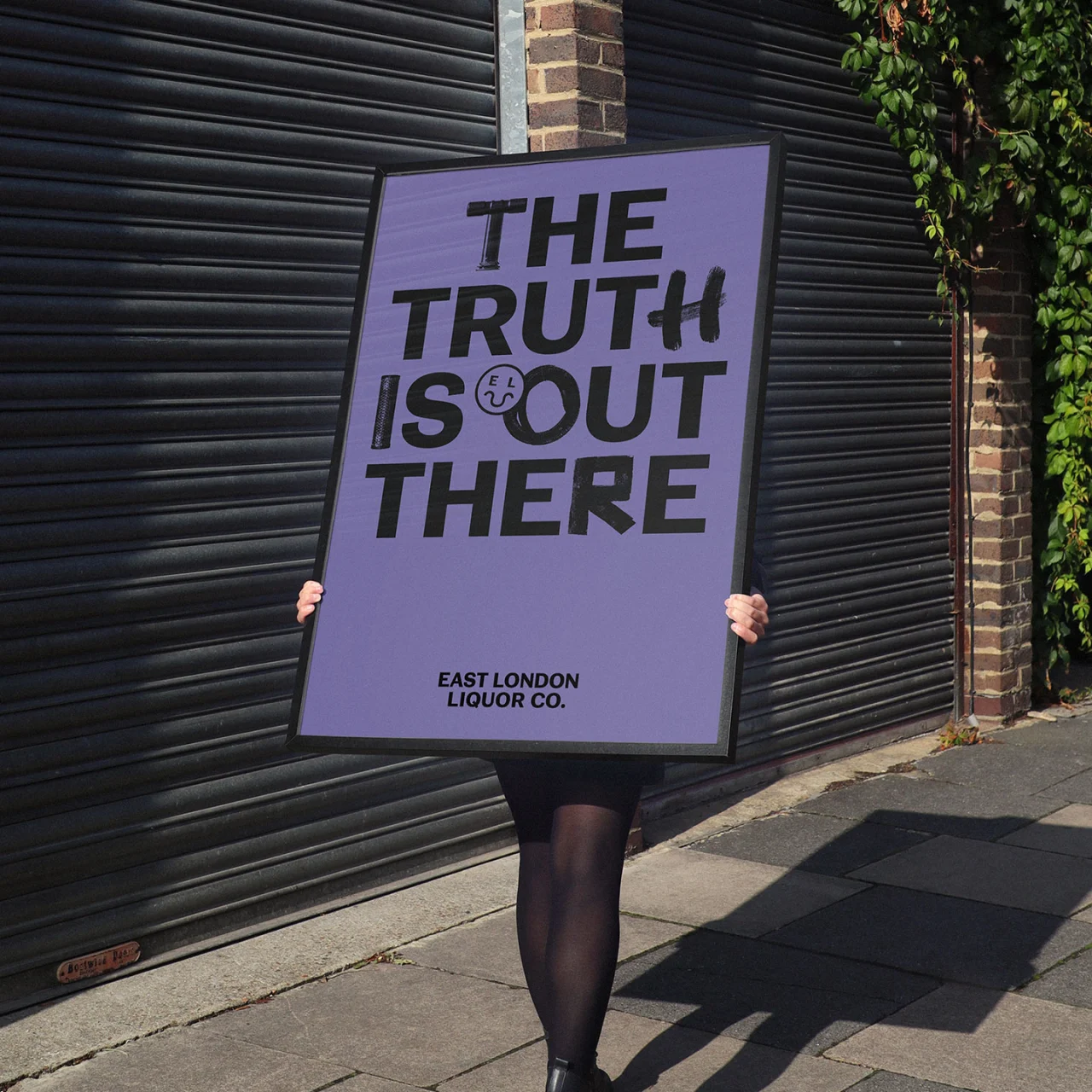
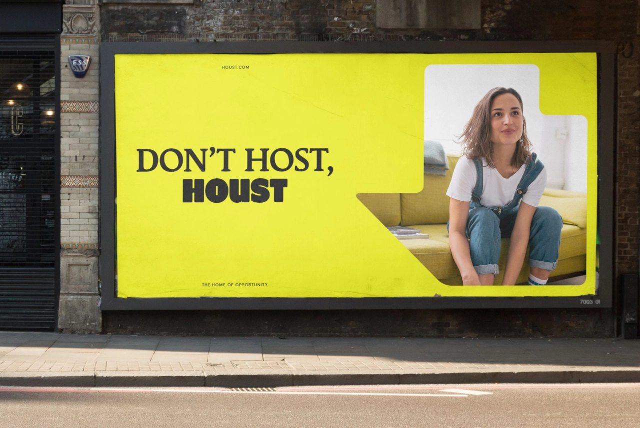
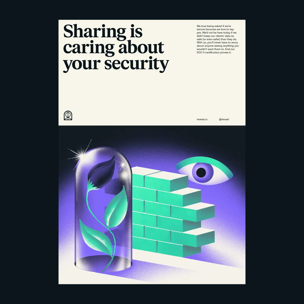
Ragged Edge creates an adventurous identity for a boutique hotel, founded on a bespoke typeface
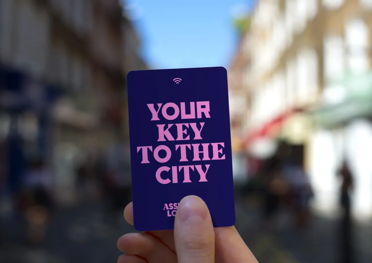
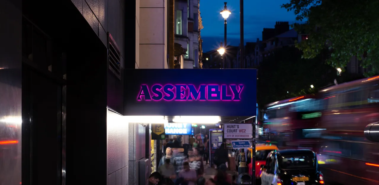
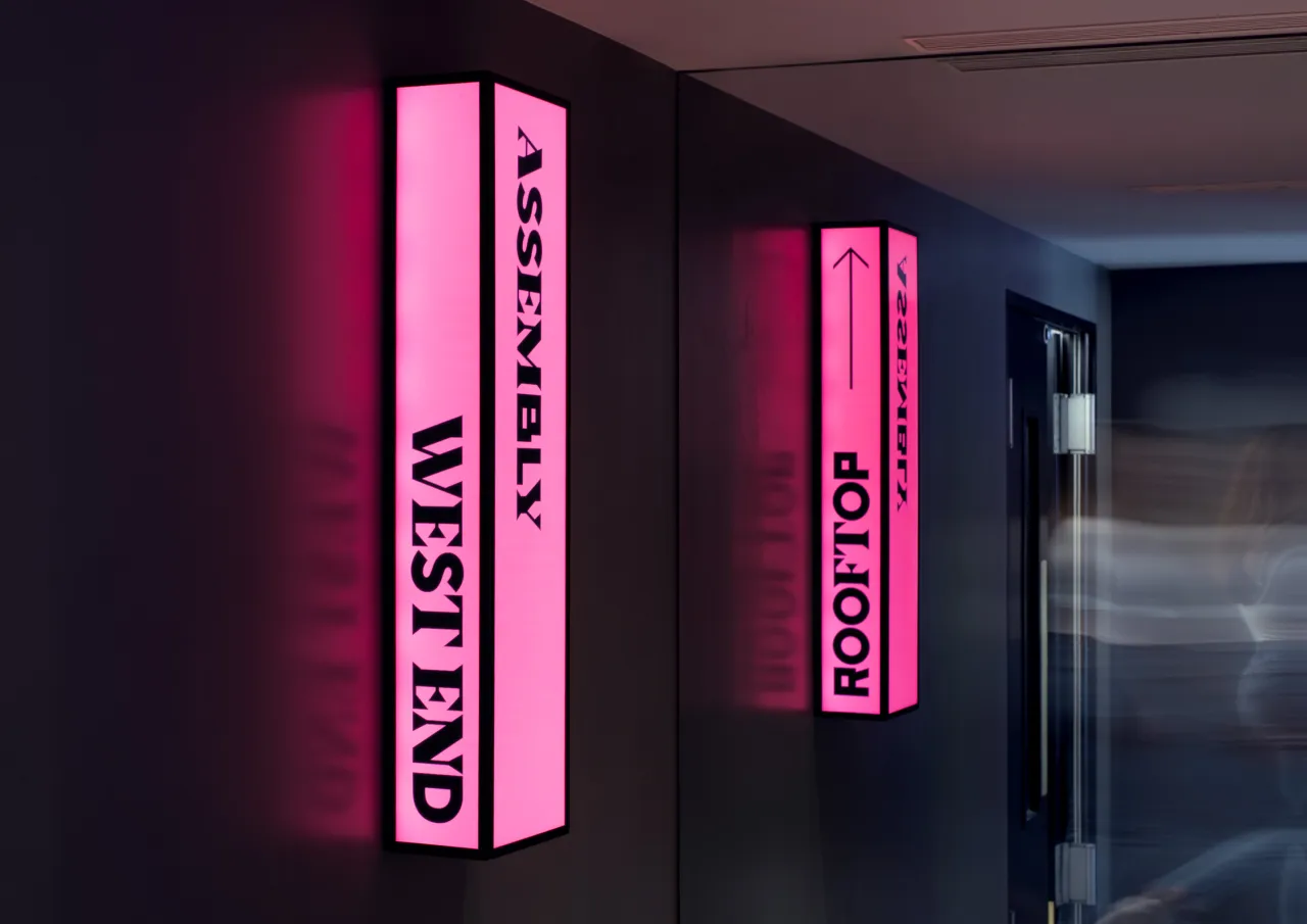
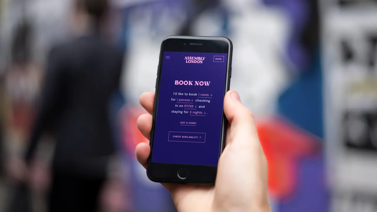
Ragged Edge has created an identity for Assembly, a new boutique hotel brand in London that doesn't want its guests to spend time in its establishment but instead wants them to "get out and experience the city".
Via Creative Boom submission. All images courtesy of Ragged Edge
"Young travellers don’t come to the West End to hang out in a hotel room,” says Max Ottignon, Ragged Edge Co-founder. “So we set out to fuel their sense of adventure. The brand idea – Get Up and Go – reflects Assembly’s disruptive approach, and informed every element of the offer, from identity through to customer service."
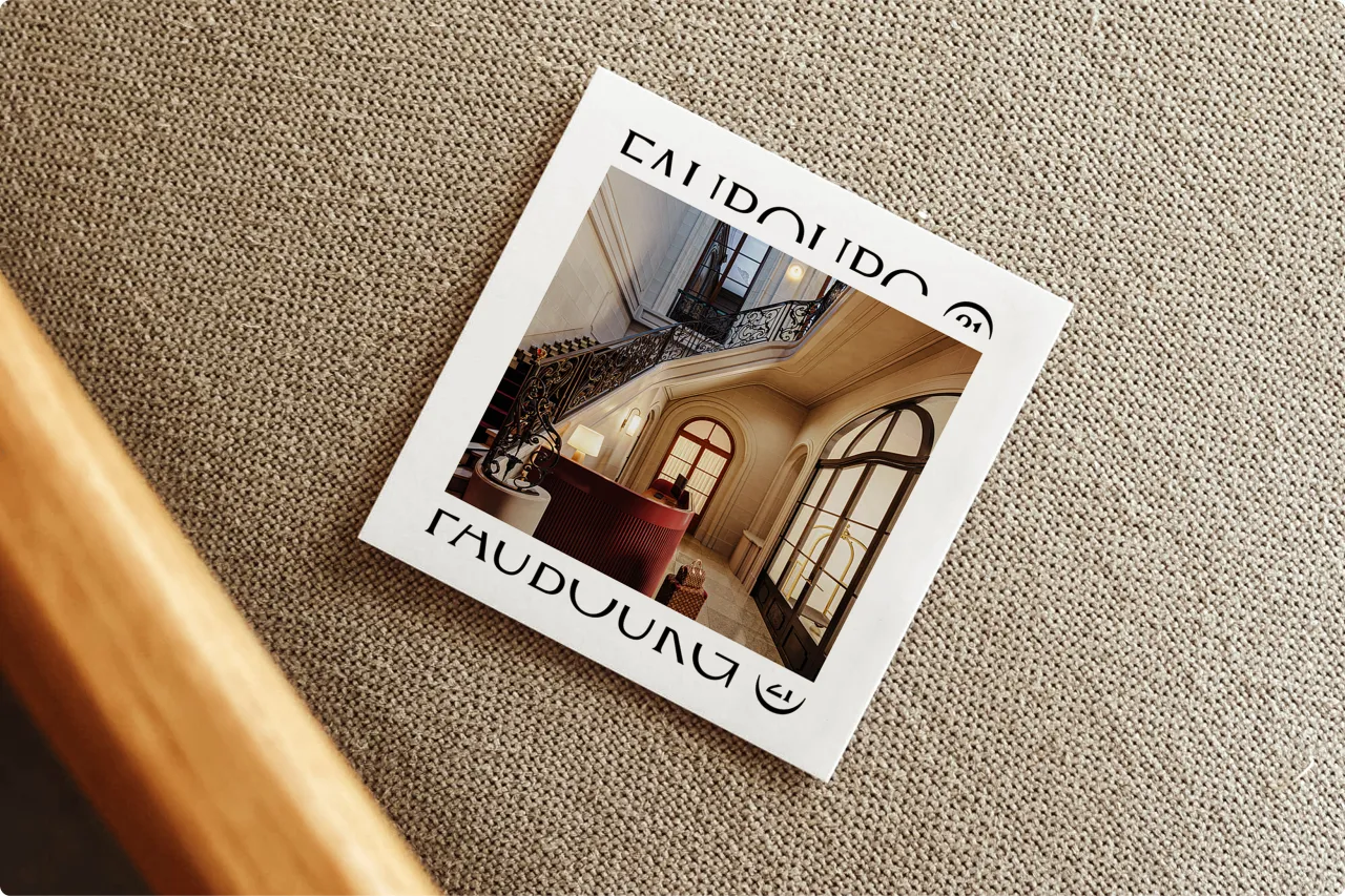
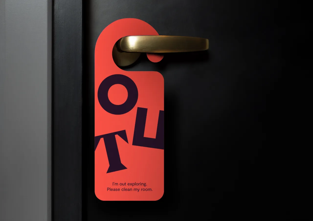
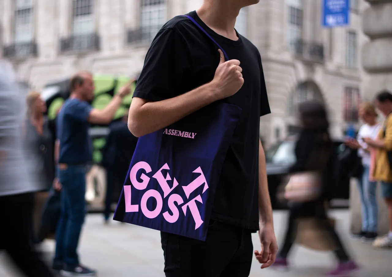
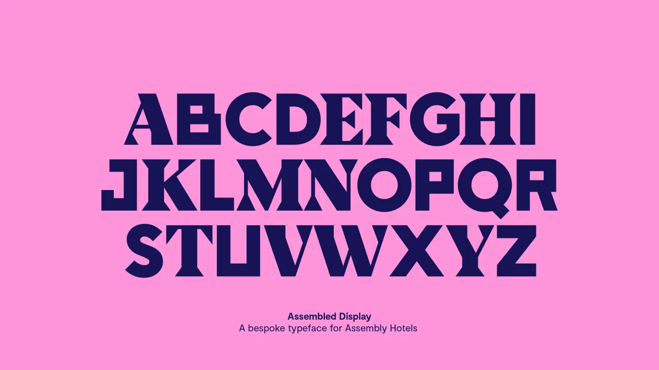
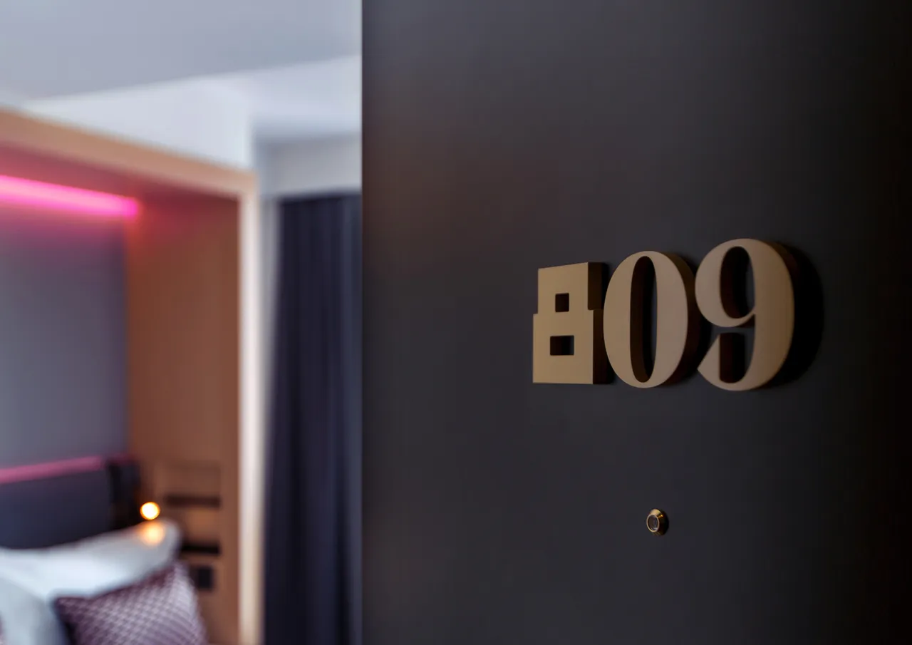
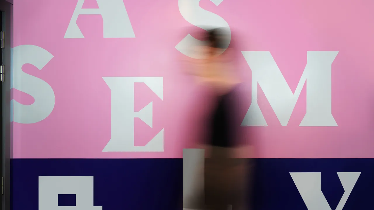
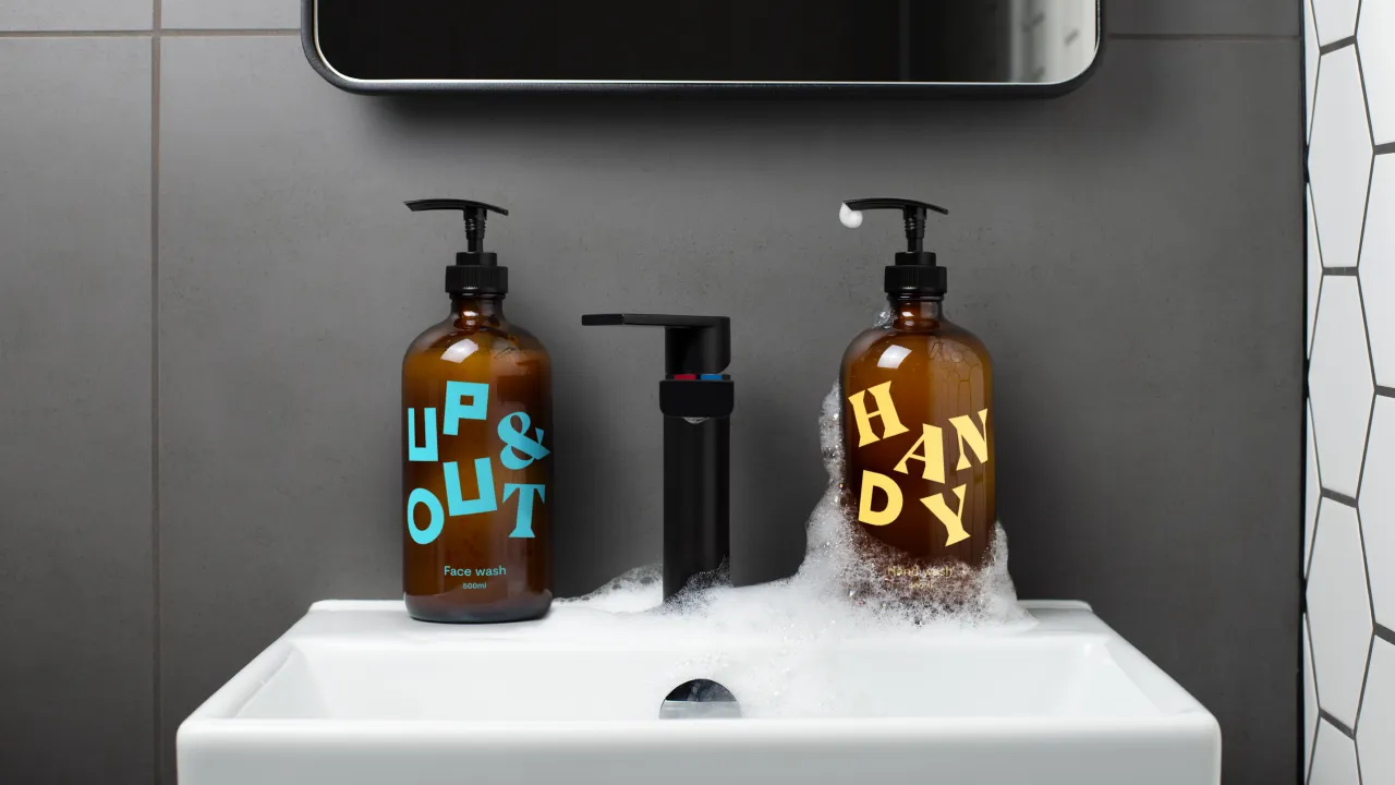
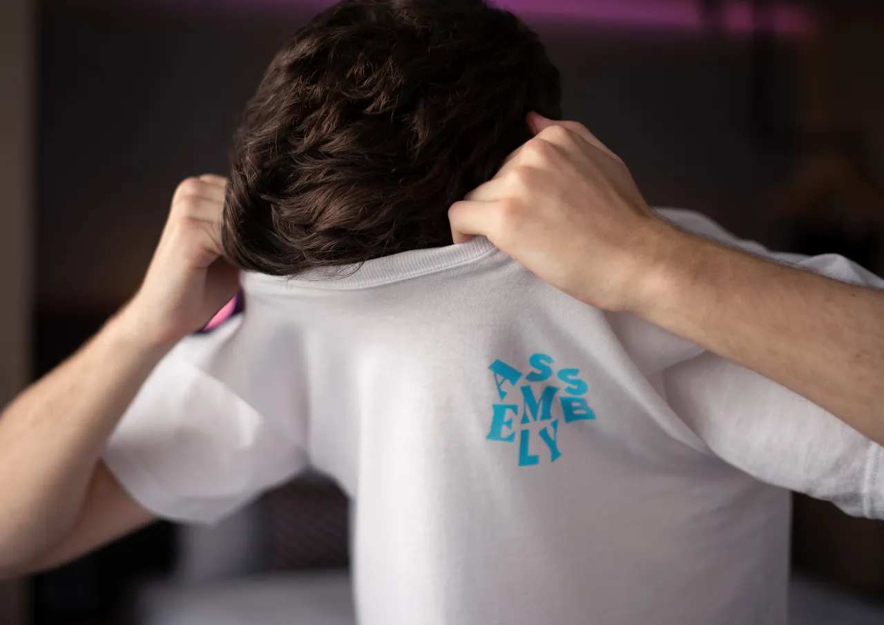
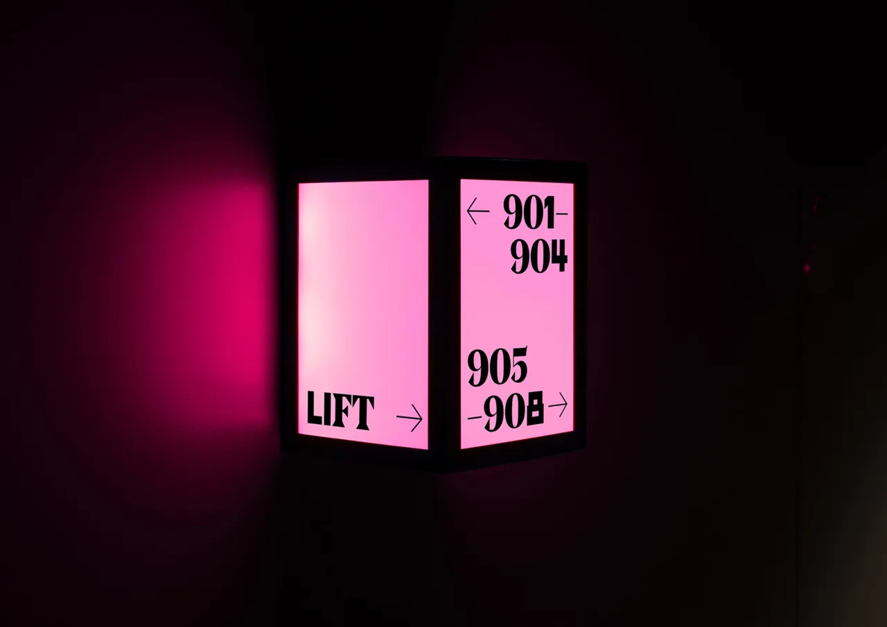
Designed as the antidote to the inoffensively bland aesthetic favoured by other millennial-focused hotel brands, the identity was built around 'Assembled', a bespoke typeface designed to reflect the diverse range of experiences on the hotel's doorstep. The eye-catching letterforms are used playfully throughout the customer experience, scattered across layouts in a visual representation of the brand idea.
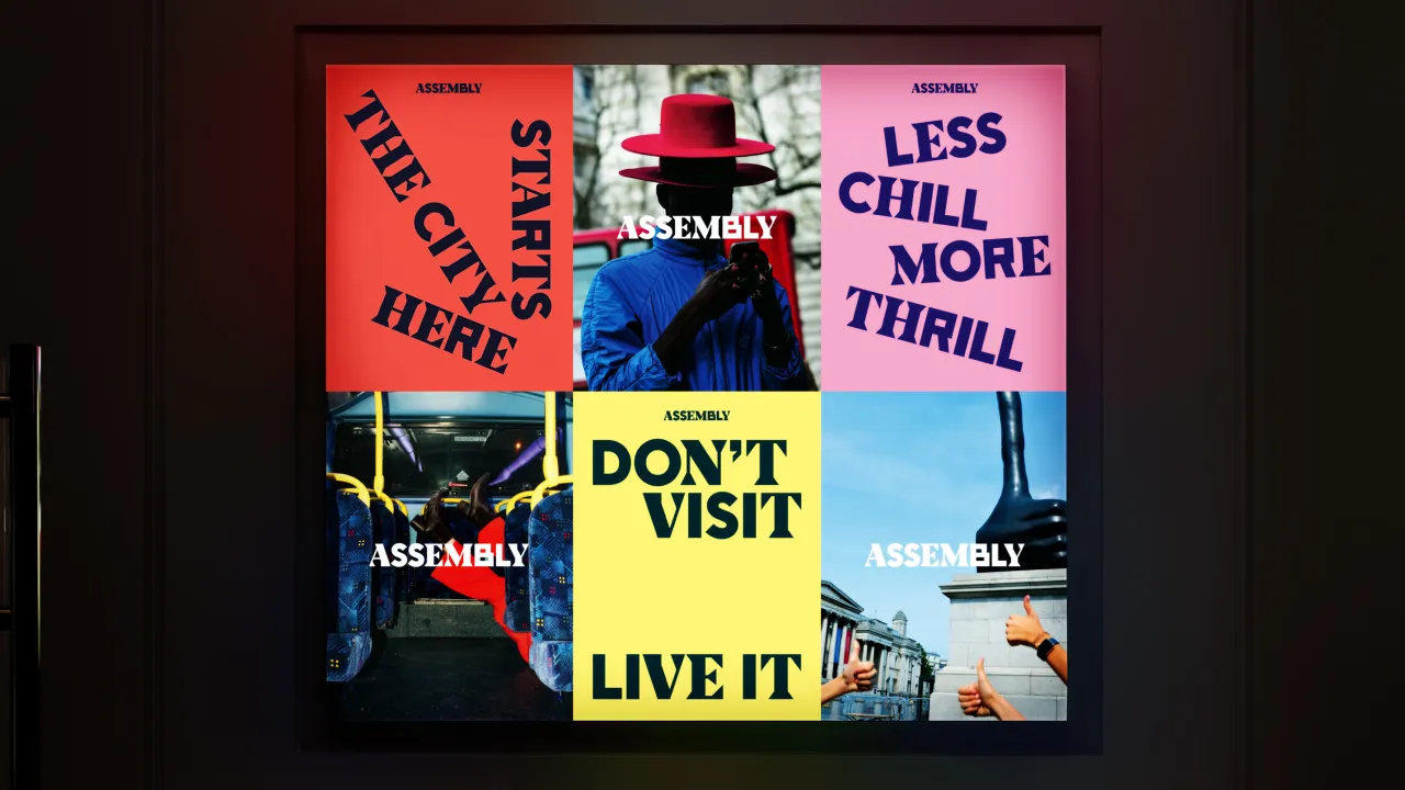
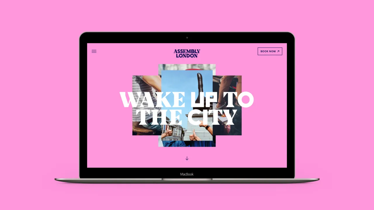
The tone of voice aims to provoke a sense of adventure. Where other hotels talk about staying in and getting comfortable, Assembly encourages its guests to explore the city. With hero lines like “Get Lost” and “Don’t Visit. Live It.” Assembly always sounds punchy, upfront and full of energy.
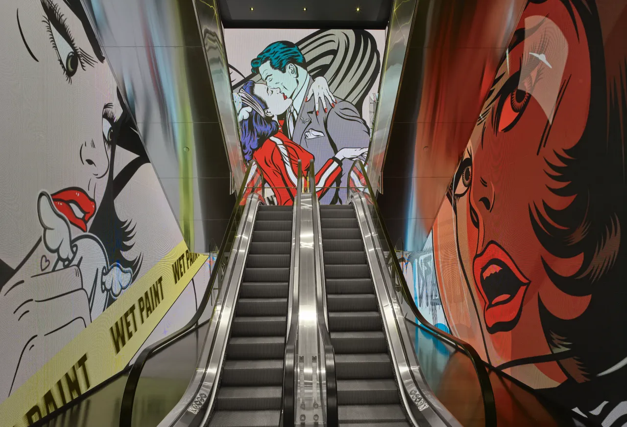
Ragged Edge also introduced a distinctive approach to photography. Candid, smile-in-the-mind moments were captured by everyday city explorers, not professional photographers.
Editor's Picks





Trending






Latest Jobs
Senior Designer at Definition
Contract·London·£45k–£50k
Creative Content Executive at Cognition
Full-time·Birmingham·£28k–£35k
Creative Social Content Producer at Bompas & Parr
Contract·London·£32k–£40k
Brand Designer, Product Launches at Figma
Full-time·New York·$127k–$269k
Head of Technical & Facilities at Midlands Arts Centre
Full-time·Birmingham·£40,210
Project Manager at A Practice for Everyday Life
Full-time·London·£37k-£46k