Is this identity for Smål Market the future of retail branding?
People People's flexible branding system for a new retail incubator in Seattle unifies six independent businesses while preserving their distinct identities.
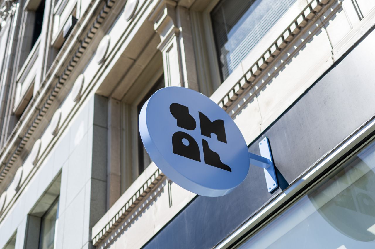
As retail faces existential threats from rising rents and online shopping, Seattle's Ballard neighbourhood is trying something different. Smål Market, a new merchants' collective and business incubator, represents an alternative model: six small businesses sharing one roof, splitting costs, and learning together.
But creating a physical space is one thing. Creating a brand that can hold six distinct identities without crushing them? That's where design thinking becomes essential.
People People, the Seattle-based studio behind the project, faced a deceptively complex brief. Working with longtime client Ballard Alliance—a nonprofit dedicated to neighbourhood vitality—they needed to develop everything from naming to website for a shopping destination that didn't yet exist, housing businesses that hadn't yet been selected.
What's more, the resulting identity needed to feel cohesive enough to signal "this is a place" while remaining flexible enough to let six independent brands breathe.
The design challenge
Essentially, this challenge inverted how retail branding usually works. Most shopping destinations create dominant environments that subsume individual tenants: think of any modern mall. But Smål Market required an umbrella brand that could unify without overpowering.
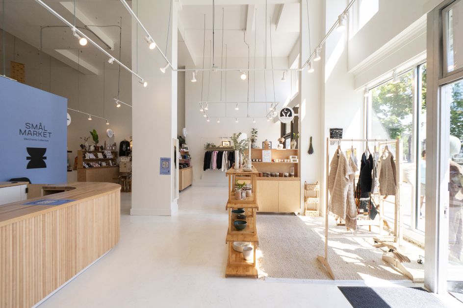
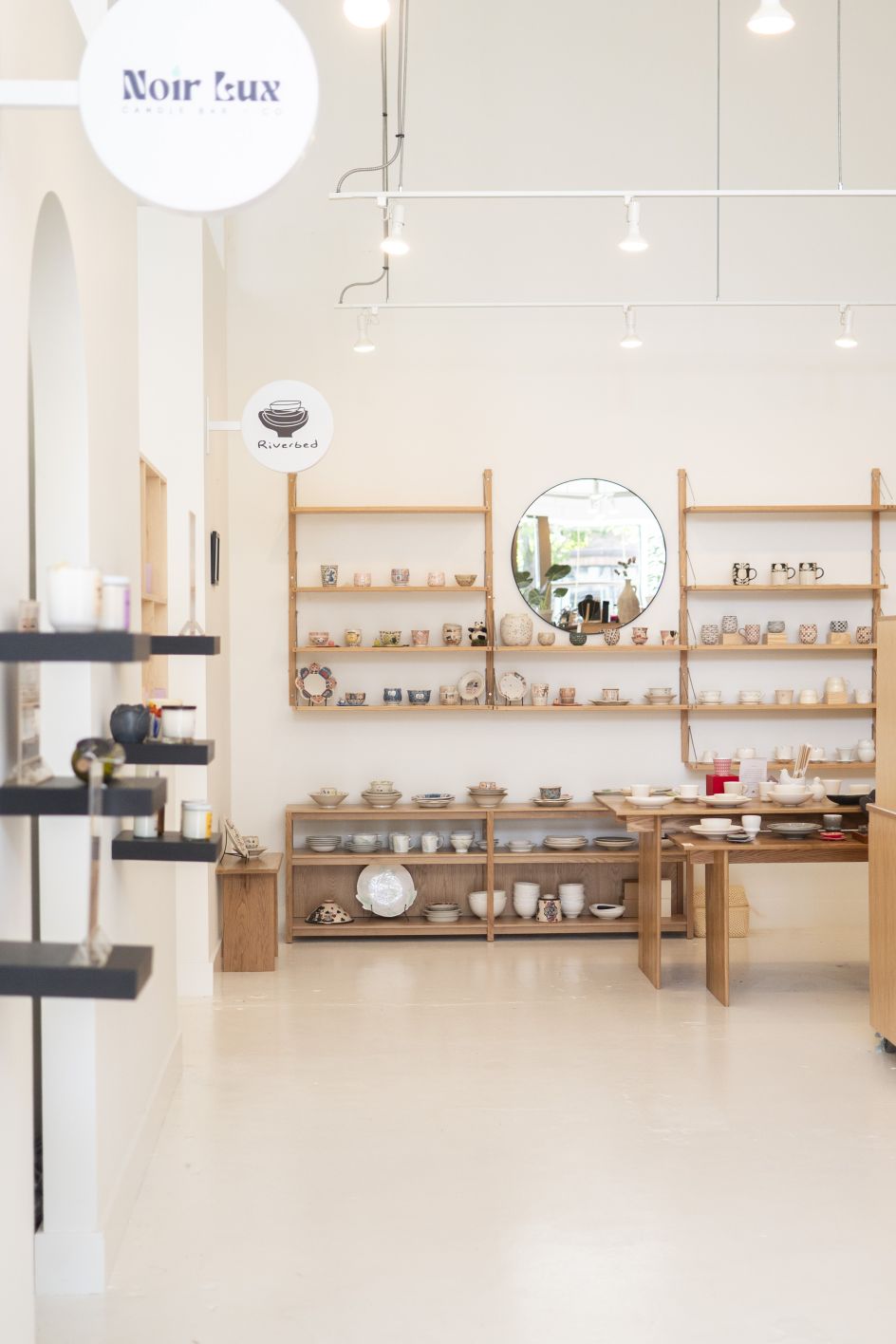
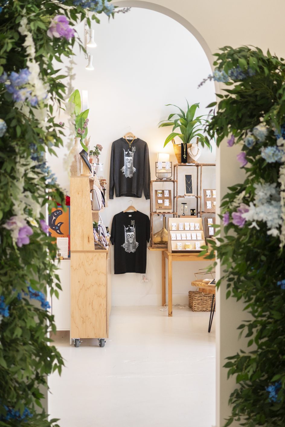
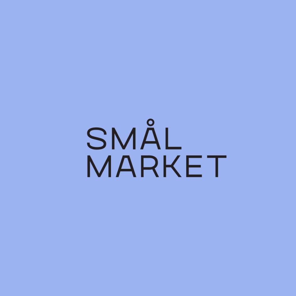
The solution started with the name itself. "Smål," meaning (you guessed it) "small" in Norwegian, taps directly into Ballard's Scandinavian heritage while elegantly articulating the market's purpose. It's memorable, distinctive, and does genuine conceptual work, representing both the small businesses and the intimate scale of collaborative retail. Paired with "Market", it grounds the concept in both its physical location on Market Street and the communal ethos of traditional market spaces.
Visual elements
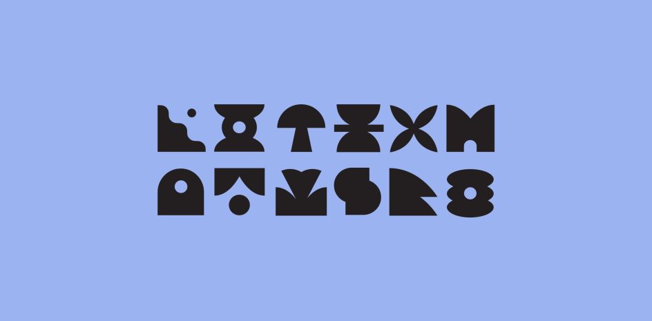
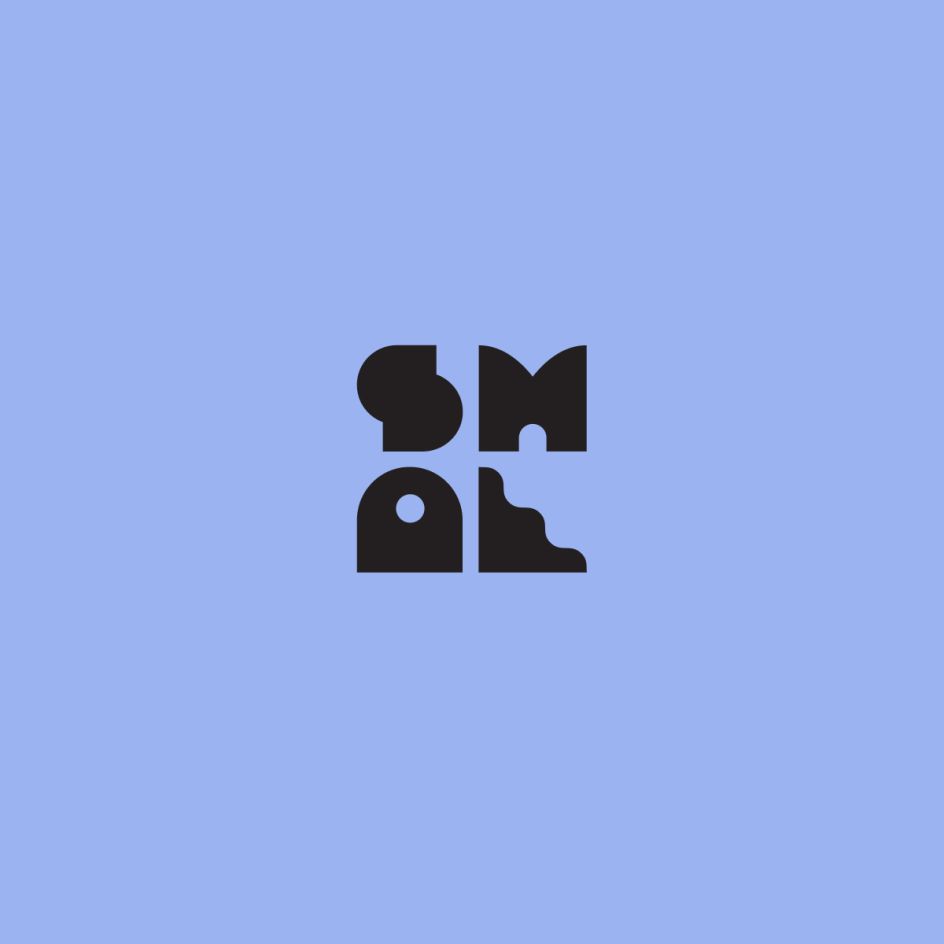
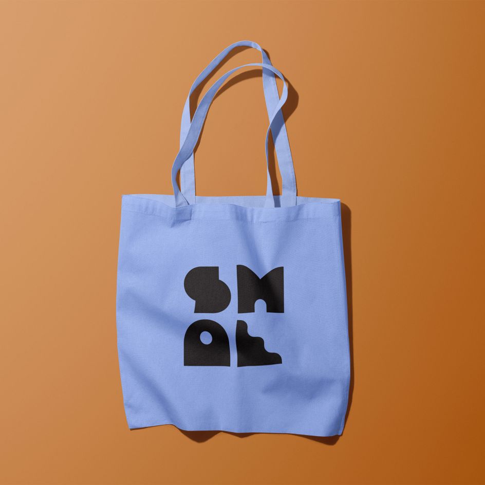
To give this concept visual life, People People developed a geometric mark that's simultaneously bold and modular. The stacked forms, visible across signage, tote bags, and wayfinding, suggest both architectural solidity and organic stackability. There's a deliberate restraint, meanwhile, in the core palette of charcoal, cream, clay and periwinkle. These aren't trend-driven colours; they're colours with staying power, rooted in understated Scandinavian design principles.
But the real sophistication lies in what the system doesn't do. The branding establishes clear parameters—typography, colour relationships, spatial logic—without being prescriptive about how each merchant uses them. This way, stores like Ruby Laine Apparel (streetwear), Noir Lux Candle Bar (handcrafted candles) and Riverbed Lifestyle (ceramic goods) can maintain their distinct visual personalities within the Smål ecosystem. The brand creates context, not conformity.
This matters because the market's annual cycle means constant turnover. Each year, participating businesses aim to graduate to their own spaces, with new merchants rotating in. The identity needed to accommodate this flux; to be simultaneously stable and elastic. It's a design challenge that mirrors the market's social mission: creating structure that enables independence rather than enforcing it.
Community ethos
The project also represents a different kind of client-designer relationship. Ballard Alliance isn't a private developer maximising returns; it's a community organisation using Congressionally Directed Spending—secured by Senator Patty Murray and administered through the Small Business Administration—to address neighbourhood vitality. So ultimately, People People aren't just making something look good here; they're helping articulate what kind of community resource this space could be.
That changes how you think about success. Yes, the identity needs to attract shoppers and look credible. But it also needs to feel welcoming to emerging entrepreneurs who might be intimidated by retail. It needs to signal "you belong here" to businesses that haven't traditionally had access to prime locations. The photography, by Maddy Porter, deliberately shows diverse products and emphasises the collaborative environment rather than individual consumption.
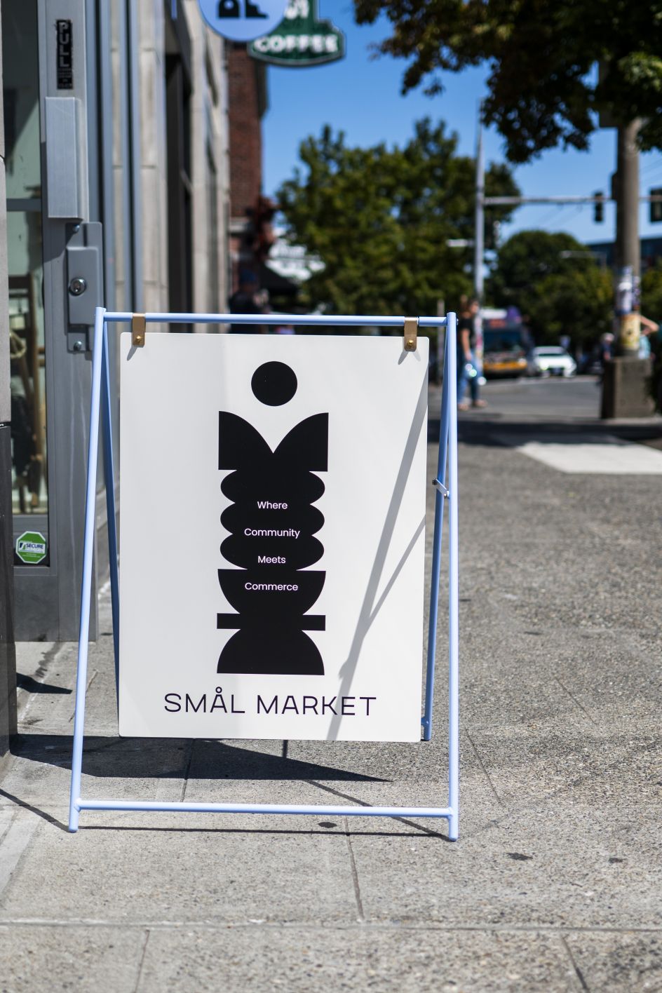
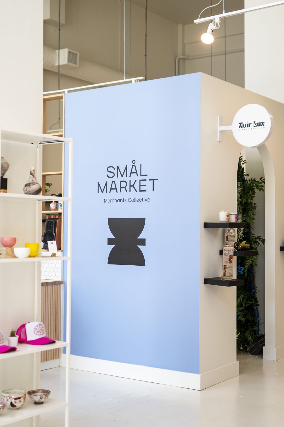
There's something refreshingly practical about the whole approach. The comprehensive scope, including naming, messaging, visual identity, signage, interior design direction, photography and website, allowed People People to think systemically rather than just deliver logo options. They weren't styling an existing concept; they were helping define what Smål Market actually means.
Why it matters
In the current design landscape, where many branding projects chase novelty or lean heavily on stylistic trends, Smål Market feels notably grounded. The Scandinavian influence isn't aesthetic tourism; it's authentic to Ballard's identity. The modern sans serif isn't trying to be the coolest typeface; it's chosen for clarity and durability. The overall impression is one of thoughtfulness over cleverness.
And this matters: to designers, to Seattle, and to the wider world beyond. Because as independent retail continues to struggle, we're likely to see more experiments with collective models, shared resources, and community-supported business incubation. Each will need design thinking that goes beyond making things pretty; thinking that can hold complexity, enable multiplicity, and serve missions beyond profit.
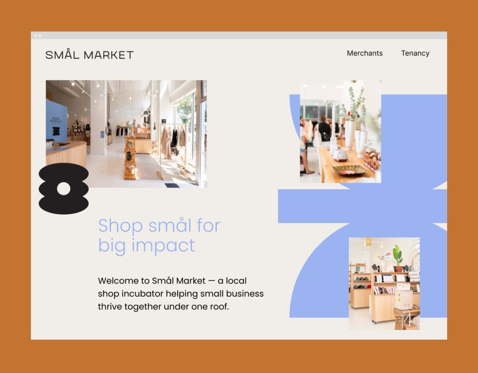
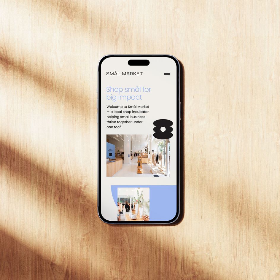
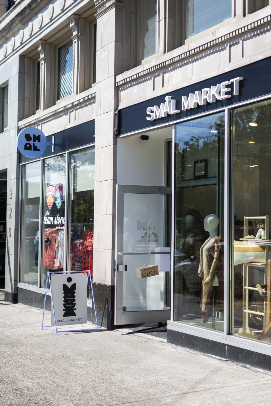
People People's work demonstrates what that can look like in practice. The Smål Market identity doesn't shout. It doesn't dominate. It creates the conditions for other things to thrive. For designers working on community-focused projects, civic initiatives, or anything involving multiple stakeholders with different needs, there are lessons here about restraint, flexibility and the quiet power of systems that know when to step back.
The first cohort of merchants—from Ballard FC's team store to The Ballard Collective's curated artworks—is now trading under that periwinkle-and-charcoal umbrella. Whether they graduate successfully to their own spaces remains to be seen. But they're doing it with an identity that gives them permission to be themselves, together. In 2026, that might be the most valuable thing design can offer.


