Leanne's Co brings Sheffield's Nether Edge together in community-driven rebrand
Sheffield-based design studio Leanne's Co has brought 22 different businesses together under one identity that celebrates the independent shops of the Nether Edge community.
Founded by Leanne Mallinshaw, Leanne's Co aims to make a positive difference by helping small businesses grow their audience and confidence. Specialising in creating identities for both emerging and established organisations, Leanne describes herself as a "design partner for companies without a design department".
And it's precisely these sorts of businesses she worked with for her latest project, Nether Edge. Known for its wholesome charm and historical significance, the leafy Sheffield suburb is home to several independent businesses that wanted to recapture the imagination of nearby residents and attract people who have never visited the area.
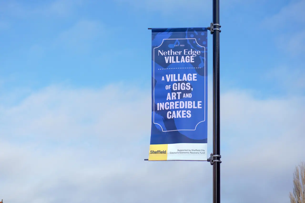
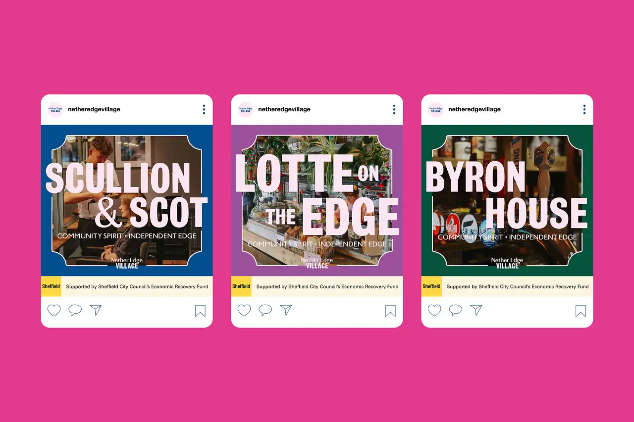
Centred around the strapline 'Community Spirit, Independent Edge', Leanne was keen to retain the local charm of the village shops that make up the area. "Having previously lived in Nether Edge and spent several years involved in the community – from being on the neighbourhood group to branding and helping to organise their annual community festival – it is an area I know well and is close to my heart," she tells Creative Boom.
Like many small businesses nationwide, though, the last few years have been rough for the organisations in Nether Edge. Covid has changed many people's shopping habits, with plenty preferring to shop online out of convenience rather than interacting with the community on their doorstep.
To combat this, the businesses in Nether Edge got together and applied for funding from Sheffield City Council's Economic Recovery Fund. Thankfully they were awarded the money and then enlisted Leanne to create a brand that would encourage people to shop locally and spend a day in Nether Edge picking up essentials and socialising.
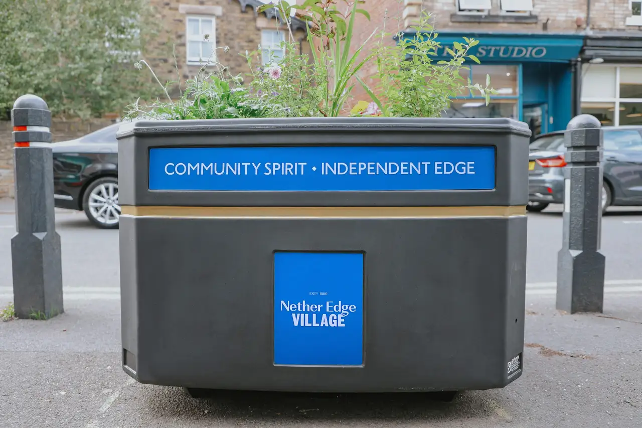
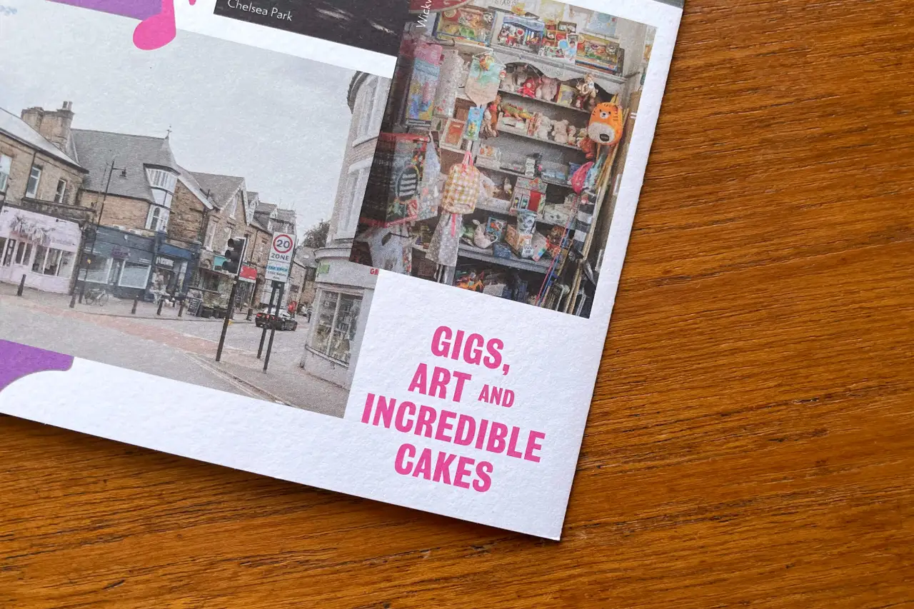
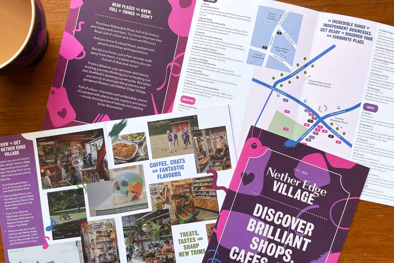
When creating the brand concept, Leanne had three essential considerations to remember. These included reflecting the history and longevity of the area, linking it to businesses without pulling focus from their identities, and making sure it had a vibrant and creative appearance that was in keeping with the business owners of Nether Edge. No mean feat. Luckily she knew just where to start.
"After studying historical photographs of the Village area, I was drawn to the typography used in the businesses' signage and advertising, and could see how this could be used to reflect the past but also appeal to an audience now," Leanne explains.
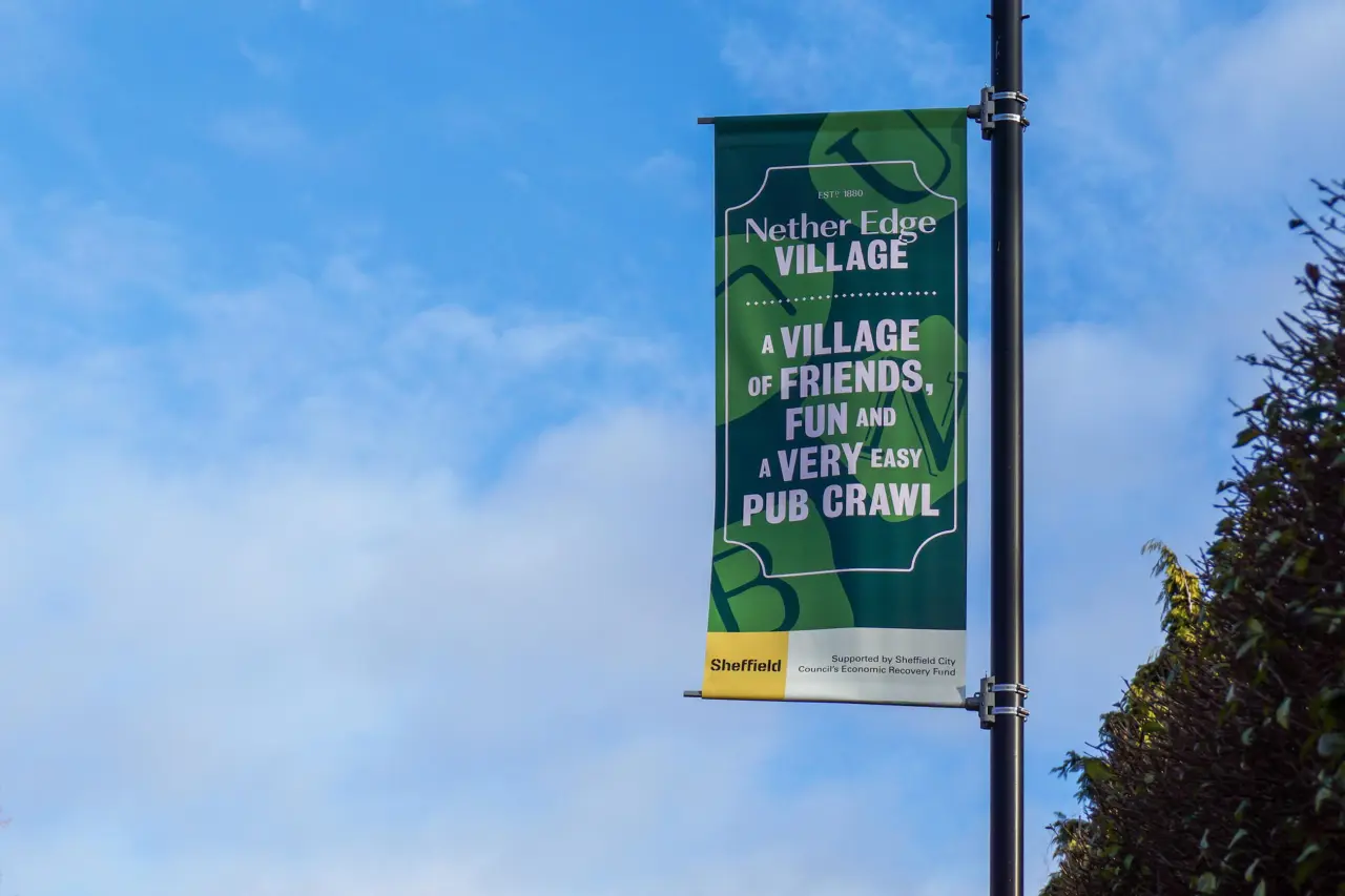
"Using typefaces that originated from Sheffield's (now closed) Stephenson Blake type foundry and working with copywriter Ash Billinghay, we created messaging that proudly shouted about all that Nether Edge Village has to offer, as well as some clever and bespoke shop local messaging.
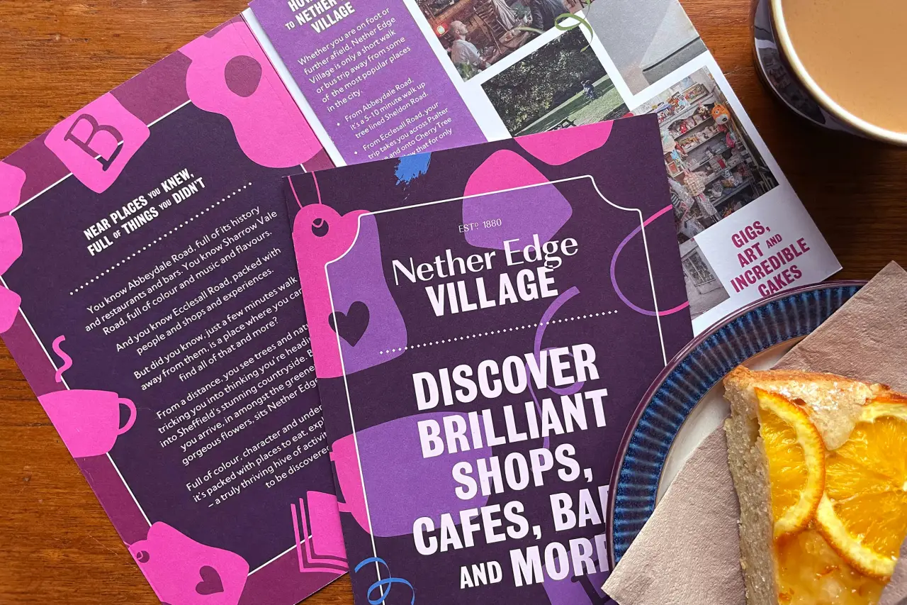
"The businesses themselves inspired the colour palette and the hand-drawn pattern that features across the brand, with the palette being directly inspired by their shop fronts."

Completing the brand identity was one element that she feels lots of small businesses overlook: good photography. Leanne ensured that professional photography was included in the funding application as it is something that many small businesses benefit from but often struggle to justify in terms of investment.
"Working with Joe Horner, we created a bank of images that the Village can use to promote and showcase each business, as well as the surrounding area, in print or online," she adds.
Taking a year to complete from funding through to execution, the Nether Edge identity seems to do the impossible. It brings together a diverse range of seemingly unrelated businesses, finds common ground, and uses this to tie them all together in a charming, cliche-free way.
"It was such a wonderful project to work on," Leanne concludes, "not just because it ticked lots of boxes for me – a budget (!), creative freedom, the opportunity to partner with other talented creatives – but because it's made an impact, not just in terms of helping the businesses bounce back after Covid but it's helped them take steps to build relationships with each other – creating a community within a community."
The new identity has proven a hit with local business owners too. Steven Ojari, the owner of Bannerdale Osteopaths and Project Lead of Nether Edge Village, adds: "In helping us create Nether Edge Village, Leanne has brought together twenty-two otherwise separate businesses under one identity, bringing us closer as a community."
Editor's Picks





Trending






Latest Jobs
Midweight Graphic Designer at We Are Your Friends
Full-time·London·£36k–£44k
Art Director at SPOKE
Full-time·London·£55k-65k
Art Director at The New York Times
Full-time·New York·$120k–$130k
Design Lead at Madeo
Full-time·New York City·$85k–$120k
Account Director at How&How
Full-time·London·£73k-£79k
Junior Project Coordinator at Colorido Studios
Full-time·Twickenham·£28k–£32k