New York's Subway Map is taken online in ambitious project by Work & Co
One of the best ways to improve your design work is to learn from the best. That's why it's worth paying attention to the winners of The Indigo Design Award, a global contest that highlights exceptional talent in the fields of graphic, digital, mobile design, design for social change and branding.
In a special series of articles, we're bringing you the inside scoop on how some of the best work from this year's 2021 winners was developed. This time, we're taking a look at the ambitious redesign of the New York Subway Map by Work & Co.
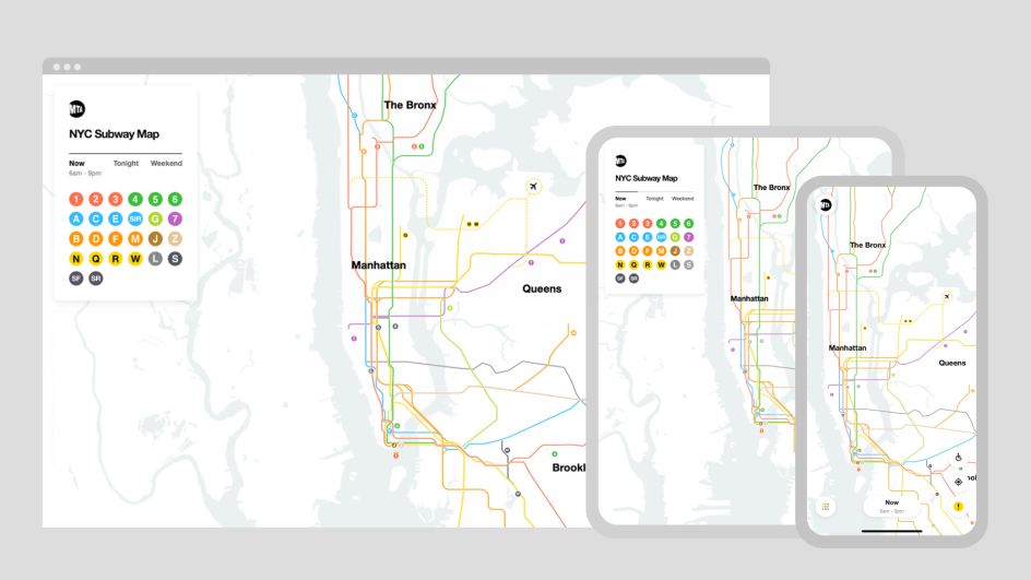
The MTA Live Subway Map is a web-based, interactive map designed to help riders navigate New York City's ever-evolving transportation network. And it's the result of an 18-month collaboration between Work & Co, the MTA, and the Transit Innovation Partnership.
Dedicated team
Work & Co is a design and technology company that's focused on creating digital products and experiences used by millions of people worldwide. Clients include brands such as Apple, IKEA, Nike, Mercedes, Aesop, and AB-InBev.
The company began in Brooklyn eight years ago, and now employs around 400 digital designers, strategists, and engineers globally in markets across the U.S., Europe and Latin America. It also has an interesting way of staffing projects. Work & Co’s model is based on fully-dedicated teams—their time is not split across various projects. For instance, the same core group of individuals that begins an engagement will finish it, which gives team members a unique sense of ownership over websites, mobile apps, eCommerce platforms, AI tools and other digital experiences it launches.
Beyond that, Work & Co combines international talent with extensive global research: in the US, nearly half their team members were born abroad. Because, as the company says, "Building products the world loves requires a diverse perspective."
The project to create a new Live Subway Map for New York was undertaken in partnership with the MTA and Transit Innovation Partnership, and they worked closely together, says Work & Co.
"We ask our clients to participate directly with us in an intensely collaborative process. The result is one united team making things the right way, with zero 'big reveals' and fewer hours invested in presentations."
Ambitious vision
Why was an interactive map needed in the first place? According to the MTA, anyone who's taken the NYC subway knows that wayfinding can involve lots of physical signage.
"That includes subway signs, maps and diagrams in stations, and posters filled with paragraphs of copy explaining service changes and construction that could impact your journey. The MTA, Work & Co and the Transit Innovation Partnership had an ambitious vision to build a new digital map that visualises those change to help millions of New Yorkers and tourists see service changes as they happen."
The map continually reroutes itself based on real-time data to show current and future service. It's the first significant redesign of the map in 40 years. It combines the geometric clarity of Massimo Vignelli's original diagram with Hertz's geographical and organic curves but powered with technology to make a map more appropriate for today's world.
This was one of a series of pro-bono projects Work & Co has launched with the aim of helping society in different ways, along with Planned Parenthood's AI-powered chatbot Roo, non-profit database GiveBlck.org, and Woke Vote. Features of the map include:
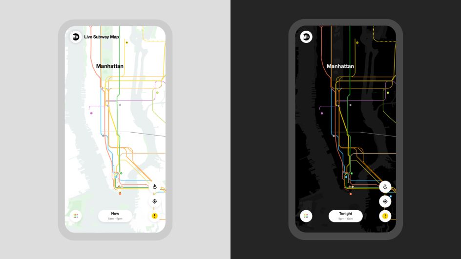
Automatically updating train lines: The lines continually redraw themselves using real-time data to illustrate current and accurate train service status. Sections of train lines fade out where a train line is not running and are denoted with dashes if trains are running in a single direction.
Moving trains: See trains moving, which helps to signal to users that the map is live and also reflects real-time locations of trains throughout the subway system.
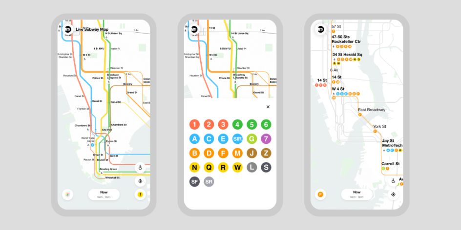
Zoom-In: Greater map detail is exposed as the user zooms in, including the ability to see individual train lines, subway entrances, station names, and street locations and names.
Subway accessibility: The new map highlights accessible stations and provides updates to accessibility-related equipment like elevators and escalators.
Emergency alerts: The map uses the MTA's data feed to convey official MTA communications for emergencies.
Designing through a pandemic
The redesign of the New York subway map was never going to be an easy task. But the timing made it all the more challenging.
"When we began work on the map, it was prior to the Covid-19 pandemic," says the MTA. "So one of the aspects we had to consider most was deciding when the product was ready for the beta launch, especially given ridership patterns changed as a result of the pandemic."
"We decided that rather than wait, we could launch the Live Subway Map as a way to help riders gain critical information about their commutes. Plus, knowing our core users are always-very-discerning New Yorkers, we always intended to launch in beta to leave enough room for feedback and dialogue for future updates. The most interesting and challenging thing about building digital products is that they're not really ever finished but rather constantly iterating."
Helping the vaccine rollout
In early 2021, the team added a new feature to help conquer Covid-19: the MTA Vaccine Locator. Tapping the new vaccine icon unveils the location of 450+ vaccine centres, and clicking on a specific site reveals accurate information about the location's type of vaccine provided, eligibility restrictions, and a link to schedule an appointment.
"The new feature came as U.S. President Biden pledged to aggressively speed up vaccine availability, and people were rushing to find and obtain vaccines," recalls Work & Co. "This speedy but effective project has created a simple way to help New Yorkers more easily find vaccination sites as everyone, everywhere globally, focuses on emerging from the pandemic."
Award recognition
Work & Co is very pleased that the project has been recognised by the Indigo Design Award 2021 as Digital Design of the Year. "Awards can help to bring recognition to all the individuals who invest in the power of launching a great new tool or experience and really care about its impact," they say.
"In our experience, the best products are the result of not just one or two people but multidisciplinary teams, bringing their expertise across design, strategy, development writing, branding, QA, product management, and more.
"Often, awards signal when someone has raised the bar on great design or achieved new paradigms. So from that perspective, it can be motivating, both for our teams and for our clients as well, to keep continually progressing."
Enter the Indigo Design Award 2022!
Fancy entering for next year? Then you'll be pleased to know the Indigo Award 2022 is now open for submission. You need to enter your work by 30 September 2021 and can find all the details you need at indigoawards.com.

Editor's Picks


Trending


Podcasts


Editor's Picks
Further Reading