New branding for L'ArcoBaleno, the design studio named after a rainbow
L'ArcoBaleno is Italian for 'The Rainbow' and the name of an online emporium for collectable design co-founded and led by creative director, Ambra Medda.
The site offers many unique, one-off pieces, not found anywhere else, as well as classic, attainable design from around the world. Accompanying this is a magazine-style editorial section and design guide which aims to position L'AB as the ultimate online resource for collectable design.
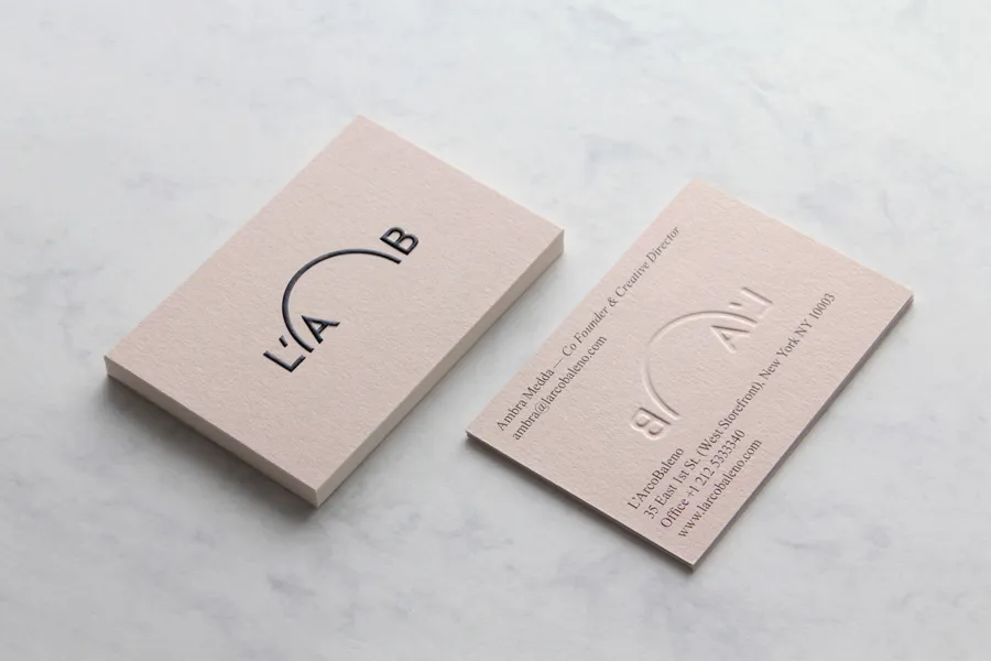
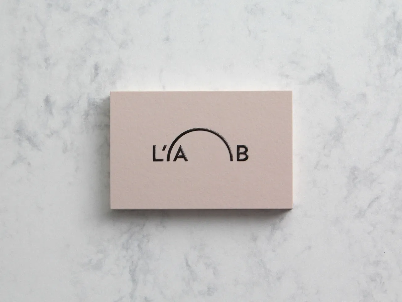
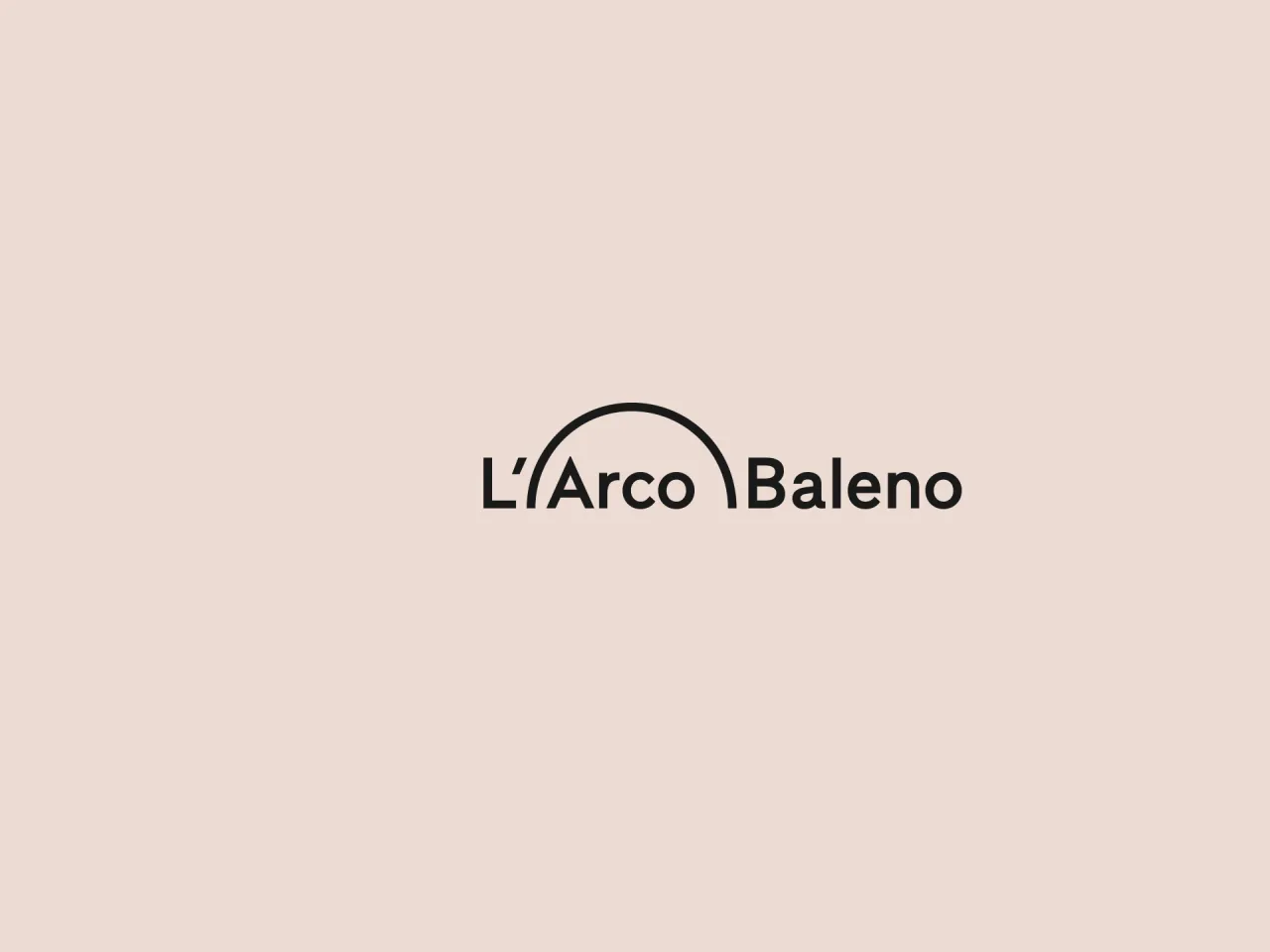
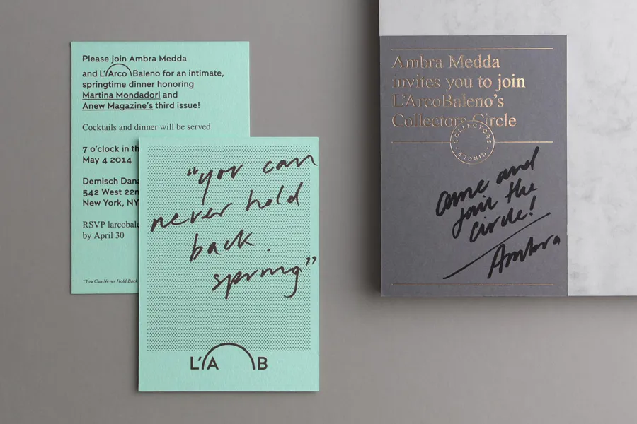
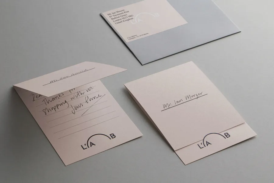
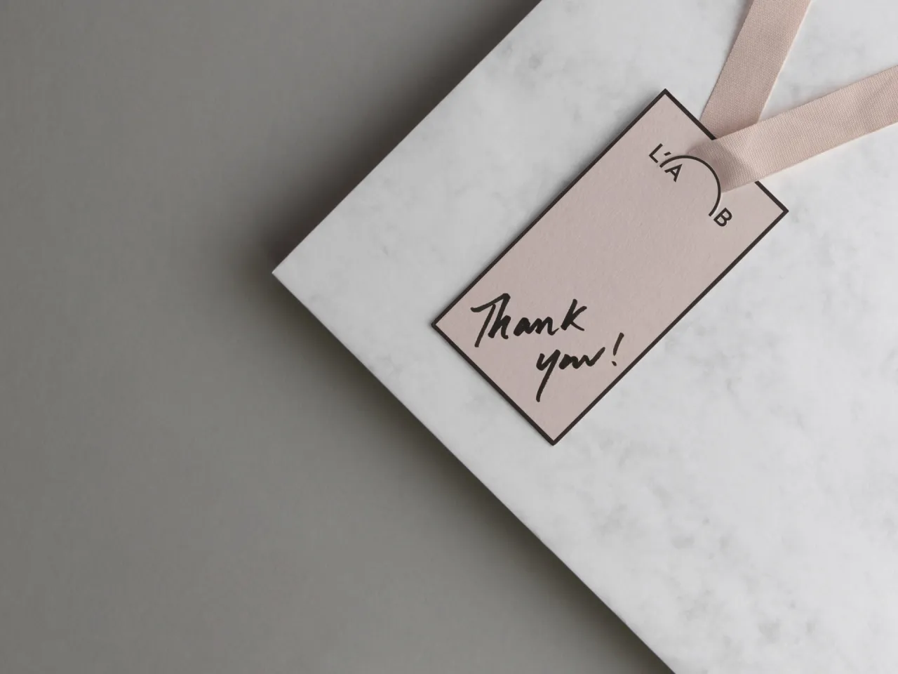
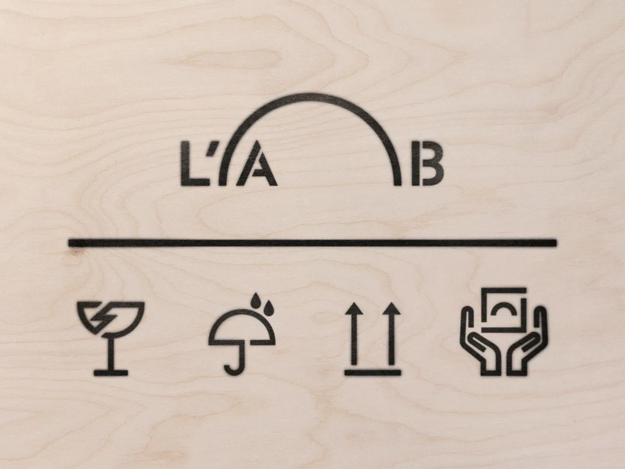
New London-based design studio Commission was asked to readdress the company's branding to better reflect both aspects of the brand and bind them closer together. As explained: "The simple arc of a rainbow was our starting point and inspiration... Unifying the worlds of design culture and commerce, it becomes a 'bridge' for the house of L'ArcoBaleno – an overarching marque of curatorship and ownership.
"This simple visual metaphor is translated into graphic and physical mechanisms across the branded collateral from correspondence cards to fine art shipping stencils."
Editor's Picks





Trending





Latest Jobs
Client Partner at Halo
Full-time·Bristol·£30k–£36k
Midweight Editor at Earworm
Full-time·Bristol·£28k-£32k
Senior 3D Motion Designer at Art&Graft
Full-time·London·£50k-£65k
Creative Social Content Producer at Bompas & Parr
Contract·London·£32k–£40k
Digital Marketing Executive at Arise
Full-time·Sheffield·From £23,750
Senior Front End Developer at Crown Creative
Full-time·Belfast·£50k–£60k