dn&co launches a dynamic and original brand identity for ARC
London-based brand and design consultancy dn&co has today launched a unique and brilliant brand identity for Advanced Research Clusters – a global network of science and innovation clusters that come together to solve problems facing the planet.
Despite not being obvious bedfellows, the worlds of maths and design can come together to create stunning results. (Did someone say Golden Ratio?) And the latest example of this unusual marriage is dn&co's new brand strategy and identity for ARC, which launches today.
If you're unaware of ARC – or Advanced Research Clusters, to give them their full name – they're hubs at the leading edge of major knowledge economies. ARC operate as part of a network that provides the best possible working environments and knowledge platforms for scientists and innovators.
But while they may be doing great work to further the advances made by scientists and innovators, ARC needed a new image. That's where dn&co comes in. Tasked with developing a brand strategy, visual identity and brand narrative, the design consultancy had to create a new, category-defining brand for science. Easy, right?
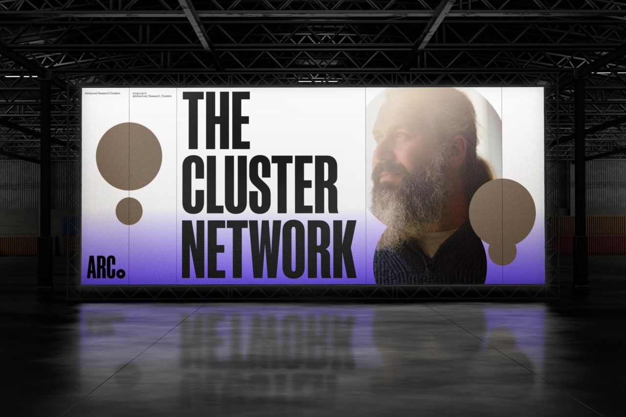
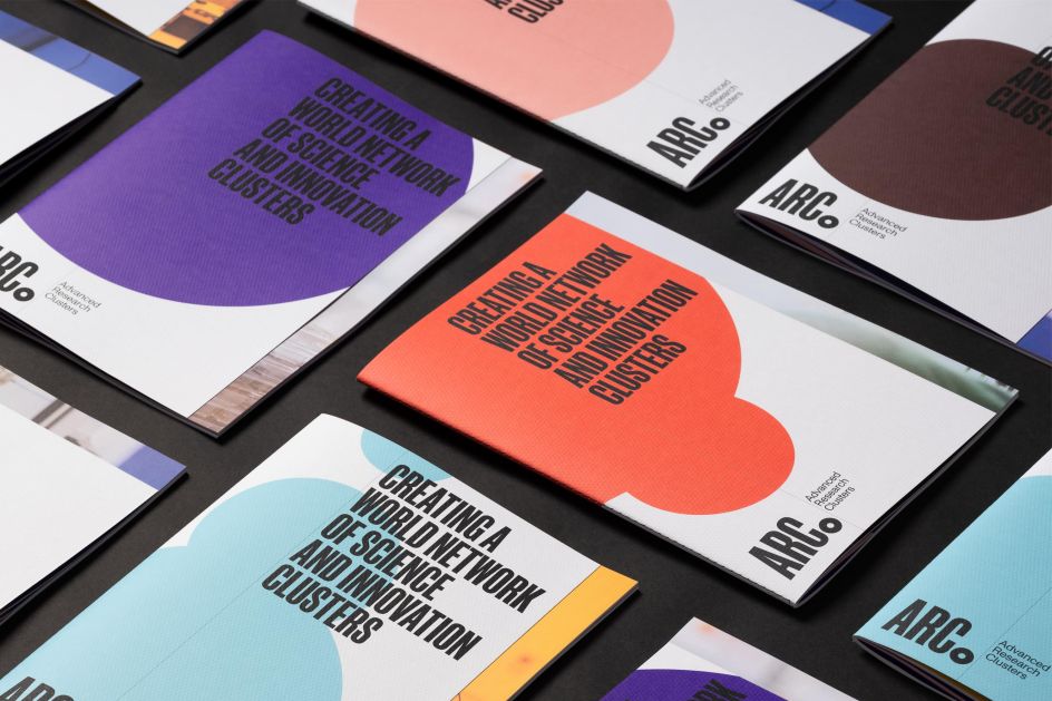
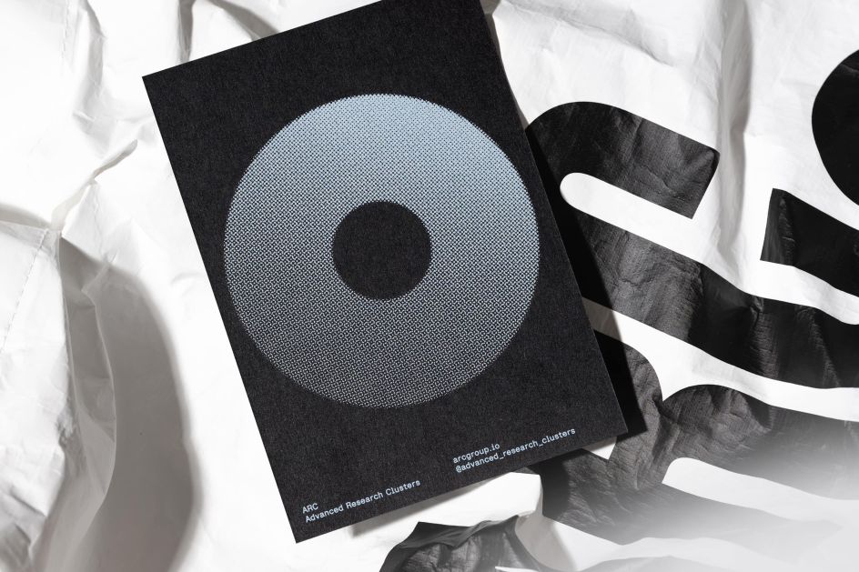
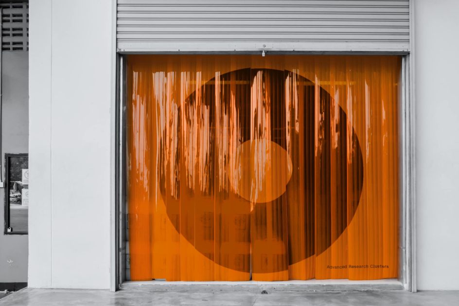
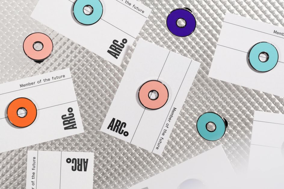
At the foundation of the brand identity is the idea of clusters themselves. These became a dynamic visual identity which built on the principles of mathematical graph theory. The nodes and edges of the clusters represent people, places, and the connections between them. And at its core, The Node and the ARC word marque represent Advance Research Clusters as a unified whole. It's also a neat reflection of how ARC challenges perceptions too.
"When you think about business parks, what comes to mind are places at the edge of town, where people go to work and do little else," says Simon Yewdall, Strategy Director at dn&co. "ARC is challenging that perception with an ecosystem that inspires people and empowers innovation across disciplines and locations. Using the language of clusters, the ARC brand signals a strongly-bound community that is human, dynamic and fun."
Sam Jones, design director at dn&co, adds: "The graphic language that sits alongside the identity is dynamic but also expresses the idea of clustering without resorting to obvious, overused visual expression.
"Predictable flow and Venn diagrams were discarded in favour of something more subtle and understated. We looked to graph theory — mathematical structures that visually represent the reactions to relationships — to create a simpler framework of edges and nodes that acts as a system for layouts."
Building on the cluster strategy is an innovative membership model. This gives people flexible access to world-class facilities, science-ready spaces, co-working areas, accelerator labs and shared amenities across the entire network of campuses.
"Science is fundamental to our lives and our future," explains Joy Nazzari, Founding Director at dn&co. "But to deliver real-world impact, scientists need places where ideas can thrive, and businesses can succeed. ARC aspires to solve the business of science with a cluster model as a catalyst for innovation.
"Working in close collaboration with our clients, we pushed that idea further to envision a larger network. Inspired by how scientists behave and collaborate, the ARC brand transcends location to provide a platform where ideas, inspiration and experiences are shared in the UK and beyond."

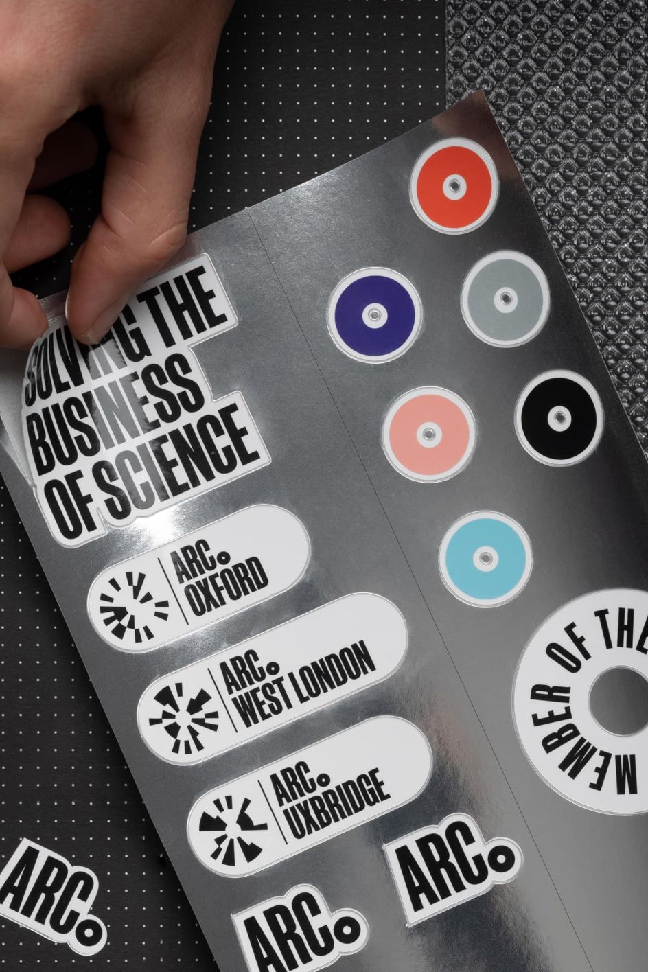
Furthering the identity strategy is a series of sub-brands generated through a tool created by dn&co. These combine Plus Codes and binary code and provide recognisable identifiers for each campus within the ARC network.
The tool, developed by dn&co's Digital Director Tom van de Velde, recognises the Plus Code for each campus' coordinates in real-time and translates them to a binary string relating to the location, delivering it as a unique mark referencing the wider family of ARC sites.
"Visually, the simple strength of the ARC identity is worlds apart from other brands in this space," says Patrick Eley, Creative Director at dn&co. "Yet we also needed to design a flexible system that could adapt to the different campuses and locations that exist now and those yet to come.

"As designers, we're fascinated by icons and codes and how people relate to them. Plus Codes – simple, free to use, open-source digital addresses – helped us capture the idea of place. Translating these through binary code, rooted in computing and communications, we created a unique formula for a series of sub-brands that locate and identify each campus, specifically in space.
"The singular circular ARC marque represents the assembled strength of all the different campuses within the network as if the sub-brands for these spaces were layered one on top of the other. Combined with opinionated condensed typography to reflect the power of the cluster ecosystem, the ARC identity presents a deliberately punchy attitude."
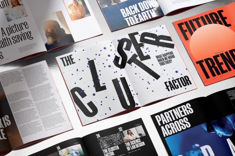
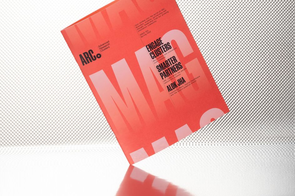
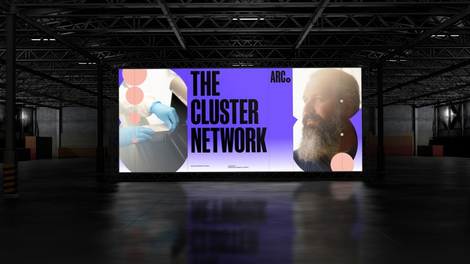
And from today, you can expect to see this deliberately punchy attitude rolled out across print, merchandise, signage, films, photography and online and on-campus applications throughout 2022.
Editor's Picks


Trending


](https://www.creativeboom.com/upload/articles/90/908fdb6378db1e95d12595416f54e6336d5e80b8_732.jpg)
Podcasts


Editor's Picks
Further Reading