Universal Favourite crafts an inclusive identity for game-changing underwear brand Nala
We all know fast fashion is bad for people and the environment. But when it comes to clothing, 'sustainable' often means dull. Yet Nala, an Australian-based underwear brand, believes it doesn't have to be that way.
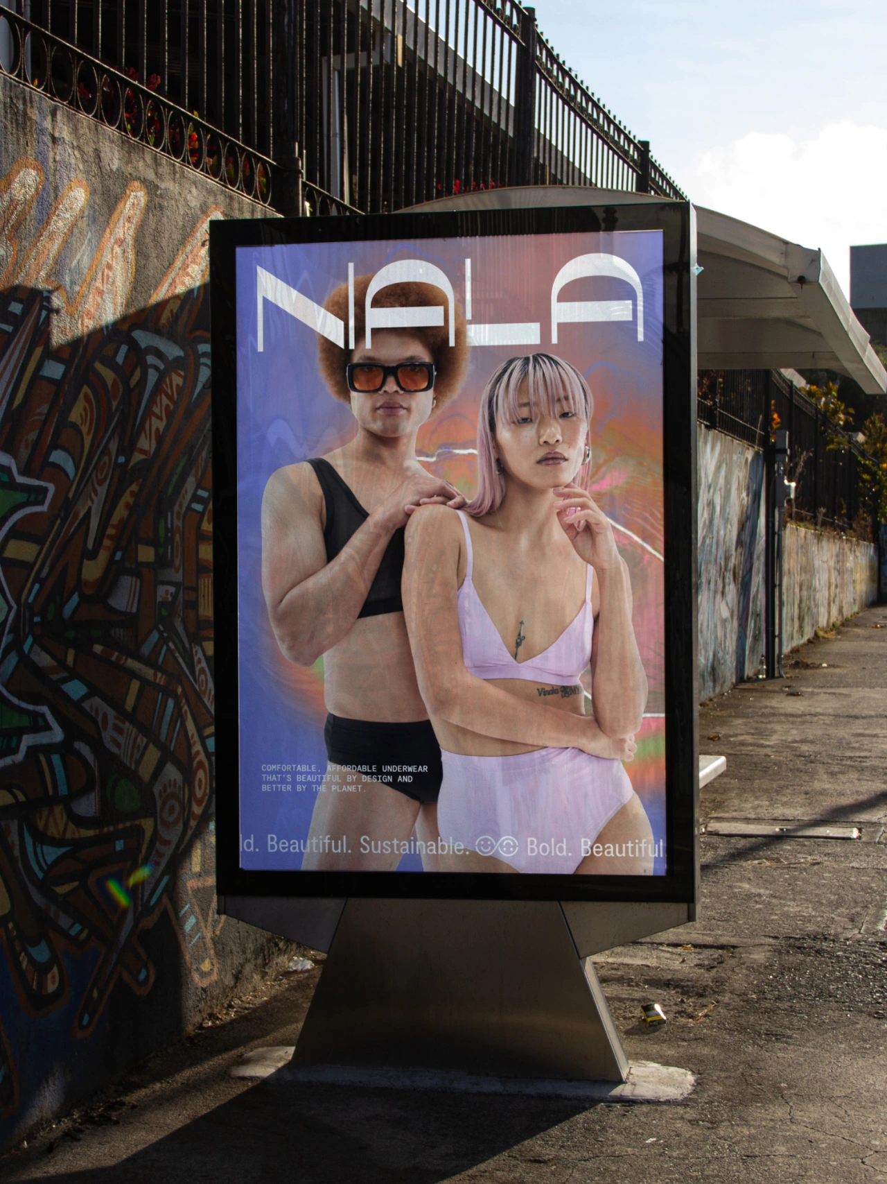
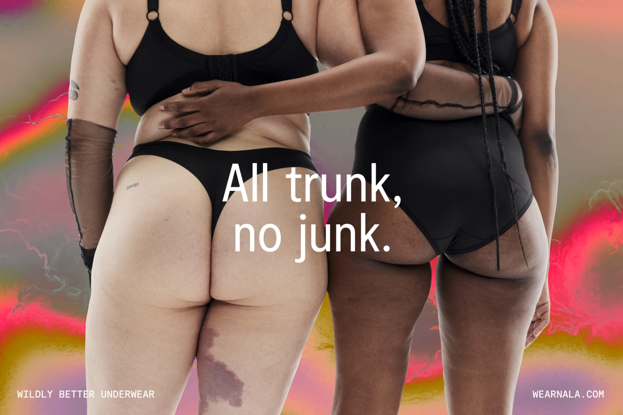
The underwear industry also has a long history of perpetuating unrealistic body standards. And while some brands have made huge steps toward a more inclusive industry, none were flaunting it loudly, proudly, and truly celebrating the diversity of the body.
Nala wants to right these wrongs, so their vision involves achieving the holy trinity of underwear, making it comfortable, sustainable and sexy.
That means no more sacrificing comfort for fit, restrictive size ranges or paying way too much for clothes that don't cost the planet. Instead, they make bold, comfortable, sustainability-focused products that empower their audience to look, feel and do good.
To promote and enhance this vision, they turned to Universal Favourite, a design studio based in Sydney, Australia.
The brief
Nala required a flexible and vibrant design system that looked as good as their offering felt and championed the diversity and attitudinal tone of the audience they serve. It needed an identity that not only stood out against the drab designs of the sustainability space it was playing in, filled with cliches like earth tones but which would also hold its own against underwear heavyweights.
At the same time, in a fast-moving marketplace, the brand also needed the ability to evolve and shift between our ever-changing identities; to capture the uniqueness of an individual yet reflect the beauty and diversity of the collective.
Concept and wordmark
Nala began with the concept of 'all of you', an idea that encapsulates the freedom and confidence that comes from wild and radical acceptance of self and by society; to feel how you feel, move how you want and look how you look.
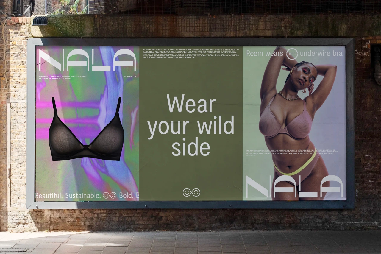
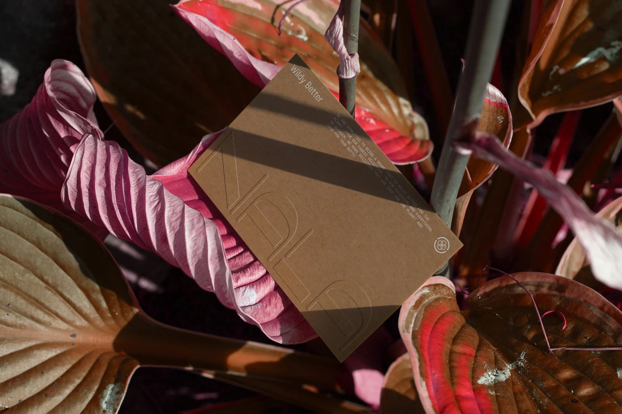
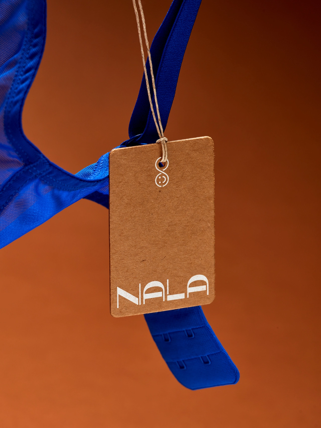
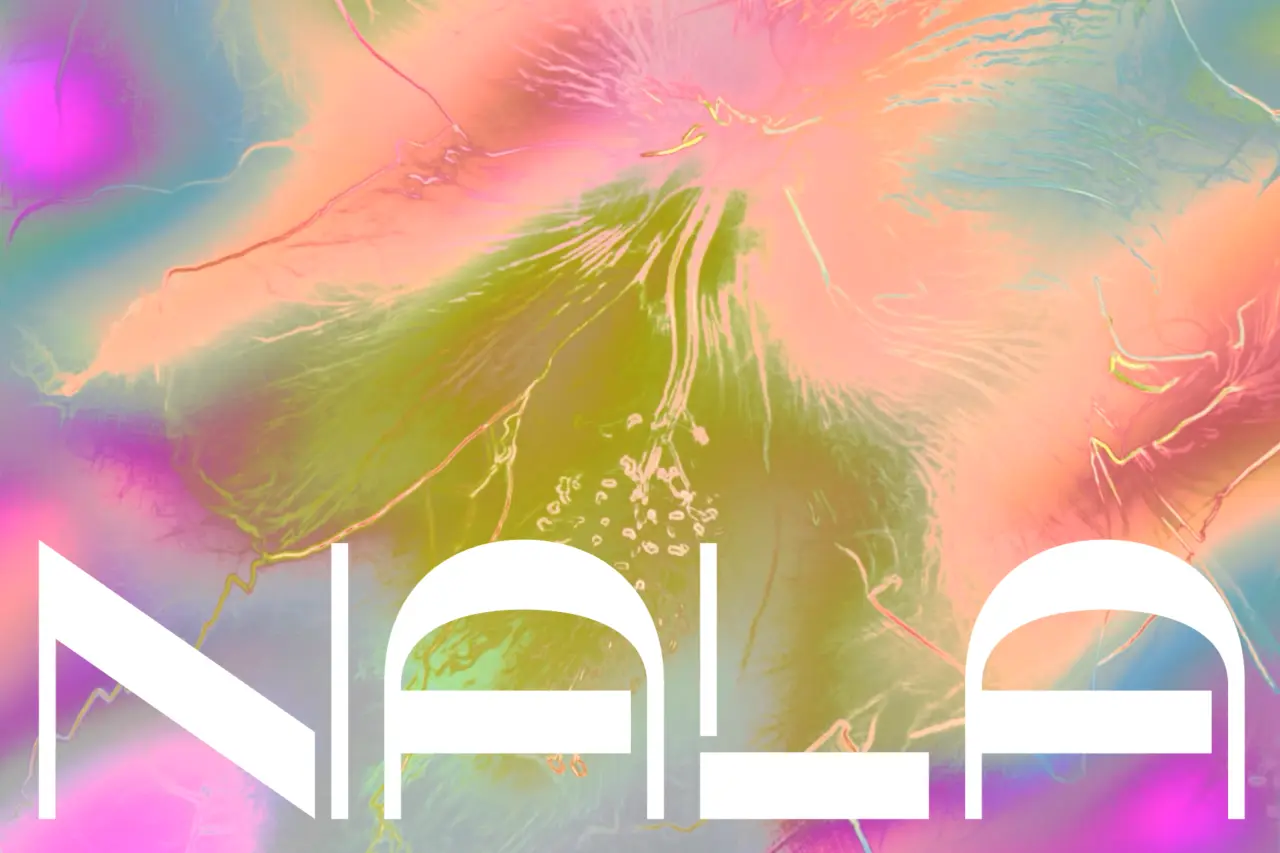
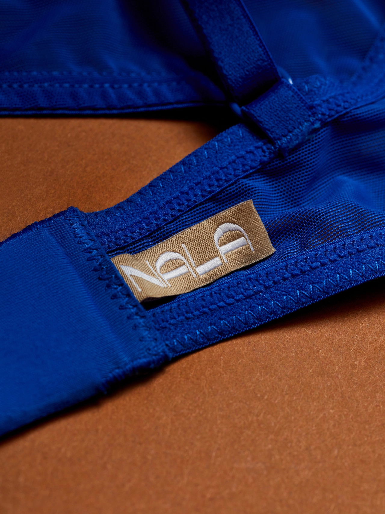
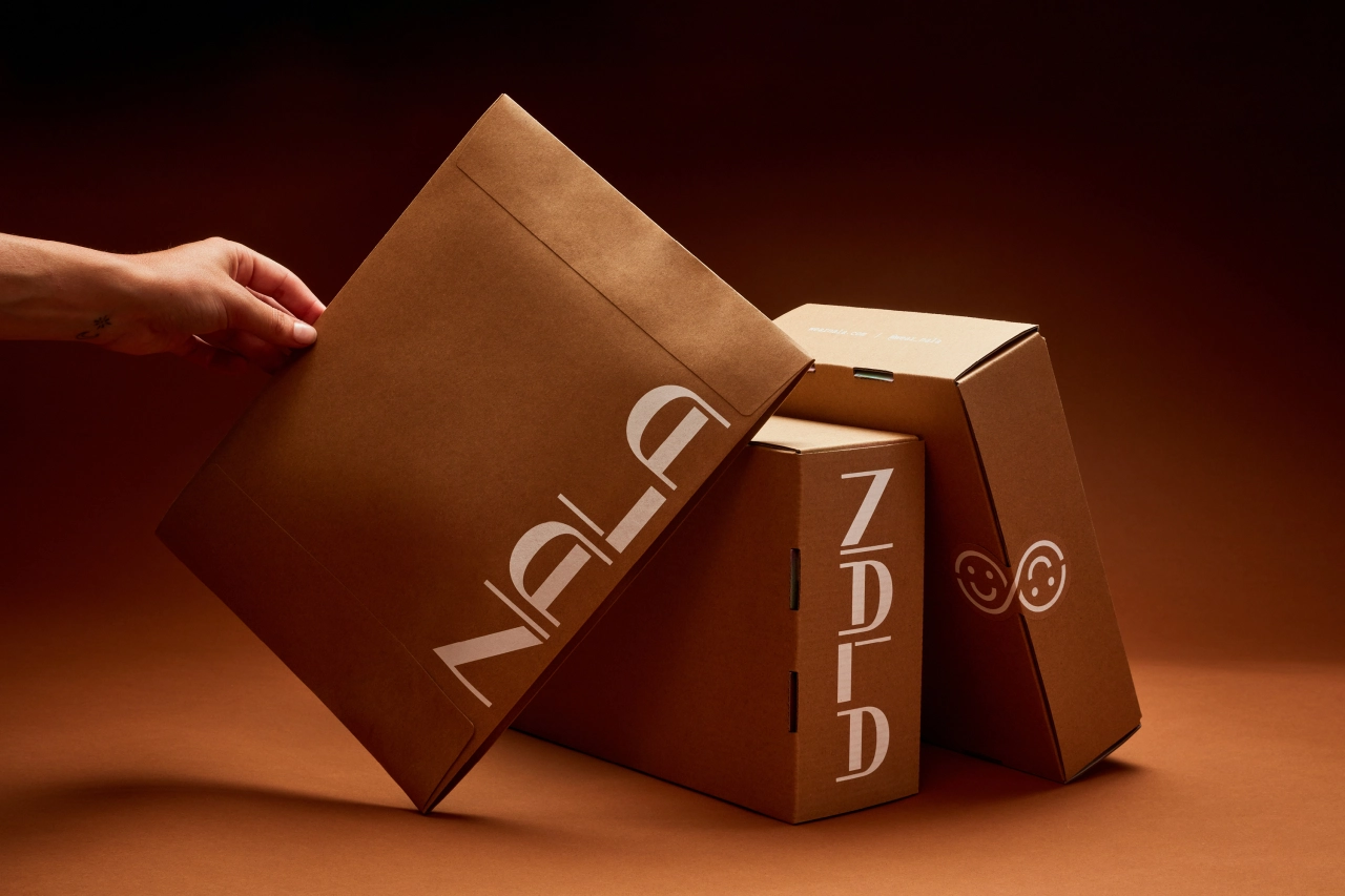
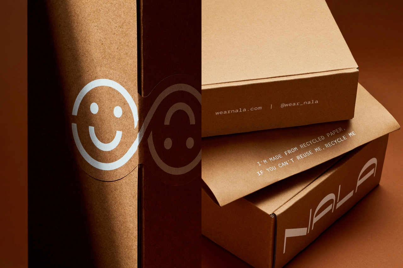
The wordmark challenges cultural norms and embraces fluidity with its unusual forms, which are strikingly simple while still adding visual interest. A supporting brandmark, the infinite smiley, brings in the brand’s environmental focus: a nod to the circular nature of the business and its commitment to giving back, as well as a universal expression of comfort and happiness.
The visual language features unique patterns that are rich and ownable. Featuring natural and organic imagery, including flowers, clouds, raindrops and water ripples, they create interesting, hyper-coloured expressions that stand out against a neutral colour palette and reflect the moods and identities of the brand’s customers.
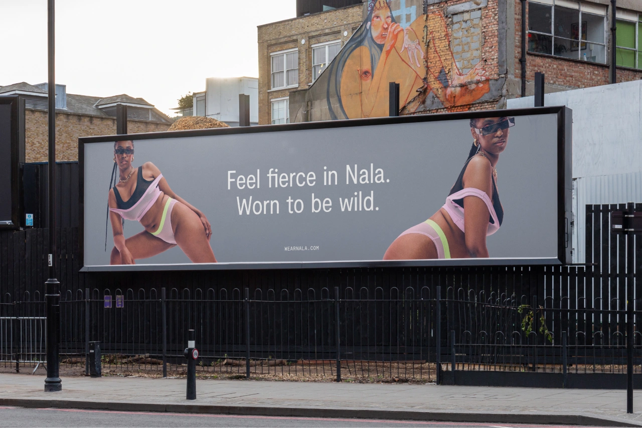
This gives the brand a cohesive yet ever-changing asset that can scale into a product, evolve seasonally and thematically, and be animated for digital.
Art direction and copywriting
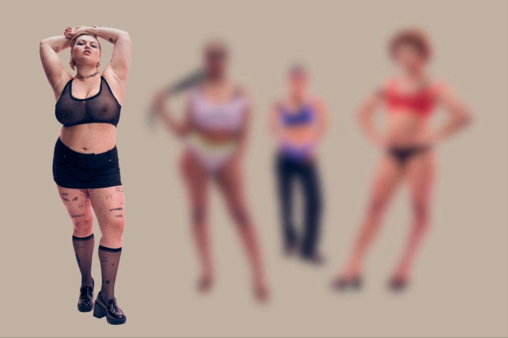
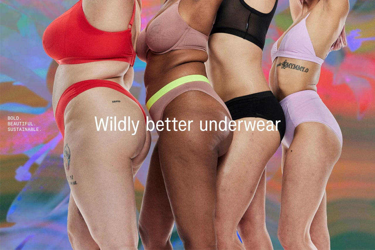
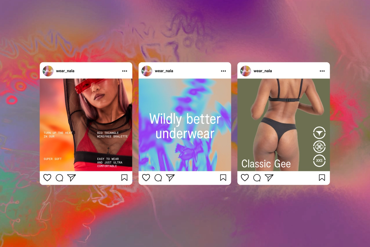
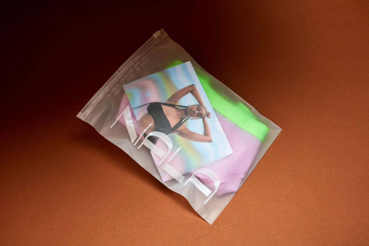
Regarding art direction, emphasising the brand's inclusivity was paramount. Universal Favourite handed over stylistic guidelines to ensure Nala's essence was encapsulated in all their photoshoots. Models needed to reflect the Nala community and beyond, showcasing diversity in body, gender, ethnicity and expression.
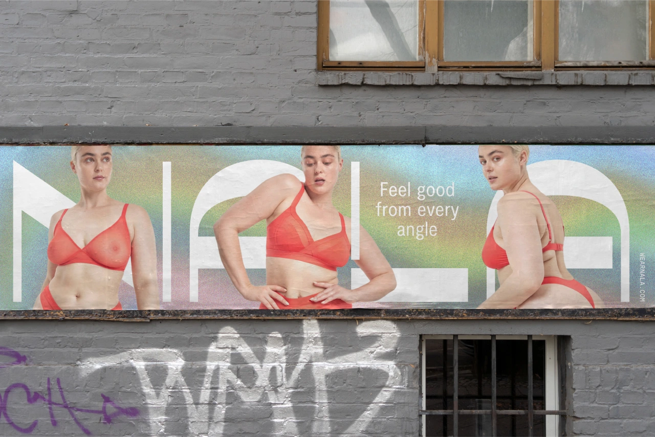
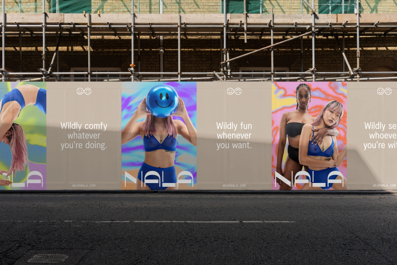
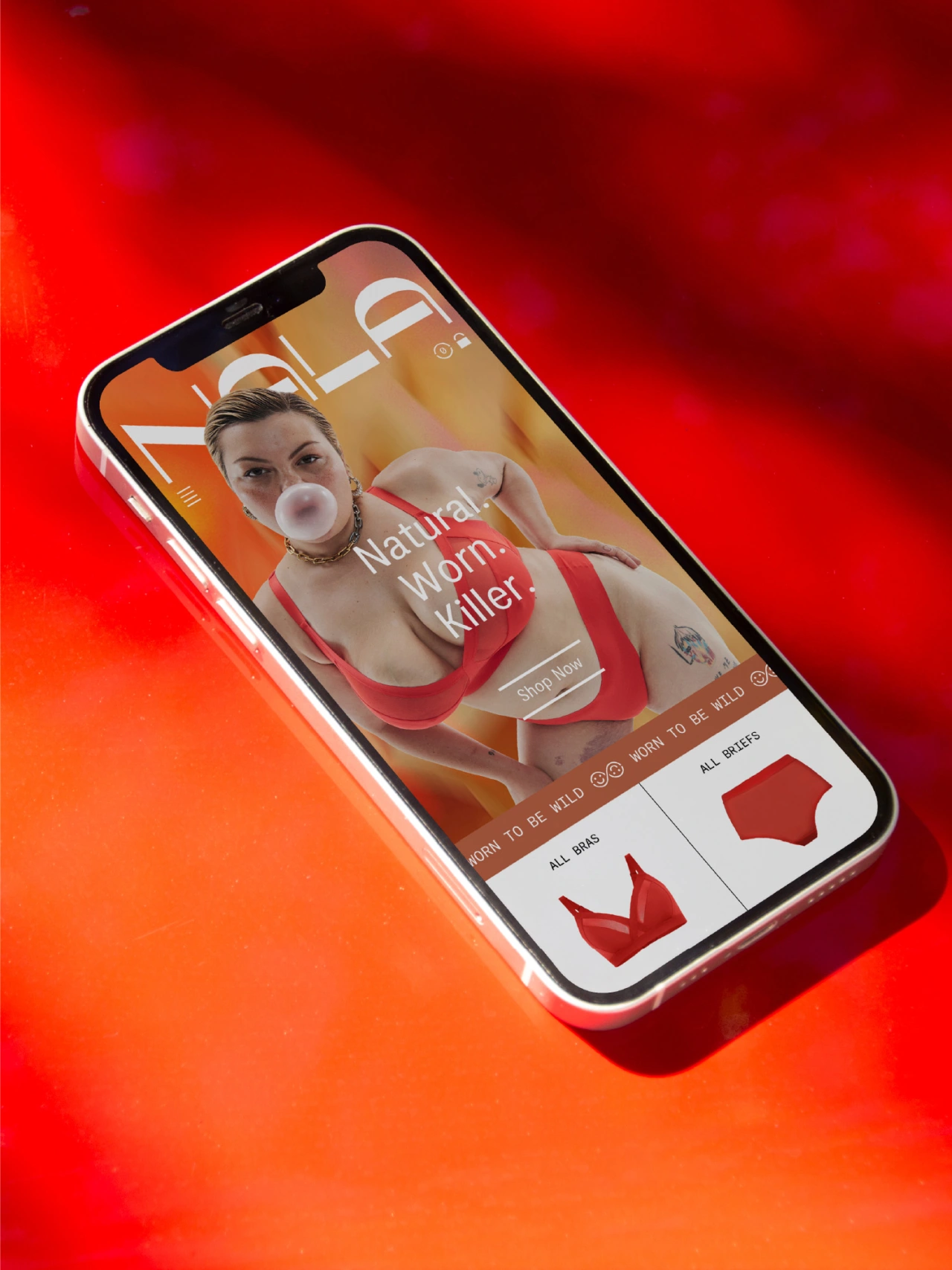
Throughout the styling, expressions and poses, they encouraged fierce confidence – an embodiment of the brand’s mantra that it’s "worn to be wild" – and the highlighting of raw beauty, with no retouching of images.
Finding the right voice for Nala was integral. With so much technical scope and innovative fabrics used in their design, the studio needed to find a way to communicate that was both informative and palatable. It was also important to strike a balance between unapologetic confidence and radical inclusivity, making sure as many people as possible feel seen, heard and empowered.
Working with copywriter Cat Wall, Universal Favourite developed a verbal identity and suite of messaging that hits those key points while adding some fun around the radical nature of the brand.
Typography and packaging
The identity uses simple and reliable typefaces to offset the rebellious nature of the photography and patterns. The primary typeface is Moderat, whose low-stroke contrast and subtle detail provide a timeless quality suited for body text and large headlines.
It's complemented by Moderat Mono, whose technical flair and tactility sing as the brand's accent font.
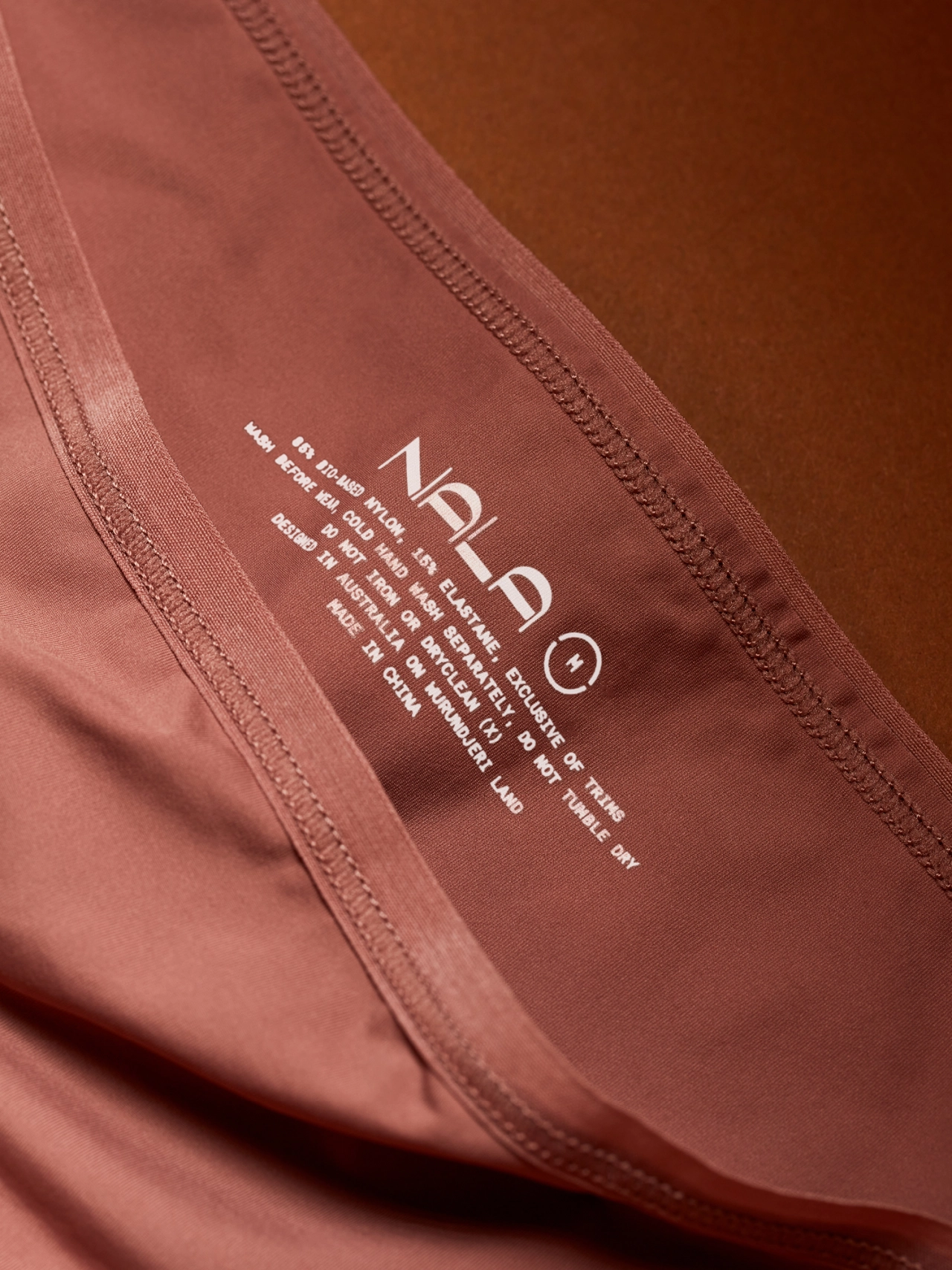
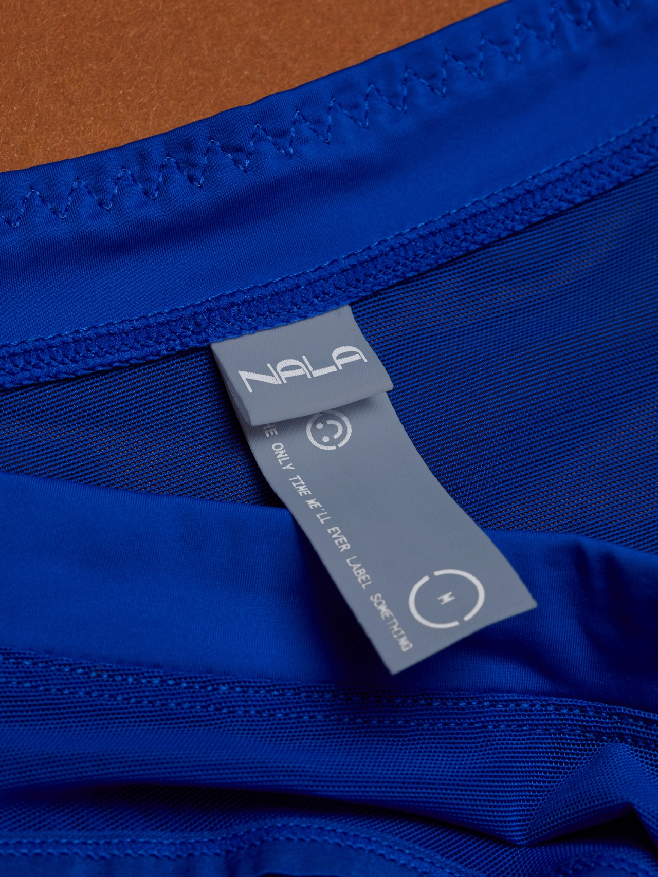
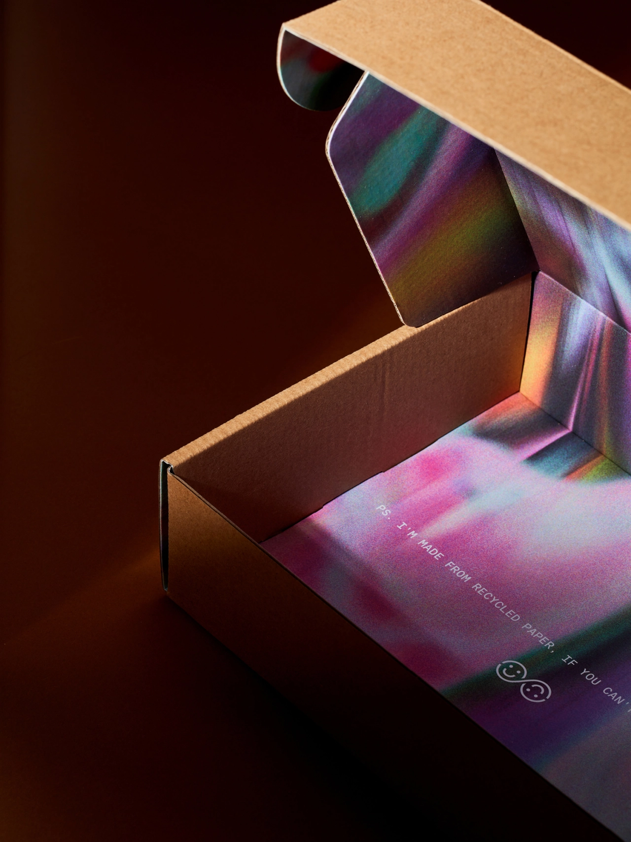
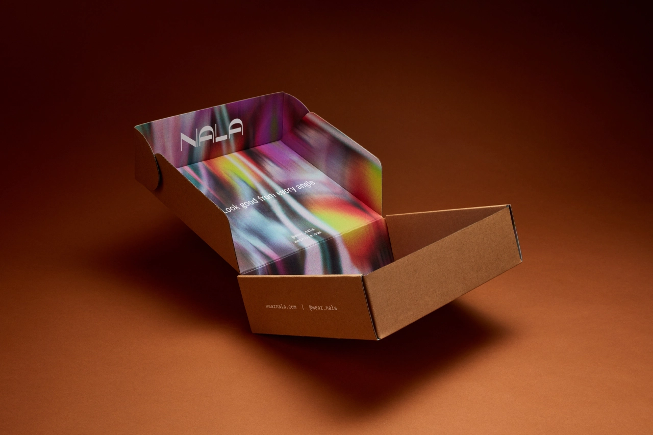
Meanwhile, the main challenge with packaging design was getting the most impact on unboxing while minimising waste.
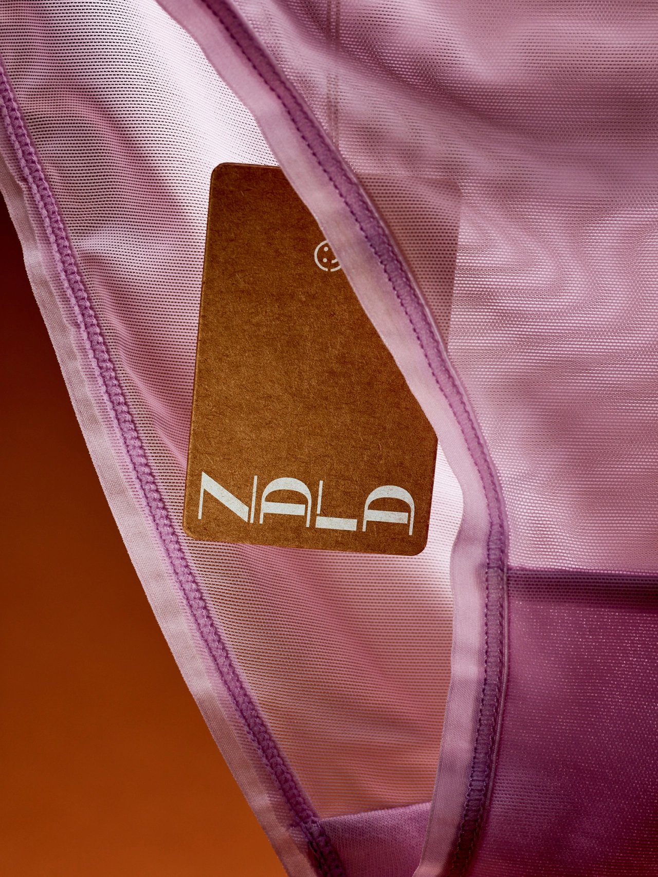
In line with Nala's strong environmental focus, kraft and recycled paper made for an appropriate choice for packaging materials, and Universal Favourite brought in the brand’s signature patterns for moments of surprise and accent. Wherever possible, text was printed directly onto products to eliminate unnecessary tags.
In total, this comprehensive visual identity does a great job of reflecting the values of this challenger brand. The flexibility of the design system means the messaging, the people and the products all work together to create an eclectic yet cohesive whole.
Editor's Picks





Trending






Latest Jobs
Account Manager at Moxie and Mettle
Full-time·Cheltenham·Up to £35k
Head of Technical & Facilities at Midlands Arts Centre
Full-time·Birmingham·£40,210
Midweight Designer at Catalyst Creative
Full-time·London·£32k-£36k
Design Lead at Madeo
Full-time·New York City·$85k–$120k
Senior 3D Motion Designer at Art&Graft
Full-time·London·£50k-£65k
Head of design at Cog Design
Full-time·London·£55K