Why the spat over New York's new logo is worth paying attention to
The world of social media is up in arms over a new logo. So what, you might think? But the reaction from the creative community to the radical working of New York City's logo goes beyond simple design conservatism. We give some context and explain why you should care.
Whenever a famous logo gets redesigned, you'll find people up in arms about it. And most of the time, that's simply because, well, people don't like change. The value of a long-standing logo is that it's easily recognisable and, if it's a good one, evokes some kind of emotional response in the viewer. Replace it with something new, and all that goes out the window. And that can make certain people very mad.
The ironic thing is, a few years down the line, when the design has bedded in, the whole cycle repeats itself. And if the brand dares to tweak this once-new, now-old logo, they'll get a lot of flack all over again, often from the same people who complained when it was introduced.
Anyone who works in design has seen this process repeat a million times over. And so we rarely focus on these kinds of controversies at Creative Boom. After all, there are so many other positive things to talk about and talented people to promote in the creative world.
Every now and again, though, there's a debate we can't ignore. And the new logo for New York is one of those moments. To explain why, we'll start with a bit of history.
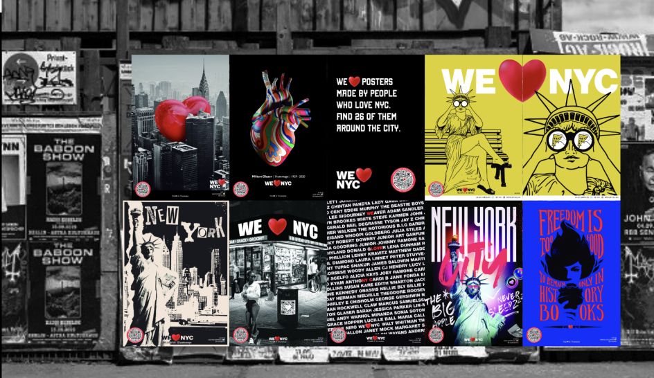
The 1976 logo
The 'I [Heart] New York' logo feels like it's been around forever, and for anyone under the age of 47, it basically has. It was designed in 1976 by the famed designer Milton Glaser (1929-2020), based on a sketch he dashed off in red crayon on some scrap paper while in the back of a cab (how New York is that?).
While today the Big Apple is a magnet for wealth, privilege and sky-high property prices, back then, the city was verging on bankruptcy and riddled with crime, poverty and violence. So the 'I Love New York' advertising campaign was as much about raising the spirits of the embattled residents, who were largely scared to walk the streets at night.
In an act of generosity, Milton Glaser designed the logo pro-bono and never made a dime from it: it was essentially his love letter to New York.
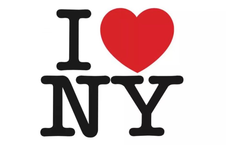
It's not surprising, then, that New Yorkers felt deeply attached to his design. Mercifully, the high levels of crime and deprivation that prompted its creation were dramatically reduced over the ensuing decades. But then the attacks of 9/11 came and ripped the heart out of the community. Suddenly the logo was everywhere once more: on T-shirts, baseball caps and basically, every item of clothing people could attach it to, as a sign of solidarity and defiance.
In short, there's much love for the 'I [Heart] New York logo, and to our knowledge, there have been absolutely zero calls for it to be changed or replaced. So when the authorities launched a successor this week – not just changing its design but the words themselves – it was a shock to people everywhere.
The 2023 logo
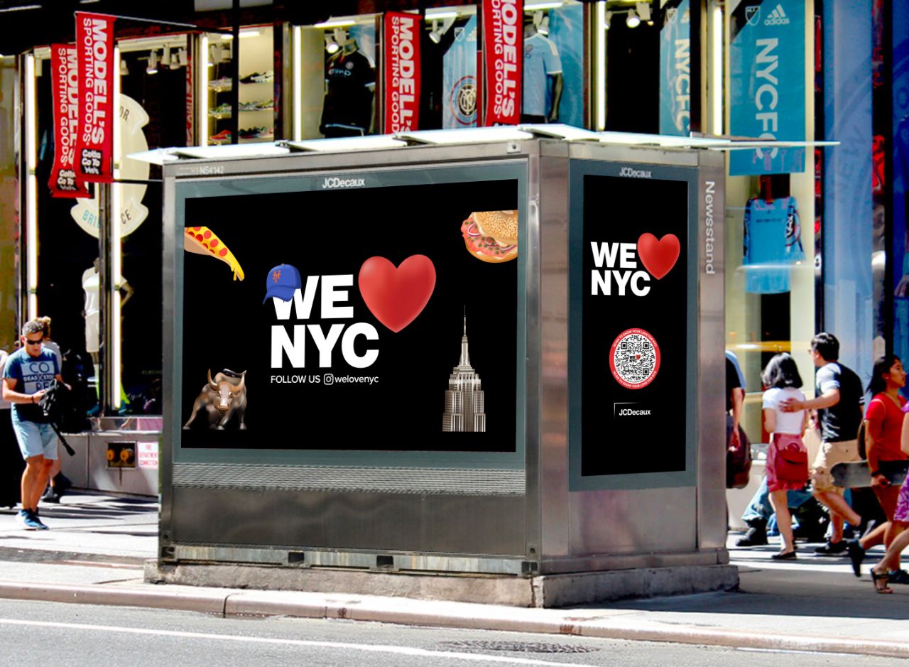
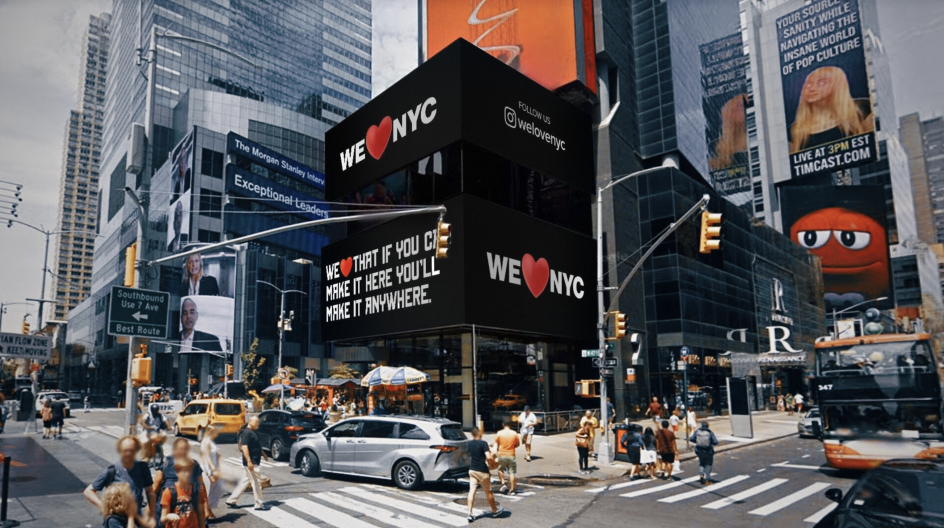
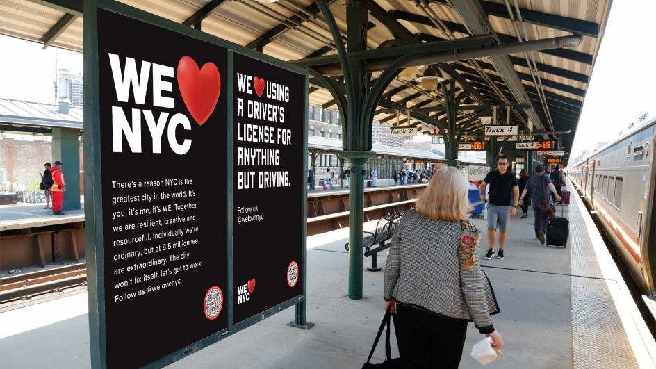
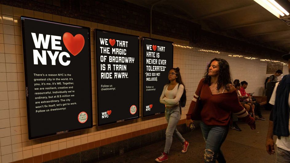
The new logo was introduced as a full-page advertisement in Monday's New York Times and then by Mayor Adams and Governor Hochul at a press conference in Manhattan's Times Square. And it's dramatically different from its predecessor.
Firstly, the text has changed from 'I [Heart] New York' to 'We [Heart] New York'. The explanation for this is long-winded, but the intention seems to be to recognise how New Yorkers came together to support each other during the pandemic.
Secondly, the design is dramatically different. The serif typewriter-style font of Glaser's original has been swapped for a sans-serif that references the Helvetica signage of New York's subway system. The heart has a gradient that gives it a more three-dimensional look. And most significantly, it's a lot bigger than the letters.
Many have argued that when stacked, this makes it more difficult to see as 'We [Heart] New York' and reads more like 'We New York [Heart]'.
Designer reaction
The reaction to the new logo from the design community has been swift and brutal. Designer John Contino, for example, wrote on Instagram: "Milton's design is perfect and brilliant, and people will WANT IT FOREVER. This new one is lame and boring, and nobody will care about it to the point that it will disappear on its own."
Artist Zipeng Zhu agrees, writing: "It's really heartbreaking that people don't understand something it's meant to be forever. The new logo is just not it. Sadly. I think we need to continue to honour the legacy that Milton Glaser has left us; his work has truly changed the world for the better."
But is this all just nostalgia? Graphic designer Louisa believes it's not, and there are actually flaws to the design. "I would guess that originally the heart was smaller and flat red, and it was arranged so that both lines together formed a neat square," she suggests. "And then came the notes. 'Can we make the heart bigger? We want to emphasise the love!'. 'Ooh, can we make the heart 3D, really highlight it'. And at some point, the designer was like, 'You know, fuck it, let me show them why this is a bad idea,' and made a really exaggerated version that incorporated the bad feedback. And then, of course, the higher-ups loved it."
Joe Natoli, founder of the UX 365 Academy, is also not a fan, describing it as "Generic, unmemorable, unremarkable, which makes it instantly forgettable. Zero impact or emotion. There is no DESIGN here, just a generic font and a heart rendered in a way where they have no visual relationship or mutual support to each other".
Not every reaction, though, has been negative. "Someone needs to win all PR awards for the New York logo update," says Christopher, who works in advertising at Wieden+Kennedy. "No one would have cared if it was a subtle and elegant update."
And designer Forrest Huu Ta also defends it, saying: "All this discourse reminds me of when I saw the 2012 Olympics logo in high school, and I thought it looked pretty cool. Fast forward to college, my professor told me the design community hated it back then. Whoever designed the We [Heart] New York logo, you deserve a purple heart, my guy."
Finally, graphic designer and writer Ellen M Shapiro makes an important point that everyone, including this writer, previously missed. "Milton Glaser's original I [Heart] New York logo was for the whole state, including Niagara Falls and dairy farms and ski resorts and everything else," she notes. "The new logo is for New York City. I do have to admit that after seeing some of the ways it’s being used, it's not as horrible as everyone first made it out to be."